

First impressions are everything, and your website is often your first chance to make a great impression with a potential client or fan. Unfortunately, most website portfolios are pretty rough. I will try to skip the obvious and avoid telling you about having a nice design or great work, instead lets focus on some of the things that are a lot less obvious but also super important when it comes to putting your best foot forward.
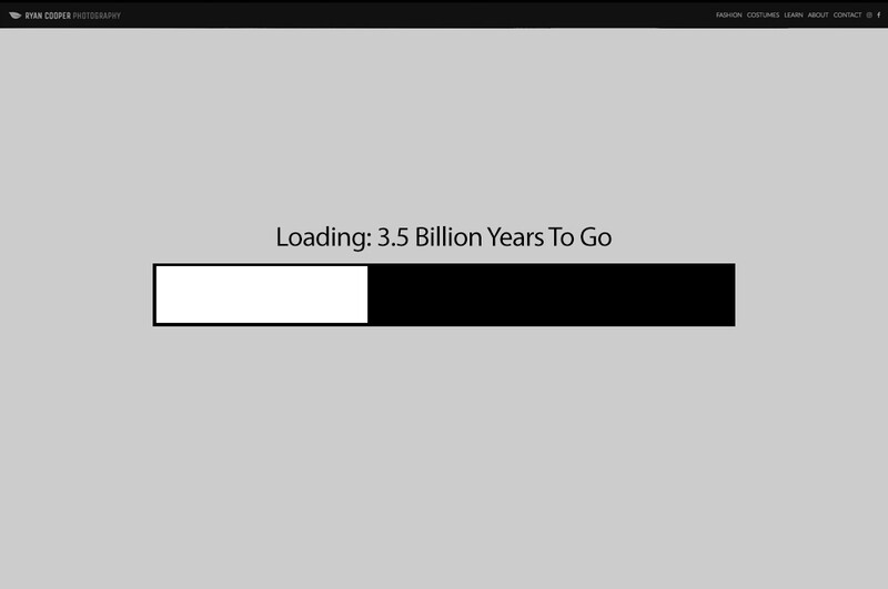
1. Your Website Loads an Entire Gallery Before Showing the First Image
Load speed is critical. The longer you force a user to wait before showing them the content they seek the more likely they will be gone before the content even shows up. One of the biggest mistakes many photography websites make is that when a user visits a gallery the gallery presents a nice load bar while it preloads the 20-plus high-quality images in the gallery. This is a brutal way to slow your website down considerably and frustrate the viewer. Instead, look for a website template or gallery system that loads only the first image or two to show right away so that it can load the rest in the background while the visitor is taking a look at the first images.
Also, make sure your images are optimized for web to look great but not bog down the load with too much data. I recommend using a third-party JPG compressor to squeeze as much compression out of your photos as possible without sacrificing visible image quality. Personally, I use ImageOptim which seems to compress far better than Photoshop's "Save For Web" tool without sacrificing quality.
2. You Make the User Work to Find Your Images
Never make the user hunt to find your work. Forcing a user to drag their cursor through vague categories, into sub-categories, and beyond is a frustrating experience for the user. If you have so many images that you need multi-tier organization you are doing something wrong. I wouldn't recommend more than three or four different categories which are all accessible via the main navigation of your website. Seeing your work should never be more than a single click away from the homepage.
3. You Create the Illusion That You Are Much Bigger Than You Are
The instinct to brand yourself as some sort of superstar photographer who travels the world conducting fabulous shoots can be quite tempting, but it is actually an anchor on your brand if it is a lie. Local, smaller clients may be impressed but also intimidated. That image of a superstar gives smaller clients the impression that you are too big for them. Furthermore, bigger clients who an international superstar photographer would actually work with already know whether you are one or not, so if you pretend to be one when you are not you only serve to make the first impression of dishonesty.
Brand yourself as the photographer you are. Don't write "international photographer" unless you frequently travel internationally for paying clients. Instead be forthcoming about your location so that clients in your area can feel comfortable hiring you. Most importantly, don't make clients jump through hoops to contact you, instead make the contact process as hassle-free as possible. Give them an email and a phone number, don't make them fuss through contact forms with CAPTCHAs.
4. Your Website Is a Disaster on Mobile Devices
This isn't 1999, the web has changed. Most users are now browsing on mobile rather than desktop. Your website will likely be serving itself to mobile users over 60 percent of the time; you can't afford to have a website that only works on desktop. Gone are the days when a website that scales "OK" can do the job. Mobile needs to be made as much or more of a priority as your full-size website. Go look at your website on your phone right now, does it look amazing? If not, you need to make changes now.
Conclusion
Having a great website is more than within reach of everyone these days. You no longer have an excuse for not having a great website that gives a great first impression. Get to work and make sure your website lets your images do the talking. Don't let a crappy website drag down an otherwise sensational portfolio. You have the power, hop to it!


Join the Fstoppers community for free
-
Post comments and join in the discussions
-
Browse the site ad-free
-
Share your work and get featured in the community
-
Compete in the photo contests for fun and prizes
7 Comments
I think this is good advice, and I follow it myself.
But it seems like the new norm on the web is to load down commercial sites with so much advertising that they're flat out impossible to navigate on mobile devices and take ages on keyboard machines. Pretty much every photographer's site is a cakewalk compared to most commercial sites these days.
Slideshows! I frackin hate slide shows! If i want to see your images, i want to see them at my pace. And music, i don't want to hear your crappy choice in music!
Thanks.
Nice article. There's a little more to optimizing a slideshow (without sacrificing image quality) than mentioned here though. For example, the slideshow solution I use displays the first image immediately, and then it loads the remaining images in the background. It is seamless solution from a user perspective.
One thing that should really be emphasized is #4 (mobile users). Having a mobile ready web site is critical, not only i terms of the user experience, but also from a search ranking perspective. I manage several web sites, and I can tell you (from first hand experience) that the majority of people visiting these web sites are now using mobile devices.
ImageOptim's website says it removes metadata? Is that all metadata?
I'd assume so, I've never checked, I never attach metadata to my images so really don't care, personally. ;)
That's cool I'm sure its tweak-able. Thanks for the tip going to download it now...