
You may have just started your journey in photography or you have been on the market for quite some time, and you still wonder if your website has more to do with getting more clients than you might think. The answer is yes, but only to some extent. Let me tell you what I thought was important for my website and what I think is important today.
Whether you use a template-based website builder or you custom code your site, the mistakes and principles I'll outline below are still applicable. There are tons of services that allow you to create a great portfolio website. Just choose the one that you find the best as price and features. I still think most of you may search for way more features than you'd actually need.
My Philosophy at the Beginning
I started by photographing children and families. I wanted to display a cool portfolio on a website that was interactive, well integrated with social networks, explained my pricing, my principles, showed options for different packages, allowed users to customize their packages, and have an online booking form. I monitored the performance of my website using built-in statistics and Google Analytics.
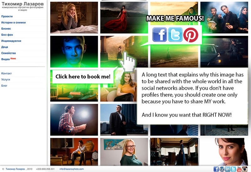
As with many beginnings, it was hard. The phone was not ringing, the emails were not flowing in. I started to think there was a problem with my website. My main misconception was people were coming to my website to immerse in my own world, having all the time in the world to spend hours of their life browsing the images, sharing them in the social networks, and reading that miles long text content. For that reason I wanted my logo everywhere (so they subconsciously had a feeling I'm a big brand), social networks buttons everywhere (so they shared my one-of-a-kind masterpieces and I gained tons of exposure), text everywhere that explained my philosophy, pricing, how I worked. They had to choose me because I shared details and behind the scenes of my working process. After they spend all that time on my website, they would click on the "Contacts" link and get in touch with me desperately asking to take their money.
The Reality
When people come to your website it is probably one of the 100 others they've opened in their browsers. They don't need your fancy logos, gallery animations, "Enter here" first screens, or long texts explaining how great thou art. Most people today are overloaded with information. They want things quick, fast, here, and now.
For that reason I removed anything that wasn't compliant with that demand. I removed all the social networks' sharing buttons and widgets. They were only slowing my pages down. I hid all the long texts, because nobody was reading them. I tried to avoid all that clicking around for viewers to find the information they needed. What they actually needed was to see quickly if I was able to create nice images and to contact me right away. That's why the website had to load quickly.
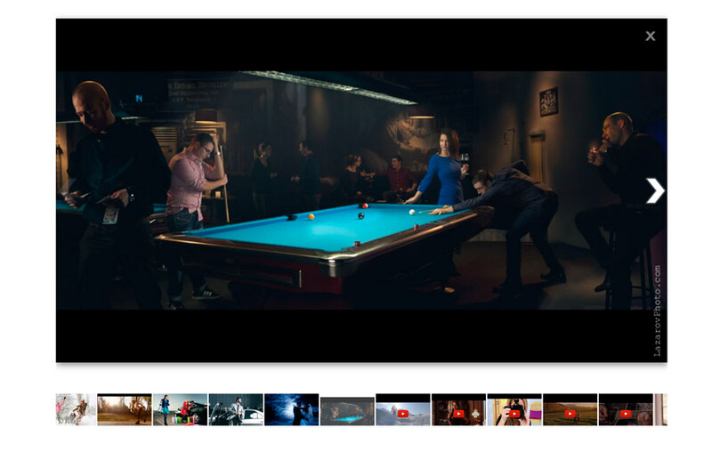
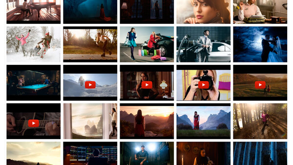
All you need is the intent for the client to hire you. They don't have to hire you for your prices or for your gear. They have to hire you because of the work you can produce. Quality should come first. This is the reason I show on the entry page everything that I think is enough for a client to judge if they should work with me. It shows the variety of images and videos I make and my contacts information. I try to have these displayed as quick as possible. This even works for international clients who don't need any interpretation to find out if they like my work and how they can get in touch with me. That saved me time and money to translate my website and create the appropriate navigation that allows switching between languages. The universal language of images and formatting made that possible. What kind of formatting, you may ask. Every person who knows what an email or a phone number is, can recognize that someone@yourdomainname.com is an email and a +123.456.7890 is probably a phone number.

I don't say your website must not display any detailed information or more galleries with images. People who are interested in seeing more of your work, or learning more about you, will dig deeper. I want to stress on the fact that the most important information they need has to be on your first page.
What You Think People Care About but They Actually Don't
They don't care about your fancy logo. It won't make them hire you (unless it says "professional photography for free"). They care about your work. As a photographer or a videographer you have to show them your work.
They don't care about your navigation type, whether it's horizontal or vertical. As long as it's intuitive and easy to interact with, it's good.
They don't care about sharing your work with the world. They will do it when you work with them and make images and videos they won't forget. Don't over-widgetize your galleries with content sharing tools. You are not a news website.
They don't care if your galleries had some cool animations. They want to quickly see your work, not your website animations.
They don't care what gear you use. Why waste links on your website to list your gear? Unless you are a rental house, you don't need that information.
They don't care about your custom font style. As long as they don't have to read much, and the text is easy to follow, you are good to go with any font type. You are a visual artist, show visual work, not lots of text.
All they care about is if you have a solid work and how they can contact you.
How I Reached to That Conclusion?
I monitored my website statistics all these years and I can say, the majority of visitors judge you by your first page impression. Most of the people hire me by looking at my first page and contacting me after that. I'm seriously thinking of having only two pages on my website in the future: an overview of my work and a contacts form, although I have my contacts listed at the footer of every page.


2 Comments
Precisely, simplicity is the way to the better!
Thanks for the feedback, Aleksey