Critique the Community
Adventure Photography
Submit your best adventure image for a chance to win a free Fstoppers tutorial
Submit your best adventure image for a chance to win a free Fstoppers tutorial
Twenty adventure photographs were chosen and rated by the Fstoppers team. Do you think the feedback is fair?
The two highest community rated images for this episode were both submitted by Mads Peter Iversen. Since he is an Fstoppers writer, we decided to give the next highest rated photo the Fstoppers original tutorial prize. Congratulations to Marian Ragan for taking that spot. We'd also like to congratulate Dan Finn for being chosen as the winner of the second tutorial prize.
If you were unable to join this contest, submissions are now open for the next episode featuring underwater photography. It doesn't matter what your subject is, as long everything took place under water. This genre is considered by Patrick and Lee to be one of the most difficult in photography to photograph well. If you'd like your chance to be critiqued and potentially win a free Fstoppers original tutorial, submit your underwater photos HERE.
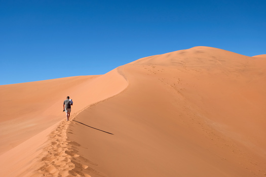
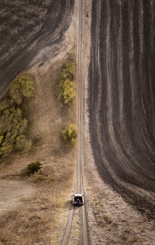
Although adventure photography is a pretty niche part of the photography industry, we want to give it the spotlight in our next episode of Critique the Community. Let's hear what the community says about your pictures.
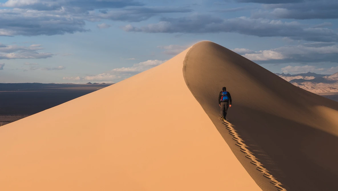
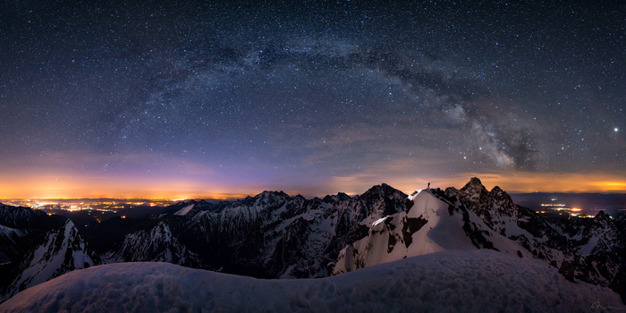
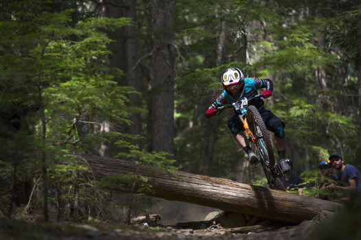
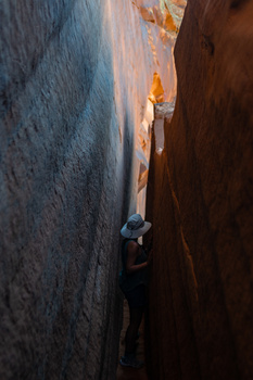
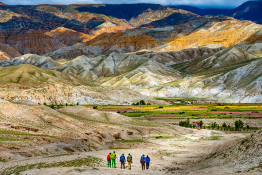
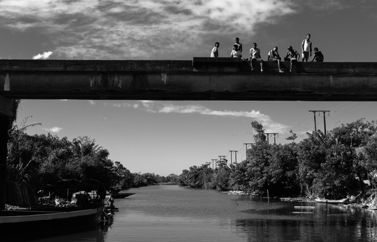
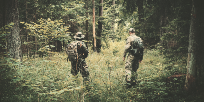
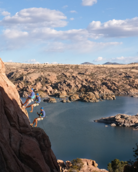
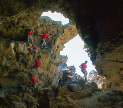
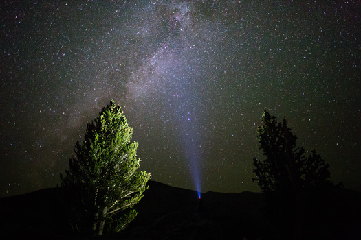
If you're unfamiliar with adventure photography, you're probably not alone. The genre largely includes the more strenuous types of outdoor activities such as rugged hiking, rock climbing, or kayaking; note Michael Destefano's featured image as an example.
Between now and September 14th, you may submit up to three of your best adventure photographs for a chance to be both critiqued by the Fstoppers team and win one of two Fstoppers tutorials. The first tutorial winner will be the community member that submits the highest rated image. The second winner will be selected at random. We will select a total of 20 images to provide feedback to.
After you've submitted your images, take a few minutes to scroll through the rest of the submissions to rate and comment on them. The easiest way to do this is use the number and arrow keys on your keyboard. Please keep any comments you leave encouraging and helpful as we're all growing in the craft together.
Fri, 09/14/2018 - 23:45
This contest has ended.
Click on the thumbnails below to comment and rate each image.
Click here to learn about the Fstoppers rating system and what each star value means.


78 Comments
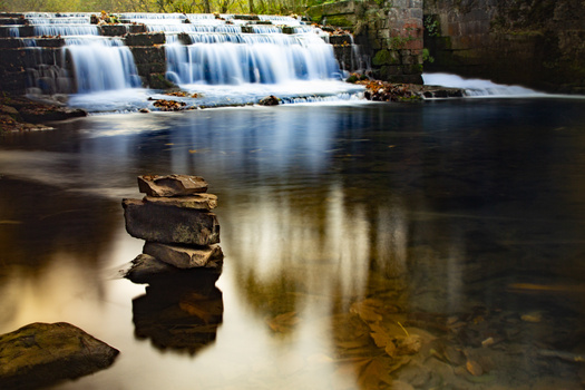
I'm the guy who shot the waterfall image with "the weird post processing" and the girl with the backpack on the rock in front of it.
Thanks Patrick for the comment "I actually don't have much to criqitique besides the color grading. [...] It could be a three, four or five." I appreciate that a lot!
Just to clear things up a little:
I have taken this pictures 3 years ago at a very unknown place in Norway, which is not touristy at all. It's a waterfall called Manafossen. Other than that, I find it it weird though, Patrick, to rate it with 2*, although you don't have much to critique other than the color grading. Color grading is a question of taste and that is okay :)
Nonetheless, I'd like to add that I have taken this picture before this teal look became so popular. Even I don't like that this color grading is overused nowadays. Last but not least, I can tell you that I have sold this image to a big Norwegian company where it has been largely printed as wallpapers in their offices ;) So it is definitely commercially successful as well!
I took another shot there with a different color grading. Maybe, it appeals to you more.
https://www.flickr.com/photos/snapshopped/32671886662/in/photolist-K9mS…
Please let me know your thoughts on that!
Cheers,
Matthias
Might be a mistake, I was able to submit 3 photos :-)
Hey Mattias, yeah that's awesome you have sold it and it has made you some money. I def think it has some commercial viability especially in the tourism field. I'm not sure I like the green tones in the link you posted and honestly I like the contest submission better including the color toning. Maybe if you desaturated the image a bit and dodged some of the shadows you could find a happy middle ground. Color toning is no doubt a subjective thing so some people might like vivid colors while others might like more natural/low key colors.
I thought so,mostly is two images.
It say's three can be submitted for this one. I assume that's because it's more niche, so there will be less submissions than a category like "portraits" or "landscapes"
Ah my eyes skipped that! Cool.