
I often hear people dismissing compositional rules, especially the Rule of Thirds. However, there is an excellent reason why rejecting them can often lead to failure. Therefore, adopting them will make you a better photographer.
Understandably, people balk at the use of the word "rule." They want to reject them because they think photography, like all art, should be free of constraints. Others believe some compositional rules are commonplace and dull. However, there are clear explanations for why they work and why you should accept them.
How We See the World
Our brains are amazing. They interpret a vast amount of data that flood into them from our eyes and other sense organs. That data is converted into electronic and chemical signals that are, in turn, transformed into something we can understand. This process raises a fascinating point; what we see is not reality, just our limited experience of it.
Let's take the color of the sky as an example. We know it as being blue. But that blue doesn't exist anywhere but in our minds. What exists are countless photons vibrating at a wavelength of around 400 nanometres, that's 1/2,500th mm and 666,000,000,000,000 times a second. The blue we see is just our brains' interpretation of that. A tiny shift in the wavelength to 7,000 nanometres, 0.007 or 7/10,000th of a millimeter, and our brains interpret those photons as red. So, red itself doesn't exist outside our minds either. Nevertheless, it is incredible that the accuracy of our eyes and brains can differentiate those minuscule differences in frequency and wavelength.

What we see as blue is just our brains interpretation of the electronic signals sent from our eyes.
Moreover, our minds expect white to be white, no matter the light under which it is viewed. Bright daylight is tinted blue. The auto white-balance setting in our brains makes us perceive daylight as white when it isn't
If colors don't exist, then does anything? Certainly not in the way we comprehend them. Everything we touch, feel, hear, taste, or smell is our brains' interpretation of reality.
Additionally, our brains filter out irrelevant stuff. Walking down a busy high street, we never notice every person passing by. If I were to ask you to describe someone who just walked past two seconds ago, you probably could not do it. Our brains organize the world around us, so we notice the important things: the faces of our loved ones, the car heading our way as we cross the street, and the shiny new camera in the shop window.

There is too much for our brains to take in, so we only see what is relevent.
Therefore, we can conclude that the rules of composition only exist in our heads too. They merely help our brains organize the subjects in a picture. If we present a photo layout in a way that makes the world look familiar, it is easily understandable and becomes more acceptable to our minds.
The Rule of Thirds and Why it Is an Appealing Aesthetic
It is common for novice photographers to deride the rule of thirds. Nevertheless, it works as one of the ways we can make sense of a photograph, and there's a very good reason why.
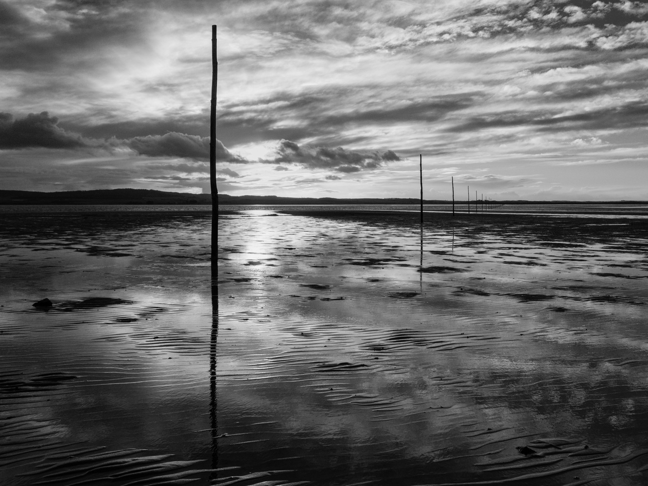
Using landscape photography as an example, the Rule of Thirds works because of how we look at the real world; we see more ground than sky.

Our eyes have a vertical field of view of around 60 degrees up from our line of sight and 75 degrees below. Furthermore, when walking, we mainly focus on a point about 20 feet ahead of us, not on the horizon. Consequently, we see about two-thirds land and one-third sky. That makes sense from an evolutionary perspective, as we are less likely to be predated from above and more likely to trip over something on the ground. It is why advanced motorists must be taught to look at the road far ahead, so they have time to react, whereas our instinct is to look much closer.
The Rule of Thirds doesn't just work vertically. If we hold our right arms out in front of us and point at something, our hand isn't aligned with our noses but about a third of the way in from the edge of our vision. So, placing the subject a third of the way from the side of a photo feels natural to us too.
The rule of thirds feels comfortable to the human eye because its familiarity is easy for the brain to accept.
Should We Break Away from the Rule of Thirds?
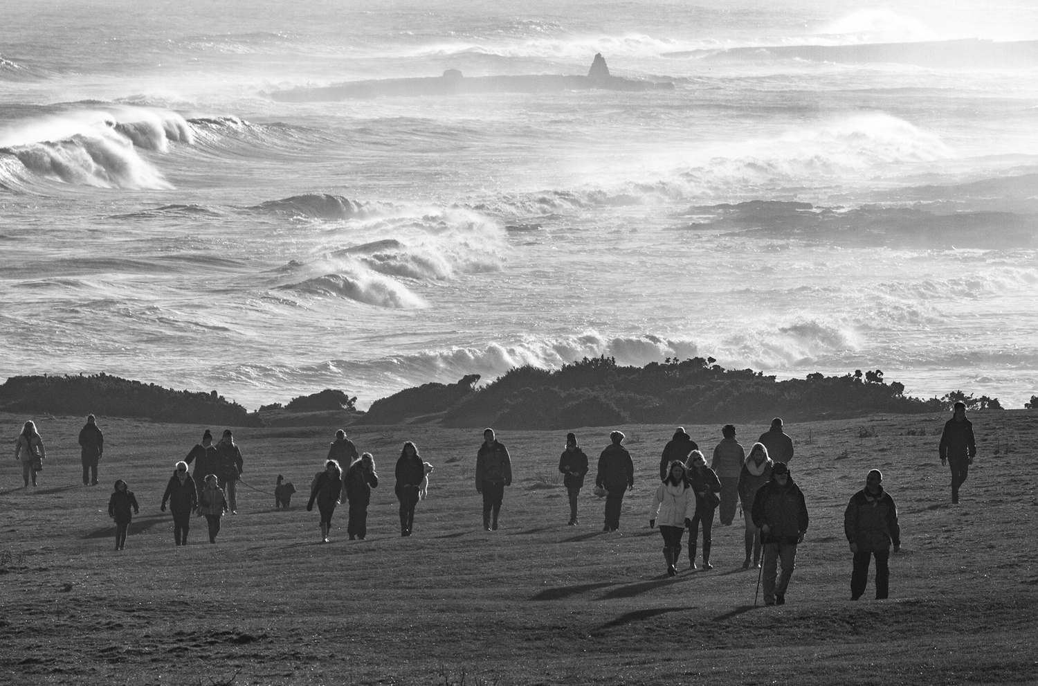
If you climb to the top of a hill or a very tall building, the proportion of sky to land changes dramatically. The sky appears much larger in proportion to the ground. It makes us feel isolated and small compared to our surroundings. The same feelings can be related in our photos by raising the camera and including more sky or space above the subject, thus making the subject small and insignificant at the bottom of the frame. Conversely, if we walk down a street surrounded by tall buildings or visit a place surrounded by mountains, we see little sky. It can feel oppressive and claustrophobic.
The emotions of someone who has their head in the clouds or, the opposite, being down to earth reinforces this idea. Imagine the feelings you experience staring up at the sky and how different it feels looking down at the ground. Most people will imagine their mood being uplifted by looking upwards or disheartened by looking down. Your photos can convey those feelings by changing the camera angle to point up or down.
So clearly, the Rule of Thirds isn't the only approach to composing a photo.

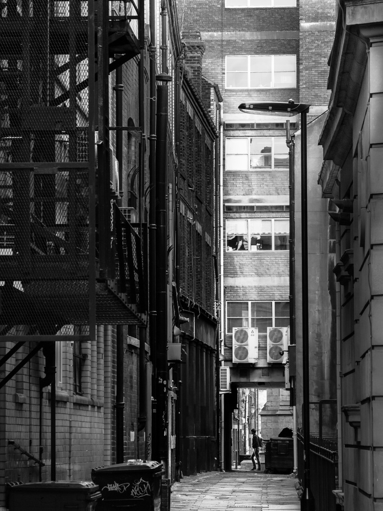
Using Leading and Lead-in Lines
Humans are unique in that if someone else points at something, we can follow the line of their arm and finger to the direction they are pointing. Other animals can't do that. If you point at something wanting your dog to look at it, it will look at your hand instead. However, even the most basic mammals understand paths and where they will lead. Like mice, bats, fish, and ants, we naturally follow lines on the ground that point toward the distance.

Equally, we use lines in photos to draw our eyes into and around the scene. Our clever brains can even create lines that don't exist. We perceive a series of aligned objects as a line and follow those as surely as we do a continuous road disappearing into the distance.
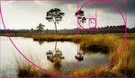
Why the Golden Ratio Works
You probably have seen the Golden Section spiral. Nando Harmsen's excellent recent article illustrated it. Its design is built around the mathematics of the Fibonacci sequence, where each number is the sum of the previous two numbers.
1
1+0 = 1
1+1 = 2
2+1 = 3
3+2 = 5
5+3 = 8
8+5 = 13
And so on.
This sequence appeals to the human mind because it comprises so much of the natural world that is familiar to us. The spiral of a snail shell, the patterns of seed heads in sunflowers, the way tree branches split, the arms of our galaxy, and the shape of the human skull and body are all constructed according to the mathematics behind the sequence.
Those appealing proportions have been used since prehistoric times; Stonehenge, the Great Pyramid of Giza, the Epidauros theatre and the Acropolis of ancient Greece, and Prehispanic Architecture in Southern America are all said to have features that correspond to the golden ratio. We can only speculate whether this was a deliberate design feature or accidental in each case. But even if they didn't necessarily know the mathematics behind it, there are sufficient ancient examples to recognize that their designers found the proportions pleasing.
The same mathematical ratio appears in the ancient poetry of India dating back some 2400 years, plus in some of the music of Bach, Mozart, and Beethoven. Even our DNA corresponds with it.

The Golden Ratio is found everywhere in nature, which is what makes it appealing to our eyes.
Because of its familiarity, it is pleasing to the human brain. Should aliens arrive here from a distant galaxy where the laws of nature are different, they might not find our seashells, flowers, architecture, paintings by great masters, or photos by Cartier-Bresson so agreeable. But we do.
Why Using Established Compositions Is Important
These are just a few examples of compositional techniques that work; they are by no means the only ways we should lay out the subjects in our pictures. However, there are reasons why these and other techniques are appealing, and it all comes down to how our brains make sense of the world.
We can break all the rules and go out of our way to create uncomfortable images using unusual compositions. That is creatively satisfying, but fewer people will appreciate what you have done because they won't necessarily understand why it jars.
Moreover, moving away from established compositional rules can distract you from the message you are trying to convey in the photo. Adopting an unusual layout doesn't help tell the photo's story unless it fits with the narrative.

The photo's subject and the story you are trying to convey are the most critical factors of a photograph. Composition is just a framework we can use to help relate the story we are telling. If employing an uncommon design that isn't as aesthetically pleasing, the viewer may give that more weight than the photo's contents.
However, if you use an accepted framework like the rule of thirds, the viewer won't be aware of it but will notice what you have photographed. Using a compositional technique, like the rule of thirds, might not be exciting, but that's the point; it isn't a distraction.


So often the discussion is around “rules”: how we define them, what they (or we) mean, whether such things should exist. To my mind, the problem, and the more meaningful area of discussion, should be around words and phrases like those used in the very first paragraph: “failure” and “better,” for example. This article, like so many, defines those terms in a very narrow fashion, and then takes those definitions as, first, immutable and, secondly, and perhaps most problematically, as shared. If you’re not talking about cause, effect, and intentionality, then I don’t think you’re talking about art, you’re talking about design. I believe successful art is that which confronts us, and a successful design is that which disappears. I also believe these discussions would bear more fruit if we didn’t conflate the two.
.
I don't use the rule of thirds as a guideline. I just compose the scene in the frame so that it looks good to my eye. Just happens to be that most of the time, what looks good to my eye just happens to more or less follow the rule of thirds.
If my subject is looking to the left, then it looks right to have more space out in front of it - to the left. And if my subject its head turned so that it is looking right, then it looks better to have more space on the right side of the frame. Guess I want to "give the subject somewhere to go".
To my eye, having the frame dissected 50/50 is a distraction. It is just so awkward looking to have the horizon line right in the center of the frame that it calls all attention to itself, and then there is no attention left for the subject. Same for a strong vertical element cutting through the center of the frame from top to bottom, such as a tree trunk. Throw it off to one side or put it way over on the edge of the frame and it isn't a terrible distraction.
I don't want things like the horizon or a tree trunk to be what my photo is all about, and moving these things out away from the center of the frame is the most logical and effective way to keep them from dominating the aesthetic.
.
It always worked for me. Of course it won't work in all cases, but if painters used it as a reference for hundred of years, in photography it is nothing else.
This discussion is boring... Very boring...
Thank you for that well constructed argument and interesting addition to the conversation.
Saying the rule of thirds is boring doesn't change the rule of thirds. Whether you agree with it or not is up to you. Someone developed this concept for a reason. Doesn't mean everyone or anyone has to follow it. YOU are in control of what you do.
Ansel Adams said: “The so-called rules of photographic composition are, in my opinion, invalid, irrelevant, immaterial.”
And I’ll go one step further and say that in my opinion these rules are actually harmful because they get in the way of developing creativity and Vision.
Ansel Adams said: using my name won't give you much of attention with empty photo gallery on fstoppers
I'm with you on this. What someone says about photography doesn't mean anything at all to me unless they can back up their words with a bunch of photos they've created. If someone posts a bunch of images that I think highly of, then what they have to say about photography will mean something to me.
I think the likelihood of a truly great photographer sharing their work with peons is about the same as the likelihood of said truly great photographer getting on a forum and sharing their opinions about composition with peons.
The Rule of Thirds has served me well, but so has the Rule of Motion, the Rule of Symmetry, the Rule of Odds, etc. There's some photos that don't work with the RoT.
The one that I adhere to much more than the Thirds is the Rule of Motion. Almost 100% of the time, when I get a shot that implies direction, I put more space in way the direction is implied. I'm sure you guys do as well, but I've judged several competitions and find shots entered that miss this rule.
Interesting article. A nice addition to the one I wrote.
Looking at the comments, it's amazing how some hate this just because of the word rule. Why not use it to your advantage instead of avoiding it as much as possible? Perhaps these people have made their own rule in the proces: "The rule of avoiding composition guidelines."
Just a little problem with wavelengths and unit conversions...
A wavelength of 7,000 nm (0.007 or 7/1,000 mm) is well into the invisible infrared spectrum. I believe the intention was to say that 700 nm (0.0007 or 7/10,000 mm) is at the red end of the visible spectrum.
Very nice discussion. I appreciate your efforts in spite of some of the predictable naysayers in the comments. Someone saying a compositional rule inhibits photographic creativity is like saying the Major scale inhibits creating music...
One area I will disagree with you on. Dogs definitely look where you point and not at your hand. There are species higher up in intelligence than dogs for sure, but dogs have learned through thousands of years of interaction with humans, to communicate with us, and hand signals including pointing have become innate.
Thanks again for your insightful and helpful piece!
Breeding matters. Sporting dogs will look where you point. Pugs, for instance, won't. They will look at your hand.
Thanks for joining the discussion and for the great comments.
I have an experiment for you.
When your dog is put of a room, stand still and point at a wall. Call the dog and see if it follows the point direction.
Next, stand opposite a dog and look at it as you slowly raise your hand and point to your right. Your dog may look at your hand.
If you turn and face the direction you are pointing in, then it will possibly look that way, as all animals will do if part of a hunting pack, or a herd of prey animals looking toward a threat. If you throw your hand forward then to point, if it is trained to fetch, it will follow the line of movement. Especially if accompanied by a verbal command.
I have yet to meet a dog that will respond to a signpost or an unmoving, pointed hand.
Interestingly, and uniquely, some elephants will respond to a pointed finger.
I would consider "pointing" as including the movement. A human, walking into a room and seeing a person's hand (and, presumably, index finger) outstretched will presume an action of the past, that the person had made the pointing movement. A dog can't presume that past action, it only sees what it sees, which is the already outstretched hand.
My point about breeding is that my Laborador will, indeed, follow my hand movement outward to what I might be pointing toward. A pug won't do even that. It will look at my hand.
The problem is the world "rules," which some people have taught themselves to oppose automatically wherever that word exists, like vampires running from sunlight.
Our eyes and brains work together in certain ways. The basis (as noted by the article) is rooted in human development from thousands of years ago. Artists discovered hundreds of years ago how to capture and direct human attention through composition in visual art. These are really composition "hacks."
Those old artists taught and wrote down those "hacks," and recent scientists doing eye-motion studies have verified those composition hacks. The hacks work.
Of course, as true with any hack...use it you want to. Or don't.
Regarding the first sentence of your comment, I wholeheartedly agree. If someone automatically has a problem with anything that's called a "rule", they ought to be smacked upside their head until some common sense gets beat into them. Life is run by rules. The world and the universe run according to rules. If people don't accept rules in photography or in anything else, they're being ridiculous and making their life so much harder than it needs to be. Rules guide us and help us be more creative. Yes, rules open up avenues of creativity that would never be possible without them.
The Rule of thirds is just a tool, it works for some images but not all. While teaching photo for about 20 years, I taught my students about the "Rule of Thirds"regularly, but not as an unbreakable law. I often referred to it as the "Really Really Really Really Good Idea of Thirds. Additionally, I found it most helpful when people are just learning composition as it encourages them to put subjects in places other than the center. As a place to start, it makes great sense. After we mature, we figure out own style and preferences in composition.