
The rule of thirds is the first thing that is taught about composition in photography. It seems to have some similarities with the golden ratio, but in reality, it’s something completely different. Let’s have a closer look at the history of these so-called rules to get a better understanding.
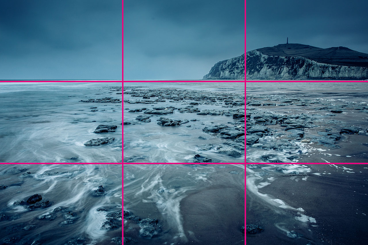
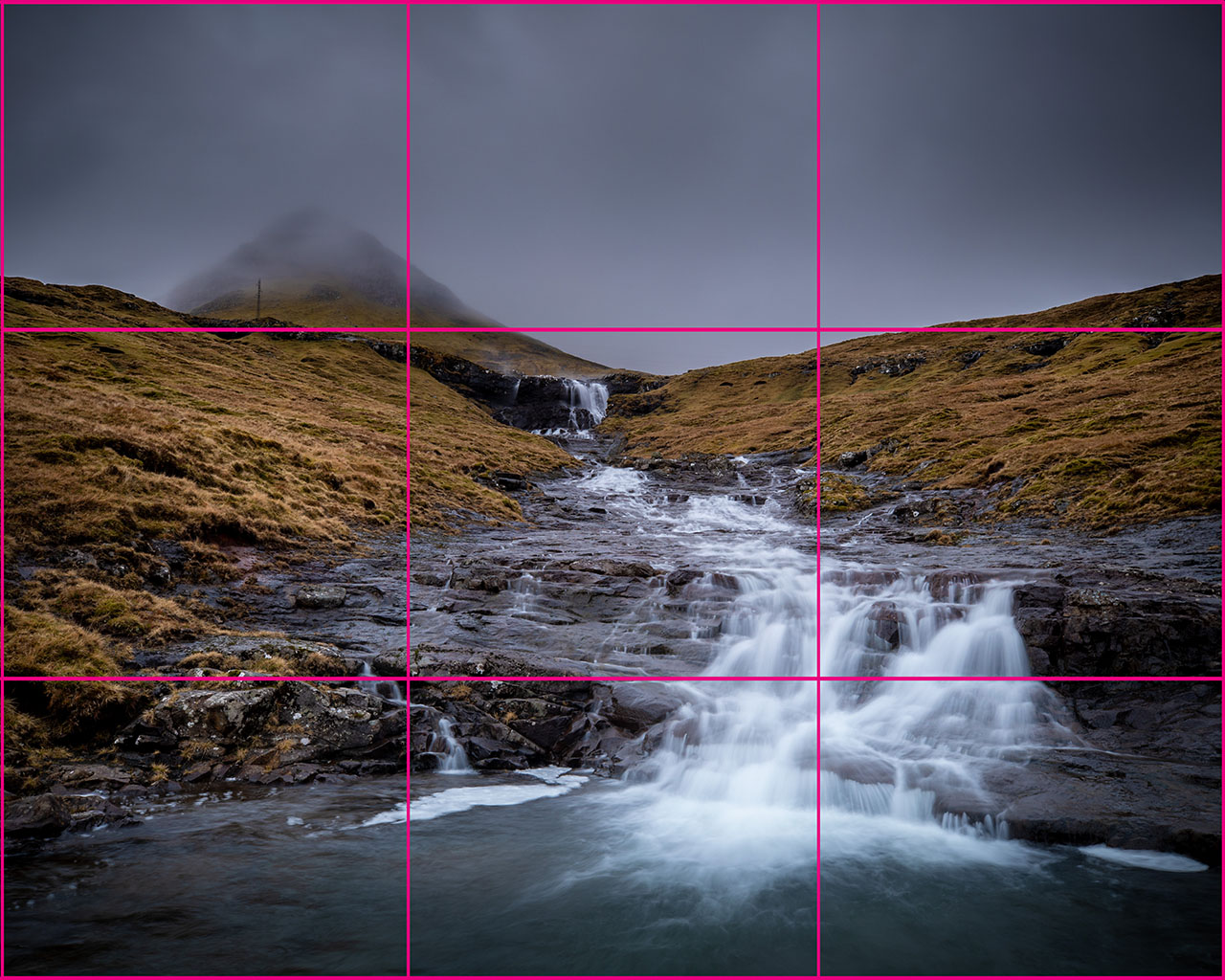
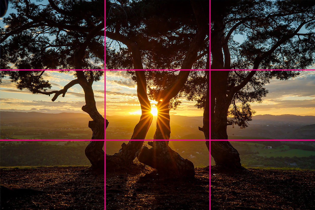
The rule of thirds is quite a simple rule. Divide the image in nine equal parts, by drawing two horizontal and two vertical lines at thirds from the edges. Place your subject on one of the lines or at the intersection of the lines, and you’re done. Sort of.
Although this can help to achieve an acceptable composition in some situations, the rule of thirds was never intended that way. In fact, the origin has absolutely nothing to do with drawing lines at thirds of the image. At first look, the similarity with the golden ratio does make it seem the two are related. Nothing is further from the truth. Let me explain why by diving into history.
The Golden Ratio, Fibonacci, and Archimedes
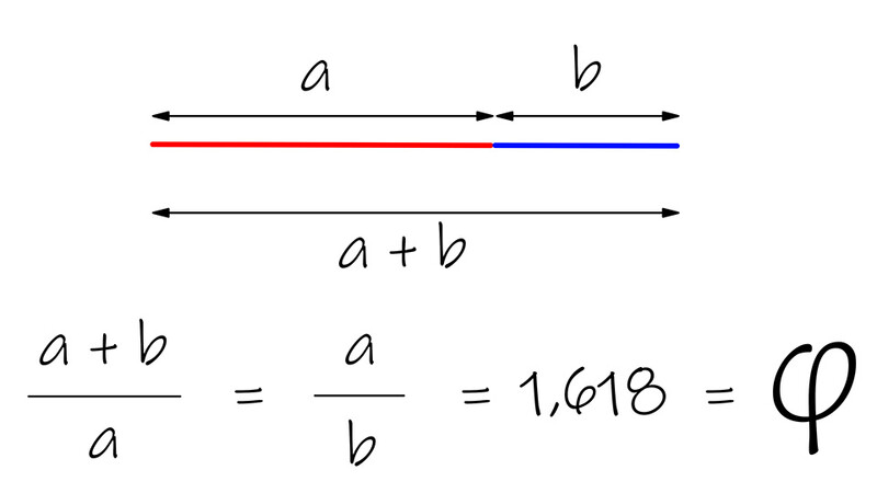
The golden ratio is an invention of mathematicians. It had nothing to do with composition in paintings. A Greek called Euclid, who lived somewhere around 400 BC, found out that the division of a line according to a certain ratio can go on indefinitely. This ratio is an irrational number, which means it cannot be written down as a natural fraction.
This irrational number is the golden ratio. The number is 1.618 followed by an infinite amount of digits, and the Greek letter for it is Phi.
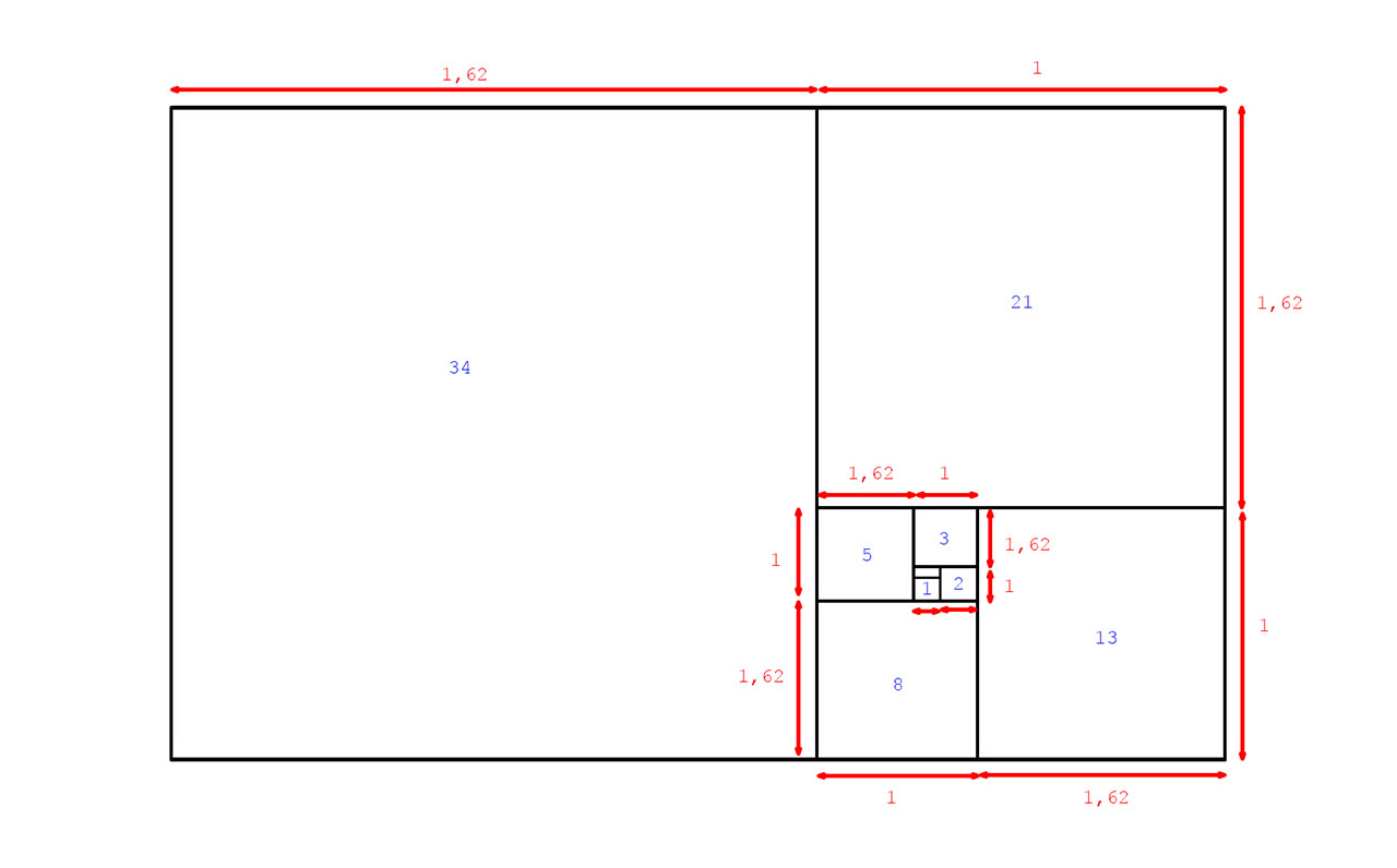
It took 16 centuries before Leonardo of Pisa came up with a sequence of numbers that was pretty special. Every number was the sum of the previous two, and the sequence was infinite. This sequence of numbers was named after his nickname: the Fibonacci sequence.
Astronomer Johannes Kepler finally discovered the link between the golden ratio and the Fibonacci sequence. He found out how the division between a Fibonacci number by the previous number in the sequence would approach the golden ratio with increasing accuracy.
Luca Pacioli and the Golden Ratio for Composition
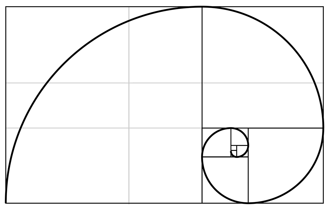
We seem to find a lot of examples in nature where the golden ratio and Fibonacci spiral are present. Of course, we have a habit of looking at those similarities and ignoring everything that doesn’t have the similarity. Nevertheless, the golden ratio is something that often appears in things growing in nature, like the distribution of leaves on a stem or the seeds in a sunflower.
Perhaps it was because of this that an Italian monk named Luca Pacioli came up with a common rule for composition. Somewhere between the 15th and 16th century, he claimed how a painting would become most realistic when the composition was made by mathematical rules. The golden ratio was chosen for this.
(public domain, Creative Commons)
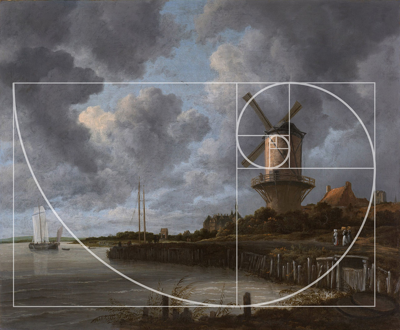
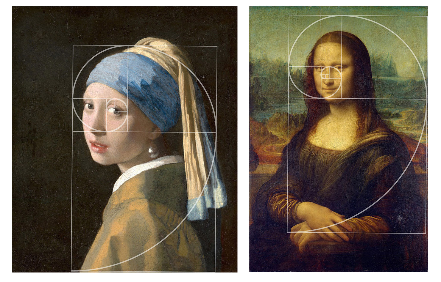
Today, we try to see the golden ratio in everything that has been built, drawn, or painted. We search for the golden ratio in buildings like the Parthenon, Pyramids, and even modern buildings. We draw the Fibonacci spiral over well-known paintings like the Mona Lisa by Leonardo da Vinci or the Girl with a Pearl Earring by Johannes Vermeer.
The Rule of Thirds
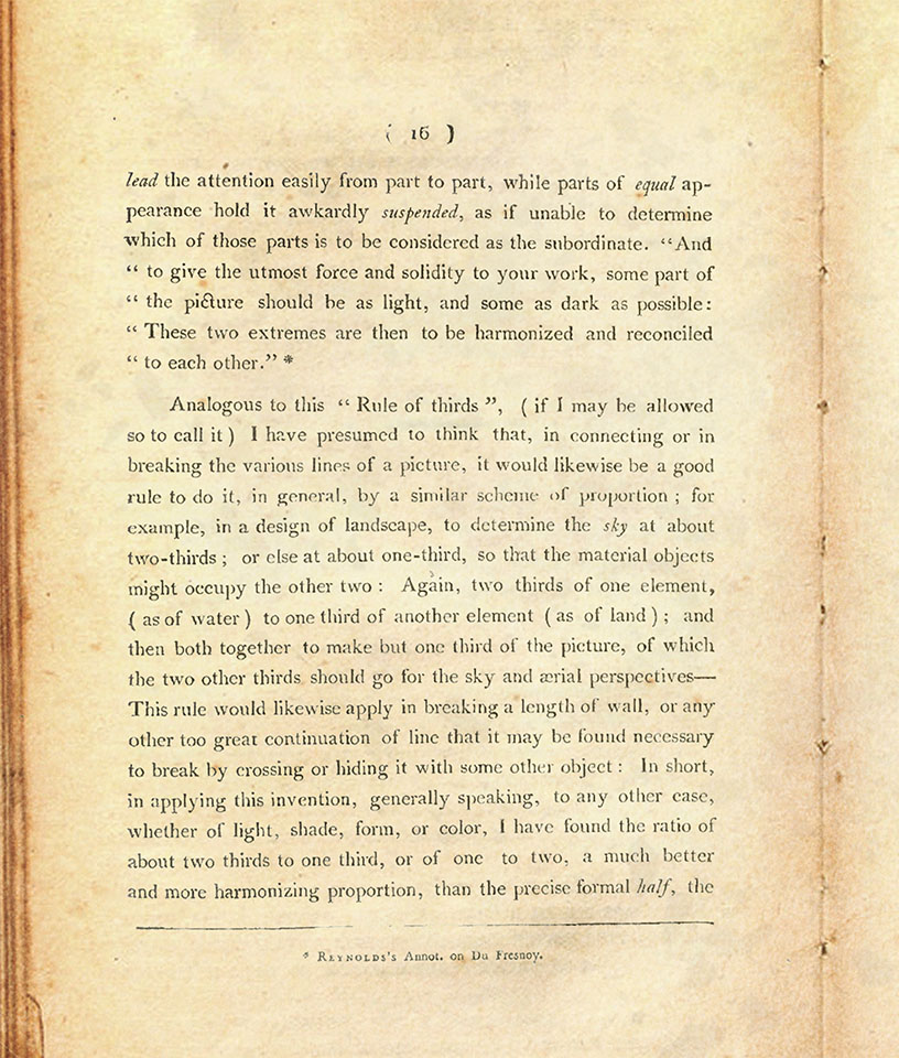
For the origin of the rule of thirds, we have to travel in time towards 1797. At that time, a certain Sir Joshua Reynolds taught at the Royal Academy of Arts in London, mentioning in his discourses how a painting works best when the use of light and dark has a ratio of approximately 1/3:2/3.
There was never any mentioning of a rule of thirds, until an English painter called John Thomas Smith came up with the rule after reading the discourses of Sir Joshua Reynolds. He took the 1/3:2/3 division even further and said it should be used for everything in a composition.
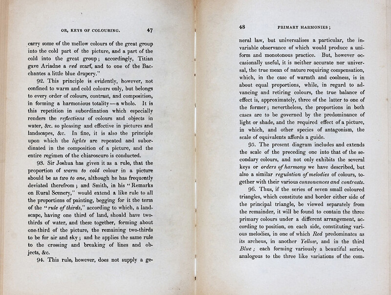
There were a lot of people who don’t like the rule of thirds, even back then. A certain George Fields wrote about the downsides of the rule of thirds in 1845, saying how the use of the rule would produce boring and monotonous images.
Today, the rule of thirds has been reduced to a bunch of lines in a photo. You should place the subject on one of the lines or at the intersections of those lines. This would give the image a lot of suspense and energy. Not everyone agrees, for obvious reasons. The original idea behind the rule of thirds, the way how light and dark in an image should be distributed, is lost and forgotten.
Using the Rule of Thirds or the Golden Ratio
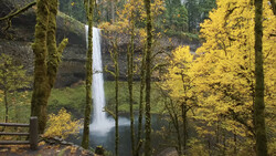
Back to modern times again. Most photographers have learned to use the rule of thirds. I believe it does work on some occasions. But perhaps it’s wiser to use the lines for the distribution of the subject in the frame. It doesn’t have to be on the thirds at all, especially if you end up with the other two thirds being almost empty. Balance and visual flow in an image are much more important.
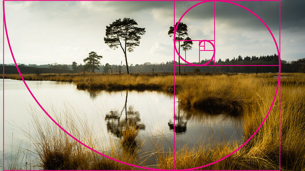
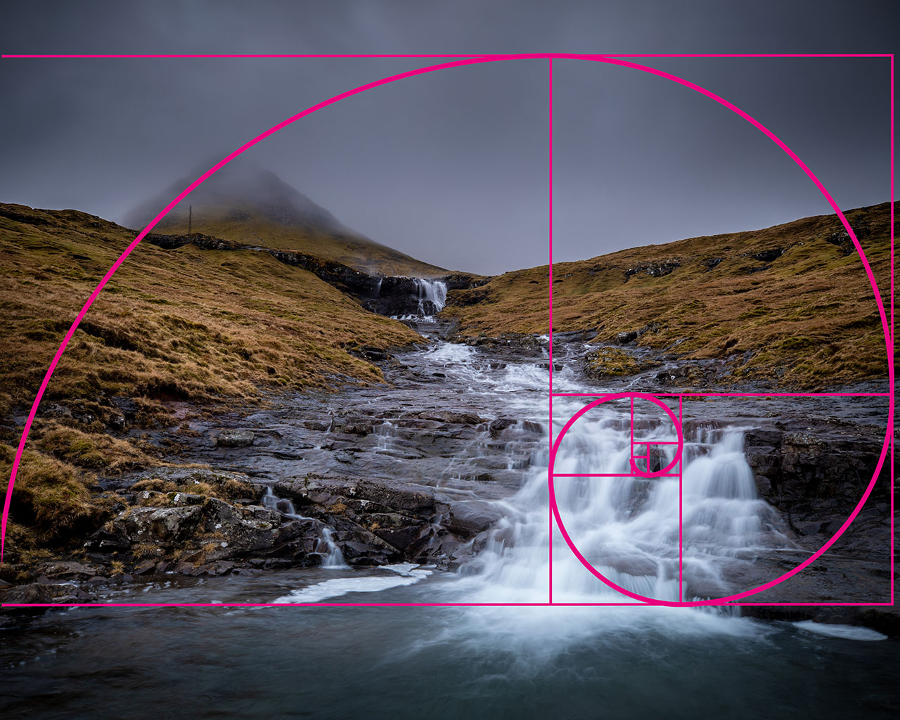
Using something like the golden ratio works much better for a lot of occasions, I think. The Fibonacci spiral can help find a visual flow through the image. There is one problem, though. Because we often visualize these rules by using the crop tool in software like Lightroom and Photoshop, we look at the lines without realizing the composition doesn’t follow the golden ratio at all.
Those crop tools project the rules inside the aspect ratio of the image itself. This can be 3:2, 4:3, or 5:4, to name a few. But this way, you’re not looking at the lines of a golden ratio anymore, because that has an aspect ratio 1.618:1. So, you may think you’re using it, but you're not. On the other hand, the rule of thirds is independent of the aspect ratio of an image.
Find Balance
It’s nice to have all these rules, and I find it important to know about its origin to understand why you should use it or not. It also illustrates that using these rules to the letter is often not very artistic. You might end up being more of a mathematician instead of a photographer.
I think it’s much wiser to find balance in a photo. Avoid distractions and use lines and curves to connect the elements in your composition. You might be surprised how often it will turn out to have a golden ratio after all or even a rule of thirds.
There are many other ways of achieving a composition. You can use the rule of odds, negative space, or the gestalt principle. How do you build the composition for your photos? Do you use the rule of thirds, golden ratio, or another rule? Please share your preferred way in the comments below.


Join the Fstoppers community for free
-
Post comments and join in the discussions
-
Browse the site ad-free
-
Share your work and get featured in the community
-
Compete in the photo contests for fun and prizes
23 Comments
I'm curious… when the Fibonacci Spiral is superimposed on an image in this article, it appears to be cropped in order to make the point of its use.
Shouldn't the negative space in the image be included? Isn't negative space a compositional element that should be included in any "rule of composition" that is imposed on it? Or am I missing something important?
Yep. Exactly what I was going to say. You can superimpose any aspect ratio over any photo in some cropped form. It doesn't mean that is how it was composed or that the ratio makes any sense in the scheme of the entire composition.
The golden section can be applied to parts of the image, and not just the entire scene. Many things in nature correspond with the proportions, such as the human form. You can also sometimes consider negative space as a frame around the subject(s).
@Jan Steinman I think the spiral is being imposed over the subject specifically. Negative space is hard to mathematically quantify as there are few defining areas the spiral could be applied to unless the negative space exists within the first sequence. I think the point is that images and subjects on which the spiral can be applied are more visually appealing. Negative space is most certainly an optional element and would not be able to be applied as an over encompassing or general rule.
What a load of old tosh!
All these so-called 'rules of composition' are nonsense.
You could start with the most poorly composed photograph you've ever seen, draw a load of lines; thirds, golden ratio, diagonals, you name it and eventually, something will fit or align with something and Voila! You've got a masterpiece!
I have to disagree with you. The great painter, Caravaggio, was another master of using it for the placement of the subjects within the frame. Other good places to start learning about it is by looking at da Vinci's "The Last Supper" or JMW Turner's "Calais Pier".
Thanks but the same thing goes for the so-called old masters as to everyday photography.
You can paste as many lines or graphics onto them as you like and you might convince yourself and perhaps a few others, that these pointless squiggles have some merit but what I posted above still applies.
Those artists used the golden section as a technique in their paintings, just as Cartier-Bresson did in his photography. They are not applied as an afterthought, which I think you are suggesting
There are psychological reasons why those mathematical proportions appeal to the human mind, and why those same proportions appear in the art and architecture of different cultures around the world. But, if the basics of design don't appeal to you, then that's fine. Art has always been about challenging that which is accepted.
Constraints imposed by amateurs!!
And yet Henri Cartier-Bresson spent his entire adult life studying the golden ratio and composing his photos in camera to cohere with the proportions and the flow of subjects within the frame.
You are reaching a long way for a relationship that probably is a coincidence.
Unfortunately the cropping tool will adjust to the aspect ratio of the frame. It won't keep the 1:1.618 ratio intact
Depends on the software, no?
Doesn't most image editors allow you to specify "same ratio" when cropping? Affinity Photo 2 does.
Every software can specify an aspect ratio of choice, but the point is when you don't use the 1,618:1 aspect ratio but a 5:4, or a 4:3, or a 3:2, or a 16:9 or whatever. In that case the overlay will be according to that aspect ratio, and not the one that follows the golden ratio.
But perhaps there is software that will keep the correct golden ratio, no matter what aspect ratio is chosen, although I would doubt that.
In Affinity Photo 2, I can select the Crop tool, then pull down "Custom Ratio," and enter "1" and "1.618", and the crop box is then constrained to that ratio, no matter how I drag it about.
Is this what you mean?
Ooooh, better yet: if you click on the "gear" icon next to the ratio menu, it has a large set of crop ratios you can select, including (ta da!) "Golden Ratio!"
That's in every software I know of possible. It's not only Affinity
But perhaps I previously misunderstand what you meant. I always use a 5:4 or 3:2 crop for my images and it that case the ratio is wrong. But it is possible to use that golden ratio crop box temporary, and afterwards changing it into the final crop.
Funny, never thought of that.
:)
Interestingly, the earliest examples of use of the Fibonacci sequence was in ancient Indian poetry, c. 450 bc.
I didn't know that. Thanks
It's a really interesting article. Thank you.
Rule of thirds is the best way for boring and uninspiring photos
That's exactly what George Fields said in his book Chromatics: Or the Analogy, Harmony, and Philosophy of Colours. But he also said it was occasionally useful.
I think it's tremendously useful for putting the main subject *anywhere* but in the centre! It gets you thinking outside the box.
If you think of the Rule of Thirds, then at least you're looking around the frame more, and are more likely to stumble on the Fibonacci Spiral or some other composition more interesting than either "centred subject" or Rule of Thirds.
I think boring and uninspiring photos is not the fault of a rule of thirds. The fault is often with the photographer that is using it blindly, without any thought or understanding. Or by using the rules of thirds when it not fits the subject at all.