
We are quite familiar to the rule of thirds, the golden ratio, and perhaps the Fibonacci spiral. We know how to use it in photography, more or less, and we all have heard about breaking these composition rules. But perhaps you should use composition theory instead.
"Break with the rules of composition." We have all have heard this statement. And we also have heard how we first must learn the rules before breaking them. But what are these rules? Let’s have a closer look before we dive into composition theory.
Well Known Composition Rules
Perhaps the rule of thirds the one of the best known rules. It is the one where the image is divided by three in both horizontal and vertical direction. It provides us with lines at 1/3 and 2/3 of the image, and four points of interest where the lines cross each other.
The golden ratio looks a bit like the rule of thirds. The image is also divided in three parts, in both horizontal and vertical direction. The location of the lines is different from the rule of thirds, now based on a mathematical approach. The Fibonacci spiral is also a nice composition rule, based on the golden ratio. It is a spiral form that can also be found in nature.
There are more composition rules. But it is a pity how a lot of photographers seem to think the rule of thirds is the only important one. It's understandable, the rule of thirds is quite simple to use. Perhaps it is too simple for some. That is why a some photographers keep on preaching how this rule has to be ignored or even broken for a successful composition.
Composition Theory Instead of Composition Rules
As everyone knows, composition is something that has been around for quite some time now. Before photography was invented, famous painters used composition techniques and rules for their paintings and masterworks. Although, that is what I thought. Composition rules are old, but not that old. The first time composition rules were used in art was in the late nineteenth century. Before that it was just a mathematical way of describing nature, of an attempt to do so.
Instead of composition rules, it may be more interesting to look at composition theory. This is the theory to describe how elements in a work of art or a photo can be arranged and distributed across the frame. After all, composition is nothing more then to create order in a chaotic system. In other words, we photographers must find a way to show all elements in our photos in an orderly manner. For that there are nine basic composition shapes that allow us to bring order into chaos. This is composition theory.
1. Symmetric Composition
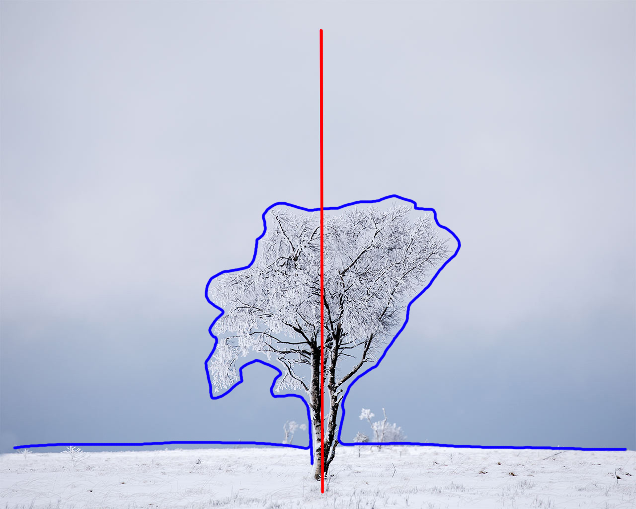
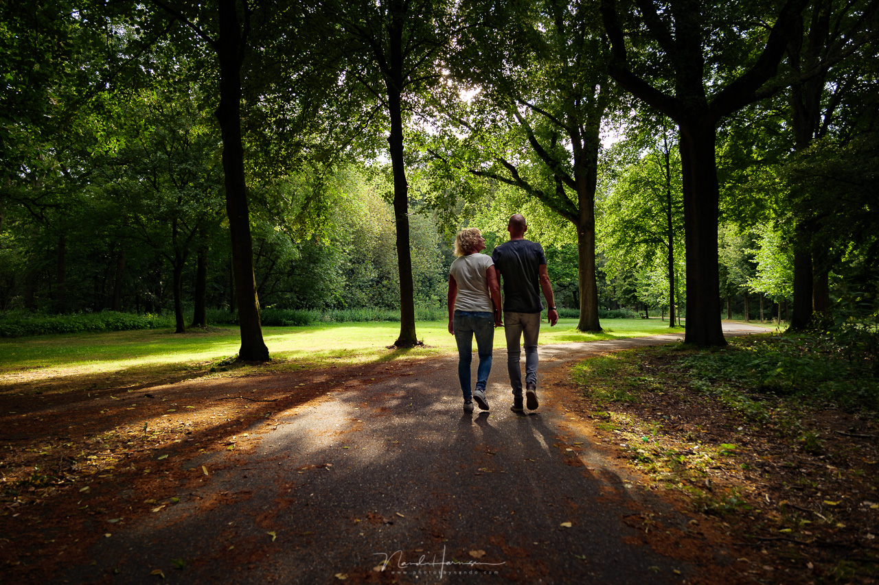
When the elements in an image are distributed in a symmetric order. There is a vertical axis divides the image, and will get all the attention. For a symmetric composition the subject of the image have to be placed on this axis.
This can be the tree like in the example, but next to the tree a lot of other elements can be placed, as long as it is a symmetric distribution. You could say, this is a central composition, although you have to remind yourself that not all symmetric compositions will be central. After all, the dividing axis can also be place off center.
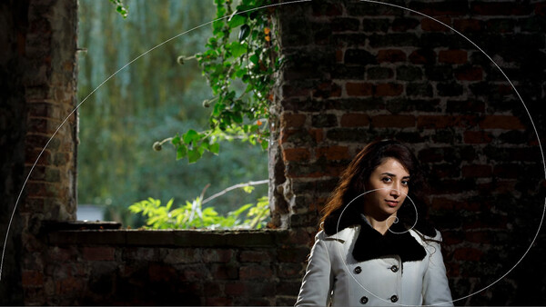
2. Central Composition
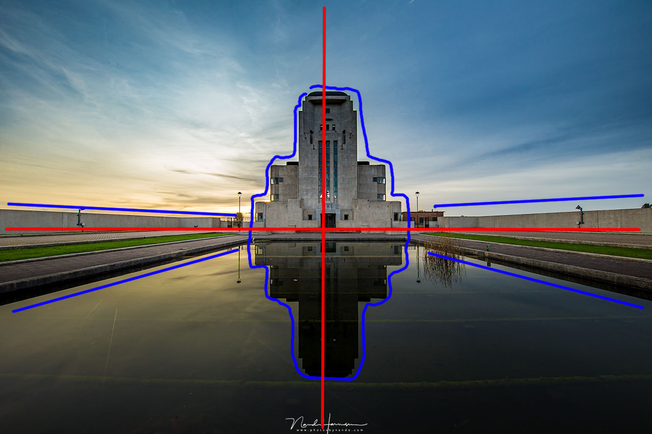
When the subject is placed in the middle, we can have a central composition. There are two axis in the image, dividing it in an equal distribution. The point of attention will be at the crossing of these two axis. To make the composition as strong as possible, all elements in the image will guide the attention to the middle where the axis cross each other. The example shows how this can work in an image.
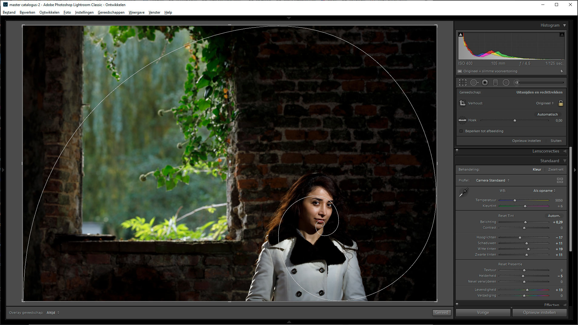
3. Asymmetric Composition
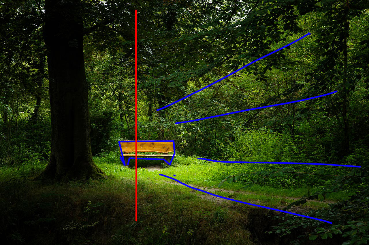
When the vertical axis is placed off center, we will have a asymmetric composition. The subject will be placed on this axis, which is the point of interest. In a lot of occasions the axis will be placed by a logical ratio, which is the golden ratio. Elements in the image will guide the eye towards the subject on the axis. In the example the path and the light will guide you towards the bench.
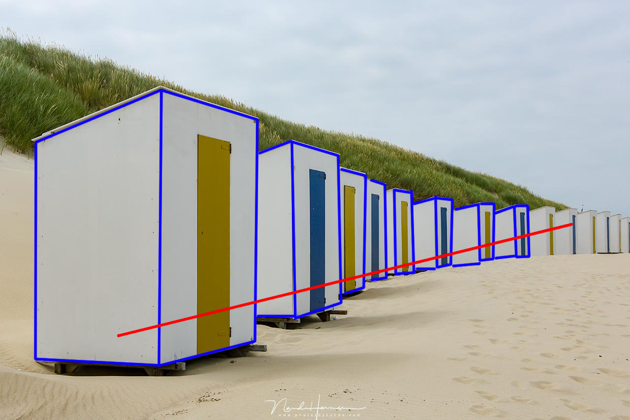
4. L Composition
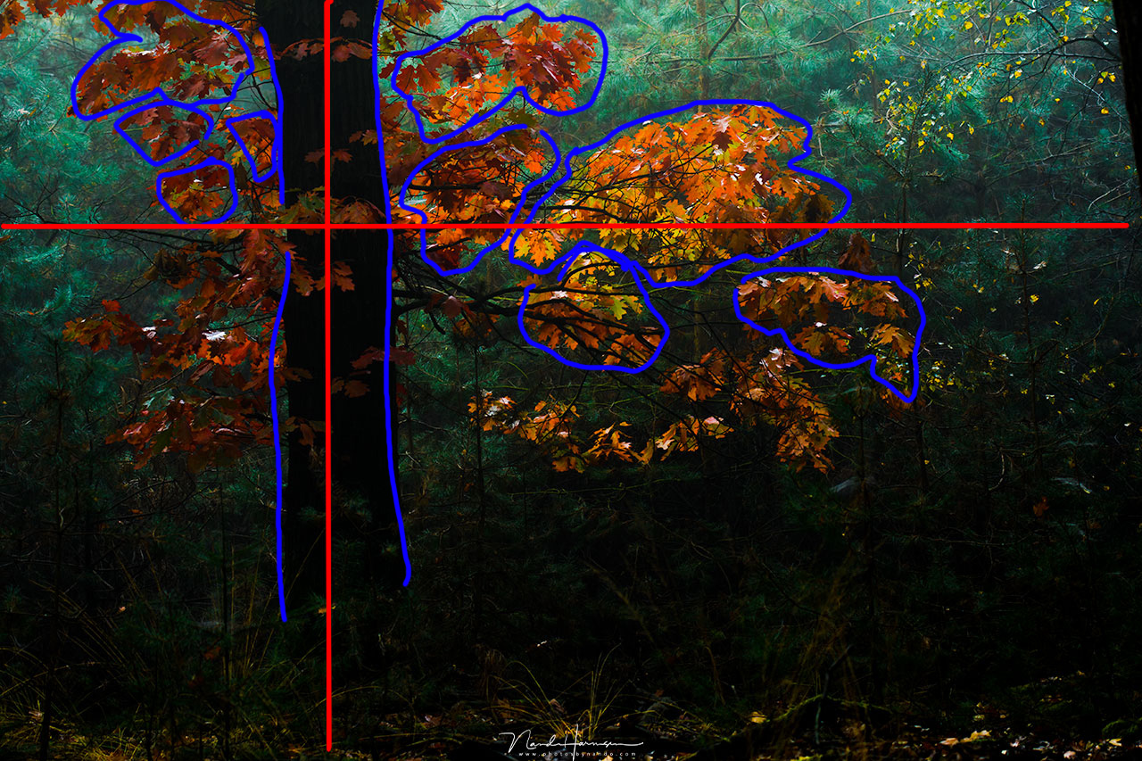
When a horizontal and vertical image axis are placed off center, we can recognize a L shape. This is the L composition. Elements in the image are located on these two axis. The axis will be placed in a logical ratio, and as you may have guessed this will often be the golden ratio. For modern times this ratio can also be at the rule of thirds, like in the example. The tree is located in the vertical orientation, and the leaves that are lit by the sunlight on the horizontal axis.
5. Geometric Composition
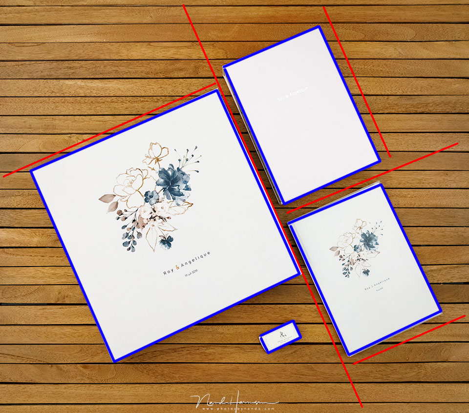
When there are no important image axis, there won’t be a clear point of interest. These axis can coincide with elements in the image, giving it a geometric character. The geometric composition is an area distribution without a clear point of interest. It was hard to find an example, but the way I present my wedding albums can be called a geometric composition.
6. Diagonal Composition
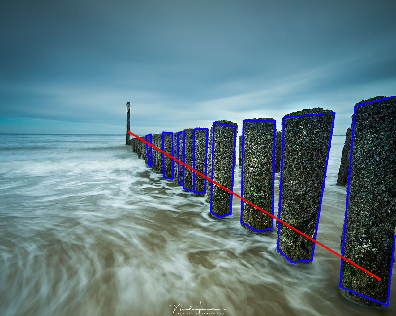
By ordering the elements in a diagonal axis across the image, we have a diagonal composition. Often these lines introduces a feeling of movement, which makes this composition very dynamic. The line will guide the eye through the image.
We distinguish a rising line, and a falling line. This distinction depends on the direction we look and read. For those who look and read from left to right, a rising line will start at the left bottom, and end at the right top. This may be a falling line for the people who look and read from right to left.
7. Triangle Composition
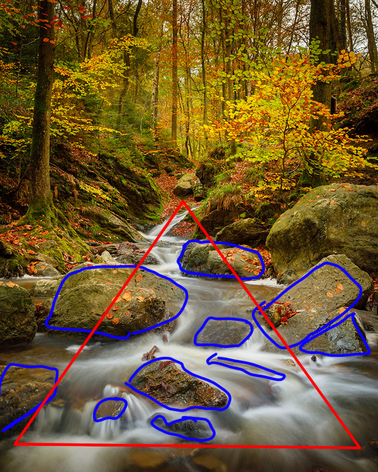
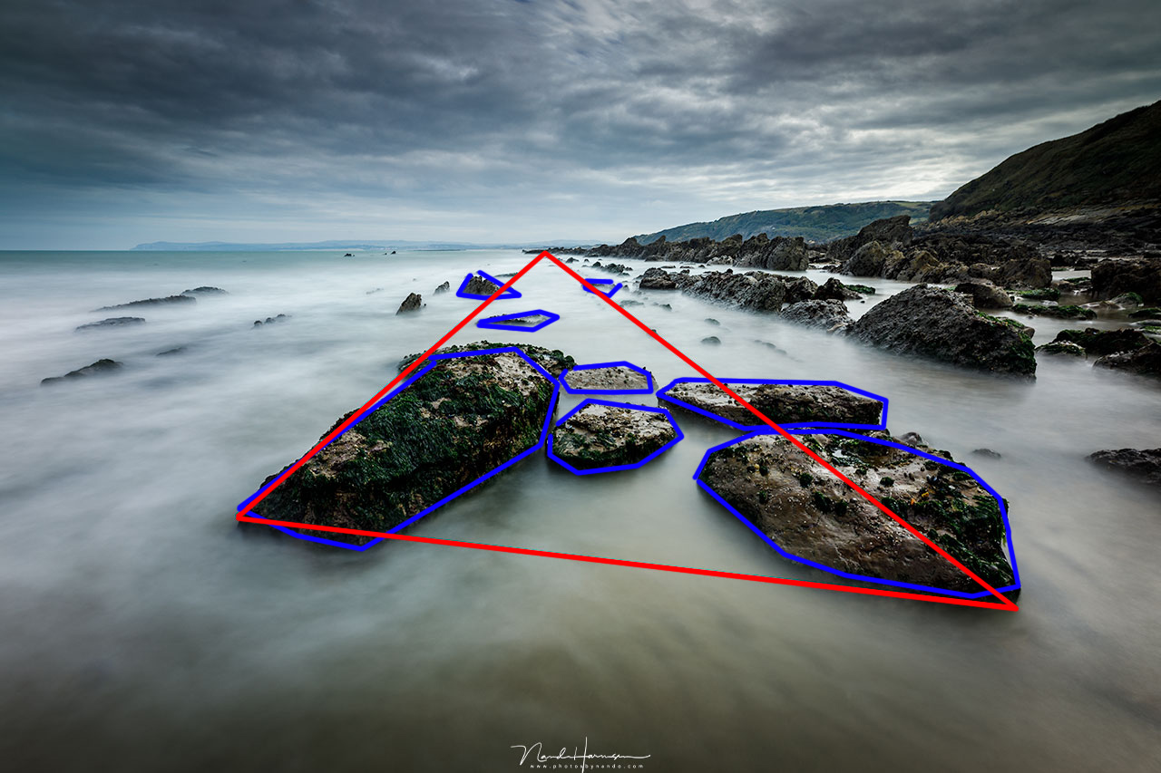
Elements in an image can also be arranged in a triangle around a vertical image axis. This is called the triangle composition. It is also possible to place the triangle upside down.
There is a stable form and a dynamic form. With the stable triangle composition there is symmetric arrangement of elements. This is also be called the pyramid composition. The dynamic triangle composition has a asymmetric arrangement of elements, while the attention stays at the image axis. This will give a sense of movement, making it more dynamic.
8. Movement Composition
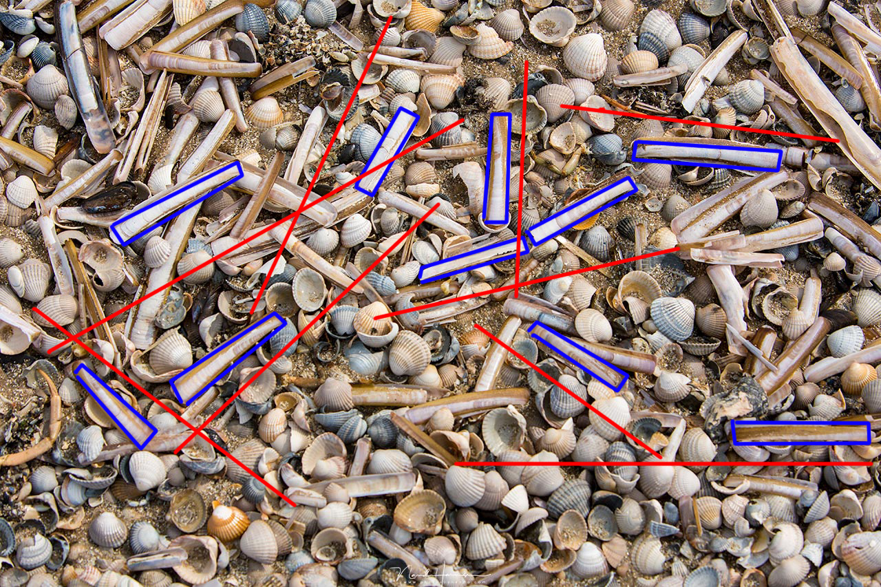
When lines and elements in the image are arranged in a more chaotic order, it will give an illusion of movement. But without any real movement in the image. The eye keeps on wondering through the image, and is not guided to one special location.
9. Field Composition (All-Over Composition)
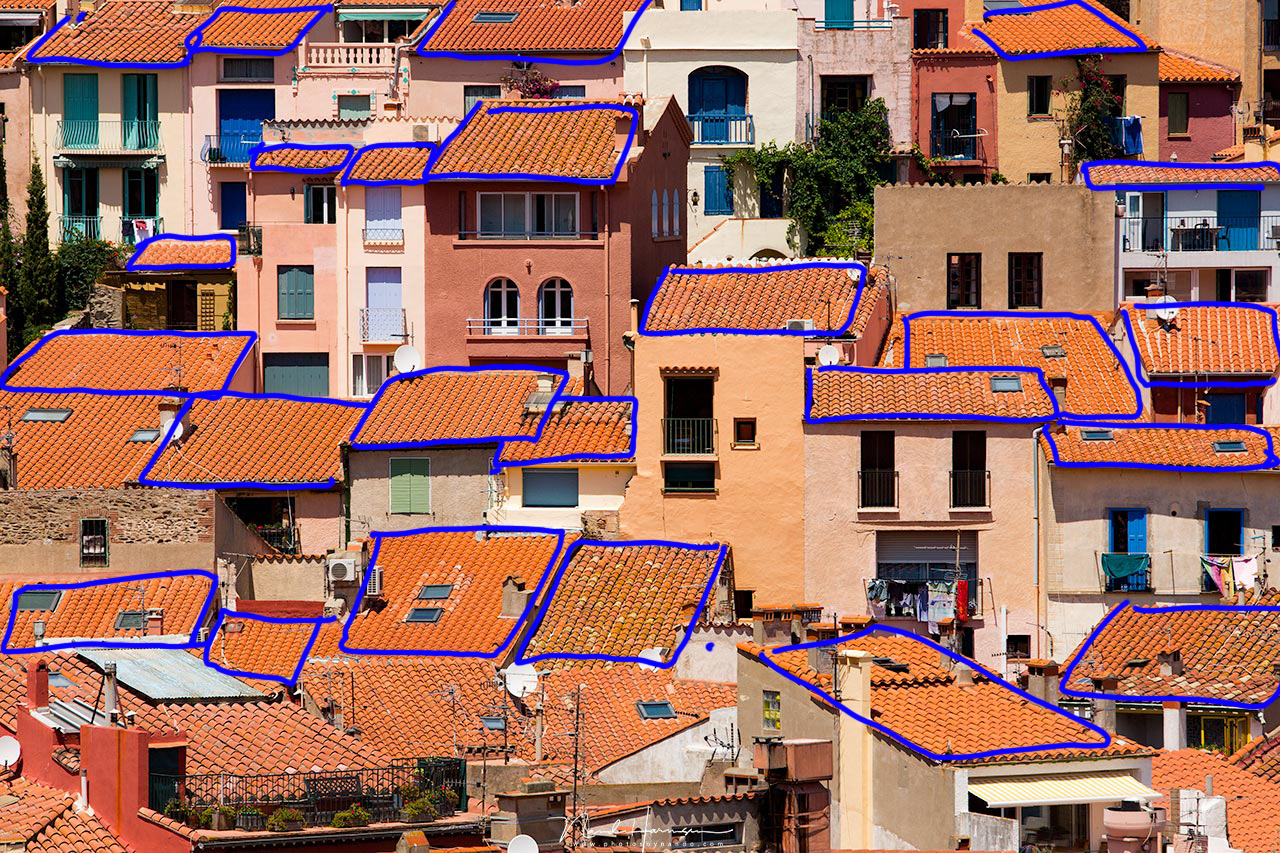
With field composition the elements are arranged in a random order. It gives the illusion of something infinite. The elements seems to continue beyond the border of the image. This is also called an all-over composition and it has no real point of interest.
How to Use These Nine Basic Composition Shapes
If you look carefully to these nine basic composition shapes, you see it is all about arranging the elements in a photo. Which composition works best depends on the subject you want to photograph. Often the subject will ask for one of these rules. But you could also try to ignore the obvious composition shape, and choose a different one.
I think it is important to disconnect your emotions. Whenever we take a photo, we are emotionally engaged. We find the landscape amazing, the sunset breathtaking. The model you are photographing may be awesome and the light magical. These emotions can blind us and make us forget about a good composition, or arrangement of elements in the image. If you can disconnect these emotions, you will be able to look at image in a more objective way.
I hope you can benefit from these nine basic composition shapes. It may help you to see beyond the obvious rule of thirds, or other rule you may like to use. Please tell me your opinion on the subject of composition, and how you use your favorite composition rule. I love to read about it in the comment and I think it might be very educational.
If you're passionate about taking your photography to the next level but aren't sure where to dive in, check out the Well-Rounded Photographer tutorial where you can learn eight different genres of photography in one place. If you purchase it now, or any of our other tutorials, you can save a 15% by using "ARTICLE" at checkout.


Join the Fstoppers community for free
-
Post comments and join in the discussions
-
Browse the site ad-free
-
Share your work and get featured in the community
-
Compete in the photo contests for fun and prizes
17 Comments
Great article! I really appreciate the breakdown for each one with sample images.
Thank you, Daniel
Yes, a good reminder!
Thanks.
Excellent stuff, one of the best articles I've seen on composition.
So here's an obscure one for you, since you like Fibonacci. If I recall correctly, it's called 'One over T'; 1/T or somesuch. It refers to the pacing of a sequence in movies, music and other art. Watch a movie trailer for example, and you'll notice the cuts are long, shorter..short..very short. Similar in music and in photography, it might be the spacing of elements.
Maybe a bit like Fibowassit in reverse. Anyway, it's a pig of a thing to search for on the net. If anybody has a good reference, I'd love to see it.
Thanks for the compliment.
And thank you for the obscure one. I am going to look into it. Sounds interesting. I am always looking to learn more about this. 'One of T'
I love thinking about composition theory and getting away from the "rules" because I always found the rules to be quite limiting and sometimes not right for a particular scene. I tend to use symmetrical composition that most. I am drawn to things placed in the center with or without guiding lines. I have also noticed in my own work that triangle show up more often than not. It is not something that I have ever conciously thought about doing, but it seems that my eye and brain like the visual appeal of triangles and symmetry. Great article!
Thanks, Heather :)
Thanks for the article. There is some things I did not quite understand though. You say you want to use theory instead of rules. A theory is a coherent set of rules. A theory is an explanation of how something works. This implies rules. When I read the headline I thought you wanted to go beyond the rules and show the theoretical explanations they appear in. And one more thing that raised my eyebrows, being an historian. You write: "The first time composition rules were used in art was in the late nineteenth century. Before that it was just a mathematical way of describing nature". Architecture, sculpture and the visual arts is heavy with composition theory long before the nineteenth century. Theory of composition is at the very core of ancient art.
I was referring to the well known rules of third and that stuff. This goes beyond this. Of course, you are right these are also based on rules.
Concerning history; this is what I learned while doing my research: people started to see compositions as a set of rules late ninetheeth century. Before that, it was not something people cared about. Scientists were using rules to describe nature, though.
But if you can show me when composition theory is used for art, I would be very grateful. :)
This is one Quick example of composition being subject to theory and put into practice. Anyway, this got me keen on going back to ny old books. I will check out the classic book on the baroque by John Rupert Martin tomorrow. https://www.sentientacademy.com/blog/a-baroque-composition
Thank you for the link. Really interesting. I love the Baroque method and it is nice to see it applied to these painting. Also nice to see the combination of baroque and triangle composition.
I haven't read the article yet, but I wonder; did the painters use these guiding lines to build their paitings, or did we, modern folk, use it to describe the reason why these compositions work so well.
:)
I love to learn more about it.
Excellent article! The superimposed red lines make it easier to understand.
Thanks
Very well written and refreshing approach. Quite complimentary to my own viewpoint as well. Thanks for that.
Superb article - the best and most helpful I have read regarding composition. Caused me to sign up with Fstoppers. Thank you!
A wonderful compliment. Thank you, Rob