
Let me first say, for reasons that will become clear momentarily, that I’m a six-foot-seven-inch tall male who weighs approximately 200 pounds and has about a week’s (…okay, week-and-a-half’s) worth of stubble. And my favorite color is pink. Did you just do a double-take?
Preferences for Individual Colors
It turns out that that double-take raises some interesting questions. Do we have innate preferences for certain colors? Do those preferences differ between the genders? Is blue for boys and pink for girls something we’re born with? Why would that be the case? As visual artists, understanding the color preferences of our audience seems like it could be pretty important.
A number of studies have found that women tend to prefer redder colors and men bluer [Hurlbert 2007]. This even appears to span some cultural boundaries — but, perhaps critically, not all [Palmer 2013]. A plausible evolutionary explanation has been posited. As women are thought to have more frequently played the role of gatherers rather than hunters in early social groups, a more refined visual ability to distinguish ripe red fruits and freshly unfurled leaves from a dark green background — and to be drawn toward those potential food sources — could yield a survival advantage [Hurlbert 2007].
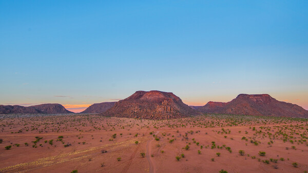
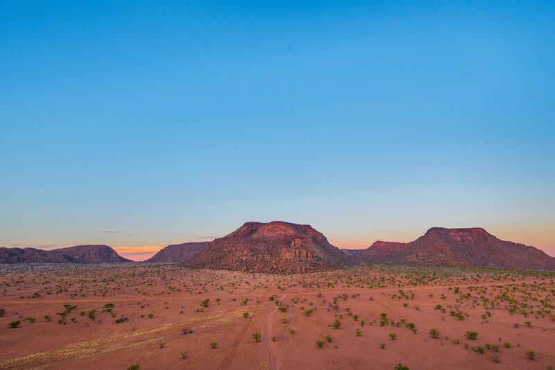
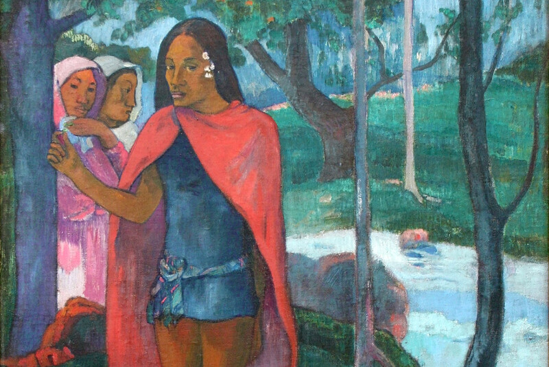
Yasuni National Park is arguably the most biodiverse place on Earth. A single hectare of land here can contain more than 650 species of trees and more than 100,000 species of insects. It’s also one of the few places where uncontacted tribes of hunter-gathers still reside. Amazon Basin, Ecuador.
It turns out, however, that this is unlikely to be the case. Infants do seem to have some innate preferences, or at least attention biases, for certain combinations of hue and lightness [Palmer 2013], but these differ substantially from those of adults. This suggests that our adult color preferences aren’t something we’re innately born with, but rather something that is learned over time.
So, what does determine our color preferences? It turns out they can almost wholly be explained by our preferences for colored objects. In fact, a correlation with object preferences explains nearly 80% of the variation in color preference in the U.S. [Palmer 2010]. If you like juicy, ripe apples and ripe apples are almost always red, you’re likely to prefer saturated reds. Bright blue is synonymous with clear skies and clean water. Dark greens, on the other hand, may be redolent of a dark, oppressive forest; and dark yellows are, well, basically the color of rotting food and poop. Hardly anyone seems to like dark yellows in studies.
The influence of objects on color preference can even be tested. In one study, the initial color preferences of participants were determined. Part of the group was then shown images of nice red things, ripe strawberries, for example, as well as a selection of gross green things, “mold and snot”. The other portion of the group was shown kiwis and pretty green trees along with red images of “blood and lesions”. When color preferences were again tested, they had shifted for the two groups in just the way you would expect [Strauss 2013].
Why do boys like blue and girls like pink, then? It’s likely a cultural feedback loop. Girls’ rooms are painted pink, they’re given pink toys, pink dresses, pink bows. Boys get blue rooms, blue jeans, blue cars. And maybe even more importantly, boys are often told not to like pink. Pink is for girls. There’s a social stigma attached to men liking it.
Color Pairs
Most images, however, contain not just one, but multiple hues. The question of how these hues may harmonize is still an active area of research (for an excellent overview see [Westland 2007]). There’s often not full agreement about what is or isn’t a harmonious set of colors, or within what contexts. There’s no shortage of ideas, mind you, but when put to empirical tests the theories can be a bit hit or miss, or yield results in the laboratory that don’t easily generalize to the complexities of the real world. I've often read, for example, that complementary colors work well together. These are color pairs opposite one another on a color wheel that make gray when mixed: blue and orange, red and green, etc.


Complementary or analogous pairings? Which do you prefer when viewed as uniform fields side-by-side?
Yet, when people are shown color pairs in simple arrangements on a computer screen, study participants reliably have a strong preference for analogous colors (those with hues very close to one another) rather than complementary pairs [Schloss 2011]. See which you prefer in the before/after image above. So, does that mean we should always strive to create photographs with as monochromatic a color scheme as possible? Of course not.
The same two complementary colors when viewed in context can be a bit more interesting.
Evaluating flat color fields on a computer screen isn’t the same as evaluating those colors within a realistic context. This is what I mean about study results not translating well to the real world. Our brains inherently perceive the visual world through the lens of our prior experiences. It's not only our preferences, but our fundamental perception of different colors, that can depend on the apparent lighting of a scene, on three-dimensional information about it, on the relative spatial placement of color patches within that 3D environment, and on heaps of prior information about the objects within the scene. That all happens subconsciously. We can't turn it off. Imagine viewing color swatches in different contexts. Bright blue washed across a clear desert sky? Beautiful. The same bright blue washed across a ripe banana? That might turn your stomach.
I suspect there's a little more complexity to color harmony than the idea that we all have some unexpressed yearning to inhabit a monochromatic world.
Painters' Use of Color Theory
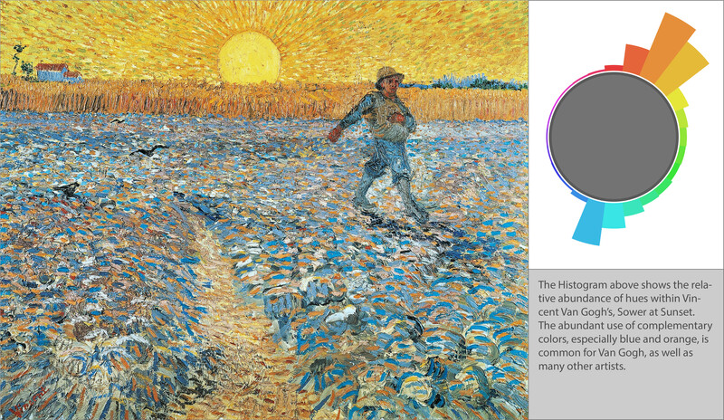
Painters have been experimentally studying color harmony for centuries, mixing colors and choosing color palettes to suit their aesthetic needs. And unlike photographers, whose palettes are often constrained by the objects in a scene or the ambient lighting conditions, painters have the complete freedom to choose a color palette that yields exactly the emotional tenor or dynamic they would like to convey. The image below is of Vincent van Gogh’s "Sower at Sunset". The relative abundance of different hues within the image is plotted as a hue histogram to the right. Longer bars indicate relatively more pixels of a particular hue; shorter bars indicate relatively fewer.
(Source image within the public domain.)
The palette of "Sower at Sunset" is dominated by those complementary colors again, blue and orange, with a few analogous hues neighboring each. The simple laboratory experiment mentioned above suggests we shouldn't find this color scheme pleasing. In fact, more generally, the study found that complementary colors were just about the least desirable pairing of all. I might beg to differ. If they happen to have a van Gogh stashed behind the dresser they're not using, I wouldn’t mind throwing it up on my wall.
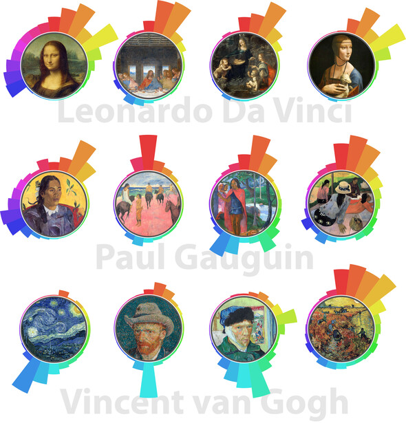
It's not that the study doesn't yield a useful bit of information. It just highlights the fact that our color preferences may be more complex than initially expected. The hue histograms for twelve other well-known works by da Vinci, Gauguin, and van Gogh are shown in the figure below.
(All source images in the public domain.)
While the color schemes vary, they’re clearly not random. Choices have been made by the artists. More than that, there are even some patterns that begin to immerge. These patterns persist not just across works by the same artist, but across the works of multiple artists.
Note that the greatest outlier is the self-portrait by van Gogh in which his ear is seen to be bandaged. To my eye the image is perhaps the least aesthetically pleasing of the group. It relies significantly on a sallow yellow — which you might recall is one of the least preferred colors to begin with — and combines it with a second sharp peak in the hue histogram ninety degrees away, the only painting of the group to use such a color scheme.
Color Palettes in Photography
Let's throw a few photographs into the mix for comparison. The following handful of images isn’t meant to be broadly representative of color palettes in my own work, let alone anyone else’s, but they’re not unusual either. How do they compare to those used by some of the master painters?
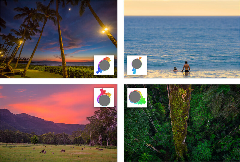
Four landscape images and their associated color palettes.
The answer seems to be that they're pretty similar. That there are many similarities, perhaps, shouldn't be surprising. Whether photographed or painted, many of the scenes and subjects are the same. Any reasonably faithful representation, regardless of media, should utilize a color scheme dictated by physics and biology far more than by the artist's preference. Indeed, some general patterns recur across both, specifically the use of: complementary colors, analogous colors, and half-shell arrangements of hue.
Color Harmony
In the mid-nineties a Japanese researcher, Matsuda, sought to provide a more definitive representation of these patterns. He proposed eight geometric distributions of hue that tended to harmonize well [Matsuda 1995 in "Color Design," Chamaret 2016]. The geometries are shown in the figure below. Imagine each circle overlaying a color wheel while being able to rotate each by any angle you like. Matsuda’s assertion was that any set of hues that all simultaneously lie within a darker band would harmonize.
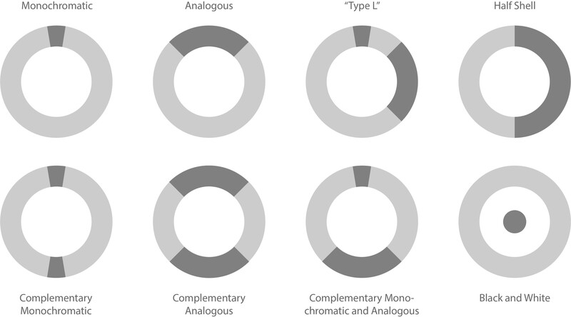
Matsuda’s harmonious color schemes.
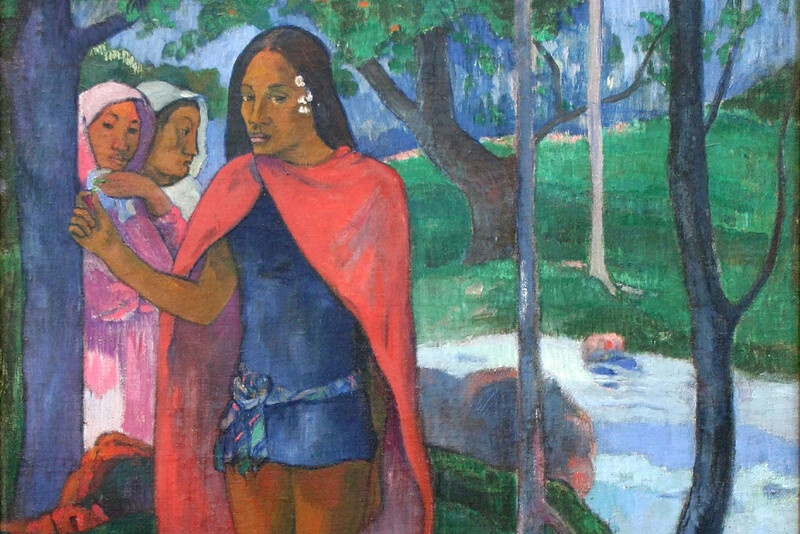
Many, if not most, of the color schemes we’ve identified do fit one of these patterns. A couple of examples are shown in the figure below with Paul Gauguin's "Woman with Flower" on the left and Vincent van Gogh's "Starry Night" on the right. In the former the hues are distributed relatively uniformly across one hemisphere of the color wheel. In the latter, a complementary orange hue is used in opposition to an analogous band of blues.
Matsuda's color schemes seem to be reasonable starting points, tools that can be used to provide a common visual language for some of the underlying patterns we may run across, a starting point for analysis and discussion. I don't buy that they're hard and fast rules that one should attempt to conform to at all costs.
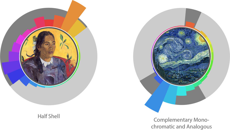
Examples of Matsuda's hue geometries in the context of Paul Gauguin's Woman with Flower and Vincent van Gogh's Starry Night.
More recent research has sought to test some of these theories about color harmony, as well as to empirically develop others. Yet, it seems each additional bit of information is as likely to add to the confusion as it is to provide further insight. The difficulty, I suspect, is two-fold. First, color harmony is a complex human preference that is challenging to untangle from the physical, environmental, and cultural contexts within which it developed — as well as from other elements of the composition and subject matter of a photograph. Second, our brains seem to be a bit less sensitive to the particulars of color than they are to, say, variations in luminosity. A little less sensitivity to color may yield a less emphatic emotional or attentional response. This likely leaves more room for other effects to factor in. There’s a good bit more discussion on contrast in this earlier article.
Photoshop Fun
Let’s do a little experimenting. Let's take a couple of images and adjust their color palettes to see what impact that might have our perception of those images and their color harmony. Selecting a good image to play around with in any significant way is actually a little challenging. The reason, as alluded to above, is context. Our brains know what stuff should look like in the natural world under different lighting conditions. Interestingly, this is more true of hue than saturation. We can alter the saturation of an image quite a bit and our brains seem to find it, not just enjoyable, but desirable (see here). Change the hue, though, and it’s pretty easy to get something that’s either very interesting, or very unsettling. Let’s experiment with an image that inspires fewer expectations about which precise hues the elements of the image should be.
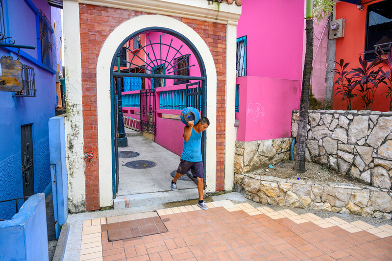
Street photo from Las Peñas neighborhood of Guayaquil, Ecuador. The image on the left is the original shot. In the image on the right, the red-orange hues have been shifted left by 15°.
In the before/after combination above, the image on the left is the original. In the image on the right, the red-orange hues have been shifted left by 15°, yielding a color palette with a more continuous range of analogous hues in the red quadrant of the color wheel. Which do you prefer? The histogram of the original image is shown in the left-most panel of the figure below. Just to its right is the histogram of the manipulated image. The furthest right panel shows the Hue/Saturation Adjustment Layer dialog used in Photoshop to perform the color shift. I would be inclined to say that the image on the right is a little more aesthetically pleasing, but also a little less interesting. (Note that the skin tones and palm fronds were masked out. Even a small shift to either was unsettling.)
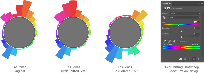
Hue histograms of the street photo from Guayaquil above. From left: histogram of the original image, histogram of the image when reds are shifted left by 15°, and the histogram when all hues are rotated left by 165°. The furthest panel to the right shows the Photoshop manipulation performed during the red shift.
Let’s try a similar adjustment on Gauguin’s "The Sorcerer of Hiva Oa". The original histogram, in a figure above, suggests a fairly wide separation between the greens and blues of the image. What if the two were brought a little closer to yield a more continuous range of analogous hues?
Paul Gauguin's, The Sorcerer of Hiva Oa. The left is a crop from the original image. The right shows the impact of shifting blue and green hues both slightly toward cyan resulting in a more analogous blue quadrant of the color palette.
The difference is subtle. And, again, I have a similar response. It, perhaps, looks somehow both more aesthetically pleasing to me, while at the same time being a little less interesting. If you agree, disagree, or have other impressions entirely, that may be something to bear in mind when contemplating how to post-process your images.
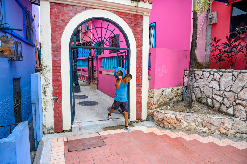
Finally, let's take a quick look at what happens when we do something more significant. In the image on the right below, the entire palette of hues, with the exception of the man's skin and the palm fronds, is shifted 165° to the left. The overall color scheme, thus, retains its slightly dog-legged, complementary nature, but mixes yellow-orange with blue rather than magenta. Quite different, yet still aesthetically pleasing in my book.
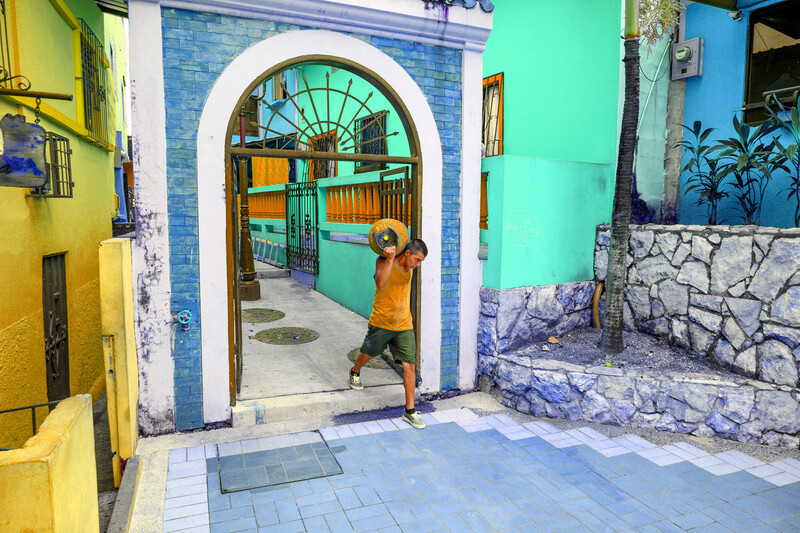
The color palette of the street scene in Guayaquil is rotated by a far more significant amount. As long as the skin tones are retained and leafy green of the palm tree, the scene is still believable, ... and kind of appealing.
Where Does this Leave Us?
That paintings and photographs often utilize similar color palettes should, perhaps, not be surprising. They often represent similar subjects and scenes. Skin tones should be roughly the same whether photographed or painted, as should the peel of an apple, or the color washed across an evening sky.
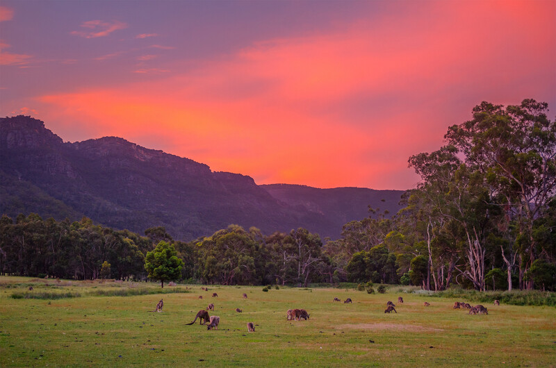
The spectral distribution of the sunset light dictates the color scheme of this image. Left: Original image. Right: With distant tree actually shaded green. Grampians National Park, Victoria, Australia.
Think about the color palette of the image above, for example. It spans a range of hues from purple through magenta to yellow-orange (the histogram is included in an earlier figure). This color scheme is dictated by physics: by the magenta-orange spectrum of the sunset light and the degree to which each of the surfaces in the image reflects those wavelengths. Here's the interesting thing. The saturated greens we think we see, aren't actually green, but yellow, sometimes even orange. Context and the brain's prior experience with the lighting of different objects under different conditions alters our perception.
To see what I mean, move the slider so that you can see the full image on the right. The hue of that distant "green" tree has been shifted so that it now really is green. It almost looks a bit blue, and a bit nauseating, doesn't it? Our brains can't figure out a physically viable way for what we're seeing to make sense. "If the tree appears that green under magenta light, it must really be even bluer, right? But then why would it reflect green when there's no green in the incident light? I think I might need to vomit." All of a sudden the color palette doesn't reflect an arrangement of hues that we're naturally comfortable with.
My suspicion is that, much as our individual color preferences reflect a correlation with objects we have a preference for, our preference for certain color harmonies reflects our affinity for previous situations within which we've observed those color schemes. Personally, broad magenta-centered color schemes will now forever remind me of an unfailingly magical evening in the Grampians, for example. Blue-orange complementary harmonies may remind many of us of golden hour light shows, or perhaps of a field of arnica, lazily buzzing with bees beneath a blue summer sky. If we've run across a color palette frequently in our past experience and have a positive association with those circumstances, I suspect we'll find that palette of colors desirable. Color schemes that violate norms we've learned from prior experiences, particularly color schemes that disagree with our subconscious expectations of how the world should physically behave, might be a bit more unsettling.
So, how can we put a little knowledge of color harmony to use when processing our images? For me, it's often helpful just to spend a little time consciously thinking about the color palette used in an image. What sort of geometric hue pattern does it represent? Are there deviations from that pattern? Are they effective? Interesting? Or do they leave me with a discordant feeling, one that I'm not seeking in that image? Do those deviations draw my attention somewhere they shouldn't? Even if there aren't hard answers to many questions about color harmony (and where are there clear answers in art), just being aware of it can get us consciously thinking about this important aspect of our images. Maybe we realize what was subtly throwing the whole feel of an image off; or maybe it just gives us a chance to experiment a little. Would a minor adjustment to a particular band of hues make the color palette a little more analogous and improve it aesthetically?
There's one way to find out. Go forth, analyze, think, experiment! And let us know what you figure out!


Join the Fstoppers community for free
-
Post comments and join in the discussions
-
Browse the site ad-free
-
Share your work and get featured in the community
-
Compete in the photo contests for fun and prizes
28 Comments
Why 165? the way it is presented it is just a "magical number"
Hey Vangelis, great point. I probably shouldn't have even included the number. I was just trying to illustrate that the same relative pattern of hues can be pleasing regardless of which hues, specifically, are involved. Had to choose some number, but you're absolutely right that there's nothing special about 165. Thanks for pointing that out!
Very Interesting analysis. It concurs that what we think is subjective is very mathematic. I have always aimed to have two complementary and one contrast. This applies to images and also to food, drink, interior & graphic design. Keep it to a simple formula rather than complicate. How many photographers consider these ideas?
How did you create the color spectrum wheels? This would be interesting to apply to images that are more popular.
Hey Rich, I wrote a little code to compute the histograms and generate the plots in Mathematica. If you're one of the 0.0001% of the population that happens to have a copy, I will happily send you the dozen or so lines of code. Otherwise, if you happen to be a coder, it looks like there might be a way to do it in Python (a notion of how one might do the plotting is here: https://stackoverflow.com/questions/54599750/coloring-a-polar-bar-chart…). Would still need to read in the image, convert to HSB space, and compute the histogram. There's gotta be some nice Python libraries that can help with that side of things, though...
I make my own miniatures and dioramas and photograph them with figurines in it, and I've been using these color theories to plan my shoots in combination with those common framing composition techniques (rule of thirds, phi grid, golden ratio, etc).
Colors can also make or break a photo. What choices of paint colors I use always undergo careful consideration. Reusing my props for other subjects in photography sometimes required a complete repainting process with different colors. What's written in this article is accurate regarding colors.
Thanks for the great explanation of the science behind color harmony. ...and I love the rigor you put into this article!
Well written, informative, thought provoking, (and remind me yet again how much I don't think about color and color theory consciously). Thank you
A feature of Vincent Van Gogh later in his career was his fondness for heavy use of yellow pigments. With hindsight it’s speculation, but various theories are that this was related to use of substances such as the epilepsy treatment, digitalis. Or perhaps it was absinthe.
Or on a musical note (no charge for that), Beethoven used few high pitch notes later in his life as his hearing declined.
(From my book The Edge of Silence)
Your explanation of the color theory applied to photography is magnificent, but the method of representation of the color spectrum wheels is brilliant, super, the best I've ever seen to analyze the color of an image. Please, please, please, make a commercial program with that idea. I will be very happy among your first clients.
Thanks José! If I find a little time at some point to code something up that doesn't depend on Mathematica I'll shoot you a copy!
Wow, what a brilliant in-depth study on color in photography!!! Best piece of content I've seen on the topic. The hue histograms are so smart, would definitely love to see this implmemeted in an app. What color model/wheel do you (and Matsuda) use though? I've been lately experimenting with using RYB implemented here http://beta.paletton.com but not only does the color wheel differ from Photoshop (that is expected based on the RYB model I guess), the hue numbers differ from Photoshop as well. So it's hard to use the two side by side. Is there any reference how to compute hue numbers and should they be at all affected by a color model? If so, is there a way to harmonize Photoshop work with a RYB color model/wheel? Thanks!
I'm trying to replicate all of this in Python and - if successful - make it available for others. However, I'm unable to reach the same kind of visualization. For instance, with Mona Lisa I have nowhere near as much hue frequency in the west / northwest region. First of all, are you sure you have it correct with Mona Lisa? Second, are you using linear axis for frequency, or logarithmical? Finally, do you only count simple hue frequency, or saturation-weighted hue frquency? Thanks :-)
Hey Jiri! Very cool!! I'm not absolutely *sure* of anything (!!), but I think so. (I'll be happy to work back and forth with you comparing things to try to figure out what's going on.) I was simply counting hue frequencies rather than saturation- or brightness-weighted frequencies so the hue histogram may not reflect what's most prominently perceived in the image. For example, I think the deep shadows is where a lot of the magentas and purples come in. If I load up the Mona Lisa image in Photoshop, add a Curves Adjustment layer to brighten it a *lot* (we're interested in the shadows here), then add a Hue/Saturation layer and crank the saturation up to 60 or 70, virtually all of her body and hair jumps out as being purple or red. Because it's so dark and relatively desaturated, however, it doesn't immediately jump out at you when you see the unmanipulated image. The idea of being able to easily examine straight, saturated-weighted, or brightness-weighted hue histograms is fantastic. I was plotting the relative frequencies linearly rather than logarithmically.
Hi, so I did manage to replicate the Mona Lisa histogram after using Wikipedia reference image (I originally used a small low quality image which turned out different results). Attached is a saturation weighted version which does not differ much from simple hue frequency. I'm now at a point where I have a fully functional Python script and I'm now figuring out how to migrate it to a web-based app available for everyone. Will keep you posted.
Hey Jiri! I agree with Patrick, ... that's awesome! Congratulations on getting the saturation weighting working, too. I think that's a great idea! ( ... Also relieved you were able to reproduce the histogram I'd created, ... whew!).
Hey Jiri, this is awesome! Would love to see your code/tool at some point!
Brilliant. Please put me on the list of people who would like to see your python code. I don't have the skills to do it, but this is a great contribution.
I just played around with your palleton tool. Very cool. It generates color schemes I would have never thought of. It seems like one should be able to match any color scheme using RYB, but I tried to match (by eye) a photo I took using Sigma DP3M with a foveon sensor. I was trying to match the red green combination in the photo (which has been heavily photoshopped.) Do you think it's matchable and I just don't know how? Or, can these colors not be matched in RYB?
Good eye to mention the different color wheels! I didn't have the space to open up that whole can of worms (and it gets pretty technical pretty quickly). There are something like four different definitions of complementary colors (if I recall correctly). Two of those represent the difference between the RGB (additive) and RYB (subtractive) color wheels (which colors are considered complementary differs between the two). Neither is a perfect match for the way our eyes actually work. Not sure about a way to harmonize Photoshop with RYB model.
For once Fstopper has a great article and photographer. Followed you on Instagram
Thanks
Wow Brant, another amazing article. A lot of effort to put all this together. Did you know that pink was the color for boys up until the 40s at least in Europe? Red was supposed to be a very affirmative and strong color and pink was its younger supplement. Nobody knows why it changed to blue, but people think that the blue work clothing and the blue of the sailors pushed it into that direction.
Hey Nils! Thanks. No, I didn't know that about boys and pink in Europe. Fantastic example! Another fun one I'd run across was the Himba people of Namibia. Their entire natural world consists almost exclusively of minor variations on the theme of beige. In tests of color preference they tend to like pretty much ANY saturated color, doesn't matter what hue...
Very, very intriguing article. Let me chime in with the others who say it would be great to be able to use your histogram presentation technique. Maybe it could be a photoshop or lightroom plugin. In any case, you have a market for it.
So a working prototype is available here http://hue-histogram.appspot.com/
Mind you, I'm no software engineer and had to learn Python - as well as how to deploy it on the web - from scratch the past couple of weeks. So currently it has no bells and whistles and shuold be only good for images no larger than about 2000x1500 pixels and files under 1,5MB. These restrictions appear with this deployment on Google Appengine where larger images would trigger server timeouts.
I will try and keep working on optimizing the code so it can digest larger files and would also like to explore options to add saturation & brightness weighted calculations and other improvements in the near future. Would also like it as a PS / LR plugin but for now let's hear your feedback!
My first use. That's awesome, Jiri! Really cool!
Good job, Jiri! Worked with no issues and is pretty much in line with what I can see with my eyes.
Thank you for the article Brent. Went through it once again - great food for thought. The only article I have ever bookmarked on Fstoppers :)
Lol! Thanks, Elmar!