

As photographers, we intuitively understand that color profoundly impacts our images, and there’s much more to it than meets the eye. Here are ways you can elevate your images by employing the power of color.
Introduction
Whether capturing a vibrant sunset, a delicate flower, or a bustling cityscape, the way colors interplay shapes our perception. However, beyond the aesthetics, color has deeper meanings. Some are scientific, while others are cultural and symbolic, shaped by our life experiences.
This is a brief introduction for novice photographers to some aspects of color many don't consider when they hold the camera to their eyes or sit at a computer wanting to print a picture.

The Physics of Color
At its core, color is a result of light interacting with matter. When light strikes an object, it absorbs certain wavelengths and reflects others. Our camera sensors detect that reflected light and translate the different wavelengths into the hues we see in our photographs. Our retinas, optic nerves, and brains do the same thing in our heads. It’s a simple concept, but this process isn’t as straightforward as it seems.
White Balance and Color Temperature
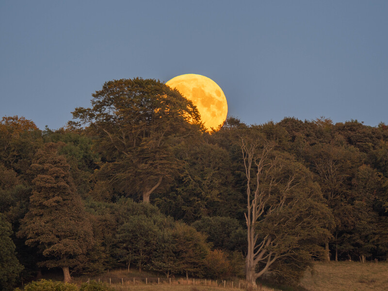
I’ve shot the same scene repeatedly because it appears dramatically different under various lighting conditions. The biggest changes occur because of the light's angle, intensity, diffusion, and color.
Consider a seascape at dawn. The ocean bathed in warm morning light exudes tranquility. Meanwhile, the blue light of twilight has a colder feeling. Although we psychologically think of yellows and oranges as warm colors and blues as cold, scientifically, it’s reversed. Understanding color temperature—measured in Kelvin—helps us adjust our white balance to capture scenes accurately. Cooler temperatures (around 5,000 K) yield bluish tones, whereas warmer temperatures (around 6,500 K) result in reddish or golden hues.

Cultural Perspectives on Color
Colors carry cultural baggage. They convey emotions and beliefs, and they are steeped in traditions. Here are just two examples.
White: Purity, Extravagance, or Surrender?
In contemporary Western cultures, white symbolizes purity and is commonly associated with bridal attire. That’s quite a modern idea. Queen Victoria’s choice of a white wedding dress in the 19th century wasn’t about purity but a display of wealth and extravagance. She chose white because the British lace industry needed support. Victoria’s was the first royal wedding to be photographed, and those photos popularized the trend of white bridal gowns.
Contrastingly, in China, white is linked to mourning. It has other meanings too. In Western culture, a white flag symbolizes surrender, a white dove peace, and a white feather cowardice.
Red: Love, War, and Politics
Red is multifaceted. In Western cultures, red embodies both passion and conflict. It’s the color of love and desire. Simultaneously, it can evoke war, danger, and urgency.
In the American flag, it signifies hardiness and valor. Yet, in Kenya, red represents the bloodshed during their fight for independence. Meanwhile, the Aboriginal flag in Australia uses red to symbolize the earth.
Interestingly, political affiliations diverge with the colors red and blue: Blue represents the right-wing Conservative Party in the UK, whose politics are more closely aligned with American Republicans, whose color is red. Red in the UK represents the left-leaning Labour Party and the Democrats in the US. Globally, red is associated with communism, socialism, and far-right ideologies. The "Reds under the beds" could equally have been fascists as communists.
The Spectrum Unseen: Aphakia, Saturation, and Evolution
Most of us experience the world through a familiar palette of colors. However, the answer to that old philosophical chestnut, “Is my red the same as yours?” is “No, it isn’t!”
Men and women see colors differently. Women are better at distinguishing between them, especially in the middle of the color spectrum. For example, women are more likely to notice if a purple object is better classified as lavender, violet, eggplant, or grape. They also see more shades of green than men and can more easily differentiate between green and blue. This appears to be partly evolutionary. It results from how human brains are wired and is also affected by hormones.
Interestingly, it’s noticed by biological men who transition into women that they can see more colors. This is sometimes used as a medical test to check the progress of the transition. Also, some women have a variant of the OPN1LW gene that makes them more sensitive to specific shades of red and green, giving them so-called "tetrachromatic" vision.
Furthermore, some individuals perceive hues beyond our ordinary spectrum. This phenomenon occurs due to a condition called aphakia, which allows some people to see into the ultraviolet (UV). Remarkably, those who have undergone cataract surgery can sometimes share this ability too. Imagine a world where flowers emit UV glow, and subtle patterns emerge in unexpected places—these individuals witness that vividly.
The Impressionist painter Claude Monet reported a newfound richness of color perception after his cataract operation. He said that his post-surgery world was ablaze with hues he had never seen before.

The Art of Judging Photos
This revelation might shed light on why certain photographers embrace heavy saturation adjustments. Perhaps they are merely translating their enhanced visual experience into their images. Pushing the saturation slider farther to the right emulates what they see with their ability to detect a broader, bolder spectrum in the real world.
That raises a question: Do you judge photographs as being poor if they appear oversaturated to you? If you encounter images with what you consider overly intense colors, pause before reaching a negative conclusion. The photographer’s eyes may perceive a broader gamut of colors than yours, with a color perception that might well extend into realms you’ve never glimpsed. Consequently, their photo developments appear more vibrant to emulate how they see the world. It may well be that they process images to match what their eyes behold in real life.
Therefore, next time you evaluate a photograph, remember that the artist behind the lens might reveal a world hidden from you, where everyday scenes have an energy you can’t perceive. Perhaps their saturation slider isn’t excessive but merely calibrated to their unique vision.
Evolutionary Insights
Our evolutionary journey from dichromatic (two-color) to trichromatic (three-color) vision shaped our perception. Primates, including humans, made this leap.
Picture our distant ancestors changing from being nocturnal to diurnal beings. Night offered no color cues, thus rendering color vision unnecessary. Perhaps the gene responsible for color blindness harks back to our dichromatic roots. However, as daylight became their norm, their ability to discern ripe fruit from green foliage or spot a tiger’s orange pelt amidst grass conferred a survival advantage. Trichromatic vision allowed them to stay alive.
Mixing Colors
Remember those art lessons at primary school where we mixed paints? We were told red, blue, and yellow were the primary colors and the building blocks of all others. Combining two primaries yielded secondary colors: red + blue = purple, blue + yellow = green, and yellow + red = orange. Add white or black, and the palette shifts toward brightness or darkness.
Then we were taught the primary missing from each secondary was its complementary color:
- Purple comprises red and blue, so yellow is its complementary color.
- Green comprises blue and yellow, so red is the complementary color.
- Orange comprises red and yellow, so blue is its complementary color.
Complementary colors stand out against each other. For example, orange lifejackets are designed to be glaringly obvious against a blue sea. As photographers, we are happy to see someone wearing a red coat in the green countryside. Then, the yellow anther and stamen in the center of aster flowers (Aster amellus) really pop against the purple petals.
Of course, that's a very simplistic guide. It’s not quite as straightforward as that; there exist many shades of red, blue, and yellow. A truer representation of complementary colors is found by installing a color wheel app on your phone; there are plenty of free ones to choose from. There, you can find complementary colors sitting on opposite sides of the wheel.
While complementary colors add tension to the image, those sitting side-by-side are called contiguous colors and are more calming—for example, green against blue or yellow against orange.
But here’s the twist: pure primary color pigments don’t exist. Red may contain hints of purple, blue may harbor a touch of green, and yellow might carry some orange. When we blend those colors, those hidden qualities emerge. Artists’ paint manufacturers offer an array of nuanced colors—Cadmium Yellow, Yellow Ocher, Hansa Yellow—to bridge the gap between theory and reality.
Inkjet printers operate differently. Instead of blue, yellow, and red, they use cyan (C), yellow (Y), and magenta (M), along with black (K). These “printer primaries” create a wider gamut of colors than the traditional primaries we learned at school. Yet even they have limitations.

Subtracting and Adding Color
The paints and inks we apply to paper are considered subtractive colors. As white daylight comprises the seven colors of the rainbow (red, orange, yellow, green, blue, indigo, and violet), a pigment will absorb some of those colors and reflect others. So, a red pigment will reflect mostly red and, as I mentioned, maybe some other colors too, but absorb those at the other end of the spectrum.
The screen in front of you consists of hundreds of thousands of tiny red, green, and blue (RGB) pixels. Take a photo of a computer monitor and zoom in, and you will see them. It’s a system used by most monitors and digital camera JPEGs, and it is additive. So, mixing different colored lights will result in new hues being created and not from some colors being absorbed.
The total range of different colors your screen can display—the gamut of colors—far outweighs those available through CMYK. In other words, some colors in RGB cannot appear in CMYK. So, when converting colors between RGB and CMYK, there’s usually a bit of color shifting. Consequently, photographers must consider the intended output (screen or print) when working with colors.
Putting It in Proportion
Apart from using complementary hues, there is another aspect of colors working together in a picture. Classic color theory considers the proportions of each color in the image.
The polymath Johann Wolfgang von Goethe (1749–1832) pointed out that some colors are brighter than others, e.g., violet is dark, and yellow is bright. Sitting midway between them, green and red both have equal inherent brightness.
He suggested that the amount of each color in a picture should be inversely proportional to its brightness. In other words, the brighter the color, the less there should be. He applied numerical values to the different colors to quantify this. So, if you create a picture that is bright orange and dark blue, then the proportion most pleasing to the eye would be the opposite of their value, i.e., eight parts blue, four parts orange. Red and green have equal values, so they should appear in equal proportions.
Sadly, in photography, we don’t always have control over how much of each color appears in a shot. However, it can be a consideration when composing and deciding whether to get closer or stand farther back.

In Conclusion
This article is just the very briefest of introductions to these topics. There are entire books on each, and hopefully, this article has sparked some desire to investigate them further. It’s worthwhile doing so.
Light and its color aren’t just about aesthetics; it’s the language we speak with our cameras. As you frame your next shot, you probably won’t consciously consider the science, culture, and symbolism behind each hue. However, learning about them will embed those aspects in your subconscious and help you to tell the story you want to relate with your pictures.


Join the Fstoppers community for free
-
Post comments and join in the discussions
-
Browse the site ad-free
-
Share your work and get featured in the community
-
Compete in the photo contests for fun and prizes
14 Comments
Ivor to me it's more about calibrated monitor, wider gamut sRGB vs adobeRGB, creating color profiles ( sensor calibration), theory of color, knowledge of basics as you mentioned RGB vs CMYK and also with LAB.
Sometimes it's coming down to screen being to bright / to dark, screen saturation and overall color management especially for Apple products known for its screen technology and overal saturation/vibrace levels, gamma values compare to professional wide gamut Design or Photography displays
Also being able to edit and print in AdobeRGB color 1.09 bil. colors ( instead of 16.5 mil. colors of sRGB)
There is really a lot to cover
Thank you, Zdenek. That's a really useful comment. Yes, as I said this was a very brief introduction and it was aimed at absolute beginners. So that was a useful expansion.
Many people don't have monitors capable of displaying the AdobeRGB colorspace (you are in a lucky minority!) and for those who do and who want to share photos online, this is an issue because social media will convert the image to s-RGB and there is no guarantee of a reasonable translation. Also, many people use third-party printing services, and some of those are limited to s-RGB.
Thanks again for the comment.
Yes Ivor. But that color profile conversion in photoshop is really easy... I mean to sRGB. It's more about the use of larger gamut when printing. I actually have dual monitor setup. One is for photo and one for video. Color theory and thinks around it is real fun. Hard on the start, but the more you understand, the better
I agee! Thanks again.
When I'm editing photos I'm not much of a technical person looking at all the different colours. I'm much more of an intuitive feel photographer and same with my editing. I go by fuel and intuition. How does it look in terms of calibration are use a MacBook Pro and a Photography setting is available on that particular monitor which is great. I haven't had to calibrate my monitor and I've printed much of my work and it comes out great. Very interesting article.
Thank you Nev.
Interesting article. I’m colour blind, can’t remember exactly what colours, and always have difficulty differentiating between green and blue , red and orange. I guess what looks good to me, might not to other people. If I’m less sensitive to say green, I may push this more in my photos and other people might find it oversaturated.
If it looks good to you, Ruud, then it will look good to other colour-blind people! There are so many variables affecting how we see colours, we can only do what's right for us. I have a grey shirt that my wife swears is green! Thank you for commenting.
Ivor, as I may have mentioned in an article of yours in the past I have been using post-processing before digital cameras became widely available the the masses. I began with digitalizing twenty years of my traditional/film images. For almost ten years I developed a firm understanding of the RGB color spectrum, plus limited introductory knowledge the CMYK (Cyan/Magenta/Yellow/Black) process. I have always practiced to optimize my images opposed to image “enhancement(s)” or “manipulation(s)”. Taking the existing information/data in film (transparencies) to digital to the most realistic prints I can make.
https://fstoppers.com/photo/683110
So you tell me … how am I doing ?
That looks pretty good to me, Paul. Thanks for the comment.
I do wish schools would teach art students about other primary colour models (maybe they do - I left school 30 years ago). It frustrated me so much that I couldn't mix the colours I wanted from red, yellow and blue paints and inks - muddy greens and murky oranges.
It blew my tiny mind when I did work experience at a photographic print finishers, developing and printing colour negatives, and I discovered RGB and CMY colour models. I went out and bought some cyan, magenta and yellow paints to experiment with and it was like I'd discovered the holy grail!
I left school 30 years ago at 15 before I went to college as chef in Czech Republic and they teached us how to mix color and tge basic stuff for water paint. But it won't teach you the dilerence of RGB and CMYK. But if you take basic graphic design course I am pretty sure they will teach you all that and more. LAB color is great also if you play around with photoshop especially
I am a graphic designer, specialising in print. Those few weeks I spent at work experience taught me a lot more about colour than I ever got taught at school and art college.
I actually spent a couple of years working as a technical demonstrator at a local college. You could see the students' brains exploding when I taught them colour theory and how what they had previously been taught about the colour wheel was wrong.
Thanks for the comments. You are right, in the printing industry, it is essential to be exacting and I absolutely agree with everything you both say.
Outside printing, I guess it's about necessity and how far people take their art. At primary school, red, yellow, and blue are good enough, and as a basic understanding of complementary and contiguous colours, it is also enough for most people to know that a red poppy will stand out against a green background and an orange lifejacket stands out against the sea. When I am out with a camera I don't think about it, I just shoot what looks good to my eye. Then, in raw development, I calibrate my screen and (usually) colour-match, but I bet most photographers don't.