

Has the rule of thirds influenced your compositions? It has mine at times. Yet, with each application I wonder, why should placing things near the thirds of an image be appealing? In fact, it turns out that the link between the rule of thirds and aesthetic appeal is weak. Is the rule of thirds dead?
A Little History
This most common of compositional techniques was initially proposed by John Thomas Smith, Keeper of Prints at the British Museum. He published a book in 1797 entitled “Remarks On Rural Scenery” within which he laid out the notion of a rule of thirds:
In short, in applying this invention, generally speaking, to any other case of light, shade, form or color, I have found the ratio of about two thirds to one third, or of one to two a much better and more harmonizing proportion, than the precise formal half, the too-far-extending four-fifths — and, in short, than any other proportion whatever.
(On a side note, do you think Mr. John Thomas Smith would be a bit surprised to find that, two hundred and some odd years later, half the population of the planet is carrying around a little device in their pocket called a “phone” that helpfully has his rule of thirds grid overlaid right on its “camera”? Oh, the missed royalties… but I digress.)
The question that keeps coming to my mind, though, is why should there be a “harmonizing proportion”, a rule of thirds? Why should we innately find it appealing to place prominent subjects or boundaries a third of the way into an image? Smith’s hypothesis was that “parts of equal appearance hold [the attention] awkwardly suspended as if unable to determine which of those parts is to be considered as the subordinate.” It’s actually an interesting proposition. Many of Ramachandran’s neuroaesthetic laws, for example, are motivated by the need for our brains to effectively divvy up our very limited attention.
Yet, it seems like one can come up with contrary examples, examples that would suggest Smith’s explanation might not be the whole story. What if we had an aesthetically strong image that was composed according to the rule of thirds, yet, within which the rule of thirds wasn’t able to play a role in apportioning our attention? It might suggest that there were other factors at play beyond Smith’s explanation (or that the rule of thirds was irrelevant).
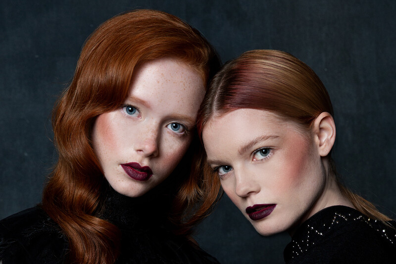
The rule of thirds doesn’t help us to apportion our attention in this case, as two equally strong subjects lie on the image’s thirds. To my eye, this doesn’t lessen the strength of the image in the slightest. This would suggest that Smith’s explanation for the rule of thirds may not tell the whole story. Image by Mark Dunsmuir | www.markandnaomi.com | instagram.com/mark_and_naomi.
Take a look at the image above, for example. It’s a crop from a larger portrait taken by fellow Staff Writer, Mark Dunsmuir. The image has two competing subjects, each of identical visual weight and each placed identically with respect to the rule of thirds. The rule of thirds, therefore, can suggest nothing about how we should divide our attention between these two focal points, yet, it still seems to contribute to a strong image (along with many other factors). I, thus, suspect there may be something to the rule of thirds, but am a little skeptical of Smith’s explanation.
In fact, nearly since its inception, there’s been a good bit of pushback against the rule of thirds, pushback that seems to go beyond your typical artist’s nonconformist streak. That wariness turns out to be well founded. In a recent study integrating the computational analysis of images with the human perception of aesthetic beauty, researchers found that the rule of thirds was only weakly correlated with the aesthetic appeal of an image. And, perhaps tellingly, I haven’t yet been able to find a good neuroaesthetic motivation for the rule of thirds in the literature. Yet when composing a shot, it often doesn’t seem a bad place to start, either. Rule of thirds-based compositions do seem to be more appealing than many other options. Perhaps the rule isn’t sufficient on its own to yield superbly crafted compositions, but maybe it’s enough to help save us from some much worse ones. Indeed, in the study referenced above the least aesthetically appealing images all had low rule of thirds scores. There did appear to be a correlation there.
I’ve, thus, spent a good bit of time over the last few weeks wondering what in our evolutionary history might have yielded a preference for image compositions based on thirds. My initial thought was that maybe this sort of framing was somehow ideal for extracting three-dimensional information from a scene in the real world; or maybe such compositions meet the competing goals of allowing us (the viewer) to keep an eye on a subject (say, the person we’re talking to) while still directing the main focus of our attention to the distant background (say, in the direction a lion might be approaching from). My wife quickly dismissed both as a little hare-brained; and they do both have tragic flaws. My other ideas fizzled out, too.
But it did get me thinking. I eventually started to wonder if maybe we’re asking the wrong question. Let’s take a quick look at a couple of other popular “rules”.
Don’t Put the Subject in the Center of the Frame
There’s another rule of thumb we often hear in photography: don’t put the subject in the center of the frame. It turns out that this is good advice. In most cases, people tend to prefer that objects not lie on the centerline of an image. There is, however, an exception. We do prefer forward-facing, symmetrical objects to be centered (see, for example, the image below).
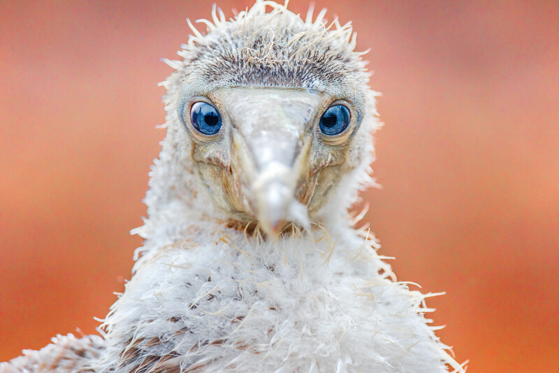
One of the few cases where a centered subject can be pleasing: when the subject, itself, is symmetrical and forward-facing.
Why should this be the case, though? Why should we prefer that symmetrical objects be centered and asymmetrical objects be moved off-center? If I were to hazard a guess, it would be that placing something on the centerline, the frame’s axis of symmetry, invites our brains to investigate just how mirror-like that symmetry actually is. And if it’s not, we come away disappointed. The image above works fairly well precisely because the subject is symmetrical. We’re critically tuned to recognize and respond to that symmetry. It’s deeply ingrained in our evaluation of beauty in human faces and, I suspect, in those of baby boobies as well. Evolutionarily, it’s thought to be a key indicator of good health. (In fact, the breaking of symmetry readily explains the plague that the bacterium, Propionibacterium acnes, represents for the teen dating scene. It makes faces asymmetric which alerts potential suitors, correctly, to an underlying health issue.)
This tendency of the centerline to highlight image symmetries can be used to great effect when we want to emphasize those symmetries in our images, as in the case of the juvenile Nazca Booby, above, or of the driftwood and building thunderhead, below.
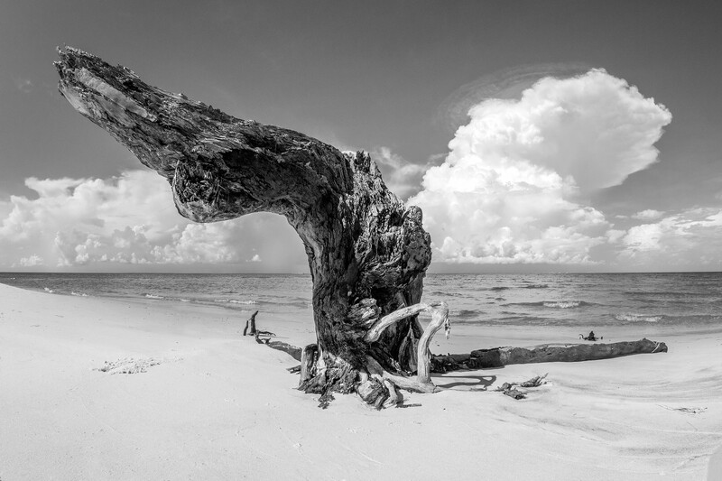
In this image, the placement of the base of the driftwood in the center of the frame deliberately invites a comparison with the symmetrical shape of the thunderhead.
If the primary subject of an image isn’t symmetrical, however, and it's placed on the centerline, it's likely to invite a comparison that doesn't work in our favor. Check out the pair of images below, which differ only in the way they’re cropped.
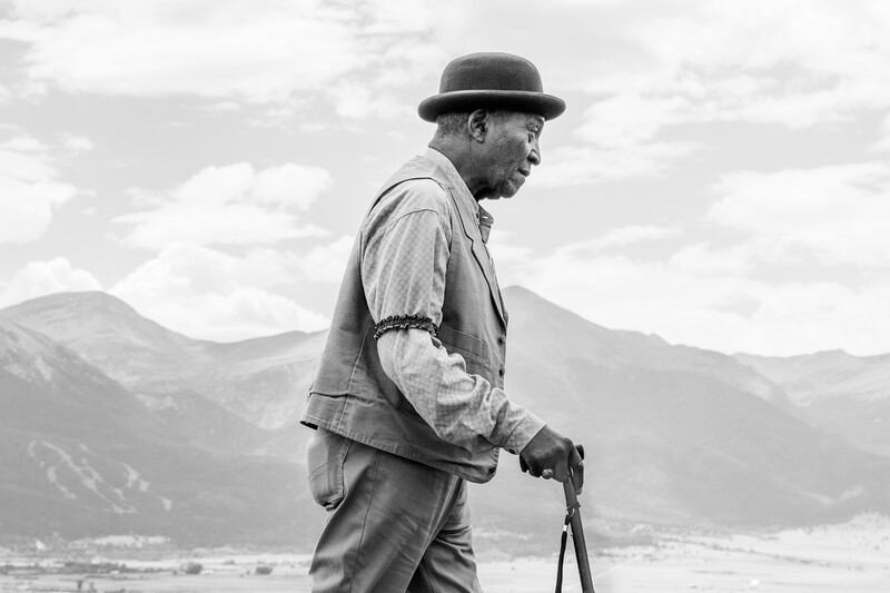

The image on the left invites the brain to look for symmetry that’s not there. My eye moves first to the primary subject of the image only to be disappointed by the lack of symmetry. It then moves to the image background searching for symmetry there, but there’s none to be found. The mountains on the left are both darker and fill more of the frame than those on the right. The composition highlights the image’s asymmetry, its imbalance. It leaves me feeling unsettled. On the other hand, placing the subject a bit off-center to the left has a number of advantages. First, our brains no longer have any expectation of symmetry in the primary subject (which would only disappoint them). Second, the darker subject on the left and the brighter open sky on the right become competing centers of visual mass that are, themselves, symmetrically balanced across the centerline of the image. Finally, it gives the subject, who’s facing to the right and obviously in the process of walking, a space to “walk into”. Research has found, in general, that when an object is off-center and has a potential directionality, we tend to prefer that the object “face” toward the center of the frame.
For most subjects there is, thus, an aesthetic preference for off-center placement. Aesthetically appealing placements along the centerline are the exception.
Image Framing
Let’s think about one other aspect of image composition. The notion of an image frame, or boundary, has been implicit throughout the entirety of this discussion. But why should we have any innate, aesthetic response at all to how something is framed? We didn’t evolve to look at pictures. Throughout the vast majority of our evolutionary history there weren't paintings or photographs to think about the framing of. Why should we have any response at all to where the bounds of an image fall relative to the subjects within it?
Just because paintings and photographs haven’t been ubiquitous throughout most of our history, doesn’t mean our visual scenes haven’t been framed. Imagine sitting in a shelter on the African savannah waiting for a meal to cook when out of the corner of your eye you catch sight of a hyena moving in the tall grass; a hyena which, from your vantage point, is just at the edge of the door frame about to disappear from view behind the shelter wall. Would you think to yourself, “Ohhhh, isn’t that lovely? That’s just where I like to find large predators: nearby and about to disappear from my line of sight.”

A hyena walks out of the visual frame.
Of course, not. You’d be on your feet in an instant trying to gain a better visual, gain more context. Where is the hyena coming from? Why is it going in that direction? Is it alone? Are there other hyenas nearby, trailing it? Or are there other hyenas in front of it that might already be circling around on you?
We have a deep, emotional, survival-based need to have enough visual space to really understand the critical elements of our environment, their surrounding contexts, and the places they may be headed to next. Our lives may depend on it. So it doesn’t matter what’s framing your field of vision, whether it’s a shelter wall, the mouth of a cave, the open space between adjacent trunks within of a copse of trees, or the bounds of an image. Your likely to feel more emotionally at peace if there's a little distance between the hyena and the point at which it disappears from view.
What Do Symmetry and Framing Have to Do with the Rule of Thirds?
Let’s step back for a moment and see where this leaves us. We’ve discussed two different rules that roughly reduce to: don’t place subjects on the centerlines of the frame; and don’t place subjects too close to the edges. The “exclusion” zones suggested by the two rules are roughly indicated in the figure below.
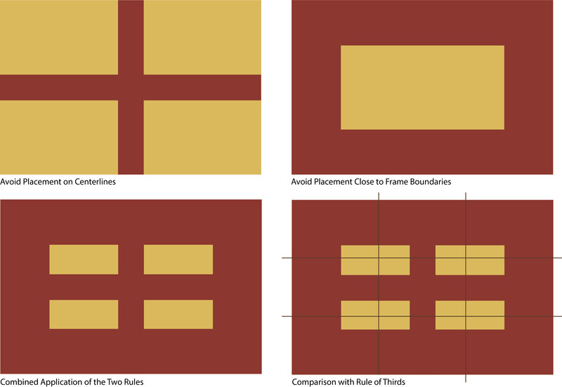
Regions of the frame within which to avoid placement of subject(s) are indicated in red. Avoidance of image centerlines is shown at top-left. Avoidance of frame boundaries at top-right. The combined “exclusion” areas are shown at bottom-left. A comparison with rule of thirds guides is included at bottom right.
Note that when the exclusion areas of the two rules are combined, we end up with something that looks suspiciously like the rule of thirds. What if the rule of thirds isn’t an affirmative rule, in the sense that there’s some evolutionary motivation for why we should prefer the focal points of an image to lie along its thirds? What if it’s just shorthand for a couple of other negative rules, rules which do have evolutionary, neuroaesthetic roots?
This might explain some of the insensitivity we often experience with respect to a precise alignment with the rule of thirds. The notional exclusion zones illustrated above suggest a good bit more room to maneuver. It’s not so much about precise placement on a third that’s important, but just a fuzzier admonition not to get “too close” to the important boundaries or planes of an image, whatever “too close” means.
It might also explain, at least in part, why the correlation between the rule of thirds and human assessed aesthetic appeal mentioned earlier is weak. If we understand the underlying rules, and the reasons for them, there are myriad ways in which the rules can selectively be pushed or broken to achieve a particular end. An experienced photographer will likely be adept at using this greater compositional flexibility to strong aesthetic effect, moving beyond simple rule of thirds compositions.
Yet, it's still not a bad rule of thumb, especially for the budding photographer. It can help avoid many significant compositional pitfalls. Eventually, however, it's probably worth understanding something about the more basic considerations that may underlie image composition so that as we grow as photographers we can choose how and when to effectively break it. Long live the rule of thirds!
Thoughts? Other ideas? Let me know in the comments, please!
Images used with permission where applicable.


Join the Fstoppers community for free
-
Post comments and join in the discussions
-
Browse the site ad-free
-
Share your work and get featured in the community
-
Compete in the photo contests for fun and prizes
25 Comments
My belief is that in most cases balance is the goal.
This can often be accomplished using the rule of thirds (ie a 'heavy' subject on a 1/3 balanced by 'lighter' elements in the remaining 2/3), or placing a symmetrical subject in the center, but it is important to understand the goal and not simply follow 'rules' that may or may not achieve this.
As indicated, our minds like to make sense of image elements also, allowing space for an object to move into etc, but in the end couldn't this also be classified as balance?
Who ever made up rules for life, surely he needed. But me, never congruent with any rules.
It should be understood that what we've been calling "rules" (as though handed down arbitrarily by authoritative organizations) are really "hacks." They are ways of doing things that have simply been discovered to work better than not.
Over thousands of years, visual artists have discovered compositions that consistently work to engage human audiences. Over the years, teachers have named and categorized them in various ways.
But they're really still just visual "hacks." They continue to work because the human brain hasn't changed much in the last few dozen millennia. (It all probably originally had to do to do with the brain arranging visual information to help in finding food and avoiding predators).
Anyone is free to use them or not, like any hack.
Well said
Alternativly.
https://www.youtube.com/watch?v=AJ7fahM5sBQ
Hi Chase, great point! I've actually got that guy's book. Article wasn't remotely meant to cover the myriad broader aspects of composition, gestalt theory, or neuroaesthetics, just explore the origins of the rule of thirds a bit. Ian Plant's, Visual Flow, is another good one for a MUCH broader discussion of composition (www.outdoorphotographyguide.com/product/visual-flow-mastering-the-art-o…). (Love your work, by the way.)
Just looking at my comment, I can see how it might come off as snarky. It was meant to be the the opposite, an appendix to your article - which I found to be pretty thoughtful.
Every couple of years I pick a restriction that I feel I’ve been using as a crutch. One of those restrictions was to shoot almost entirely centered. Which forced me to use other more subtle compositional tools. Once restricted, I started to see lots of paintings, movies, designs there were centered as well, but still very aesthetically pleasing. And over the course of time, I’ve come to look at images built around the rule of thirds to be less interesting (I’m aware of how my focus skews my perspective bias).
I really just wanted to add a P.S. to your exploration of composition.
I say whatever works for you, go for it. Make your own rules, and let the fates decide.
A thoughtful article, thanks.
I suspect the thirds rule is most relevant when the subject is 'pointing'. When portrait subject is front-on, centred is good. When in profile, we create an uneasy feel because of the negative space behind the head. So better to remove that, and use the thirds rule instead. Ditto any similar scenario such as an animal, stick, etc.
I would submit that your photo with the pointing hand is not 'in the middle' it's still to the left side of the frame. look at how much blue there is to the right of the hand compared to the left, it is unbalanced in a way that is not obvious so it feels uncomfortable.
in the frame with the hand all the way in the left of the frame it is still unbalanced, but it is unbalanced in a way that is so obvious that it is no longer uncomfortable.
rule of thirds is nothing but an overly complicated way of saying "its not always best to place the subject in the middle".
No, it's about the harmony and balance of proportions, it's about how your eye travels through the photo. It's about the space in front of, or behind a person or animal. It's about the visual weight of the parts of the composition. It's about leading lines and where they are going. It's about how we see things in nature and how the human brain and vision works. It's more than just shoving something off-center and calling it good.
no its not about any of those things, you can have negative space, leading lines and whatnot without placing your subject one third into an image. rule of thirds is nothing but a stupidly complicated way to tell beginners that sometimes placing something off center can be an option.
Literally nobody said it was all about shoving something of center and calling it good. But your long drawn out explanation of what the rule of thirds is about is an overly complicated way of saying "its not always best to put the subject in the middle". Like Jonas said, you can have all those things without having the rule of thirds and still have a great image. So no, rule of thirds isn't about those things. They are on the same level as rule of thirds, tools to a great image.
My point was, there's more to it than just putting something off-center. Call it over complicated, but there are reasons for some stuff and just saying "its [sic] not always best to put the subject in the middle" doesn't explain *WHY*. For a beginner, the "why" is just as important as the "what". So the beginner places their subject off-center, but up, down, left, or right? Telling a beginner "its [sic] not always best to put the subject in the middle" is simply saying "put it anywhere but in the middle, it doesn't matter where, it doesn't matter which way your subject is facing".
1/3 is simply saying "not in the center, but not too close to the edge". It doesn't mean literally exactly 1/3, it's an easy way of saying 1/3ish.
good photographers just compose their images in a way they think look best and use their experience and taste as their tools. rule of thirds is strictly beginner advice as they often place their subject in the middle regardless of other factors(leading lines etc.). it would be much simpler advice to just tell them to experiment with other compositions rather than pretend theres some kind of science to 1/3s which the word "rule" implies. ive seen people who have been doing photography for years justify their compositions with the rule of thirds which is why i think its overly complicated. that and the notion that you "break" the rules with certain compositions, it isnt a rule, theres nothing to break.
balance however you want to make the shot interesting to your viewer. don't follow rules because someone told you to.
When negative spaces, symmetry and leading lines make more sense than rule of thirds. ;)
I remember way back in grade 10 English I was trying to break the three point, three paragraph essay rules. The teacher told me that it's best to master the rules first, before you learn to break them. Other wise, when you break the rules, everyone sees a mess, instead of a masterful incongruity.
Well written and well thought out. Diagonals forever. Follow the lines.
The Best Rule you can teach with PHOTOGRAPHY is "There Are No Rules!"
The rule of thirds was not a made up rule to create great images, but based on observation of what arrangements seemed most pleasing to the brain. I've been taking photographs professionally and as an amateur for over 65 of my 77 years. I can't recall every using the rule of thirds to compose a single shot, but if I go back over my work and look at the work of others, well over half of those images I really like would fall into a box that said "Rule of Thirds."
Brent thanks for this article. Your explanation is one of the best I have read on composition and placement of subjects. I have intuitively thought the same but you have laid out the arguments very nicely.
Thanks Arun. Much appreciated!
I would say the rule of thirds is used less than a third of the time...or less.
Scroll down to the bottom of the page to the posted pics, it is not used that frequently.