
The rule of thirds is completely overrated. There, I said it. Nope, I am not going to take it back.
The day when I first picked up my camera and looked through my viewfinder to find the grid of thirds, I quickly thought to myself: "well, this seems to be a little too simple and predictable." Every image with the composition or focus point lined up the same. I struggled to work out how artists took this principle and then crafted works of art from it. The simple answer is that they did not. The rule of thirds is the dumbed-down version of the actual compositional grids used by artists. It took me years to find this out, but once you go down the rabbit hole of composition and learn the truth, it is hard to look at an image the same again.
Before I blow your mind with the actual compositional grid, let's just quickly take one last look at the rules of thirds, say bon voyage, and abruptly push that simpleton out of our lives.
Here we go, drum roll, please! Ladies and gentlemen, I am pleased to introduce you to the Armature grid.
For centuries, painters and artists alike have used this grid and other compositional techniques to create their masterpieces. As you may have noticed, the rule of thirds is still lurking in there, but it is mainly an empty foundation the grid is built upon. The rule of thirds is a pushbike, and the armature grid is a Ducati.
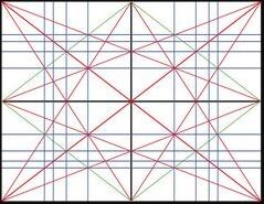
So, how do you use the grid? Well, multiple compositional techniques can be used in conjunction with the grid, and I will not be able to cover them all, so I'll cherry-pick a few, and the rest you will have to research yourself. The grid utilizes dynamic symmetry, which guides your images along in creating a balance between the elements and unifies the pieces together.
One way of using the grid is to make use of the two large diagonals in it, the baroque diagonal and the sinister diagonal. The baroque goes left to right; it is the more natural of the two, because we read that way. But what if you wanted to create an image that felt off? Maybe you want to create a sense of confusion. Then, this is where the sinister diagonal comes in. Because it goes against our natural way of reading an image, it creates an uneasy feeling.
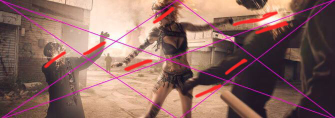
To go one step further, you would compose your models or composite your elements to flow with all the diagonals of the grid, locking them into the grid.
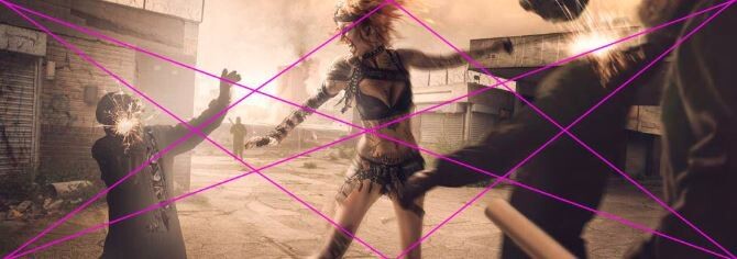
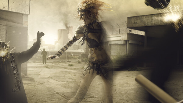
Look at this image I created years ago. All three people lock into the grid, creating a sense of compositional unity. I colored in red where they are locked in.
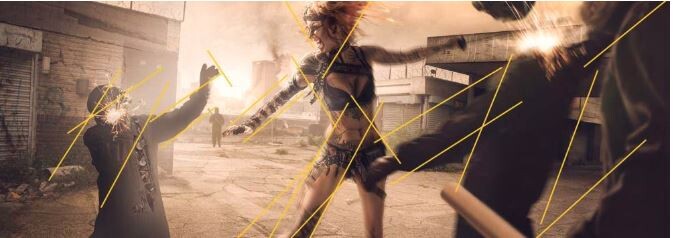
Which brings me to gamut. Gamut is the rhythm of an image. It is the repetition of a number of angles created by the image. It is something that most people will not recognize but will subconsciously pick up on. If you look at the image here, you can see where the gamut in this image is. As it was an early image, some are a little off. And this is where looking and reflecting on your work becomes important. With a little adjustment to the guy on the left, we could have a home run of matching gamut.
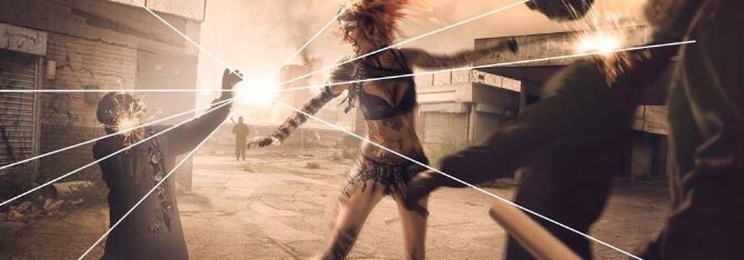
The last technique I will go into is radiating lines. Radiating lines is one of the compositional techniques to bring unity to your image. The lines are like branches from a tree, all radiating out from a common point. If they share the same line, then it relates them and creates unity. Hopefully, you can now see how everything is connected. Composition is not just one technique; it is many techniques used together that create one unified piece of work.
So, here is your homework. There are many more compositional techniques. I will list them here, and it is your task to go out and research the:
- Arabesque
- Coincidences
- Ellipses
- Enclosures
- Aerial perspective
- Greatest area of contrast
- Edge flicker
Now, I wish I could say I learned this all by myself, but I did not. I was taught by my friend, Tavis Leaf Glover. He runs a website called Canon of Design, where you can learn all the techniques I have mentioned and more. Class tip, the homework will be really easy if you search here. I would love to hear your thoughts.


Join the Fstoppers community for free
-
Post comments and join in the discussions
-
Browse the site ad-free
-
Share your work and get featured in the community
-
Compete in the photo contests for fun and prizes
32 Comments
LOL! I know I'm going to need help with this and I'll take a look over Glover's site. Composition, more than anything else in photography, IMHO, will be a game changer.
Truth be known.........all the compositional rules are overrated as it is all highly subjective.
You must like Jazz
On occasion if it's Dixieland.........but mostly classical.
Why can't this website just be gear announcements and releases. Opinion pieces have no benefit, its just the comment section with pictures and a flashy headline.
change my mind
You're not interested in actual photography - just gear?
correct
Possibly irony and sarcasm as well?
Go to DPreview for that, the community is awesome too, really helpful (not a single piece of sarcasm was used in this post).
Oh forreal? welp later fstoppers
Bye.
I think just the opposite is true. Nothing is less interesting than articles about new camera equipment. Especially articles like this one, where a photographer takes a clear opinion and expresses why he or she represents it, is a clear advantage for this community. It's really interesting to ask yourself questions after such an article and then to find out if you should change something in your photography.
It might be overrated but if you look at well done movies or TV show, the Rule of Thirds is heavily used. Heck, one of the X-Men movies has Wolverine in the left third of the frame as the camera pans away from the mutant's school. :-)
^^^ This.
However, I think the so called rule of thirds is best used as a means to get photographers to at least think about composition. Thinking about composition is commonly overlooked by new photographers; choosing instead to point the camera at a subject and just snapping away. Any photograph with at least some thought into composition is going to look better than one with no thought about composition.
The title is clickbait, but Clinton Lofthouse actually says that there are loads of rules to be followed, that the rule of thirds is just the emerged part of the iceberg, and sticking with it only is cheap, when you know what is available.
It’s more like a guideline.
I studied aesthetics in university for a semester and barely scratched the surface. You could devote a lifetime to trying to understand and explain it. But the rule of thirds is pretty well documented. Conversely, placing the focal point dead center rarely is the most pressing approach.
That was my first impression on reading this. IMHO there are no doubt better photos with which to illustrate these concepts.
Nice article and great images to back up the concept I wish more ideas like this were shared on this site. the gear part of the site wait for it..... I'm yawning is so boring.
Triangle shapes found in a pentagon, I think it was Penrose who in the 1970's came up with the idea of using PHI to create asymmetrical non repeating five fold shapes. In this example came sets of triangles to form kites, darts and diamonds.
Placing asymmetrical element in a broad symmetrical pattern that is not visible to the eye but only to the brain is genius.
All rules are overrated.
I’m gonna be honest, I’m a relative newcomer so I’m just now learning the art of composition.. the main thing I’ve picked up is that leading lines tend to have much more of an impact on an image than rule of thirds. Most of the shots I look at and say wow tend to have some clever way of leading your eye through the scene.
You mom is over rated...
That depends on what you think the rule of thirds is. If you think it means "All images should have the subject on a third", then I agree with you. If you believe it means "Most people find compositions with a dominant feature on a third to be balanced and pleasing, but there are many other pleasing compositions, and sometimes you don't want pleasing", then not so much so.
I'll continue using the rule of thirds. not because I doubt anything you say, which is actually quite interesting, but because its easier for a novice like me. when I'm taking pictures of my kids running across the field etc., I can remember just enough to put them 1/3 across the frame. I don't have the skill or mental capacity at this point to do anything more.
Another garbage clickbait article.
The "rule" of thirds was always an approximation of the Golden ratio and a mnemonic device, nothing more, nothing less.
Let's see you visualize the "Armature" grid everytime you lift the camera to take a photograph...
What was first? Rules or pleasant composition? You can construct as many grids as you like in the hope the grid convinces your eyes.
The rule of thirds, and other rules of composition, exist because they work. They give people a good foundation in composition. But an artist needs to decide when a rule works, and when it doesn't. You have to learn the rules so you know when, and how, to break them.
Have Fun,
Jeff
The rule of thirds isn't rated very highly by much of ayone, so it is pretty hard to say that it is overrated.
I mean, for something to be overrated, doesn't it have to be something that most people rate rather highly in the first place?
"Rules" such as gamut and radiating lines can work very nicely for more complex compositions. But many of us strive to create simplistic images with a subject and a feature-less background. We work hard to get our subject out in the open and to remove everything else from the scene, so that we can create a much simpler image.
For an image with just a subject and a blank field as a background (a "proper image", if you will), I don't see how radiating lines or gamut can work, because we don't have multiple lines or angles in the image.
For super-simple compositions like the ones most of us are striving for, the rule of thirds can often work rather well.
I think Bruce Barnbaum has offered the best knowledge on composition of anyone I've ever heard or read. Instead of talking about various types of lines you can overlay on your frame and try to match stuff up with, he talks about composition as a visual language, and discusses in depth what various types of lines, tones, curves, contrast, textures, etc. might help you communicate.
This book is a recommended read, very elaborate: "Michael Freeman - The Photographer's Eye". The content is much more interesting than the title ;)
https://www.amazon.com/Photographers-Eye-Composition-Design-Digital/dp/…