

Although any photographer worth their salt knows there is always more to learn, they might not understand what to look for when studying great art. At first, it can seem inaccessible. So here is a first taste of what to look for and consider adopting into your photography.
Did you come to this article because I mentioned Canikony in the title? It's always surprising that many more people read my articles about gear than they do about photography techniques. Perhaps those who want to read about the latest camera or lens know everything there is to know about photography, though I doubt it. Sorry to disappoint, but this has nothing at all to do with which brand of camera you use.
Hokusai Katsushika and Visual Weight
The Japanese artist Hokusai Katsushika (1760-1849) was famed for his 36 views of Mount Fuji. One of the most famous images is the woodblock print "Fine Wind, Clear Morning," also known as "Red Mount Fuji."
The lesson here is one of visual weight. The eye is drawn immediately to the mountain that dominates the picture, and the eye follows the leading line down the slope. That's not how it works. It may not seem obvious to the Western eye, but much Japanese art is read from right to left because that is the direction they read their text.
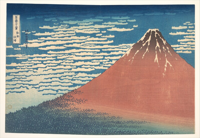
Consequently, sometimes Westerners make the incorrect assumption that the slope of the mountain is a leading line that the eye follows to the top. But the image works the other way around, and the eye is drawn immediately to the mountain and then runs down the slope to the trees depicted below.
In Western photography, we find images where the subject moves left to right more comfortably. That doesn’t necessarily mean we should always shoot subjects looking or traveling in that direction. By having images going “against the grain,” we can add tension to a photograph.
Compare the following image that I have flipped horizontally. Most people of European descent will find the left-hand image easier to accept.
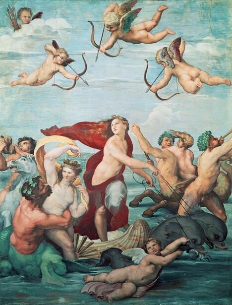
Raphael and the Rule of Odds
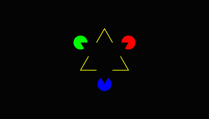
Many artists use groups of three elements as part of their composition. This adheres to the “Rule of Odds” in visual arts. The reasoning behind this is believed to be that having an odd number means your brain can’t pair them up or group them as easily. That keeps your eyes moving across the composition, creating visual tension or dynamism. That’s because there is no “conclusion” to the image. In comparison, even numbers create a sense of "relaxation" and can even be boring.
You can try this as an experiment. Take seven small, similar objects such as coins, stones, or Lego bricks. Place one on a table and photograph it. Add a second object and photograph that. Then a third, and so on until you have snapped all seven. Compare the photos and think about which you prefer. Most people will like the photos with odd numbers better than those with even.
Like all rules in photography, in this context, the word “Rule” in the “Rule of Odds” should be considered in the way we think of it when we say “as a rule” and not a hard and fast prescription.
The odd numbers can refer to the contents of separate groupings within a picture. Take as an example the following painting by Raphael and how he used groups of three in his fresco "The Triumph of Galatea." Even the two dolphins are added to by a cherub moving parallel to them. The horse on the left is pale and the same hue as the land behind, separating it from the group. Consequently, at first glance, there are only three figures there. Similarly, the cherub in the top left corner is apart from the group of three.
Caravaggio and Tenebrism
Chiaroscuro is an Italian term that translates as “light-dark.” It is a technique employed in the visual arts to represent light and shadow to define three-dimensional objects. It involves the use of strong contrasts between light and dark that affect the whole composition. So, this is a lesson about exposure.
The technique was first brought to its full potential by Leonardo da Vinci in the late 15th century but became a primary technique for many painters by the late 17th century. The term was used to describe any painting, drawing, or print that depended on an extensive gradation of light and darkness.
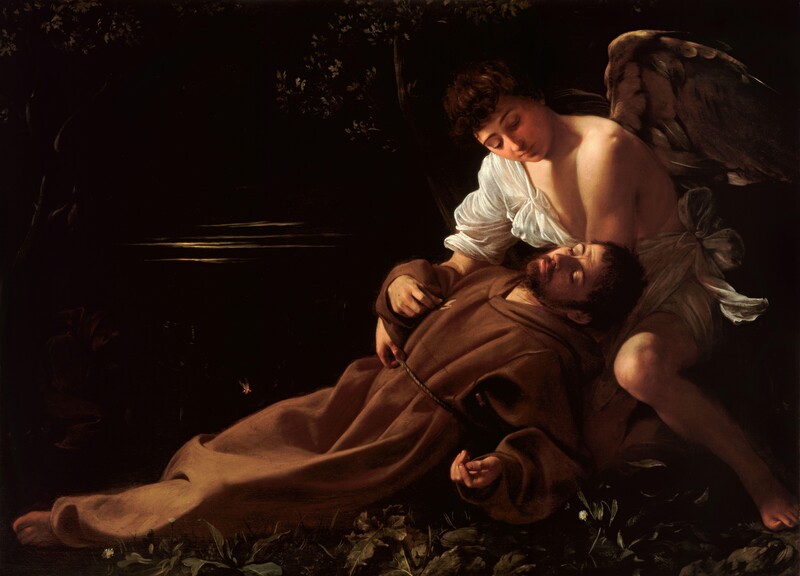
Famously, Caravaggio used Chiaroscuro's most dramatic form, known as tenebrism, employing a harsh, dramatic light to isolate their figures, thus heightening their emotional tension. Another master of chiaroscuro was Rembrandt.
In photography, we can employ chiaroscuro-type effects by looking for dramatic changes in light. By observing the histogram, we can reduce the exposure by bringing the highlights into the middle and pushing the mid-tones to the left and into the shadows. Usually, this is called low-key photography. The reverse is also possible where the exposure is increased, mid-tones are pushed into the highlights, and shadows are made white. That is, of course, a high-key image.
Leonardo da Vinci and The Golden Section
The Golden Section, Golden Ratio, Divine Proportions, call it what you may, the ratio of 1:1.618 appears in nature, geometry, and all art forms. It’s defined by the simple formula a/b = (a+b)/a = approximately 1.618. It’s usually written as the Greek letter Phi, φ. It’s associated with the Fibonacci Sequence, where each number in the sequence is the sum of the previous two numbers; 0, 1, 1, 2, 3, 5, 8, 13, 21, 34, 55, 89, 144, 233, and so on. If you divide each number by its predecessor, you arrive at numbers getting ever closer to about 1.618 as the sequence progresses.
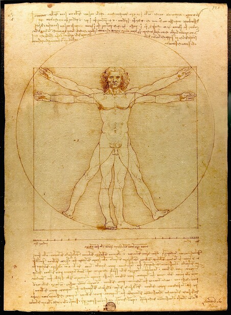
The appeal of the Golden Ratio to the human eye is believed to be linked to several factors. Firstly, the human brain has an innate tendency to recognize and appreciate proportion. The Golden Ratio reflects a unique balance and proportion, creating a sense of visual harmony.
Furthermore, the Golden Ratio is found in many natural phenomena, and this familiarity could make images based on it more appealing. For example, the human face and body share the same mathematical proportional relationships seen in all living things that cohere with the Golden Ratio. That may explain the cognitive preference for it. Also, research shows that our brains identify, interpret, and process images based on the Golden Ratio more quickly than images that do not incorporate it.
Leonardo da Vinci is probably the most famous artist to have used the Golden Ratio, demonstrating it in the "Vitruvian Man" and using it in works such as "The Last Supper" and "Mona Lisa."
Some raw development and editing tools show an overlay representing the Golden Ratio. If you use Lightroom Classic or Photoshop, open the crop tool, then tap O on the keyboard. The spiral and the four-lined grid represent the Golden Ratio proportions. Holding down Shift + O will rotate the spiral.
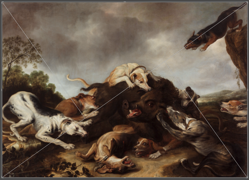
Frans Snyder and Diagonals
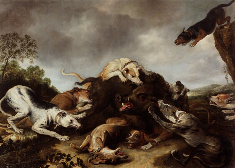
Diagonal lines in photographs add dynamism to a photo, creating a tension that isn't there in horizontal or vertical layouts. Frans Snijders' painting, "The Wild Boar Hunt," illustrates this so well. Notice how the imagined diagonal from the top right with the leaping dog follows through the eyes of the two white dogs. That imagined line happens because our minds create line continuations that don't exist.
Going back to the Snyder painting, look at the secondary diagonal running from the bottom left upwards. The artist has used the diagonals that work against our natural Western desire to view a picture from left to right to add further tension to the picture. Again, you can bring up the diagonal overlay in Lightroom and Photoshop.
Canikony and Subject Matter
All those great masters had a hook that made their pictures appealing to their viewers. Just as my use of the made-up word Canikony might have drawn you to this article because I was hinting at camera brands, those old masters chose subjects that would attract viewers to their pictures. For some, it was drawing on religious themes. Meanwhile, for others, it may have been the somewhat gruesome spectacle of a wild boar being savaged by dogs.
Many modern artworks challenge our perceptions of what art should be. It can leave us feeling challenged or even duped. But that's what art should do. It should provoke an emotional reaction.
Therefore, it's possible that some of the subject matter or techniques shown in this article do not appeal to you. Even if you find someone's art hard to swallow, whether it is painting, sculpture, writing, or photography, you can learn from the limitations of your subjectivity by accepting that art is never wrong, it's just different from how you would do it. Consequently, if you reject it just because you don't like it, you are losing out and demonstrating your limitations.
Moreover, if you find yourself riled because your approach differs from another photographer, that artist has done their job just as well as if you found the work pleasing.

In Conclusion
These are by no means the only lessons we can use from the world of art; there are more I will mention in future articles. Furthermore, they only scratch the surface of these techniques. But they do highlight how adopting the methods of the past masters can improve our photography. So, I encourage you to research further into each of these topics.
What have you learned from artists outside photography? Are there techniques that the old masters employed that you use?
It would be great to hear about them in the comments.


Join the Fstoppers community for free
-
Post comments and join in the discussions
-
Browse the site ad-free
-
Share your work and get featured in the community
-
Compete in the photo contests for fun and prizes
41 Comments
Ivor Rackham asked,
"Did you come to this article because I mentioned Canikony in the title?"
No. I almost DIDN'T click on the article because that term was included. Why? Because I am not all that interested in discussions about camera brands, even though I own and use two of the brands woven into that term.
I am far more interested in the aspects of photography and art that don't have anything to do with gear.
Titles that are written to induce clicks are offensive to me. They make me feel like I am being treated like a number instead of a human. My behavior will not be controlled or influenced by others. I refuse to comply.
I can be so dense sometimes (my wife might say more than sometimes). I didn't initially even catch the reference to Nikon/Canon. It was not a word I'd heard of. I thought it might have something to do with technique. I was kind of bracing for another debate over technical qualities vs emotional response in a picture. And I was curious about the word, so Ivor probably got one reader for reasons that he didn't expect.
I'm not asking anyone to comply, Tom. I would be happier if more people read articles that weren't about gear but about techniques. But, if you could see the viewing figures, it's the article about equipment getting the biggest readership. It's odd. When I buy photography magazines, I always skip over the gear reviews.
Edward, Canikon was an old word commonly used to describe the mass-produced cameras that dominated the market. Now that Sony outsells Nikon, I added the Y.
Ivor, you and I are very like-minded when it comes to what we like to read about and think about when it comes to photography. I also think it's odd that gear-related content is so popular.
I have no idea if there's a correlation between the volume of readers and the number of comments. I would guess so but all I can see are the number of comments. And I suspect the quantity of comments is impacted by how controversial the subject is. Rather than purely gear vs technique vs ideology, an article with natural lines of argument will get a response.
Take this article for example... the response seemed to languish until Eric makes a controversial statement about the nature of the starting point and control we have of photography. Obviously that hit a nerve with Tom and myself. Ivor's article was educational but nothing that very many people could argue with. And by nature most of us are contrarians. In other words, I'll typically remain silent until someone says something I feel needs to be corrected.
Camera gear probably draws a lot of comments because it's so easy to argue one side or the other, and come across as the superior mind in the process. How many times do we hear something irrelevant like "I've been a professional for 85 years... so my opinion counts more than yours." Simple arguments afford simple minds the opportunity to make a big splash in a small swimming pool. So it doesn't surprise me at all that camera gear increases readership. But I think other subjects can increase readers and comments too if the subject invites a difference of opinion. Is there anything more controversial than AI? Write an article about something like that or the death of photography and watch the comments fly.
Edward wrote,
"..... by nature most of us are contrarians. In other words, I'll typically remain silent until someone says something I feel needs to be corrected."
I am so glad that you wrote that, because I very much relate. In fact, I will often scan over articles just searching for something that is incorrect, so that I can pounce on it! Haha! It is so fun to find things that need to be corrected!
I can see the readership numbers but I don't think that is publically available. Historically, I have written articles covering similar points as these, and they have had a fraction of the readership of this one, which is doing well. Is it because I added a reference to Canon, Nikon, and Sony in the title? I suspect so,
I wrote an article recently reviewing some gear from a popular brand that had many times the readership of this, but fewer comments. I believe adding a comment to an article does generate more readers, so even the obnoxious ones help pay me for my work. But the title, lead paragraph, and topic must appeal to readers for a good readership. So if you ever start blogging about photography and want to be read, that's the way to go.
Talking about comments, some are ill-natured and those are usually incoherent. Others fire off thinly veiled insults because they don't have the intelligence to debate constructively. I really enjoy people discussing the topic, even if they disagree with me. However, when they just come out with derogatory comments, I treat them with the contempt they deserve.
Sometimes, it comes back to bite them as the professional photography world is a small one. I recently had the opportunity to pass on a big, lucrative photoshoot in a location where one of the grumpier commenters lives; I often get asked for recommendations. He was the only photographer I knew in that place. Do you think I recommended him?
I have no doubt that you did everything you could imagine to divert business away from that person. I wouldn't blame you. I wish you success with your articles. Blogging will probably be the last way I'd try to make some money in photography. I'm kind of old for learning new tricks, and analyzing data doesn't appeal much to me. The whole business of photography just seems to have gotten too complicated... sort of like the TV remote control. I went out for a few hours this afternoon cold-calling businesses, armed with a few business cards and print samples. Felt good for a change to have actual human interaction.
I get your point, Edward. But your comments are coherent and well-written, so if the urge took you, you could give it a go and I think you would be successful at it.
From a business perspective, most of my work comes via word of mouth. The numerous business courses I've been on all emphasized the importance of SEO and analysis of hits. I don't bother with that anymore and my business keeps rolling along. My clients are happy, which is the most important thing for me.
Not surprising. SEO makes for good classroom material, but every (I mean every) decent customer I've ever had has come from my initiating personal contact... either by phone, email, or in-person. Usually a combination of the three. Oddly enough I've never received much business from referrals. Maybe because I don't ask my existing customers for them.
While learning and applying aesthetic lessons from art can of course be useful in photography, especially in the edit stage when it comes to cropping removing of distractions and making other more subtle changes. What the article somewhat ignores is ; apart from photographic still life and other planned static studio based situations much of photography is either dynamic and unpredictable such as in wildlife or is simply dealing with situations that are out of the control of the photographer as in landscape, street and documentary photography. In photography unlike painting you have to work with what’s presented to you often in a moment, and attempting in that fraction of a second make some visual and aesthetic sense of it. Even in landscape where time to think is available it’s still all about making some sense of what is there. Much of photography is making sense of the varying degrees of chaos that is being presented to the photographer. This situation is very different to the slow methodical and calculated way in which a painter works who is in complete control over what goes on the canvas or panel of wood. I would argue that while some general aesthetic principles may well exist applying them in the dynamic often chaotic world of photography at the time of the taking of the image is not easy and requires a totally different aesthetic mindset from a studio based artist who has all the control and time in the world. As I said applying these artistic rules in the edit when the time and control are there is very different from applying them when taking the image.
I came to the article to see what Ivor was banging on about this week!
Eric Robinson wrote:
"..... much of photography is either dynamic and unpredictable such as in wildlife or is simply dealing with situations that are out of the control of the photographer as in landscape, street and documentary photography. In photography unlike painting you have to work with what’s presented to you often in a moment, and attempting in that fraction of a second make some visual and aesthetic sense of it"
Eric,
Even though the exact timing of things is unpredictable in wildlife photography, we can still apply the principles that Ivor discusses. How? By pre-imagining them. We can think about what would look cool when we are afield, and then wait for it to happen. Or we can see an animal in a certain spot, and then think of what that scene would look like from a different angle, and then change our position accordingly.
So we can plan our shots in advance, not unlike the studio painter ..... but we just have to wait a long time, maybe hours or days, for the animal to get into the right position.
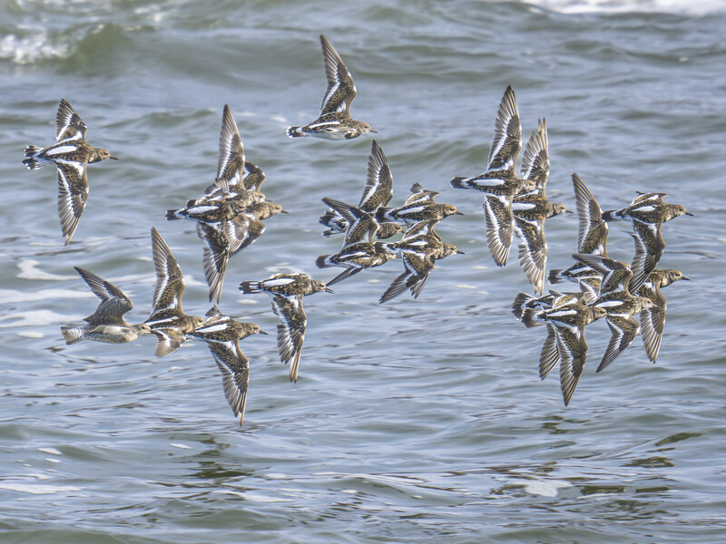
Here's a recent example from last week .....
I have been photographing shorebirds at the beach lately, on the coast of New Jersey. I noticed a couple weeks ago that it looks cool when a wave comes in and goes out, how the edge of the incoming/receding wave is all foamy. So then I thought that a composition would look cool if it had 3 layers - sand, foam, and water - a horizontally layered composition.
But of course as a wildlife photographer, that only works for me if there is a living critter in that scene. And I thought that in this instance, of all the different species of shorebirds that were there, an American Oystercatcher would be the best subject for that scene, because of the way their yellow eyes and orangey bills are complementary to the blue water (opposite each other on the color wheel). So I just waited until one of the Oystercatchers wandered out to the surf to forage, and then I went out after him to get him in the midst of those 3 layers.
So yes, it is entirely possible to think of a type of composition, or a color scheme, or special lighting, such as the interplay between light and shadow, or chiaroscuro, and then go into nature and position one's self accordingly, and then just wait and wait until the desired subject comes into the exact right spot.
These principles of art apply just as well to wildlife photography and other dynamic genres as they do to any other genre ..... we just need to have the ability to put the time in, because what can be accomplished in minutes in a studio could take days or months or years in the field.
Relative to a painter beginning with a blank canvas, photographers do have less control over the final image. But that is not to say we are at the complete mercy of elements outside our control. While we may not be able to create mountains and rainbows out of nothing, we can control where we stand which affects our composition and perspective. We also choose which elements to include within the frame and which to exclude. So I feel that a large degree of control of the image is indeed exercised at the point of capture. As you say, maybe not to the full extent as the painter, but creativity in composition is nevertheless a critical aspect of photography... not to be underestimated. Nature is inherently messy but it's our skill as a photographer to create order out of chaos. Sometimes it requires a different way of looking at the scene from our initial impression. But that's what separates good photographers from not-so-good. Also, I find that the harder I work, the luckier I get with regard to capturing those illusive rainbows and lightning strikes in my pictures, or great lighting in general.
Thank you, Ivor, for another thought-provoking article. One particular painting that had a huge influence on my photography was a portrait of a woman by the name of Rebecca Boylston in 1767, painted by the artist John Copley, and hanging in the Boston Museum of Fine Art. I was just beginning my journey in photography and I'm no portrait photographer, but what really impressed me was the detailed texture and luminosity of the painting. It brought to life a person who hadn't lived for over 200 years. From that day forward I would strive to accomplish that in my photographs. I suppose that I'm more "inspired" by the depth and magnitude of the work of the great painters than I imagine conscientiously learning from their compositional construction of the picture. But then I don't think much about lines and numbers in my photos... a picture just seems to feel right or it doesn't. It usually feels balanced, or not. I'd probably do well to study more of the principles you've highlighted in your article so I'd have a more concrete understanding of composition, rather than some vague feeling about it. There are just so many ways to learn our craft. Thanks again, Ivor.
Thanks, Edward.
I just Googled that splendid painting - I didn't know it - and see what you mean. There's a lot we can learn from art like that. I agree that a picture can feel right or not, and it's a useful exercise to work out why.
Excellent points, Edward! I appreciate your insights and the way you articulate them.
“ Relative to a painter beginning with a blank canvas, photographers do have less control over the final image”…
Photographers start with the whole world and must remove things to create a cogent image. A photographer I know considers photography “lying by omission”. Clearly, we have a different kind of challenge….
Ivor Rackham wrote:
"Diagonal lines in photographs add dynamism to a photo, creating a tension that isn't there in horizontal or vertical layouts."
I very much prefer angles over true horizontal lines for most compositions in wildlife and nature photography. I am not sure that that is necessarily because there is a "tension" caused by a diagonal. I just think it is more visually pleasing.
For example, if I photograph a bird on a perch, I try to set the perch up in a way that it is at an angle instead of level. I also prefer to compose large mammals on a groundplane/horizon that is angled instead of flat. It just looks better to my eye.
For example, I think this photo of a Whitetail buck would look stupid if the groundplane was level. Thank God that he hung out for a bit in this particular spot, where the ground slopes uphill in front of him, because I find this a much more pleasing image than it would be if the ground were flat.
Yup, it's one of those psychological facts that whether people realize it or not, that horizontal lines trigger a more calm feeling compared to vertical lines. Of course, all this happens at generally a low level and that there can be exceptions.
By the way, the way I read text, from left to right and from top to bottom, has nothing at all to do with the way I view a scene or a work of art. There is no carryover from reading to other visual activities. I do NOT assess things from left to right or top to bottom any more than I do from right to left, or from bottom to top. That only happens when I read text, not anywhere else.
I think most people's brains and inclinations are good enough not to default into doing one thing the way they do other things.
But would the above picture not feel awkward if the deer were positioned in the right side of the frame instead of the left? By allowing the animal space to move into the picture (left to right) you give motion to the picture... which is as important as diagonal lines for creating dynamic images. Even if we were to turn him around (placing him on the right side of the frame and looking left), I suspect you'd feel less comfortable with that composition. Take a look at your images and consider how many of your animals are on the left and looking toward negative space on the right. Obviously you can't always control the direction an animal is facing in wildlife photography (and like everything in art... there are no absolutes), but I'm suggesting that maybe there's more of a subconscious connection between reading a book and a picture than you might think.
Edward,
I agree that the image would look awkward if the buck's head was close to, and facing, the edge of the frame.
I do not agree that it would look awkward if it were horizontally flipped. Whether the subject is facing from left to right or from right to left has no bearing at all on how natural or "right" a photo or a painting feels or looks.
I very often flip my images horizontally when I put them into a collection, such as a gallery on a website. This is to maintain a randomness in the images ..... it could look odd if 6 or 7 images in a row all had the subject facing the same way. So I flip a few here and there just to make sure they're "mixed up". It doesn't matter which ones get flipped and which are left in their original orientation, just as long as they appear to be random.
Several academic papers I read when researching this article suggested that Japanese art is viewed from right to left for the reasons I gave. Similarly, western art is often viewed left to right. Of course, there are always exceptions.
It's one of the things I always included in my basic photography course and, before giving the reason, get the trainee to take two pictures. One with a subject looking right to left and the other left to right. Of the 300 or so one-to-one lessons I have run, only four (European) people have preferred the right-to-left composition. I'm not saying that we should always shoot photos that travel in that direction, but it's something to be aware of as it can affect the mood of the image.
I love that whitetail photo, by the way.
Thanks for the additional info about right to left vs left to right.
I think that if people were completely unbiased, they would view each thing they see according to the dynamics of that particular thing, and not based on how they have viewed other things throughout their lives.
I think it's best to make sure we don't have biased that carry over from one part of life to other parts of life. We must fight against the way our brains work so that we never make assumptions and so that we never do anything by default or out of habit.
Tom / Ivor and all others concerned. We've all heard a picture is worth a thousand words. The two images depict the whole eastern / western, right / left, conscious / subconscious thing.
Personally when I view a piece of art I look at the whole piece and let my eyes be drawn to and tell me what path to take.
Yes, that is the way to best view an image! Totally with you on that ... in fact, that is exactly what I have been trying to say in my previous comments.
I try to Canikony every day. Sometimes I Canikony with my wife. I was even arrested for Canikony in public. Maybe I need to join Canikony Anonymous.
I have rarely read such a cultured and high-level article other than the typical equipment review. Perhaps because in addition to being a photographer, I am a painter and I also taught at universities in these fields for thirty years. I am therefore pleased to have been pleased with a review that, in addition to being familiar to me in its contents, seemed very creative with the use of that personal term you use. I have nothing against information about equipment, I just think that more articles like this should be found in other publications. Thank you for those contents that comforted me so much.
I really enjoyed the article.
But: modern Japanese is read left to right.
It’s only in the traditional tategaki (縦書き) that there is a right to left element: the text is read in columns from top to bottom, with the columns ordered from right to left.
Caught me on the title, but the hook got me into the article. Couldn’t agree more with you. The great photographers clearly knew these rules.
A great introduction to the science of composition is a classic college media text that has gone through at least 5 editions. The book is Sight Sound Motion: Applied Media Aesthetics, by Herbert Zettle. It’s directed to film and video students, but much of it is of great benefit to photographers.
I picked up a second edition copy in 1992, and still refer to it today. It was my first introduction to the golden section.
Portraiture is one area where the local art gallery has been instructive. Backlighting, Rembrandt lighting etc but one thing I picked up was the use of catch lights in a subject's eyes to add sparkle and depth. I always use a small flash on my camera even if it does not affect the overall exposure but adds that sparkle.
Us wildlife photographers call that "catch light". And it is something that we capture with intentionality. While watching an animal or bird through the viewfinder, we often watch its eyes as it turns its head and strikes different poses ... then as soon as the ambient sunlight reflects off the eye, giving that catch light, that is when we depress the shutter. Of course these days most people don't bother waiting, they just add catch light in Photoshop when they process the images. But I guess I'm a bit of an old soul because I still wait for it and capture it naturally.
"Art is never wrong, just different!". Okay, heard it. Sounds like a nihilist approach to art. But then you should also accept that the reception of art can also be different, and that an opinion is never wrong. E.g., for me, the Japanese painting at the start is completely boring. And I dare say so.
But I agree that we should learn from anything that we admire and like. Studying other work is a fast pace to progress. I actually also learn from art that I do not like.
I liked the article very much. I am just an amateur photographer and this is a hobby. This article gave me new ideas on how to frame and try new ideas of using light. Frankly, I never thought of great paintings as inspiration for photography. We tend to focus too much on sharpness of images and what equipment will get us there. There is much to photography I think. This article leads to one of these avenues. Thank you!
I recently attended a talk the other night by the renowned Scottish artist Ken Curry and as with all talks on creativity I always think how it can be applied to photography. During the talk Ken Curry mentioned how he used photography for some of his more famous works like the Oncologists. It reminded me how many artists have been using photographic techniques for centuries; Canaletto, Rembrandt and Vermeer spring to mind, through their use of the camera obscura to help capture realism and fine detail. Personally I think how art can influence photography is more to do with the creative thinking behind it rather than simply using some geometric compositional techniques which may not be applicable in real life photographic situations, whereas the creative intentions that drive one to take a photograph in a particular way though not as obvious is still there. An example could be going out at night into your city to capture street images inspired by Hopper. Here the artistic intent would be more about feeling and emotion rather than simply geometry. Though in saying that framing such shots could actively avoid such arrangements as part of the aesthetic.
To conclude I would say artistic input into photography is more about bringing emotion or a particular aesthetic into your work rather than trying to shoehorn more static geometrical constraints such as the golden section. I’m not saying they don’t have a place but for me the overriding riding lessons we can learn from art are far deeper, more subtle and inherently emotional rather than simply the geometry of the shot. Think about the falling soldier. Fake or not it relies more on emotion and shock than any underlying geometry. Was he influenced in some way by Goya? Not through any geometry but by the emotion and shock value inherent in the shot?
"I would say artistic input into photography is more about bringing emotion or a particular aesthetic into your work rather than trying to shoehorn more static geometrical constraints such as the golden section."
I totally agree, emotion is the key. It's not about what you saw but being able to give a sense of how you feel about what you saw. But, the reality is, if your composition doesn't work, no amount of emotion is going to get through if it's not pleasing to look at.
So much of art is not one thing or another, it's about balance. Form vs content is the age old struggle. You need both in almost equal proportions. Most of what we see though is all about form.
No question about it. A good art museum is a great place to study composition.
I really enjoyed this article Ivor, thank you!
Plus I was intrigued by “canikony” and felt clever when I figured it out so that’s given me a boost for the day 🙂
Thank you, Tom. I'm glad you enjoyed it.
Interesting yet ironic at the same time. Great that you introduced several principles of composition used by masters of the visual arts to your readers. Ironic the tool you used to illustrate these techniques is found in several Adobe applications as an aide within the crop tool. I’ve used it for years as a fail-safe check of my images justification as “art”. The irony is that many of the tutorial on composition show how to use these aides / guides in conjunction with the crop tool. Is this teaching artist composition or just yet another photoshop generational “hack”?
From what I understand many of the Masters would sketch out their compositional intend on canvas or other medium from their mind’s eye as a base in the visualization process. That’s how foundational composition was/is to a Master.
I know in my photography my composition is set in the viewfinder before the shutter is released not as an after thought or a salvage operation through post-processing software.
I do the same...
Thanks, Paul.
Likewise, I want to get the composition as right as possible in the camera. Like everyone, I don't always succeed, but it's something I strive for.
I have no objection to photographers cropping an image in software or using an enlarger in the darkroom to improve the composition. No law or godly commandment states that just because my choice is to attempt to get the composition right in camera I can dictate to others how they must work. If someone wants to use the crop tool to create a better photo, that's fine by me.
Furthermore, compositional knowledge isn't a priori, and we all learned it one way or another. I am sure that by using the crop tool overlays enough, the photographer's eye is trained to learn what might work. I think that any tool that helps a photographer to learn, either knowingly or subliminally, is a good thing.
Is cropping any different from a painter like Rembrandt or Vermeer using the camera obscura to project an image onto their canvas, and changing the composition by repositioning the canvas or camera? Or for other artists to imagine or draw representations of the golden section beneath their compositions as a guide. Even sketching a scene on paper will be a crop of what the painter saw before them. As you point out, these were master artists, so had mastered the art of composition. Not every (any?) photographer has reached that level of perfection.
So, isn't any approach to improving images valid and not a hack?
Thanks for the comment. It's an interesting discussion point.