Often, we think a landscape has to be photographed with a wide angle lens and a large depth of field. Some think it is even better to use extreme wide angles and always in combination with a maximum depth of field. But have you ever thought of photographing a landscape with a minimum depth of field?
Although nowadays, it has become more common to use longer focal lengths for landscapes, the majority still seem to believe the best landscape photo is made with a wide angle to get as much of the surroundings in frame as possible. Of course, it is mandatory to have a maximum depth of field. At least, that is the impression I still have when listening to tutorials and articles all over the internet. But it is not always necessary to acquire that maximum depth of field.

A somewhat traditional landscape photo, with a wide angle lens and a large depth of field so everything in the photo is completely sharp (EOS 5D IV EF16-35L @ 27mm | ISO100 | f/16 | 1/8 sec ( 1EV))

A small depth of field is often used with portraits. This is an example of such use. (EOS 1D X 85L | ISO200 | f/1.6 | 1/3200)
On most occasions, a shallow depth of field is associated with something like portrait photography, with focus on the eye and a razor-thin depth of field. It can give a photo a great sense of depth. When combined with a longer focal length, we can bring this effect into extremes, especially when using apertures of f/2.8, f/2.0, or even f/1.4. In nature photography, we can also see the use of large apertures and razor-thin depth of field when photographing toad stool, flowers, or other (semi) macro objects. These are often made with tele lenses to acquire that much wanted smooth out of focus rendering in the image. It can even result in a complete loss of detail in the background, leaving nothing more than a smooth, silky color gradient.

The wings of a dragonfly with a soft, out of focus background due to a small depth of field. Because the surrounding are unrecognizable, this is clearly not a landscape, of course. (EOS 5D3 EF100L | ISO100 | f/4.5 | 1/30)

Using a small aperture with a recognizable out of focus landscape — well, more or less. It gives a good idea of the location of the subject. (EOS 1D X EF35L | ISO100 | f/.,4 | 1/200 (-1.3EV))
But for landscapes, a small depth of field is not that common. Mostly, you see photos of impressive landscapes with a nice foreground that leads the eye into the scenery and everything razor sharp from a centimeter distance out to infinity. But when everything is in focus, it can be difficult to find a clear subject in the picture. In other words, you need to build up the photo extra carefully, with leading lines and all the other composition guidelines to make the photo visually attractive. This is one of the most difficult things to do in landscape photography, and all too often, a photo of a fantastic landscape results into an overabundance of sharply focused details that all scream for attention. The viewer will be jumping from one point in the photo to another without ever getting real focus. You can get lost in an image like that.

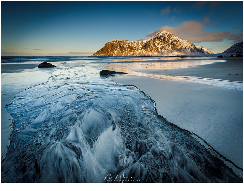
Skagsanden beach at Lofoten with beautiful patterns in the sand. But the mountains attract too much attention. Now there are two points of interest in one picture, each fighting for attention. (EOS 5D IV EF16-35L | ISO100 | f/11 | 1/8)
When you are photographing a landscape, you need to choose a single point of interest, a clear subject. You need to make sure the viewer will see that subject without having to search for it or without getting distracted too much by other elements in the photo. The subject has to stand out from its surroundings. Of course, these surroundings are really important to the photo, simply because it is the landscape in which the subject is situated. But it is also important that it is not getting more attention than our subject. A good composition and guiding lines in a photo will lead all attention to that subject. But sometimes, it helps when you remove all redundant points of attention simply by blurring the background and foreground. In other words, use a small depth of field. At the same time, it can give the photo that sense of depth or even a nice 3D effect.
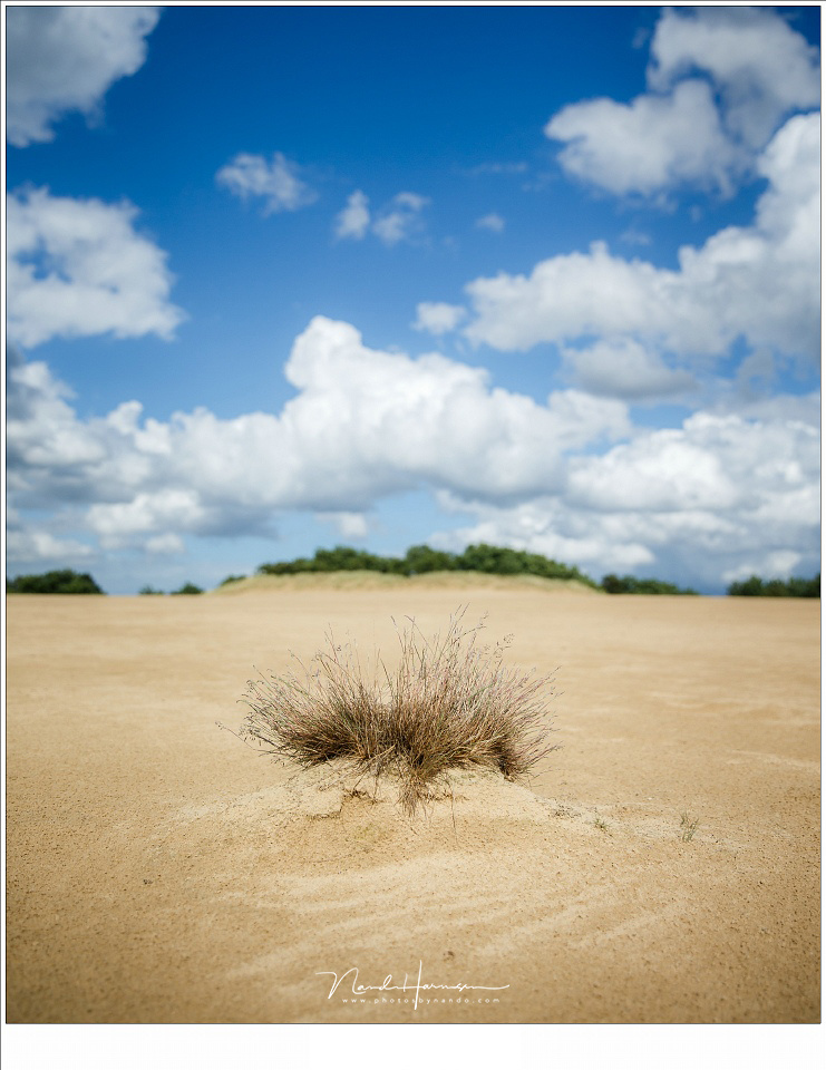
As you can see in the before after example above, a large depth of field will make the background (almost) in focus. But the thing I want to show, the subject, is the grass situated in the foreground. The surroundings and background are important and need to be present, but do not need too much attention. They just have to be there. By introducing a small depth of field, the background is put to the background — literally — while it still is recognizable. I find the photo has gained a real 3D effect in the process.
Below are two other examples of how much difference a smaller depth of field can make regarding the point of attention in a landscape. Also, notice how the photo gains that 3D effect.
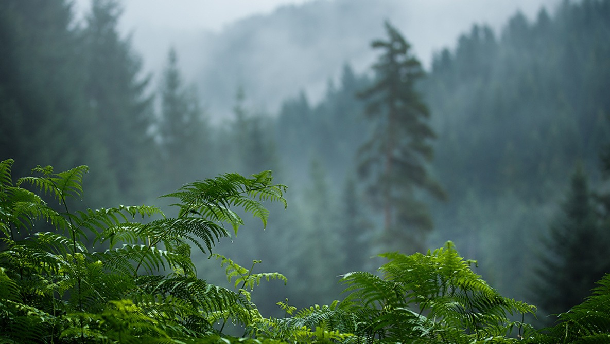
When using smaller depth of field, it is always important to keep the landscape present in the photo, or better said: you need to keep the landscape recognizable. If you remove the landscape from your photo, you end up with that semi macro shot that has no connection with its surroundings anymore. So, be careful not to blur the background too much. In other words, don’t automatically use the largest aperture available, but use the one that gives you the best effect.

These winter birches are clearly standing free from the background because of the smaller depth of field. (EOS 5D III EF 70-200mm | ISO100 | f/2.8 | 1/1600)
If you think that a small depth of field can only be accomplished with a longer focal length, you are mistaken. Extreme wide angle lenses can also be used for a small depth of field. Lenses like the Laowa 15mm macro are a good example, but also, a 16mm wide angle can be used for this goal, especially when a large aperture is possible. You need to close in on your subject as much as possible for the best effect when using these wide angle lenses.

Even with a 11mm focal length, it is possible to acquire a small depth of field, but only if you get close enough to the subject like in this photo. (EOS 1D X EF11-24L @ 11mm | ISO 1600 | f/4 | 1/160 (-0.7EV))
If you really love a small depth of field, you can always consider a tilt-shift lens. You won't get a smaller depth of field with these lenses, but you can replace the position of the focus plane through the tilt function. Although the depth of field doesn't change, it looks like the depth of field has become even smaller than normally possible with that combination of focal length and aperture. This is also called the miniature effect.

With the tilt function of a tilt-shift lens, you can place the focal plane anywhere you like, thus ending up with the background even further out of focus. (EOS 5D III TS-E17L with a few degrees of tilt | ISO 200 | f/4 | 1/320 ( 0.7EV))
Let me know if you ever considered a small depth of field for your landscapes, or if you already use these technique for you landscape photos.


Nice shots and good points made.
Thanks
A bit too funny for me ;)
But the idea of ALCE look snice, if used locally
Meh. It seems to do a mediocre job of emulating what you can already do in Photoshop with a little help from Camera Raw.
Combination of clarity, sharpness, curves, etc... While that plugin is easier, I prefer much more controlled edits. Unless they exaggerated the effects for viewing purposes (understandable), I found the results to be overdone.
Don't forget to use the effects you mention not globally but locally. That is the key to better post-processing.
Absolutely!
They, and others, are used in conjunction with each other. That plugin is certainly easier and quicker but doesn't allow as much control. And for that matter, if you're going to use a plugin, the NIK collection does that and much more, albeit for a bit more money.
I'm sure it'll be useful for some people, just not for me.
This is something that you can do in Photoshop and Lightroom also, and perhaps even better, just like Deleted User mentioned.
Great piece, makes the concept of "depth of field" so much more real and creative ,rather than just another mandatory technical tool to show off pretty things like "bouquet "and the like . Thx for sharing .
Thank you for your comment. :)
Great and super timely article for me. I've been doing a bit of this lately, it does add some depth I feel to the usual landscape photos. It's really challenging to take interesting landscape photos so anything a bit different is good for the genre!
Thanks for sharing. It is fun to do and can be challenging indeed
To me, the "3-D" look has always been about NOT having depth be too shallow, actually. When the background gets too blurry, it makes the background look more like a photoshopped backdrop than a 3-D scene. Only a faint, faint amount of blur, if any, helps with creating that sense of depth.
The REAL help, when it comes to creating a 3-D look, is two things:
Firstly, your actual image needs a strong composition that connects foreground, mid-ground, and background in a way that causes the viewer's eye to smoothly wander the whole depth of the photo. Leading lines perform this job well, of course, but often people still miss the mid-ground, especially when shooting super-close shots at ultra-wide focal lengths. And no matter how strong of a leading line or subject you have in the foreground, if the midground is lost, then the 3-D feeling is lost, to some extent.
Secondly, it has a lot to do with the processing and/or display of the photo, whether online or in print. Ultra-fine detail needs to be brought out correctly, instead of the usual "chunky" detail that most resizing methods employ for web-based viewing, and even printing. (In other words, a finer radius, at a higher intensity, is usually better than a thicker/bigger radius, and a lower intensity. But, this is also a matter of preference.)
(Nikon D750, 24mm, f/13)
It is clear you prefer maximum depth of field. To me the photo you posted does not have a really 3D effect and not a really strong composition. Just a colorfull forground. But hey; that is the nice thing about phtoography. Everyone has his or her own preference and taste. Won't you agree?
To most viewers, a "3D image" is one that you feel like you can step into. Shallow depth of field, and a missing mid-ground, simply stop the viewer from being able to do that.
Using a shallow depth of field may create a perception of depth, or layers, for people who actually understand why bokeh exists, but when an image is hung massively in a gallery, and lit perfectly, it is the criteria I previously listed which make an image seem truly "deep". Sorry that my own example wasn't powerful enough to convey that point. :-\
Thats where opinions differ.
"Using a small aperture with a recognizable out of focus landscape"
FFS
Aperture = Hole
Small Aperture = Small Hole = Large F-Stop Number = Deep DoF
Large Aperture = Large Hole = Small F-Stop Number = Shallow DoF
Just had to get that out of my system...
Thanks for clearing this out.
What an excellent article. Thank you.
You're welcome
Late to the party on this one but just wanted to say it's one of the best articles I've seen in fstoppers. Thanks for reminding us not to stay inside a box.
There were several comments about being able to do this in Photoshop. Seems to me the point of the article is to widen the one's perception about what can be done and the artistic merits of a different concept. Well done, enjoyed very much.