
When I first decided to try converting some of my photos to black and white, it seemed very hard to get good results. I would often rely on using the desaturate adjustment in Adobe Photoshop that I learned in high school 20 years ago. This makes for some very flat and gray looking images. From there I found better results by using tools like Photoshop actions and Nik Silver Efex. This method still lacks control a bit, and in my opinion anytime you have to leave Adobe Lightroom, your workflow speed is taking a hit. Once I learned to emulate the monochrome photos I was attracted to and impressed by, my work started getting better.
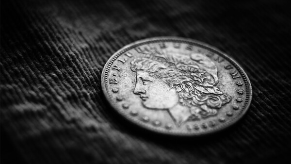
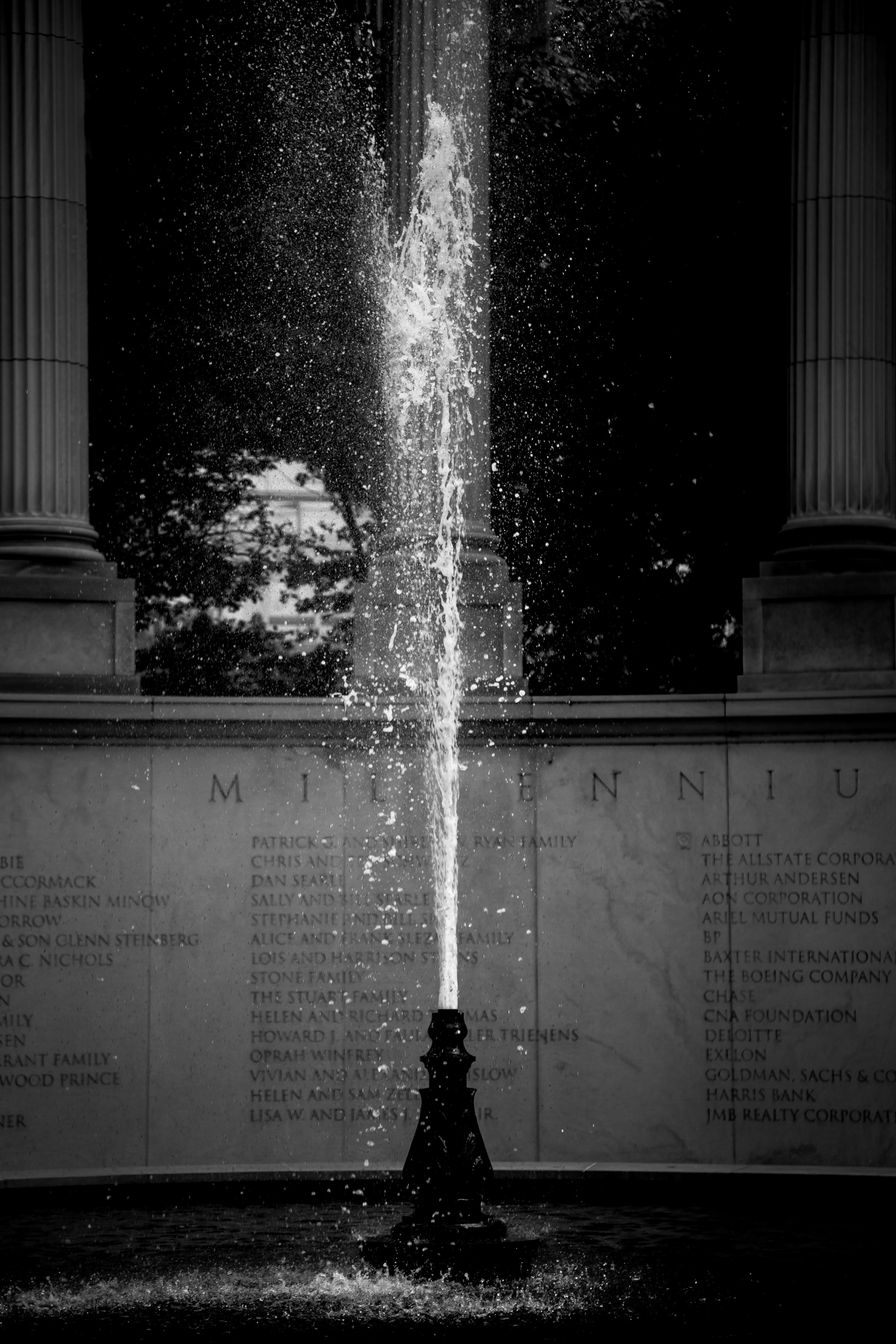
As I developed a taste for what kind of photography I liked, black and white photography grabbed my attention right away for its ability to captivate the viewer in a way color photography often falls short. The shots that I gravitated towards were all either very dynamically balanced with blacks, middle grays, and almost white highlights, or were very contrasty and dark.
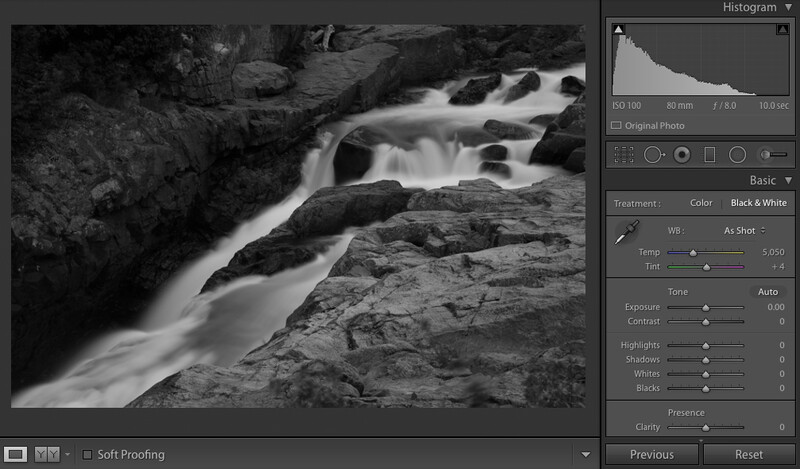
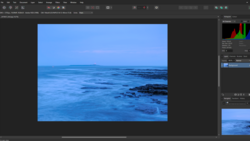
The more I paid attention to this pattern of photos I enjoyed, the easier it was to start to emulate. By simply using the following sliders in Lightroom you are able to really refine a monochrome image quickly:
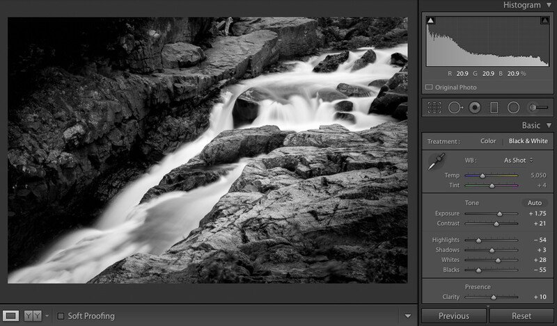
The main thing I've found that I prefer is blacker blacks and whiter whites. Black and white photos also seem to be more tolerant to very dark and moody shots. This is often coupled with one strong light source drawing the eye.
Sometimes you may be tempted to use some split toning or a fade effect on your photos. While I think it is appropriate at times, I also think there is a bit of dating yourself when you use these more trendy looks. It might be good to not overuse unless that is the direction and look you want for all your work.
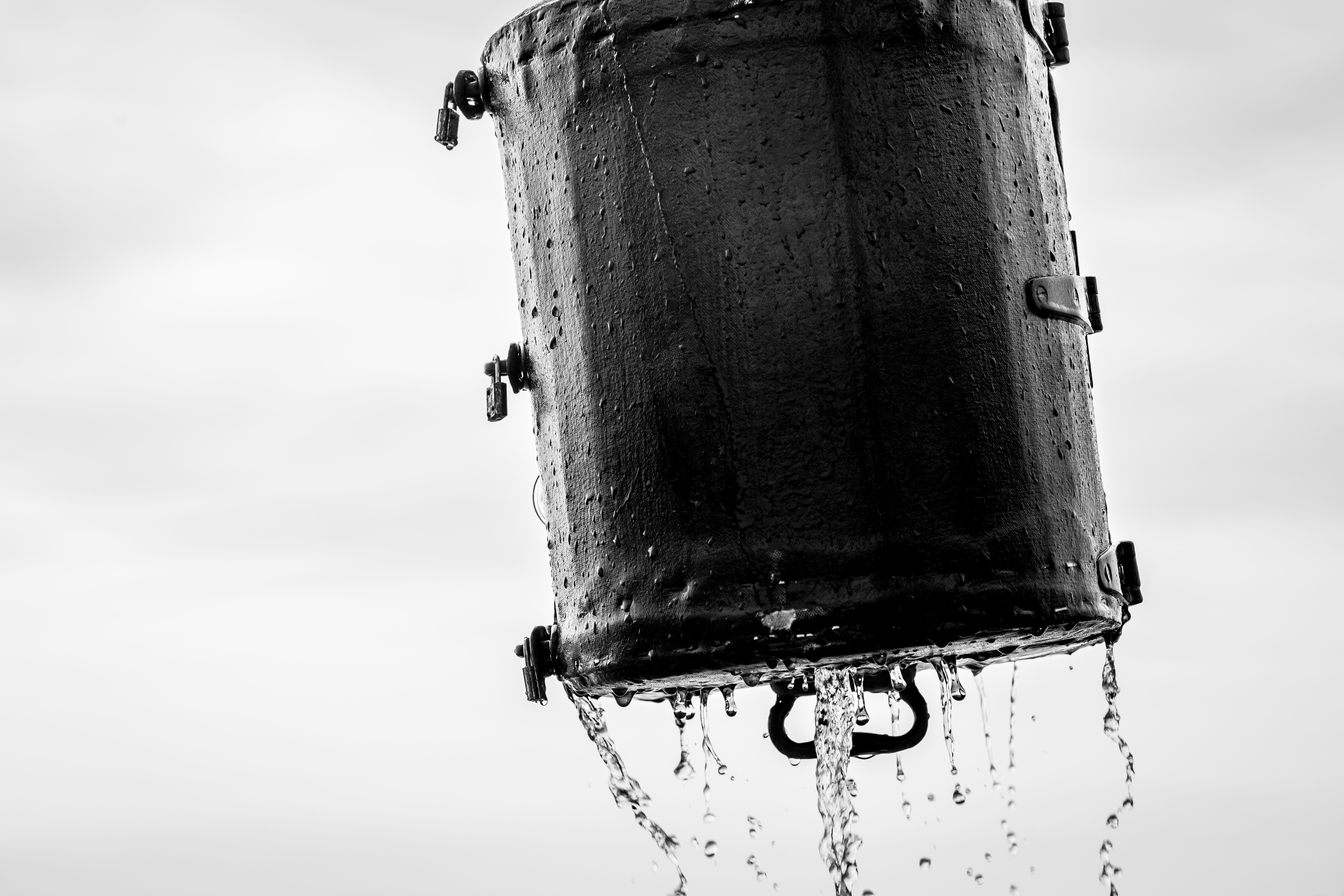
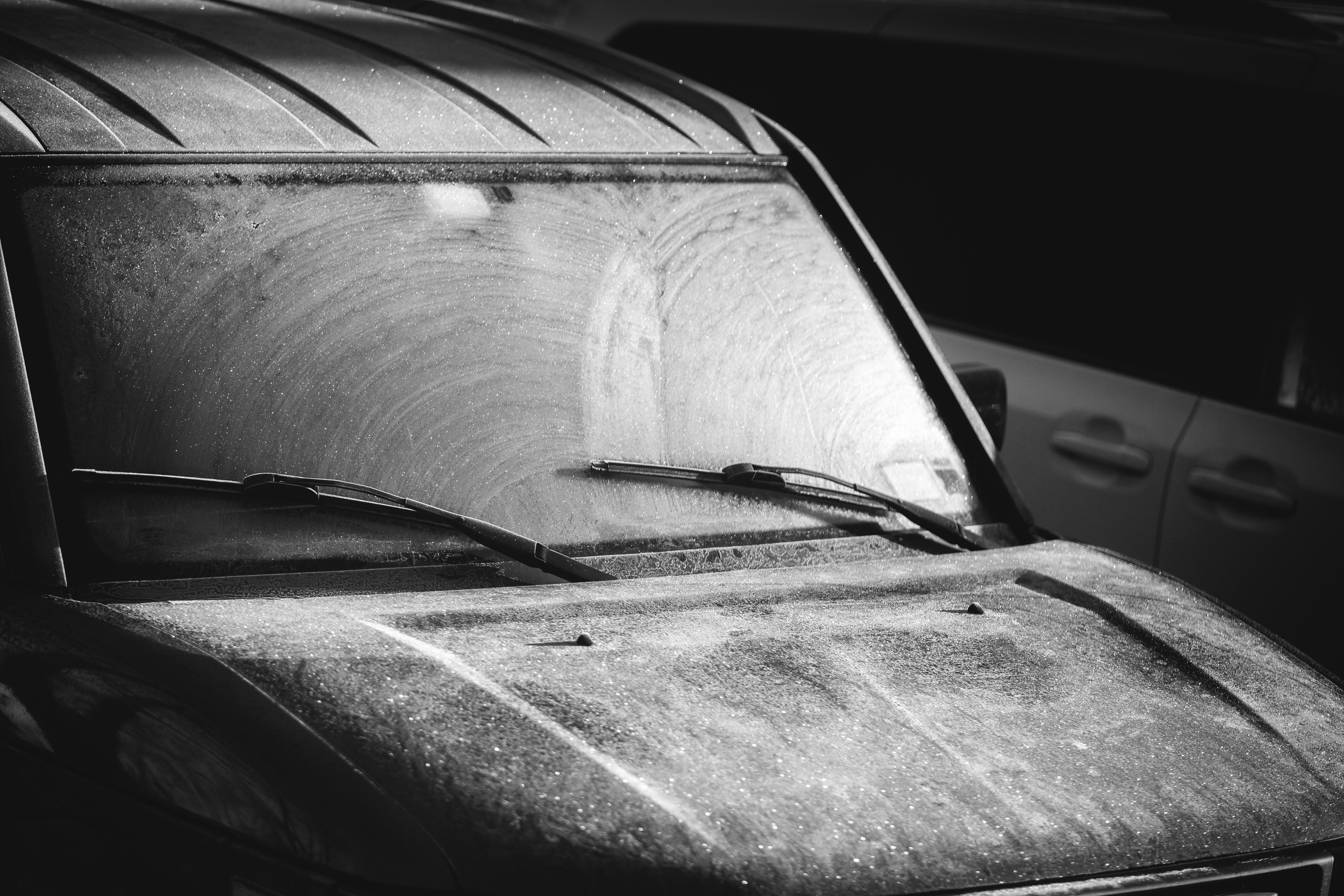
Another thing that I love in all photos that truly shines in monochrome is rim-light. I happen to love this shot below of my Honda Element from a frosty Western New York morning. The light captured on the top of the left wiper makes it for me.
So if you've struggled with converting to monochrome in the past, try and think about the photos you've seen that you like and try your hand at editing in that style. You may just surprise yourself.


Join the Fstoppers community for free
-
Post comments and join in the discussions
-
Browse the site ad-free
-
Share your work and get featured in the community
-
Compete in the photo contests for fun and prizes
2 Comments
When I worked B&W in the darkroom we had these red filters that we'd stuff in to the enlarger boost contrast. I preferred this method to the graded paper route, just my preference. And now that I live in Lightroom I like to see clipping on both ends, no matter what the shot. Maybe it's because of that early darkroom experience, but it doesn't feel like B&W if there are no blacks or whites. This article reminded me of that time, and method of development. A look I always appreciate, and one that now helps me decide if an image is worthy of the greyscale treatment. If it looks like mud when I convert it, then keep it in color, but if there are deep blacks and brilliant whites...
I remember the red filters! Thanks for reading and the great comment Andrew.