

Consistent photo editing can be a huge factor in ensuring that your brand is cohesive. Knowing how to achieve consistency on a regular basis is a handy tool every photographer should have in their skill set.
When marketing your photography and business to potential clients, an essential aspect of building trust with a potential client base is having a consistent brand. For photographers, one of the most visible elements of our brand is our photography. If our editing or post-processing style differs from photo session to photo session, we’re missing out on a tremendous opportunity to build trust and confidence amongst not only potential clients, but our peers as well. Here are a few tips to help you have a more consistent photo editing process.
Pay Attention to Skin Tones
If you’re a portrait photographer, skin tones are one of the most critical aspects of your photos. Making sure that your subject’s skin tones are consistent, as well as true-to-life will help set you apart as a professional photographer. When post-processing portraits, pay particular attention to the temperature and tint of your subject’s skin tone. Ensure that every photo, from start to finish within your workflow, is close to the same temperature and tint regardless of lighting situation. This doesn’t mean that your kelvin settings need to be the same in Lightroom between photos, but the tones should match one another.
Likewise, for photographers who don’t photograph portraits of people, a good tip is to pay attention to the temperature and tint of the highlights in your photos to ensure a more cohesive post-processing look throughout all of your photos. A great way to compare photos throughout your workflow timeline, if using Lightroom, is to use Reference View to make sure your tones are accurate between photos.
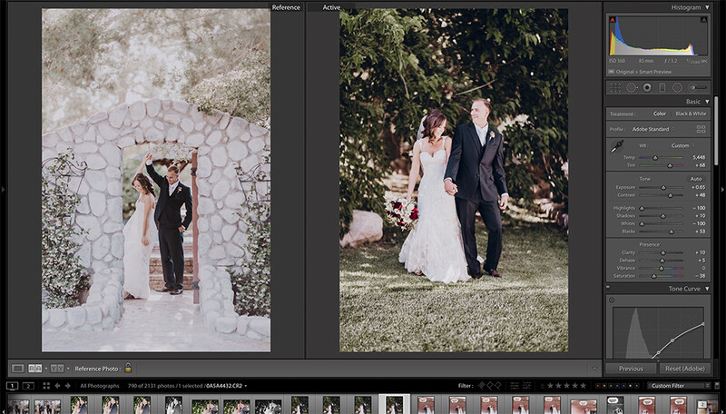
Using Reference View in Lightroom
The Reference View feature within the Develop module of Lightroom has become one of my favorite tools to utilize during any post-processing. Over the last year or so, this one Lightroom feature has helped me to build a hugely consistent portfolio. This is important so that clients know exactly what to expect with the end product when they receive the photos they’ve commissioned.
In order to achieve consistency between tones from photo to photo, or even between photo session to photo session, I’ve put together a folder of reference photos for myself that I can pull into any active session that I’m currently post-processing. My reference folder has a handful of photo samples from various photo sessions and a wide range of lighting and skin tone samples that I can use with Reference View to make sure my tones are entirely consistent regardless of lighting or skin tone differences.
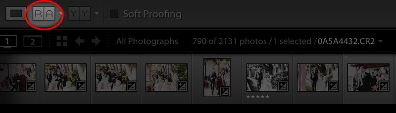
To use Reference View, while in the Develop module, make sure your toolbar is visible (if it isn’t, press “T” or go to View>Show Toolbar). Within your toolbar (on the bottom left of your screen), you’ll notice Reference View, illustrated on your toolbar as “R|A” (you can also press Shift+R to enter Reference View). Once in Reference View, you can drag any photo within your current library into the left side of your screen, which then becomes your “Reference” photo. As you cycle through photos within your library, you’ll notice the right side of your screen becomes the current photo you’re working on or your “Active” photo. When you’re done comparing your active photo to your reference photo, you can simply advance to the next photo, or leave Reference View by clicking the “R|A” icon on your toolbar or pressing “D” to return to regular view.
Presets: Only Use One or Two
Whether you’ve purchased presets in the past, or have built your own from scratch, for the sake of consistency, it’s important only to use one or two presets throughout all of your post-processing.
The last thing any photographer should want is an identity crisis within photo editing. The more presets we use when editing, the harder it is to achieve consistency across the board. An unintended side effect of using many presets is that your clients won’t know what the result will be with photos. This is the last thing we as photographers should want. The point of having a consistent brand and consistent photo editing is to build trust amongst our client base. By using many presets, we’re doing the opposite of trust-building.
Try to choose one to two presets that can be used in a variety of settings and stick with those presets. I have one color preset and one black and white preset that I’ve cultivated over the years to work in many lighting situations and with multiple skin tone types. I’ve found that by sticking to my one preset, I’ve been able to achieve much more consistent results.
Bonus Tip: Instagram Feed Consistency
If you’re struggling to build a feed that is consistent and that conveys your brand effectively, try using an app like Plann or platform like Planoly to plan your feed accordingly. You can use these platforms to upload photos and compare them to the rest of your feed to ensure that each photo is consistent in color, tone, composition, and overall feel.
Consistency in photo editing is one of the best ways to build a strong brand. When you work on achieving consistent editing between various photo sessions, you’ll notice your portfolio will strengthen, your social media will become better (I’m looking at you Instagram feed), and you’ll find that you’ll start to build a stronger following. People will know what to expect from you as a photographer, and your work will be that much more unique and true to your style because you’ll actually have a style. A consistent style.
If you feel like your past work or portfolio is lacking, revisit how much time you spend on consistency. You may find that by paying closer attention to your tones, presets, and overall brand flow, that you’ll build a much stronger brand and presence. Consistency may be the one thing missing from your photos that can help you to develop your own unique style.
Lead image by Negative Space via Pexels.


Join the Fstoppers community for free
-
Post comments and join in the discussions
-
Browse the site ad-free
-
Share your work and get featured in the community
-
Compete in the photo contests for fun and prizes
4 Comments
Love the tip about reference view. Never really thought about that before, but yeah - Time saver!
Amazing tip the reference one! never heard it before!
those are instructive articles, with basic stuff + amazing tips here and there
thumbs up to this! Thanks
Consistency isn't an overnight thing. It requires investment, dedication, and love for what you're doing. Much the same as throughout everyday life, consistency in photography will bring you an achievement, yet it requires a considerable measure of work! So take the weight off possibly! When you're not working with customers, rehearse by taking your camera out and simply playing with what you've gained from your appearance. Discover a style or alter that you adore and that sparkle light on your qualities as a craftsman (https://photza.com/blog/view/online-photo-editing - read about this in details). We need to limit it down in light of the fact that when we're attempting to do everything, we don't get extremely reliable with anything. Great article. I agree with all you say)