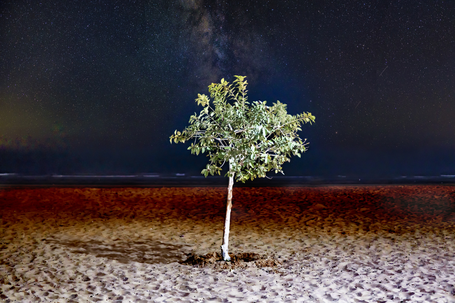
I like the concept and the placement of the milky way is perfect, but I do have two critique.
The first is that the light on the tree is too harsh, making it look blown out and white.
The second would be with the framing (and this is more of a preference), but I'd rather see this from further back or a wider angle, to showcase the stars a little more.
A nice concept but composition could be better. As mentioned by Jena. I'd like to see this as a vertical crop. I agree with Jordan that the whites are too harsh. The light on the ground around the tree is too bright for me and detracts from the stars.


4 Comments
I have edited the harsh shadows and did some burning.
I like the concept and the placement of the milky way is perfect, but I do have two critique.
The first is that the light on the tree is too harsh, making it look blown out and white.
The second would be with the framing (and this is more of a preference), but I'd rather see this from further back or a wider angle, to showcase the stars a little more.
I would take down the whites and make this a vertical shot but I think this is very interesting!
A nice concept but composition could be better. As mentioned by Jena. I'd like to see this as a vertical crop. I agree with Jordan that the whites are too harsh. The light on the ground around the tree is too bright for me and detracts from the stars.