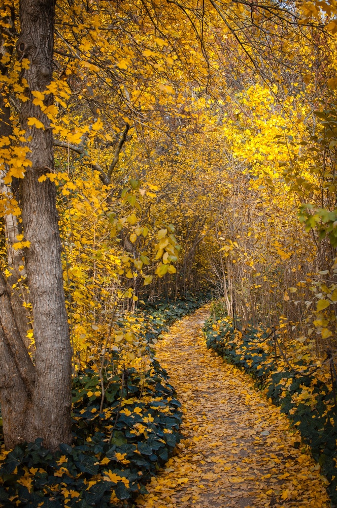
A good solid image. The greens along the path don't look real to me. It looks like the color was edited to have more of a punch. I would love this image if the green was a little lighter. I am curious about the tree on the left. maybe a wider crop would help with those questions, it could also take away from the image. I like the depth of field and composition over all.
i agree with andy, a wider shot would be very good. the colors are imho very nice. a little more differentiation between the branches and the leaves would be good. needs a bit work i say.
I like this a lot! I would've centered more on the path and brought the angle down lower if I were to do a vertical shot like this but the colors look great and it's a beautiful scene.
Thanks very much Andy, Richard and Jena for your comments and insights. You made me courious about my own image, I have gone back to the raw image a check how I processed it, as this image was taken one year ago and I did not remember very well. The image was taken with a prime 50 m 1,8 on my beloved-but-in retirement D90(dx), that makes like a 80 on full frame. It is a very small path located in a romantic historical garden. The image is uncropped. Yes, the yellows are enhanced, but the green crawling plants have this darken green color naturally, probably the high iso on a dx sensor makes the shadows look this way.











4 Comments
A good solid image. The greens along the path don't look real to me. It looks like the color was edited to have more of a punch. I would love this image if the green was a little lighter. I am curious about the tree on the left. maybe a wider crop would help with those questions, it could also take away from the image. I like the depth of field and composition over all.
i agree with andy, a wider shot would be very good. the colors are imho very nice. a little more differentiation between the branches and the leaves would be good. needs a bit work i say.
I like this a lot! I would've centered more on the path and brought the angle down lower if I were to do a vertical shot like this but the colors look great and it's a beautiful scene.
Thanks very much Andy, Richard and Jena for your comments and insights. You made me courious about my own image, I have gone back to the raw image a check how I processed it, as this image was taken one year ago and I did not remember very well. The image was taken with a prime 50 m 1,8 on my beloved-but-in retirement D90(dx), that makes like a 80 on full frame. It is a very small path located in a romantic historical garden. The image is uncropped. Yes, the yellows are enhanced, but the green crawling plants have this darken green color naturally, probably the high iso on a dx sensor makes the shadows look this way.