
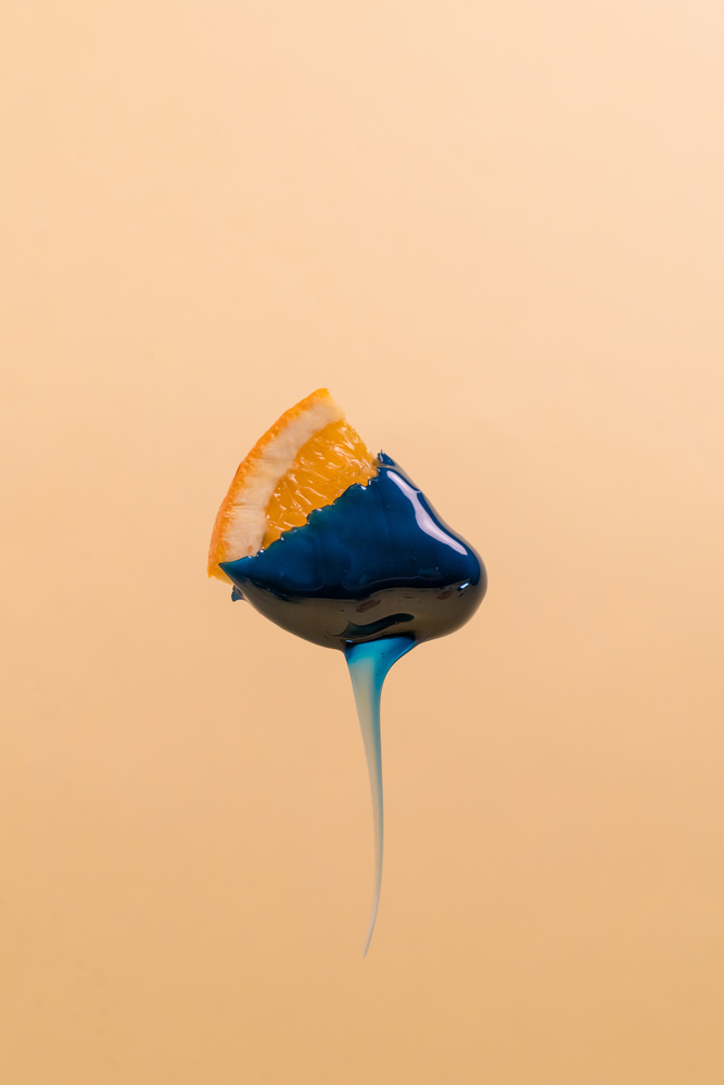
This image I shot, was for a hair waxing company. I thought it would be creative to use fruits along with the wax to symbolize how gentle the process can be with this company's products. While also using pops of color to compliment the product colors
Contest Submissions
Click on the thumbnails below to comment and rate each image.
Click here to learn about the Fstoppers rating system and what each star value means.



























2 Comments
I never would have guessed what the concept was for (interesting... waxing!) but I really love the sharpness, and graphic execution. Orange and blue are my favorite complementary colors, and they really pop here. Interesting, definitely.
That is just beautiful