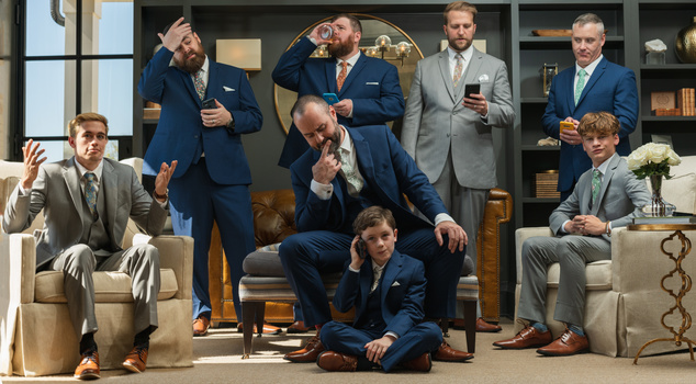
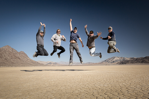
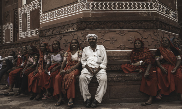
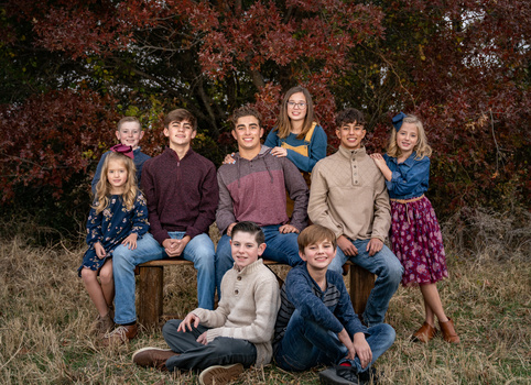
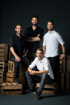
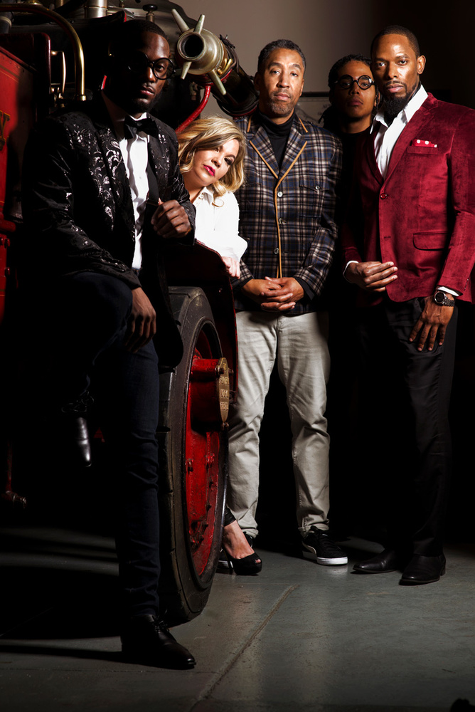
This is a great opportunity lost. Nice subject, nice composition. However, the light is far too contrasty. It really needed a softened light source, or better yet, two. The harsh shadows partially obscure two of the faces, and the woman's shirt is blown out as is the white shirt worn by the gentleman on the right. I would recommend cropping up from the bottom to eliminate the black "bump" at the lower right. Since there is space between the arm and the photo edge at the left, I would recommend the same on the right - it's been cropped too tight into the arm.
Funny thing is I liked the harsh lighting. This was actually a cover for a magazine. That being said I can see why a softer more even light would be more pleasing. Ill keep it in mind for next time, thanks for the comment.


2 Comments
This is a great opportunity lost. Nice subject, nice composition. However, the light is far too contrasty. It really needed a softened light source, or better yet, two. The harsh shadows partially obscure two of the faces, and the woman's shirt is blown out as is the white shirt worn by the gentleman on the right. I would recommend cropping up from the bottom to eliminate the black "bump" at the lower right. Since there is space between the arm and the photo edge at the left, I would recommend the same on the right - it's been cropped too tight into the arm.
Funny thing is I liked the harsh lighting. This was actually a cover for a magazine. That being said I can see why a softer more even light would be more pleasing. Ill keep it in mind for next time, thanks for the comment.