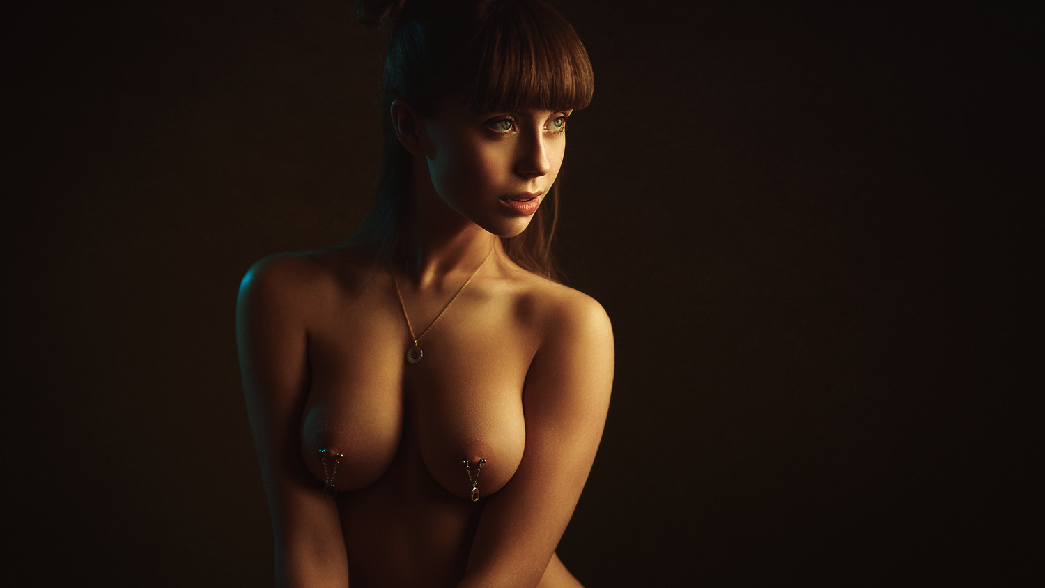
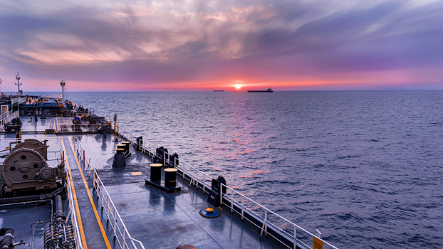
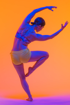
Maybe not the most extreme of colors, but Im a sucker for the exaggerated orange and teal look here.
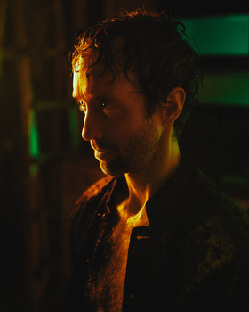
Shot with tungsten modeling lights as opposed to flash. Which allowed me to shoot in F1.8
Contest Submissions
Click on the thumbnails below to comment and rate each image.
Click here to learn about the Fstoppers rating system and what each star value means.


2 Comments
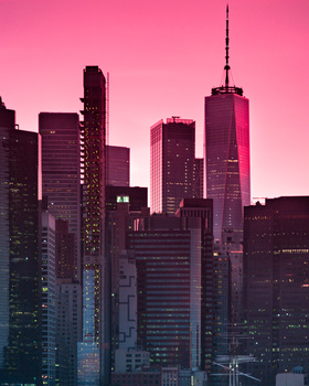
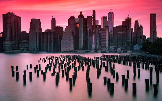
The result is incredible and professional, but I am not positively reacting to the negative space. The shape as a whole feels too current "standard" 16:9, almost like that frame cheapens your work or message a bit. Your other photo is stronger because the frame is tighter. But I love orange, so I love for warm glow.
Thanks for the feed back.. 16:9 will always be my favourite aspect ratio and I dont see the issue of filling a pc monitor with the image rather than having the negative space be a black border, that makes no sense to me. One can always zoom in and crop if they are on a mobile device.. OR turn it the right way :)