Man I love how no one tells me what's wrong with the photo. If you aren't going to tell me how to improve as you rate the image low then fucking suck a dick
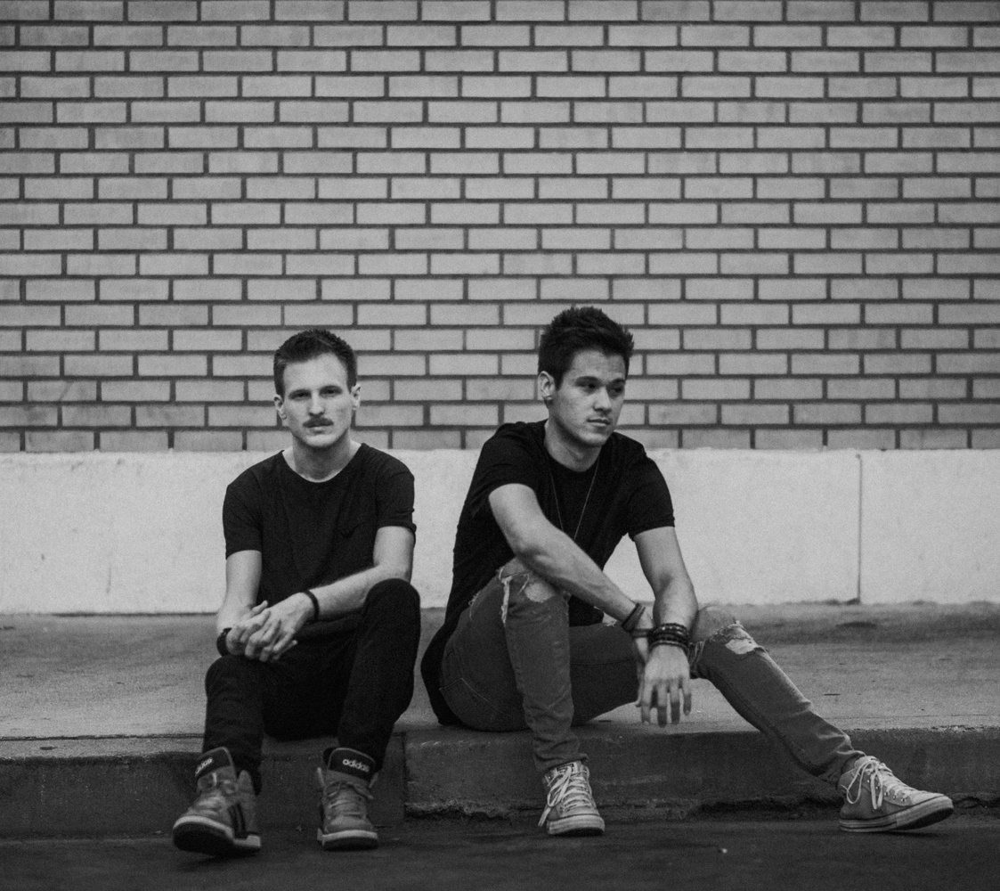
i didnt give you a 1 star but i will give my 2 cents. i love the model's poses and the lighting is nice/soft but the composition is a little awkward and there's not a whole lot of depth. something that i think would help with depth would be to get lower and have the models feet work as leading lines to their faces. a great rule of thumb from someone like froknowsphoto is to set the eyes of the subject on or above the top 1/3 of the image and it generally helps keep the subject the main focus of the image. you could cut out a lot of dead space above the subjects (the brick wall) and that alone would help a lot. hope this is helpful!












2 Comments
Man I love how no one tells me what's wrong with the photo. If you aren't going to tell me how to improve as you rate the image low then fucking suck a dick
i didnt give you a 1 star but i will give my 2 cents. i love the model's poses and the lighting is nice/soft but the composition is a little awkward and there's not a whole lot of depth. something that i think would help with depth would be to get lower and have the models feet work as leading lines to their faces. a great rule of thumb from someone like froknowsphoto is to set the eyes of the subject on or above the top 1/3 of the image and it generally helps keep the subject the main focus of the image. you could cut out a lot of dead space above the subjects (the brick wall) and that alone would help a lot. hope this is helpful!