


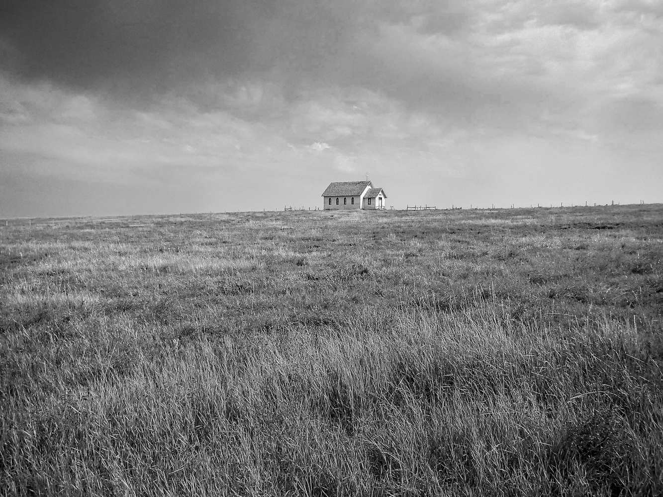
This was a roadside stop for a small western town in the Dakotas. I turned away from the tourist part to find this church off on a low hill. I like both the color and BW version.
Click on the thumbnails below to comment and rate each image.
Click here to learn about the Fstoppers rating system and what each star value means.
5 Comments
Dan interesting photo but there is no lead to the subject, the long grass in the bottom third draws my eve away from the subject. Sorry I feel mean now so you may crit me harshly.
Always enjoy comments, find them very helpful. thank you for the honesty.
I wonder if it could benefit from greater contrast? It has dramatic sky and a textured foreground that would be great to bring out and offset the lonely subject of the single building.
Mike I would have cropped out the long grass in the foreground and cropped off about the same on the right side of the photo. Don't work on the contrast, just darken the shadow and lighten the whites a little. You need to bring your subject a little more to the right and then crop your foreground so that the building is just above the bottom third of your pic with the horizon on the third. If you see that it looks a little flat then adjust the contrast until the picture pops out at you.
I like the grass. I'd darken the shadows in the sky to bring some contrast and balance the foreground. The church? ... It's perfect! - in the middle, but small and somehow unimportant. Like in today's societies - seems distant and neglected with its barely visible Cross. And the storm above...see.
All the best everyone! God bless and thank you for sharing! :)