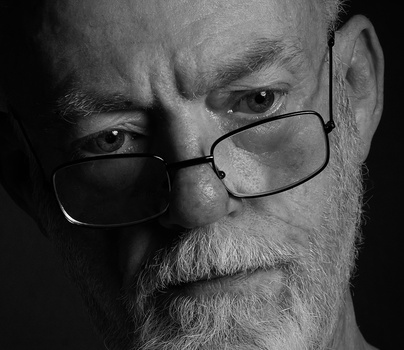


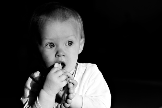
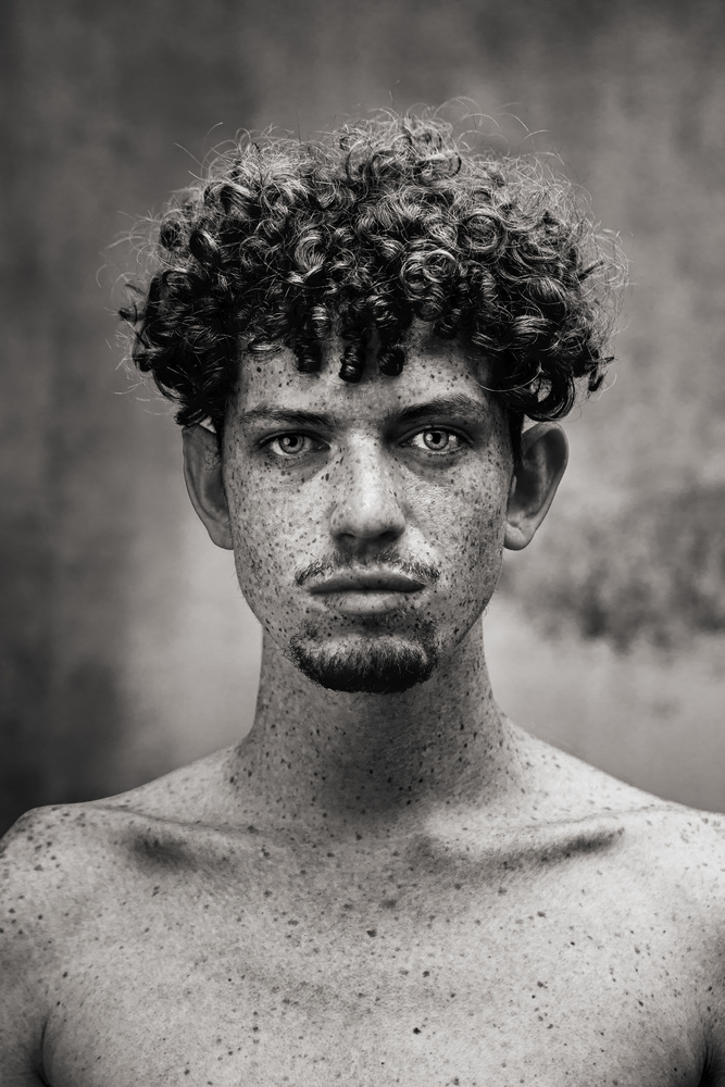
My entire portfolio is in color, this photo was an opportunity to challenge myself and photograph in a style outside of my comfort zone.This portrait was the Sony World Photography Awards 2023 US National Winner, so I will say challenging myself paid off in the end.
I wanted to show expression through my subjects gaze. I had a basic setup a 60 inch parabolic umbrella with diffuser directly overhead my subject to create very soft light that adds highlight to the unruly curly hair and creates strong shadows below due to the direction of the light accentuating his collar bone and a very tiny reflector underneath to fill in the shadows under his eyes and add more light into his eyes. I shot knowing that it would be a black and white image with strong blacks that highlights his beautiful skin and freckles to create a rawness feeling to it.
Post Production:
Only raw adjustments in Adobe Lightroom and Black & White conversion.
Click on the thumbnails below to comment and rate each image.
Click here to learn about the Fstoppers rating system and what each star value means.
1 Comment
You're obviously a very talented photographer, Angela, with great care for detail. The aspect of this image though which I find a bit disturbing is the solid black tones of his hair above the eyes and ears... the blackest blacks in the image. Stands out in contrast to the mid-tones and highlights of hair on the top of his head. Draws attention where there should be none, in my opinion. Maybe the same issue with the chin. I would have thought the reflector from below would have lit the front of his hair a little more. So my eyes detour from the gaze of your subject's eyes to his hair.
I'm trying to process my response to your photo in light of your comments on contrast. Naturally his freckles create a lot of local contrast, but your soft light overall, distributed evenly from side to side, feels counter to the "bold" contrast you're describing. The "strong shadows" which you say that you used to accentuate his cheek and collar appear more like delicate shadows to me.... accomplishing what you wanted, but nothing like the really dark tones of his hair which is where the punchy contrast comes from, if there is any. I still feel like the image, overall, is more flat than contrasty.
You nailed the expression, so is it reasonable to critique the shadow detail?