What once was old and lost can be found new again, can’t it? That’s what photography is all about, after all. Sealing something in time. A visual tomb, preserved without the breeze of the next day to blow it along, but never suffocating. Alive. It's funny that this is how I felt when I stumbled across photographs from The National Gallery of Australia’s "Colour My World" exhibit.
What was once a trend that faded away with the onset of cheap 35mm film and one-hour developers caught my eye as eccentric and somehow classical in appearance. Hand painting on black and white prints might be a thing of the past but it’s fun to observe what the trend meant for the times.
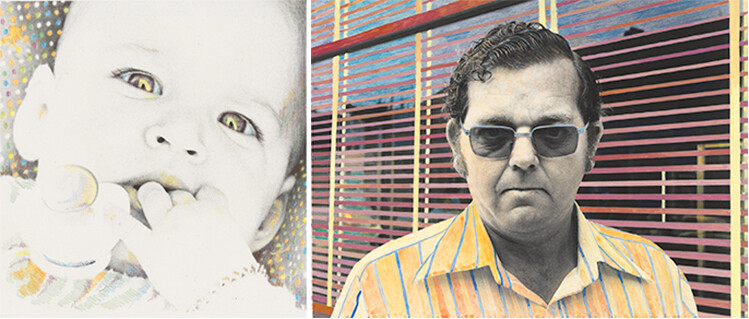
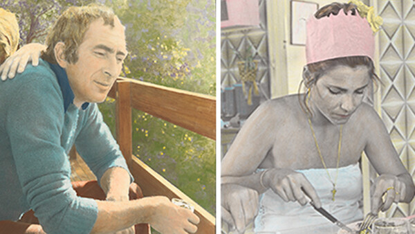
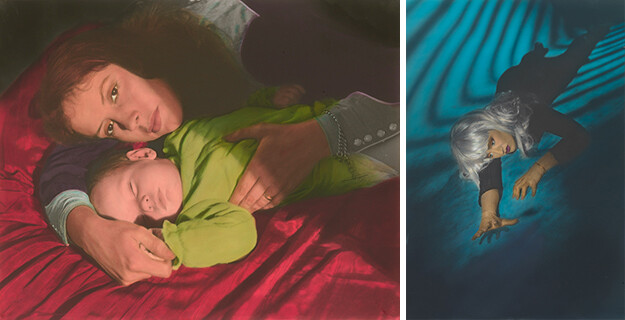
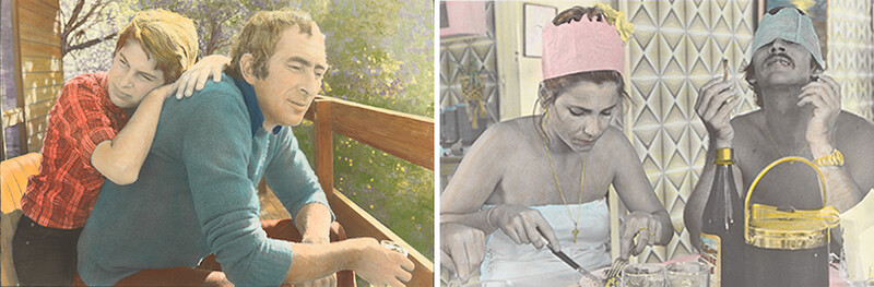
This photography gallery is on display at the National Gallery of Australia until Sept. 20, 2015. It's an observation of a relatively modern technique that was born out of retouching methods used to repair, preserve, and colorize black and white prints.
“The 1970s saw a revival of handcolouring among a number of Australian photographers and it remains a significant aspect of contemporary practice,” reads the National Gallery’s website. “The artists included in this exhibition seek to create a direct connection between their experience and that of the viewer.”
I was surprised how drawn I was to the funky colors and almost Warhol-esque pop art look that these late 70s and early 80s prints presented — especially if I'm honest in how often I’ve scoffed at dramatic Photoshop trends that have only recently been bucked by the mainstream.
Selective color anyone? It’s hard to deny the parallel between the look of the aforementioned painting technique and the most famous Photoshop trick of the early aughts. Is it possible that in the not-so-near future I’ll stumble upon a gallery of white vignettes and black and white brides clutching deep red bouquets and be filled with the same whimsy? I’m betting not, but who knows? These trends really do define us as artists. None of us are truly immune to the pressures of our culture and subculture. I have the green stonewashed jeans to prove it.
I love that these images are, to me, just the raucous versions of the colorized photo of my wife's grandmother that is resting on an end table at my in-laws' house. She’s pastel and somehow enhanced in a way that utters the era of the print’s origin without truly announcing a date.
I just can’t get past the idea that nostalgia will make us love everything again someday. I know, the film nerds are going to hammer me for comparing anything silver halide to selective color, and perhaps they are categorically different enough for me to feel ashamed of the comparison? Perhaps.
Either way, hand painting is pretty cool and you can even find some sort of instruction to do so yourself, if you’d like to relive this trend.
All images used with permission.


Join the Fstoppers community for free
-
Post comments and join in the discussions
-
Browse the site ad-free
-
Share your work and get featured in the community
-
Compete in the photo contests for fun and prizes
3 Comments
I've got a pretty good sized set of Veronica Cass oils, if anyone wants to have a go...
We used to do this in high school, I found a few of the pics I did recently. Its pretty cool.
Show us, Ricky!