
How far should you sit from your screen? How large can you print your photos? Why are stacked sensors better? There is much more to those pixels than you might think.
Our eyes’ retinas comprise millions of photoreceptor cells, individual light detecting points called rods and cones. Each eye has about 576 million, with rods detecting a grayscale image and cones picking up the color. The cones stop working in low light, so you can’t see that roses are red and violets blue at night. There is also a third type of cell called the photosensitive ganglion cell, which is not involved in vision but in adjusting your iris and circadian rhythm. These parallel the light meter that adjusts the exposure in your camera.
That’s a lot of photoreceptor cells in your eye compared to the equivalent photoreceptors on your camera’s sensor. However, that high resolution is mainly concentrated in a small area in the center of your retina, the fovea, and beyond that, the resolution is not so great in peripheral vision.
You can test this with your eyes. Gradually move closer to your monitor or TV. You will see the individual pixels that make up the picture at some point. However, you can only see those directly in front of your eyes.
The distance where you can see the pixels will vary depending upon whether you have an HD 1080p or a 4K screen. Consequently, the viewing distance should depend upon the monitor you are using. Sit too far away, you can’t resolve all the details in the image, too close and you will see the pixels.
For a 1080p HD screen, the viewing distance should be about three times the screen’s height.
I’m typing this using a 24” HD monitor, so the screen’s height is about 11.8”. Therefore, I ideally need to sit approximately 35.4” from the screen. For a 4K monitor, I should be 1.5 times the screen’s height, 17.6”, away from the screen.
For an 8K monitor, we need to sit closer still to resolve all the details. If my screen were the same size as I have now, I would need to be only 9” from the screen to resolve all the detail. However, I would not be able to see the entire screen at that distance. Consequently, that resolution would be lost on me. Before you rush out to buy the latest 8K TV or monitor, you might want to consider how far from it your chair is and, therefore, how big the screen should be. Otherwise, you won’t get the full benefits of that resolution.
Those measurements are approximations to illustrate a point. My screens are wall-mounted on extending brackets, and I move my office chair around. Consequently, I am never an exact 34.4” from the screen. Furthermore, it also assumes we have perfect eyesight. As we get older, most of us suffer some degradation of vision, not just of resolution, but in dynamic range too.
I typically use 300 dpi, or dots per inch, for printing. That means a 1” x 1” square would have 300 x 300 = 90,000 dots, far more than your eyes can perceive. Accordingly, the image looks sharp. If we reduced that to 85 dots per inch, you would see those dots; the image would look pixilated. If you are old enough to remember the newspapers and comics where the pictures consisted of tiny dots, that was the resolution most offset presses used. Yet, like your computer monitor and TV, the images were supposed to be observed from a reading distance, so the pictures appeared well defined.

If you scanned that newspaper picture and then printed it at a bigger size, those dots would appear bigger and further apart, so you would need to stand further back to distinguish the details. The same happens with low-resolution photographs. If you try to enlarge it too far, the image becomes pixilated and appears soft. Take a few paces backwards and the image shrinks in your field of view. It seems sharp once again. This is worth knowing. If you have a blurry photo that you want to share, it will appear sharper if you reduce it in size.
The printers of billboards know this. That is how they produced enormous prints of images from cameras with far lower resolutions than are available today. People driving past them would not be getting that close and, consequently, could not see the pixels.
So, how many pixels do we need to print an image to hang on our wall?
According to an old chart on the B&H website, a 10-megapixel camera can print a 20” x 30”. However, on the Whitewall blog, from 10 MP upwards, they can print to the maximum size of 106” x 71” (270 x 180 cm). That makes a mockery of the whole race for ever more pixels. Many of us would be better suited to lower resolution cameras with a lower pixel density. That would mean each photodiode — light receptor — on the sensor would be larger. Thus, it could gather more photons, so the signal to noise ratio and the dynamic range would be greater.
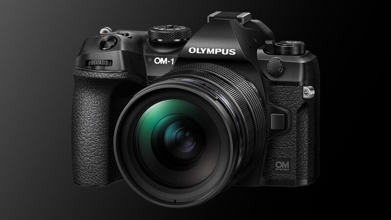
The new stacked sensors, such as the one found in the new Sony Alpha 1, the Nikon Z 9, the Canon R3, and the OM System OM-1 are far more efficient. Put very simply, on traditional sensors, the millions of photodiodes that collect the light sit alongside their associated transistors that process the resulting electrical signal. On a stacked sensor, the transistor sits below the photodiodes. Therefore, each photodiode can use that space and be much larger.
This means the stacked sensor is more like the retina in your eye, where the bipolar cells and the ganglion cells, that act like the transistor, sit behind the rods and cones.
This new technology also allows much faster shooting. The Z 9 and the Alpha 1 can achieve 20 uncompressed raw frames per second (fps), the R3 achieve 30 raw fps, while the OM-1 can shoot up to a blistering 120 fps of uncompressed raw files; a benefit of the smaller sensor.
Going back to the light receptors in your eye, the color-detecting cones are concentrated on the fovea. The rods work better in low light. They are concentrated more on the periphery. Therefore, you can see things out of the corner of your eye at night that you cannot see when you look directly at them.
There are three different types of color-detecting cones. L-cones detect long-wavelength red light, M-cones detect medium wavelength blue light, and S-cones are sensitive to short-wave green light. There are about as many green cones as red and blue together.
That mix of two parts green to one part red and one part blue is duplicated on the sensor in your camera.
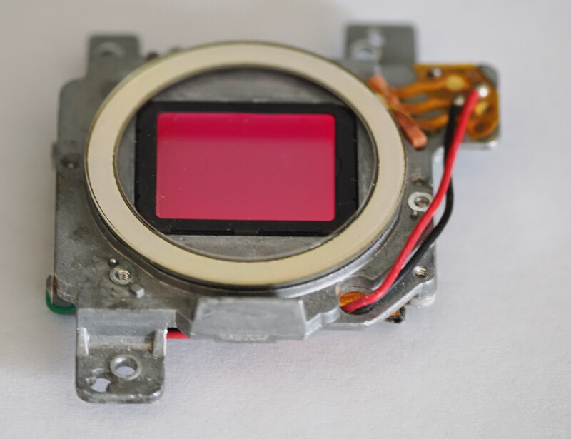
Each photodiode has a light filter that absorbs light at one range of light and reflects it at others. As the more numerous green filters will reflect red light, your sensor will appear to be more of a reddish hue.
I hope you found that interesting. Understanding a bit about how those microscopic dots work can make a big difference to how we work with our photos. Perhaps you have some helpful information relating to resolution, sharing images, and printing that you can share with me. Please do so in the comments below.


14 Comments
Thank you for the original and interesting content! Wish Fstoppers had more of that... Makes a lot more sense why FujiFilm created their X-trans sensor the way they did.
One innovation I hope can be achieved is making a pixel sized spectrometer. If that could be achieved, it would simplify every other aspect of a sensor design. Basically no need for a CFA, IR cut filter, or any other corrective layer. Those additional layers cost you around 2/3 to 1 stop of light reaching a photosite.
If each photosite instead could just output a spectral reading, then every photosite will have an accurate color representation, thus no longer having the color resolution being around half or less of the luminance channel resolution (due to the demosaicing process)
At that point, users would also get the benefit of being able to select the visible spectrum they want, thus being able to show things in the IR and UV range if needed.
The biggest thing holding back current color sensors (besides low light performance, is the reliance on a CFA and demosaicing process to get a color image.
That is really fascinating Naruto. It's great seeing ideas like that aired. Thank you.
Or another thing that would be awesome is if each and every photosite (pixel) would have its very own color filter array. Yup - 40 million pixels, and 40m million color filter arrays to go with them. That would ensure that every pixel records much more accurate and detailed color information than the simple pixels we have now. Who knows, maybe in 100 or 200 years, could such a thing be possible?
Tom, that is how the Foveon sensors work that are in the Sigma cameras. Each photo site is a stack of three photodiodes. Each of the three photodiodes are sensitive to only R, G or B. The blue sensor is on top, it absorbs the blue photons and passes the green and red photons. Next is the green sensor that absorbs green photons and passes the red photons down to the bottom red sensor.
I have no experience with the Foveon sensors themselves, but I have some experience with other electro-optical sensors that are multispectral and built with stacked photodiodes. In principal, they can be much better than mosaic sensors, but in practice, it is difficult to achieve the same level of sensitivity and noise in the stacked structure as in a flat structure. Color separation is not as clean, There is bleed from one color to the others, and some loss of transmission of the photons from the upper diodes to the lower diodes. Balancing the color output requires complex compensation to eliminate the crosstalk between the colors, and inevitably leaves some artifacts. The effects are more pronounced the smaller the geometry of the pixels.
I'm not sure why the technology hasn't caught on more in the camera market. It is undoubtedly more expensive to manufacture, the complexity means lower yields, and from what I have read, the Foveon sensors have never been able to achieve the same signal to noise performance as the mosaic sensors.
I hope that efforts continue on this class of sensors. The benefits are significant, but overcoming the negatives and being able to manufacture at low enough cost and high enough yield will be challenging.
There has been ongoing research on photosensors in which the spectral response is electrically tunable. In principle, this would allow each photo site to have a single photodiode that could take three successive readings, one in each of the RGB wavelength ranges. These are highly experimental at this point, so not practical in the near term, but the enabling graphene and nanotube technologies are progressing at very high rates. For photodetectors, this is the holy grail.
So, you won't have to wait 100 years, but probably more than 10.
Regarding "stacked sensors" - what's described here are backside illuminated (BSI) sensors. They are not necessarily stacked with other supporting circuitry.
"Reflect red light" - the color filter arrays on the image sensors generally absorb light instead of reflecting it. The red color in the picture probably has to do with the coating on the optical filter (usually AR + IR-cut + low pass) in front of the image sensor.
That's interesting, thanks.
I hate how DPI for printing and viewing has been translated into megapixels required for capturing an image. For those two measures to be equal, you'd need every pixel to capture full color information (instead of just R, G, or B). You'd also need an optically perfect lens and no AA filter.
But none of those conditions are ever true. Thus, more megapixels produce noticeably sharper real-world images, particularly when working with Bayer filters. Based on my own blind tests, this is true FAR beyond the "300 DPI" accepted limit.
Traditionally we've also had very arbitrary limits on viewing distances, whereby people don't view big prints closeup. That's true for billboards, but go into any art gallery and you'll see peole walk right up to images they're interested in and view it at their eye's minimum focusing distance.
Even for personal images, you never really know when some photo you planned to print at 8x10" will be needed for someone's eulogy at 2'x3'. Or you want to make a print for the grandparents but the scale of their home and decorating style require a larger print size to fill the space. Anyway, long story short, there's no point at which more detail is useless, and if you have the means, I'd recommend capturing the highest resolution possible.
Thanks for that interesting comment, Tony. It's good to hear a different opinion.
Is a viewing distance arbitrary? Surely, that is calculated by simple trigonometry. The viewing angle of our vision is approximately 120 degrees. However, most of that is peripheral vision with macular vision only around 16 degrees. Therefore, for a 40" print, one would need to stand 145" back to appreciate the image in its entirety.
With paintings, we stand back and observe the entire work. Only if we are studying the pattern of the brushwork for academic purposes do we get that close. But this was rarely the way the artists intended their paintings to be seen. Surely the same applies to photography.
The photographic artist should be able to decide whether he or she wants people to examine their photos close up. In most - not all - cases, a photograph is shot to be seen as a whole for its entire story to be told. Astrophotography is one example where that may not be true. So, When people are walking close up to an artistic photograph, aren't they misinterpreting the photo's purpose? This is the fault of the viewer, not the photograph.
The photographic artist should be able to dictate how far from the image the picture is viewed. Fair enough, if he has created the photographic equivalent of Where's Waldo, then a higher definition image might be appropriate. But standing up close so the whole image cannot be seen is disrespectful to the photographer,
Furthermore, I believe the majority of amateur photographers require photographs solely for the purpose of displaying them electronically. Additionally, the huge file sizes are an unnecessary expense for storage, require more processing power than many computers have, and are an additional CO2 burden on the planet.
It's a fascinating thing to ponder. Thanks for adding to the conversation.
Actually, Ivor, with very large prints or paintings, most people tend to stand back and view the whole piece at once, then step forward until they are extremely close, to examine the detail in a particular portion of the image. Then they take a few steps to the left, or right, to closely examine the fine detail in another portion of the image.
Most normal people are not satisfied with merely looking at the image as a whole. That would be like holding a newspaper so far away that you could read the larger print of the headline, but not read the fine print of the article itself. Art and photography lovers not only want to see the big picture, but also see and scrutinize all of the super fine minute detail within the image. This is especially true for my genre, wildlife photography, but also quite true for landscape photography, as well as many other genres.
I see your point, Tom. Maybe that is the difference between photographing an identification photo and art. If you are shooting images with the intention of the subject being individually identifiable, where tiny differences matter, for scientific purposes, then I would agree. With art, the entire picture is usually what is
Your observation of "normal" people getting up close and viewing isn't the same observation I make at good galleries where the display is designed to stand back and view from an optimum distance. Many have benches set at the correct distance. Perhaps that's a cultural difference.
I'm not sure if I agree with the newspaper analogy though. I think the difference would be between holding the paper at a reading distance and bringing it too close so you can only see the individual words, which then become meaningless.
Thanks for the comment. It's an interesting discussion.
Ivor,
I am not talking specifically about wildlife photography; hence not specifically about identifying a subject. I am speaking much more broadly, about art in general.
At the art galleries I have visited, which show mainly oil, acrylic, and mixed media paintings and sculptures, most of the people who are there to see the artwork walk up to each piece and look at the details very closely. With paintings, I notice that most of the people step right up to the paintings (many of which are several feet across) so they can see the details in the artwork. And most of them are very interested in the texture of the painting - the actual texture of the paint left by the way the brush strokes were applied. This is normal, and by that I mean that most of the people do this looking up close thing, regardless of how large the piece is.
By "normal" people, I mean people who by all appearances are just regular people who causally enjoy art, and are not artists or art experts themselves. Such as folks who may occasionally go to a local gallery on a Sunday afternoon, or may attend a "First Friday" event at a gallery once a year or so, but who are not "really into it". These are the people who step up real close to whatever it is they are viewing to see the fine detail ,,, an d of course those who are artists and/or photographers themselves also get up real close to examine the fine detail.
I see people doing the same step up close thing when there is a large photo in a hotel lobby or a public building or a restaurant or wherever. This is normal and regular behavior when someone is interested in any type of art that they see on display.
Thank you Ivor! One tiny correction though: The M cones detect the medium wavelength GREEN light, and the S cones detect the BLUE light. :)
Oops, You are right. I must have got carried away in the typing or editing. Thanks!