How do you make sure that your photos make a lasting impression? Is there a formula that can help you achieve better visual design?
Landscape photography goes way beyond just documenting a certain place through photographs. It is not just about traveling to take pictures of a place. The deeper aim of a landscape photographer is to find the best way to see a particular location and provide their viewers with a memorable experience through their photographs.
One way to make a lasting impression in your photos is to give your viewers a satisfying experience of viewing your image. In landscape photography, this can be achieved through different ways in which you entice the viewer to take a bit more time to look at the image and see it not just as a while image but also a harmonious blend of many different parts. Through meticulous composition and visual design, you can achieve better consistency in your photos no matter where you are and no matter what the location offers you.
Depth

Having multiple visual elements that suggest depth in each of the layers of the image attracts more attention.
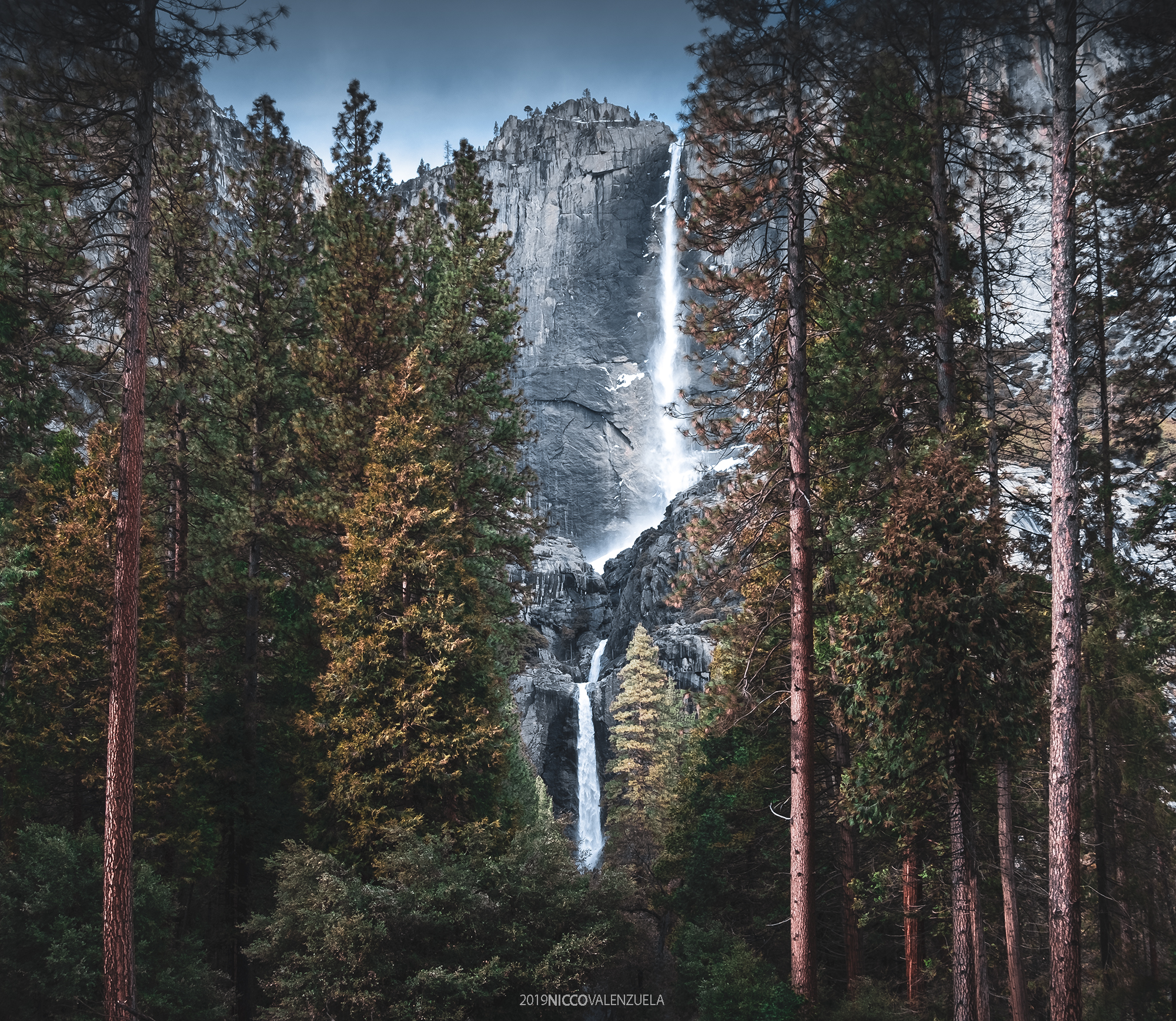
One way to achieve more dynamic visual design is to infuse more depth into your shot. This is achieved by using visual elements present in multiple layers of the scene that would suggest that each layer virtually goes deeper. For more complex compositions, you can divide each frame into three main layers; the background, which is commonly the sky; the mid-ground, where distant visual elements are seen, such as mountains, buildings, or distant bodies of water; and the foreground, which is basically anything in frame that is proximal to the camera. Each of these layers can contain visual elements that suggest depth.
There are various ways to achieve a sense of depth in the background. Specifically in the sky, lighting and motion can emphasize the presence of multiple layers even from a relative distance. One of the main reasons why lighting during sunrise or sunset is often preferred is because the direction from which sunlight illuminates clouds often emphasizes the edges and the spaces between multiple layers of clouds. This is, of course, in addition to the effect given off by the colors cast by the light from the setting or rising sun. Another way to make your background more dynamic is to use motion. One reason for using long exposure when there is relatively enough light is to allow the movement of the clouds to render unique textures that suggest direction.

Diagonal line in the foreground plus the scud clouds in the back.
The mid-ground and foreground can sometimes be interchangeable. The mid-ground often contains visual elements that are relatively distant but not taking up the farthest layer. Depth in the mid-ground would often depend on the structure itself and how it is being affected by light, however certain environmental factors such as fog or haze can also put additional depth into that layer. One common approach to achieve more depth in the foreground is to use ultra-wide angle lenses. Wide lenses have an effect that stretches both the structures and spaces between them in such a way that objects closer to the camera are more emphasized. Using visual elements that create a diagonal pattern also emphasize space and distance within the more proximal area.
Balance

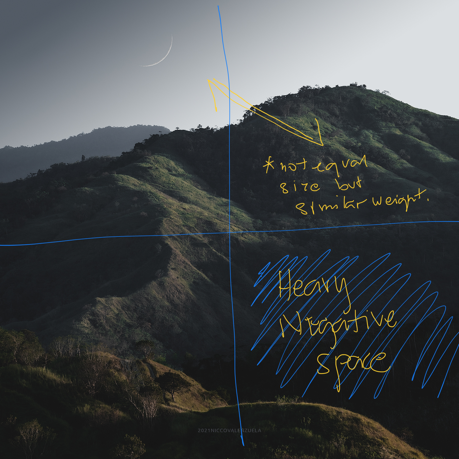
Another aspect through which you can provide a satisfying experience to your viewers is when you attain balance in your visual design. It’s a basic factor to aim for balanced exposures, but balance is actually part of what governs the entirety of framing, composition, and even colors. Every visual element in your frame has its own visual weight. Empty spaces also take up a lot of visual weight. This is not synonymous to the amount of space that an object takes but the amount of attention that it calls for. This can be through its size, its brightness, or its color.

While perhaps the most automatic example of balance in visual design is symmetry, it is not an absolute requirement. The frame does not have to be symmetrical to seem satisfying. Instead, relative visual balance should be the goal. This means that objects with a lot of visual weight should generally be reciprocated on the other side, not necessarily of the same size, or brightness but one with a similar effect. A bright object can be the equivalent of a larger negative space, or an identifiable figure such as a silhouette of a person can be equivalent to a waterfall. What is important is to weigh each visual element with how you perceive it yourself and see how its presence affects the entire frame.
Flow

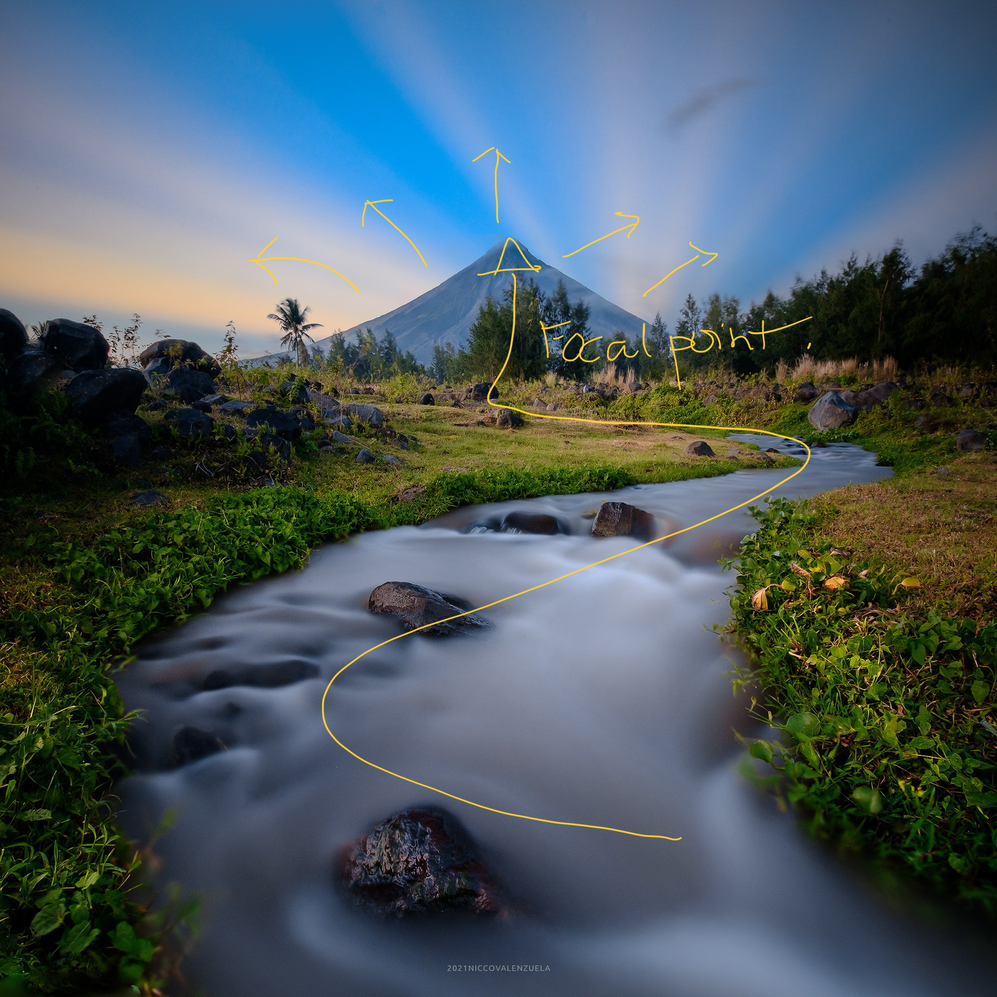
The third factor to aim to have is a coherent visual flow within your photograph. While most landscape images have a focal point, which is perhaps the highlight of the scene, it is important to consider how every other part of the image contributes to the entirety. Imagine the visual experience that your image offers as a tour of a place. You can use certain visual elements as guides or arrows that will lead the eyes of your viewers in and around the photograph. You can use actual lines present in the scene to point to one direction, or you can use objects that represent rhythm or sequences. It can be the flow of water in a stream, traffic trails in the city, the repetition of lamp posts or pillars, or virtual lines created by rocks. Following that idea, the flow will, of course, have to lead somewhere and how you compose your images should be clear about that. The goal is that the visual flow will lead to a focal point at which your viewers will find resolution to the experience of seeing your photo and then see the image as a whole. Every line that points away from this flow and every visual element with considerable weight that competes with the focal point will be distractions.
Shooting landscape photographs and aiming to complete all visual factors might not always be possible. As landscape photographers, we are often limited by what the environment actually offers. Nonetheless, the objective is to put together as much of a visual experience as you can fit within a single frame from what the location has to offer.


