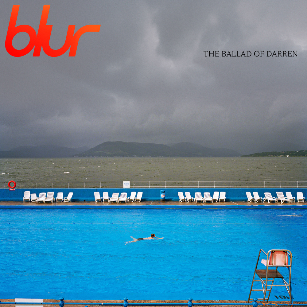
Icons of 90s British indie music Blur have just announced their long-awaited ninth studio album. The cover art has me tilting my head slightly to the left in confusion.
Blur chose to feature an image by Martin Parr for the artwork of their upcoming album release. Parr, known for relaying themes of leisure, consumer culture, and often satire within his work, created an image of Gourock Lido in 2004 during one of many visits to Scotland. This image shows lone swimmer, Ian Galt, in a saltwater pool built directly on the banks of the Clyde Estuary in Inverclyde. The striking contrast between the vibrant, luminous blue pool and the brooding nature of the stormy sky and choppy river waters is a scenario, which no doubt fits with Parr's well-documented love of clichés. The image was made as part of a commission by architect John McAslan, who invited Parr to photograph the area where he spent his childhood between Port Glasgow and Dunoon titled A8, after the stretch of road that runs between each town.
Gourock outdoor pool is a saltwater public lido located in Inverclyde. Opened in 1909, the Lido is Scotland's oldest heated swimming pool and a great spot to head to on a rare warm and sunny day in the country. Scottish fans of Blur were quick to recognize the lido when the album announcement made its way across social media recently, with Inverclyde Council tweeting:
Now, I am not usually one to be hung up on numbers when it comes to photography. I prefer to focus on the concept and context when viewing images. With that said, one thing that should always be true when it comes to photographing bodies of water is that the horizon should always be straight. The horizon in this image is ever so slightly tilted. I say ever so slightly, but it annoyed me so much that I downloaded the image and opened it in Photoshop to check that my eyes were not deceiving me, and indeed, the horizon veers off at an angle of approximately 0.3 degrees, which is enough to be noticeable and have me searching for my sea-legs. Perplexingly, the pool edge and blue wall are perfectly straight, which perhaps was seen to be more important in the image-making process.

Does this matter? Well, that depends on who you ask, I suppose. Avid landscape photographers and perfectionists will probably notice this straight away, while the majority of Martin Parr or indeed Blur fans will enjoy the visuals for what they are. I am neither a landscape photographer nor perfectionist, but I do strive to abide by the straight horizon rule.
This cover feels like a visual nod to Blur's 1991 and 1995 albums, Leisure and The Great Escape ,which both feature swimmers. The Ballad of Darren is scheduled for release on July 23, 2023.
Lead Image: ©Blur / Martin Parr


The pool contains water and is level , so it’s level. The wall is level. This means also the horizon is actually level . Visually it may appear not level but it is. Indentations make it seem not level.
It's enough to make me scream, "woo hoo!"
Hah, I should have seen that coming
Fixed it!
Phew! Thats better!
I often take photo's with my seemingly un-destorted 40mm 'normal' lens but do notice slanted lines in my photos, not just from me not holding the camera straight. I have a bit of an 'it is what it is' approach to my photos so just embrace the imperfect.
I took a photo across a pond with trees reflecting in the water. The camera was level (I checked with the spirit level) the trees were perfectly vertical but the shore looked tilted. It was just the shore on the opposite side not being parallel to me and that makes it feel slanted. I guess that’s the case with the Blur cover.
Yes, your image is a good example of standing slightly down bank of the scene you are photographing. This is different from a horizon line, which on a clear day can be a viewing distance of approximately 3 miles away.
This is taken at 200mm and slightly cropped, the shore wasn’t that close but not 3 miles away
I don't get it.. i can't even see the horizon since there are hills in the way.. 🤷♂️