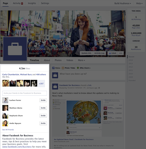
Facebook announced that this week they plan on rolling out a new "streamlined" look for Pages that will appear on desktop users. They claim it will make it easier for people to find information they want and that the new style will help the Page admins find tools they use the most. Here is a quick breakdown of what you can expect in the new design changes and features.
Some of the key features that Facebook highlighted for this new updated included a new timeline design, easier to access key admin tools, and a new "pages to watch" feature. These features all seem just to be OK. Will they be a huge improvement from what we already see? Not really. Based on what they posted, it seems to be just minor "improvements" to make navigation easier and to release one new feature.

The new timeline design will have a right-side column for all of your Page's posts to appear. Facebook said this will mean your posts will appear "consistently on your Page and in News feed." The left-side column of the timeline will feature information about the business. A map, phone number, business hours, website URL, and some photos/videos will appear in that section. Nothing "new" really. I personally preferred everything at the top how it was previously.


Now, no matter where you are at on your Page, you will be able to view information about ads you are running, new likes, new messages or notifications, and more. There is also a new navigation option which will appear at the top of the Page to make accessing your activity, insights, and settings much easier as well. These are all things that I think were pretty easy to get to before but I am pretty happy with this change.

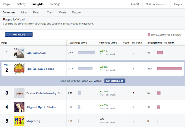
The last part of the update they are pushing out is the new "pages to watch" feature. I have actually been using it for a few months now on a page I managed and it is kind of cool but creepy at the same time. "Pages to Watch allows admins to create a list of Pages similar to their own and compare the performance of their Page with that of the businesses they care about." I have been able to use it for a company I got hired by to track their competitions Facebook history. It let me compare how many likes they were getting or losing each week to what the Page I managed was doing. That is great from a marketing perspective but creepy in a sense that anyone could do the same to you and as far as I know, you would never be informed. In the version I used, it was very simplistic and just showed likes. In the "new" updated Pages to Watch feature, Facebook actually shows a breakdown of total page likes, new page likes, posts this week, and engagement this week that those pages have been getting. Depending on your situation this feature can have its benefits or be absolutely useless.

Overall, I am not that impressed with all of the changes. It seems as if Facebook put a strong focus on making navigation better but gave up the current style to do so. I did not have issues with the current layout and navigation. I really just wish they would update their Facebook Pages App before focusing on the desktop version.
How do you feel about this new Facebook Pages coming out this week?
[via Facebook]


Meh... I guess as a photographer, i'd prefer something a bit more focused on the images but facebook isnt a "photography"specific platform. I guess its not a bad thing that facebook is trying to streamline things :) Though I would like it if they COULD do something a little more specific to the genre of the page... for example, when you create the page - you're given a choice (of layouts if you will) to suit your 'image'.
That would be so nice..
Great idea.
I just want to be able to find my videos while on mobile.
Use a browser, not an app. Voila. Not that hard to figure out.
Oh I know, I just hate that FB intentionally obfuscates this on the mobile app.
Looks similar to G+ (front page)
If they want to make them more popular, maybe they should set the API so people will actually see them.
I am assuming the short description that appears on the landing page is no longer there. :-S every thing else looks ok but I hope this is optional
I've got to the point where I no longer care about the design chenges they put through - not worth the stress! But I totally agree, I wish they would put more effort into the two (ios) apps. They're horrendous to use!
"That is great from a marketing perspective but creepy in a sense that
anyone could do the same to you and as far as I know, you would never be
informed."
Actually, I remember getting a notification about someone adding my page to a page watch list a few days ago ... but no actual name was given. So you know someone is watching you, but you don't know who.
As for the page redesign, it's not revolutionary, but seems ok enough.
I'd prefer it if they fixed the newsfeed so that when I posted something, all the users who liked my page actually got to see it, and not just 10 - 15% of them.
It wouldn't work. People like an average of 40-ish Pages each, and have on average 150 friends each (seems kinda low to me but, hey). Thats around 200 sources of info going into your Newsfeed – lets say those pages posted like four times per day and each friend posted one status update – that's over 300 individual posts to trawl through each day. Who has time for that? If they showed everything from everyone you've opted in to even less would get seen.
On my birthday...the one day where I get a lot of posts on my own page that I actually want to see FB decides to obscure all the posts and condenses them to one small post that I have to keep expanding to see.
Of course everyone's bullsh!t game posts were clearly in view at the top of my feed.
Thanks FaceBook!!
We need re-balanced organic reach instead of new design! The Facebook is forcing you to pay every posts to reach your followers... and if you pay, the 50% of the reach is missing the target audience.
I really, really hate Facebook, but most of my followers still using this crap.
Too bad it has been clearly demonstrated that most Facebook "likes" are fake. Worse, the overwhelming number of fake "likes" actually makes it harder for your business to be brought to the attention of your target market. Being about to better see other people's fake "likes" to your own isn't a particularly useful site improvement.
I manage a couple of Facebook pages and this is really going to upset the aesthetics of these pages as we have utilised many of the current design elements into creating what we think are attractive pages that draw attention to the right places.
For example, the 'boxes' along the top that housed 'photos', 'likes' etc we customised with widgets such as Twitter and Vimeo and then changed their thumbnails to be more inline with the rest of our page design. But now these are gone, and they were useful assets to have on the page...