
Studying and understanding color helps us become better photographers. In the process, we may discover that some things we believe are true may not be.
The same subject under different color lighting can result in very different pictures. But there is a lot more to color than the particular wavelengths of photons hitting our camera's sensor.
Color Symbolism
Photographers often use colors to represent beliefs or feelings. However, any color can mean different things at different times and to different cultures.
White is typically considered the color of purity. Most believe this is why it is used by brides in contemporary western cultures. However, it was Queen Victoria who started that tradition of white wedding dresses because she wanted to support the Honiton, the lace-making industry in the village of Beer in Devon, which was in financial trouble. Wearing a white dress was not a symbol of purity, but of wealth and extravagance; lace was a luxury item.
Victoria and Albert's was the first royal wedding to be photographed and the photographs were widely distributed and so white weddings caught on. Although not shared to the same extent as they are today, those photos, nevertheless, had a cultural impact. Theirs was probably the first celebrity wedding and the Queen became the first influencer.
Prior to that, wedding dresses were any color and most often black. Moreover, it was usually just the bride's “Sunday best” dress, and not one created solely for the wedding. That would have been considered a waste of materials, a belief that is returning as we become more aware of the limited resources of our planet.
Head to China and there you will find a very different relationship with white. You may well see a funeral with the mourners in white clothing. Wedding dresses are red and gold.
Similar disparities in the symbolism of other colors happen across different cultures. In the American flag, red means hardiness and valor, while in the Kenyan flag red is for the bloodshed during their fight for independence. However, the in the flag of the Aboriginal people of Australia it represents the earth.
Even between America and the UK, otherwise similar in so many cultural respects, red and blue signify the opposite political beliefs in each country. Blue is the color of Conservatives in the UK whose political beliefs are more closely aligned with the American Republicans, whose color is red. Red in the UK is the color of the left-leaning Labour Party. Furthermore, red is also associated with communism in Russia and China, socialism in Europe, and many far-right flags are predominantly red too.
Colors can have conflicting meanings in single societies too. For instance, in western cultures, red often represents both love and war.
Why Your Photography Judge May Be Getting It Wrong
There are some born with the ability to see colors most of us cannot. A condition called aphakia allows people to see into the ultraviolet end of the spectrum. In fact, many people who have had cataracts removed from their eyes can see UV too. Consequently, they see more vivid colors than most of us. After his cataract operation, Claud Monet said he could see colors that he could never see before. This can be a reason why some photographers use saturation adjustments much more heavily than others.
So, if you are a photography club judge, before condemning someone for their heavy use of the saturation slider, consider that what they are producing is possibly a more accurate representation of how they see the world than your interpretation. Their eyes’ version of RGB has a wider gamut than yours, and consequently, their photos are processed to have stronger colors than your more muted images. In fact, as they are seeing more color than you, it could be argued that their images are more accurate than yours (or mine).

Evolutionary History
The shift away from seeing into the ultraviolet came with our evolution from dichromatic (two-color) to trichromatic (three-color) vision. Amongst mammals, this change only happened in primates. Subsequently, they could spot fruit amongst the green leaves at a greater distance, as well as the orange pelt of tigers hiding in the grass; it was an evolutionary advantage.
This evolution happened as our ancestors shifted from being nocturnal to crepuscular, and then to the diurnal mammals we are today. Head out at night and you cannot see color, so there was no evolutionary need for our very distant nocturnal ancestors to be able to do so. People with color blindness may well have the gene that our dichromatic ancestors had.
Your More Recent History
Do you recall mixing paints in art lessons at school? Although not strictly accurate, the model we learned is still a good place to start when thinking about how we use color effectively in photography.
Red, blue, and yellow, we were taught, were the primary colors. The result of mixing any two primaries is a secondary color. Blend red and blue results in purple, blue and yellow together make green, and combining yellow and red gives us orange. Adding white or black made the colors brighter or darker. Mixing three primaries we get the tertiary color, brown.
Actually, it’s a lot more complex than that. There are no pure primary color pigments. If there were, when mixing two primaries they would just cancel each other out. All we would see reflected from the paint would be gray. Both red and blue both contain some purple, and it is that purple that is reflected when we stir them together. Likewise, both yellow and red pigments contain an element of orange, and yellow and blue pigments contain some green. As the primary colors cancel each other, it’s those remaining qualities that we see.
It’s for this reason that artists’ paint manufacturers make available a wide range of similar colors that we would not otherwise be able to achieve, for example, Cadmium Yellow, Yellow Ocher, Hansa Yellow, and so on.
If you have an inkjet printer, you will know that it doesn’t contain blue, yellow, and red ink but (most commonly) cyan (C), yellow (Y), and magenta (M), along with one or more blacks (K). These "primaries" are much better at reproducing a wide range, or gamut, of colors than blue, red, and yellow. Yet they still have their limitations; there are colors in nature that cannot be reproduced by the CMYK inks, and printers can also produce fewer colors than sRGB used by most monitors and digital cameras.
Complementary Colors
Taking things back to the simplest primary-school level, each secondary color has a complementary primary color. That is the primary color not included in its composition.
- Purple comprises red and blue, so yellow is its complementary color.
- Green comprises blue and yellow, so red is the complementary color.
- Orange comprises red and yellow, so blue is its complementary color.

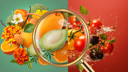
Complementary colors stand out against each other. For example, orange lifeboats are glaringly obvious against a blue sea. As photographers, we are often pleased to see someone wearing a red coat in the green countryside because they are conspicuous. Then, the yellow anther and stamen in the center of aster flowers (Aster amellus) really pop against the purple petals.
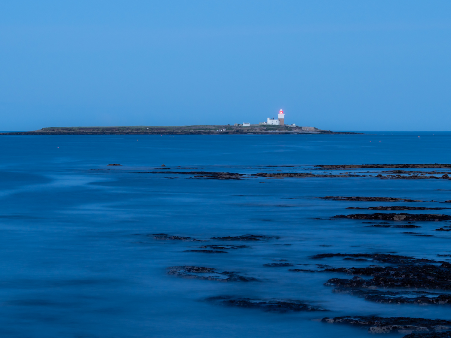
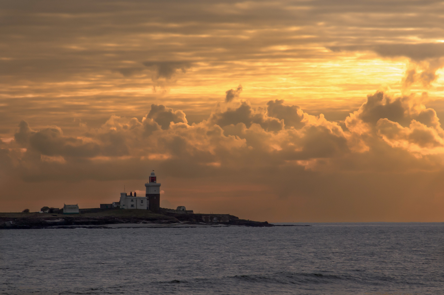
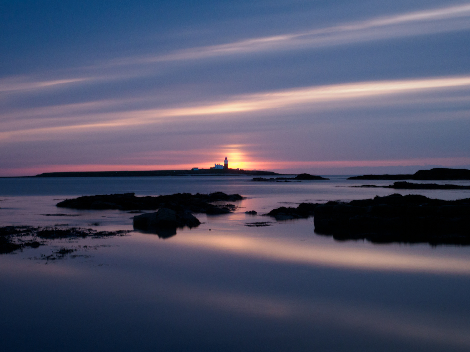
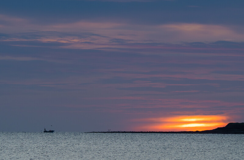
Of course, that's just a rough guide and it’s not quite as straightforward as that. A truer representation of complementary colors is found by installing a color wheel app on your phone; there are plenty of free ones to choose from. There you find complementary colors sitting on opposite sides of the wheel. While complementary colors add tension to the image, those that sit side-by-side are called contiguous colors and are more calming.
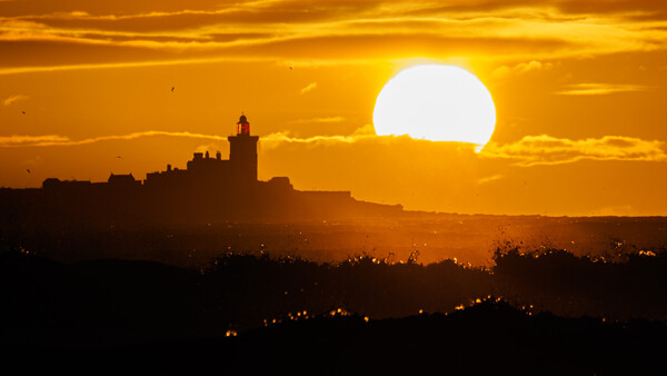
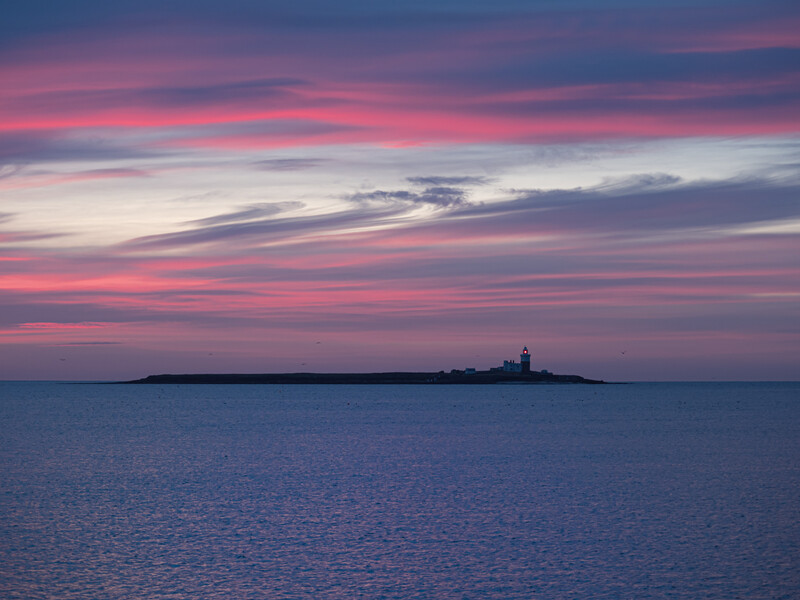
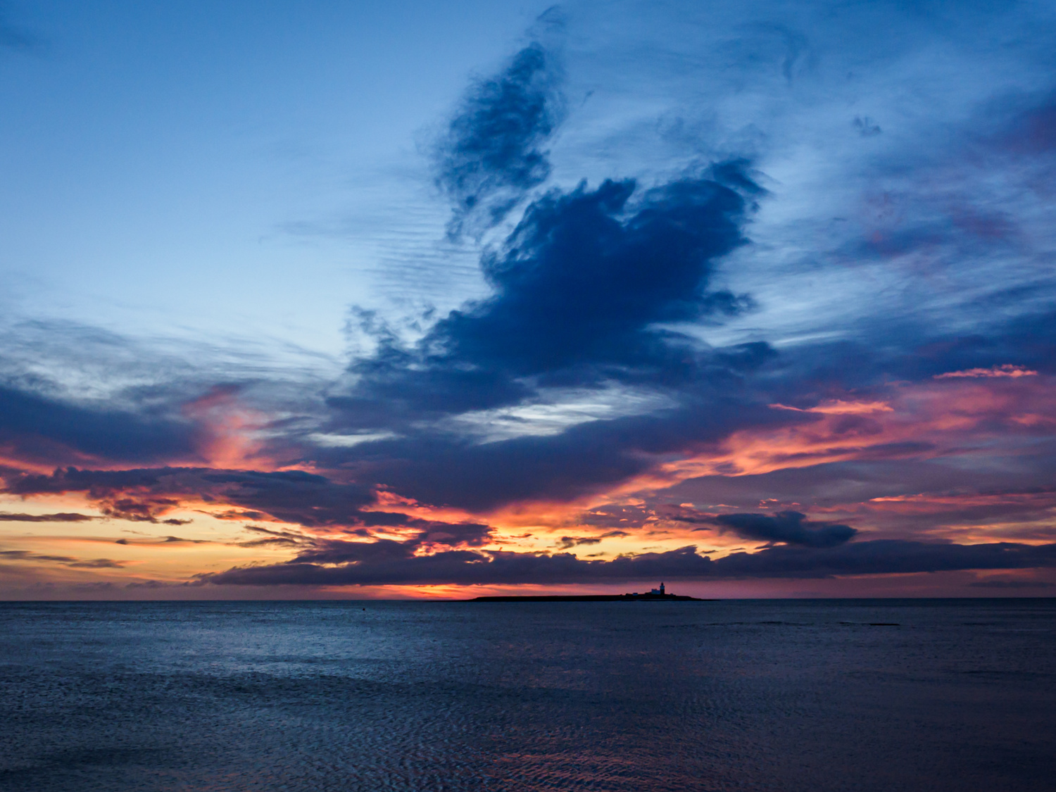
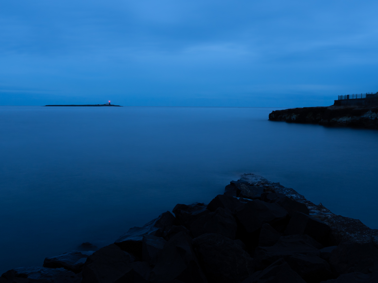
The following images of the same subject have a very different feel to each other because of the different color palette.


Putting It in Proportion
Apart from using complementary hues, there is another aspect of colors working together in a picture. It is something as photographers we can learn from classic color theory and that is the proportions of each color in the image.
The polymath Johann Wolfgang von Goethe (1749-1832) pointed out that some colors are brighter than others: violet is dark, yellow is bright. Sitting between them, green and red both have equal inherent brightness. He suggested that in a picture the amount of each color should be inversely proportional to its brightness; the brighter the color, the less there should be. He applied numerical values to the colors’ brightness to quantify this. (He would have made things simpler if he had given the darker colors higher numbers!)
Violet 3
Blue 4
Green 6
Red 6
Orange 8
Yellow 9
So, if you create a picture that is orange and blue, then the proportion most pleasing to the eye would be the opposite of their value, i.e. eight parts blue, 4 parts orange. Red and green have equal values so should appear in equal proportions.
But, sadly, in many types of photography, we don’t always have control over how much of each color appears in a shot, but it can be a consideration when composing and deciding whether to get closer or stand further back.
Scratching the Surface
Even a basic understanding of color can help us use it to its best effect and, in doing so, improve our photography. I can only just touch the surface here of what there is to say about color. There is plenty more about the topic here at Fstoppers, so please do search the archives to discover more. Also, I would be really interested in hearing what you have to say about the subject in the comments.


Join the Fstoppers community for free
-
Post comments and join in the discussions
-
Browse the site ad-free
-
Share your work and get featured in the community
-
Compete in the photo contests for fun and prizes
14 Comments
Hi Ivor, I like the first part of your article. It is interesting to read about the different receptions of color in different cultures. What follows in your text leaves me a bit unsure.
"... Cataracts that have been removed from their eyes can also see UV. Consequently, they see more vivid colors than most of us." and "After his cataract surgery, Claud (sic!) Monet said he could see colors he could never see before."
Claude Monet suffered from cataracts. His paintings became increasingly brown and yellow and of lesser detail. After cataract surgery on one eye, he was able to see colors again, but without the lens' UV filter, the whites "expanded" to a bluish white. He later had special colored glasses made because he didn't want to give up colors and light.
I don't think it is correct to say that after cataract removal all colors become more vivid compared to a healthy eye. Therefore, the thesis that some photographers produce very vivid colors is IMHO on very shaky ground.
When it comes to color mixing, I learned it differently. Mixing two primary (base) colors (pure, if you will) produces a secondary color (but never gray), which is itself a base color of the opposing color model of the two: subtractive and additive. There do not have to be other (purple, green) pigments. The concept of subsractive color mixing is filtering the light which is reflected from a white surface.
Goethe's color theory is outdated and is based on the assumption that colors are created from the mixture of brightness and darkness. But that would mean an addition of spectral colors can not result in white light.
Thanks Jan, I enjoy your replies!
I did a fair bit of research into aphakia, both with people who are born seeing the broader spectrum and those who have had cataract removal and who, consequently, have had their UV filter diminished. There's a huge amount of information out there. You might find this article interesting. https://www.bbc.com/future/article/20150727-what-are-the-limits-of-huma…
My research into the mixing of pigments came from Michael Wilcox's book "Blue and Yellow don't make Green", which looks into the science behind the blending of colors. When mixing two primaries (in this example blue and yellow) he says "The yellow pigment absorbs all the blue light and vice-versa. The result is a dark gray, almost black. But how can this be? Everyone knows that blue and yellow make green." He goes on to explain that no pigment is pure in colour, and it is the impurities that result in the production of the secondary colors. It's a fascinating read if, like me, you find this sort of thing interesting.
Goethe's color theory is still a useful guide for balancing the quantities of colors within an image. Indeed, just walking around my hometown, it is evident that designers still apply it when combining, say, blue and orange. Michael Freeman's outstanding book, The Photographer's Eye, still refers to classic color theory as do several others my library. But like every 'rule' in photography and art, it is there to be bent, reshaped, snapped, and shattered, as well as completely ignored.
As you suggest, there is a lot more to it and far more than I can write about in a relatively short article like this and it is just an introduction to some ideas that others might like to research further. I'll try to expand on it in the future too.
Thanks again for your reply.
I think I see the contradictions. Wilcox's book is about painting, not printing. Painting means mixing colors, which is not filtering (but additive), printing means layering (shading) primary colors, which is filtering (subtractive). When we talk about photography, we also talk about printing and that means layers of CMYK. So yes, cyan and yellow makes green.
Goethe tried to disprove Newtonian color theory and failed miserably. Maybe it is acceptable from an aesthetic background.
Regarding aphakia: people with aphakia have a fourth cone (instead of three) to receive light information. I read the article you linked above, parts of which are reproduced in a longer text which I can't find right now and which I read after your article. You can't compare aphakia to cataract, which basically just takes away the filter (lens) and allows (more) UV light to pass through.
There is one important thing to note: The cones in our eyes see different wavelengths, distributed among red, green and blue. A beam of light has no color regardless of its wavelength. It is our brain that assembles an image from these (overlapping) three bands. Color models are based on the nature of human light reception. CMYK printing as well.
Many thanks for your response. Cheers!
Color theory is something that could be written about in volumes - and has! This article was about thinking of color to improve our photography and, as I said, just scratching the surface. Lots of the research for it got filed away for future articles. There is a limit to how much can be included in one short and (hopefully) broadly accessible article.
I ran a series of lectures a couple of years ago regarding the nature of light and our interpretations of reality. It's a fascinating topic where science and philosophy overlap.
I think people oversaturate because they are losing the ability to see colors well, as when they get cataracts. I've noticed that in many older photographers. They try to compensate for it by saturating to the colors they think match what they remember.
That is quite probable too, Michelle. This, of course, then brings the whole (often taboo) matter of subjectivity and poses some rhetorical questions.
If a photographer reproduces what they believe to be the correct colors that they remember, is that reality any less right than how another person perceives the world?
If a completely desaturated image is acceptable, should not an image with increased saturation be acceptable too? If not, why?
If a heavily saturated image is wrong, isn't that just us judging it according to popular belief? Isn't it better that those beliefs are challenged? (I am a great believer in challenging popular beliefs!)
Thanks so much for replying and that food for thought. I'll have to think about these questions, and perhaps they'll be the basis for a future article.
Surely if they are seeing more colour than the rest of us in the original scene they will see it in the resulting images without the need to adjust the saturation sliders? 99.99% of beginners push the sliders too far because that gets their images the most likes.
Thanks for replying, Desmond. Yes, I agree about beginners. That happens too. Although, if "over-saturated" images generate more likes, then one could argue that wider appeal is more valid than the elitist views of the photographic establishment. (I know, that would be a controversial point of view, but I am playing devil's advocate.
Is it possible that, because the screen's color gamut does not encompass UV, as a consequence, someone with apahkia would need to alter the sliders more to simulate what they see?
I see what you're saying now, about the screen not being able to produce what they originally see. Point taken. Though I think the majority of "sliders pushed to the limit" photos get more likes because the skies and water , and everything else, looks more like it would in a perceived 'paradise'. All of my favourite photos though are isolated instances where the scene turned out looking amazing without any adjustments. If I played around with the sliders and pushed the other "also ran" images I got they would get a lot of praise - when in fact it wouldn't be what they looked like in reality. I like to only present what really looked good 'at the time' https://www.springbokphotography.com
Excellent photos on your site, Desmond. Just had a quick look and will have a proper stroll around it later. Thanks for sharing it - Looking at great photographs is one of my favourite things!
Thanks Ivor - I like to push technology to the limit to see what I can capture :)
The book, "Vision and Art: the Biology of Seeing" is pretty good on this topic, too. It cover some of the science, but not too much, and applies it to art (well, painting anyway). And not just color theory, but "contrast theory," or how important contrast is to composition (both color contrast and tone contrast). Basically, the brain processes contrast first and foremost, before it moves on to processing color information. Which is one main reason B&W (or even monochrome) works so well.
Thank you ,Timothy. That's fascinating. I am getting onto contrasts in a future article so will see if I can get a copy of that book before then.