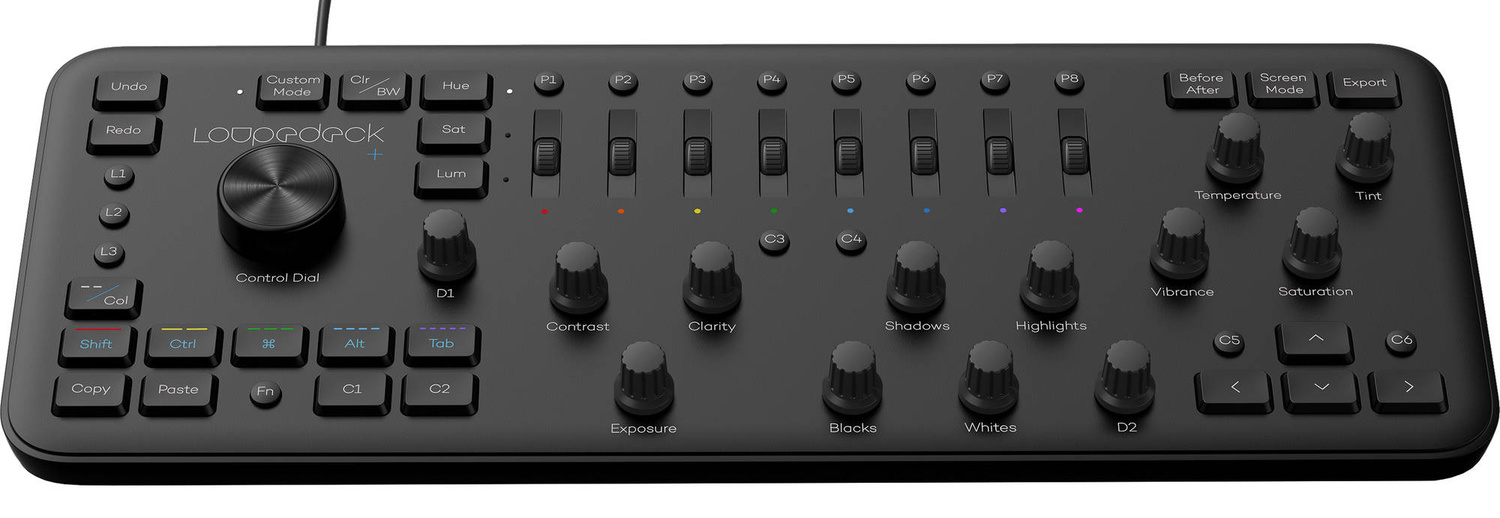
Lightroom and Photoshop are programs full of sliders and the like, none of which are naturally suited to a mouse and keyboard. As a dedicated editing console, the Loupedeck+ aims to fix that and save you serious time, and it packs quite the punch. Check out our review!
Introduction
If you spend any amount of time in Lightroom or similar software, you know that dragging sliders back and forth with a mouse isn't the most intuitive or efficient way of working. And of course, there are also keyboard shortcuts, but those are workarounds in a sense. There's no true correspondence between Lightroom's virtual adjustment controls and physical hardware — at least, the hardware that comes with the standard computer. And thus is the motivation for the Loupedeck+, which creates true physical controls for the on-screen counterparts, making working with apps like Lightroom more intuitive and maximizing your efficiency. As a musician who spends hours a day using similar MIDI control interfaces, the idea was music to my ears.
Design and Setup
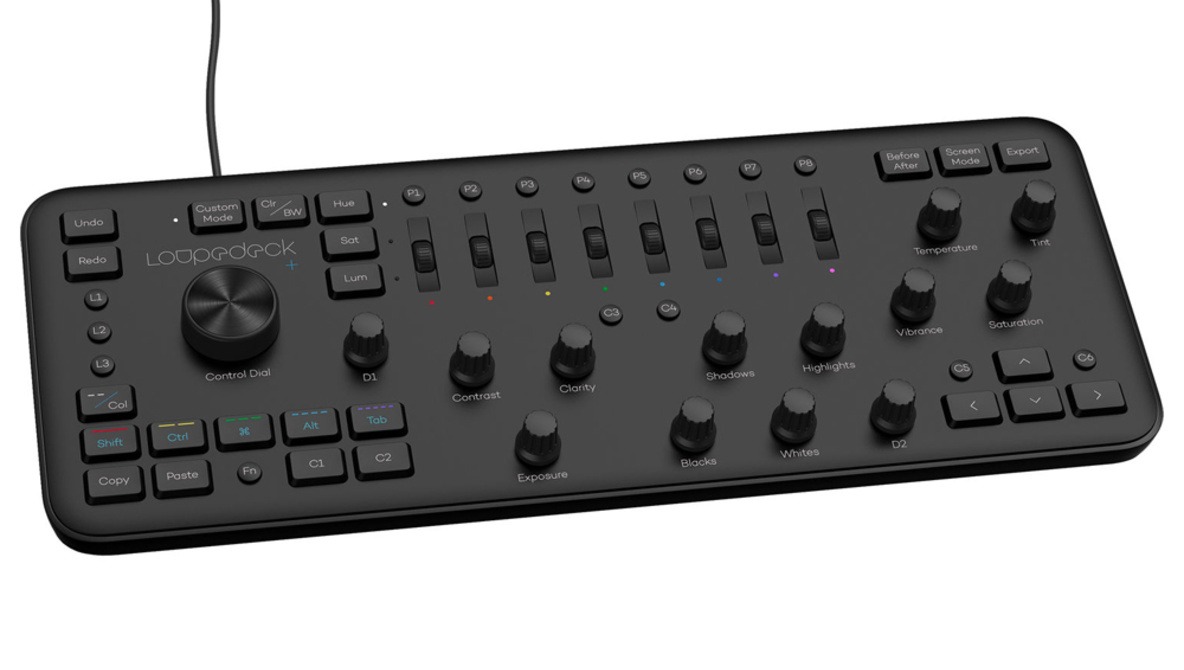
The Loupedeck+ comes in a pleasing matte black plastic case with six rubber feet. Though it's plastic, it feels solid and looks elegant and modern. I'm a fan of such designs as I feel they age well and will never look out of place on a desk.
 As you can see, the Loupedeck+ covers a range of functions and features that one regularly uses in the Library and Develop modules, including everything you need to cull, rate, and select photos (whether you do that by numeric ratings, using picks, or assigning color labels) along with all the major adjustments one makes in the Develop module, even including dedicated dials for the individual hues in the HSL panel. In addition, every dial and knob is programmed so that pressing it returns its value to zero. One thing I immediately appreciated is that all knobs and dials on the device are infinite turn, meaning they don't have a physical position that corresponds to an on-screen value. This is important, as it saves you from a very specific but annoying scenario: say, for example, you adjust the shadows to +60 on a photo. When you go to the next photo, because the dial has no physical memory or orientation, the shadows stay at zero instead of jumping to +60 the moment you grab the dial.
The device has a veritable plethora of customizable controls, with two customizable dials (D1 and D2), L1-L3 corresponding to local adjustment controls (though you can set them to whatever you want), and C1-C6 offering six more customizable keys. Note that you can set different functions for the Library and Develop modules. Finally, the P1-P8 keys correspond to presets, with each being able to be set to two (using the function key gets you the second preset). And if that isn't enough, there's also a full custom mode that lets you assign custom functions to all the dials. For example, I assigned all my split toning, sharpening, and noise reduction functions to the custom mode, and with one tap, I can pull them up. One small complaint is that the large control dial is limited only to cropping and moving between photos in the Develop module; I'd much prefer that I be able to assign it to something like sharpening or the like. Perhaps that will be changed with a software upgrade.
 Setup was quite simple: I downloaded the software and installed it, plugged in the device, and I was off and running. Opening the setup software allowed me to easily customize all the functions I wanted, though the Loupedeck+ is already set up quite well by default; any customization I did was just adding additional options.
Usage
Physical
The layout of the Loupedeck+ is very good. The controls have just the right amount of space between them so that the board is not cluttered, but also minimizes movement. The keys are sized well with good indentation and travel, the knobs turn smoothly and have a satisfying click when pressed, and the dials work just as well. Altogether, this adds up to an ergonomic experience that's much more comfortable over the course of a multi-hour editing session than a mouse and a keyboard.
Efficiency and Enjoyment
This is where the Loupedeck+ gets a big thumbs up from me. After having spent a ton of time with MIDI keyboards and the like, I know that these sorts of proprietary control interfaces aren't really worth your time unless they do truly accomplish some combination of the following: increasing your efficiency, making the work more enjoyable, and enabling new creative avenues. The Loupedeck+ delivers on all three. First, it enables you to edit quickly — very quickly. I can dial in standard exposure, shadows, highlights, blacks, and white adjustments in the same time it would normally take me to dial in just one of those with the mouse. It becomes even quicker when you get into more esoteric adjustments and don't have to move between panels by scrolling in Lightroom, instead just grabbing the appropriate control on the interface. Culling photos showed a similar increase in efficiency. Because the device has such a complete set of controls, I can really accomplish just about everything I need to without taking my hands off it, which is crucial, as having to switch between it and the mouse and keyboard wouldn't likely save me much time. And it's quite responsive: there's no lag between moving a physical control and the change appearing on screen.
Second, I personally enjoy working this way much more: it's more intuitive, and because it's so efficient, the tools get out of the way and you can focus on experimenting with your work. Lastly, that efficiency really does enable a bit more creativity. Because I can do things like adjust eight hues in the HSL panel all at once, I don't have to sacrifice creativity for the sake of not spending inordinate amounts of time on a set.
What I Liked
- Good build quality and design
- Comprehensive set of controls
- Responsive
- Intuitive
- Fun to use
What I Didn't Like
- Limited control dial functionality
Conclusion
Producing these sorts of control interfaces is a tricky game: they have to be comprehensive, efficient, and intuitive enough to noticeably improve upon the standard experience. If they're deficient is any of those three areas, it's likely the user is going to end up back with the standard keyboard and mouse after a month. The Loupedeck+ delivers in all three areas, however, and that's why it's been on my desk as my go-to Lightroom solution and why I can highly recommend it. The Loupedeck+ is compatible with Lightroom, Adobe Premiere Pro CC, Skylum Aurora HDR, Capture One (beta support), and starting today, with Photoshop CC, greatly extending its usefulness, particularly for photographers who bounce between Lightroom and Photoshop quite a bit. It's available for $249 here.


Just got one. They had a discount for Black Friday.Quitely impressed with it. I find it quicker and skips a lot of keyboard shortcuts. A direct button for export is handy. I’ve only used it for Lightroom. It’s pretty well thought out. Buttons are programmable but it should have a labeled sharpening dial (D1 is by default). I think I will keep using it for the long run.
it's always been one of those things that I think could be handy to speed up workflow, but I've never hit the trigger. Right now I've left hand on the keyboard and right hand on the Wacom. You have to fit this in between or can you slide the keyboard out the way for all the major edit adjustment tasks?
The only time I'm really using the keyboard is to press "Enter" to close brushes or filters in Lightroom. Something on the Loupedeck might do this but I haven't discovered it yet. I'm not great at reading instructions I just tend to use something and learn as I go. In that sense its very easy to use and intuitive. I assume it works in Photoshop Raw Filter (but I haven't tried) but I don't think it would be much good in Photoshop in general. It's really designed for Lightroom (and Luminar + Adobe Premiere). I think they have made it to work very well with lightroom. The big dial rotates the photograph and other things depending on what you are in (but I haven't fully work this out yet) So for cropping I'm currently using the mouse/keyboard. I'm not a spokeman for the tool but I am enjoying it. I'd say they learned alot from the first version. In terms of processing I'm about 90% in Lightroom and 10% in Photoshop. So it really helps me. Often these sort of tools aren't as good as promised but I think they did well here.
It look pretty slick and if I was a Lightroom guy I'd be right onto it. I'm pretty happy with the set up I have at the moment- gaming mouse and game pad- in Photoshop but I can never stop looking at the competition. How does this work in Photoshop? I assume it can only really be used in the Camera RAW module?
Been using it for a year with Capture One, love it. Saves me a TON of time.