Can a keyboard do more than just type? Can it speed up your workflow and make everyday tasks easier? Do you even need it to? The Logitech Craft is trying to be the answer to these questions and more.
Like a lot of others in the creative field, I have been using gaming keyboards for their customizable features and software profiles for a long time. Recently I have been looking into upgrading to the G910 from Logitech. For some, the gimmicky trends, flashy LEDs, and overall look can be a turnoff or even eyesore on an otherwise clean desktop. So when asked if I wanted to try out Logitech's new Craft keyboard designed with creatives in mind I couldn't say no.
Design
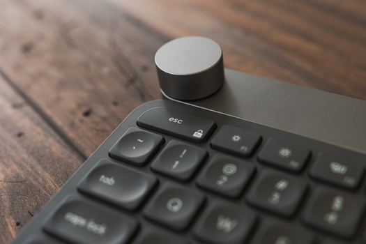
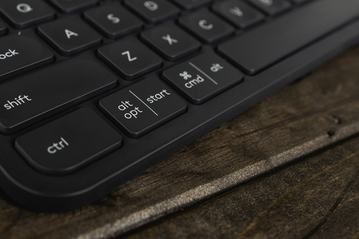
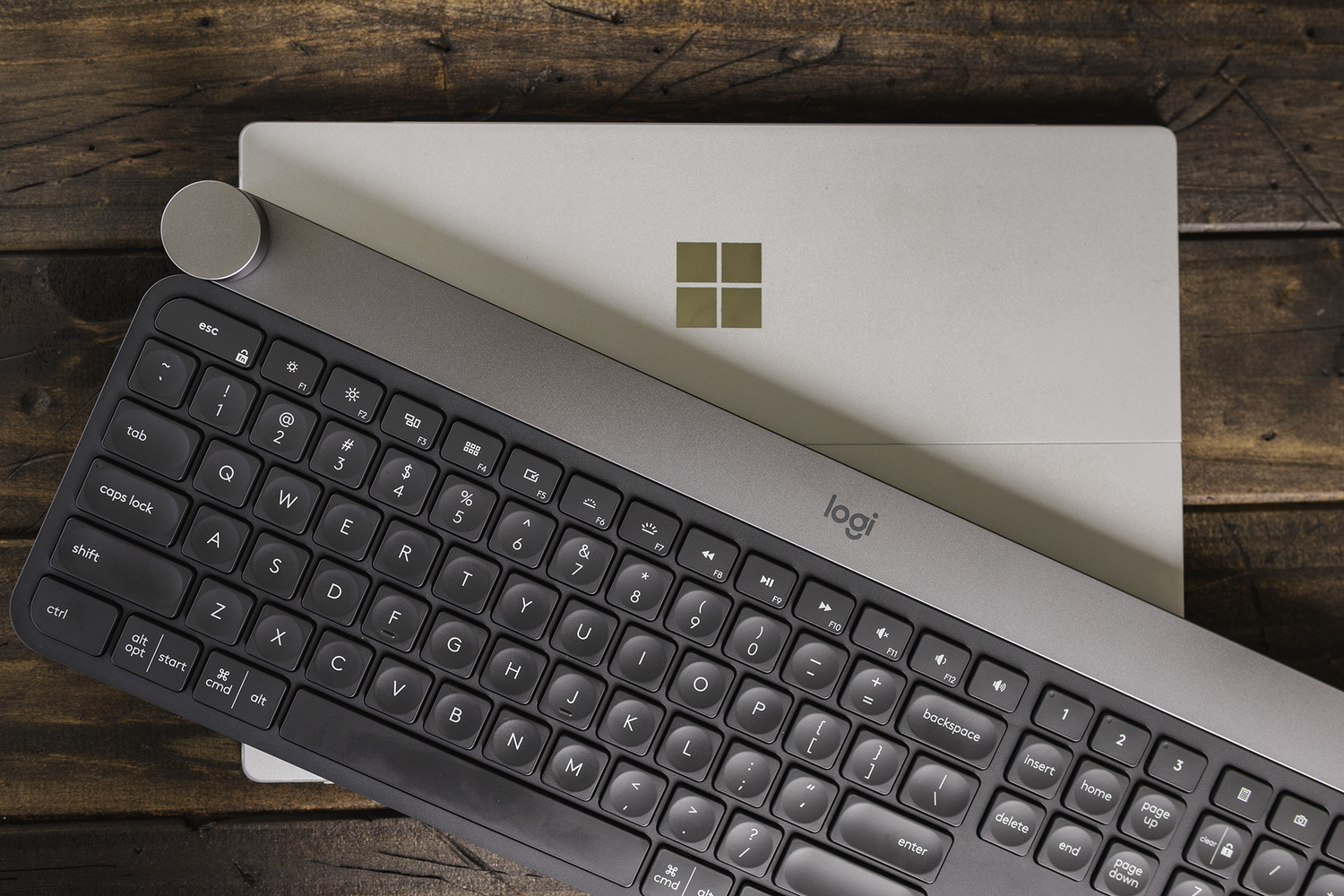
As I pick up the Logitech Craft from its box, I’m surprised by its heavy weight. It has a minimalistic design with sleek curves and a thin form. The main body is a hard plastic, but the top portion that holds the electronics is metal. Even though it’s a full-size keyboard, its overall design and thin dimensions make you think it is smaller and lighter than it actually is. It's not flimsy and doesn't feel cheap with very little flex. This is good since it costs a little more than your average gaming keyboard at $199. It is very reminiscent of some of the older Bluetooth laptop and media center keyboards but with a much better and more modern look. It is cross-platform compatible with proper keys for Windows/option and command/alt. I could see the overall minimal design esthetic and feel appealing to a lot of iMac users.
The keys are backlit with a smart illumination feature that detects motion and adapts to lighting conditions. Additionally, the brightness can be set manually. It doesn't seem to take into account daylight to conserve power which is something I would hope is changed in a future update. The keys themselves have a slight dishing on the surface, are very low profile, and have short travel making them fairly quick although they are non-mechanical switches.
Features
The Craft is a Bluetooth-enabled wireless keyboard with a 1,500 mAh battery said to last up to a week of use. This seems to be pretty close to my experiences with about half my week in the studio working at my desk. There is a USB Type-C connector for charging and a battery indicator light.
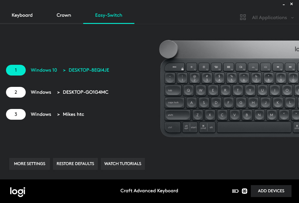
You can connect the keyboard to up to three different Bluetooth devices using what they are calling Easy-Switch buttons. This is a great feature if you find yourself using multiple desktops or a desktop and a laptop. I had no problems easily connecting to my desktop, Surface Pro, and cell phone then switching smoothly between them with the 1-2-3 Easy-Switch button.
It is also compatible with the Logitech Flow software if used with a flow-enabled mouse like the MX Master 2S. This is dedicated software that allows for seamlessly moving your mouse and keyboard between one computer and another. It also allows for you to copy and paste items between multiple desktops even between Windows and macOS. Flow works with several of their devices and is pretty impressive on its own.

The entire top row of keys, which includes the function keys, are customizable giving you 17 keys with a wide selection of options for programming. There are no dedicated custom keys, or G-keys as they are often called, which would have been a nice feature. Especially since the bulk of keys allowed to be customized are the F-keys and this can sometimes lead to key shortcut problems.
Of course, the main feature is the touch-sensitive dial called the Crown.
Crown
The Crown is a multi-input, touch-sensitive dial that allows for application-specific function via the Logitech options utility. It comes with a variety of software profiles including several from Adobe Suite, Microsoft Office, and several popular Internet browsers. For this review, I will be focusing on Adobe Lightroom, Photoshop, and Premiere.

Tapping the dial brings up the onscreen menu system with a variety of options depending on the application in use. Turning the dial allows for moving through these options while clicking it selects the tool or function. Once you have chosen a tool or function, turning the dial again alters or adjusts that function. By default in Windows, the dial controls volume but you can also start and pause in most video applications. You can also add custom controls to the Global settings as well as a lot of applications, but the options are limited. I set the touch to open up the Windows Action bar which I found very useful on my Surface Pro and the Press and Turn to switch between open applications.
Lightroom
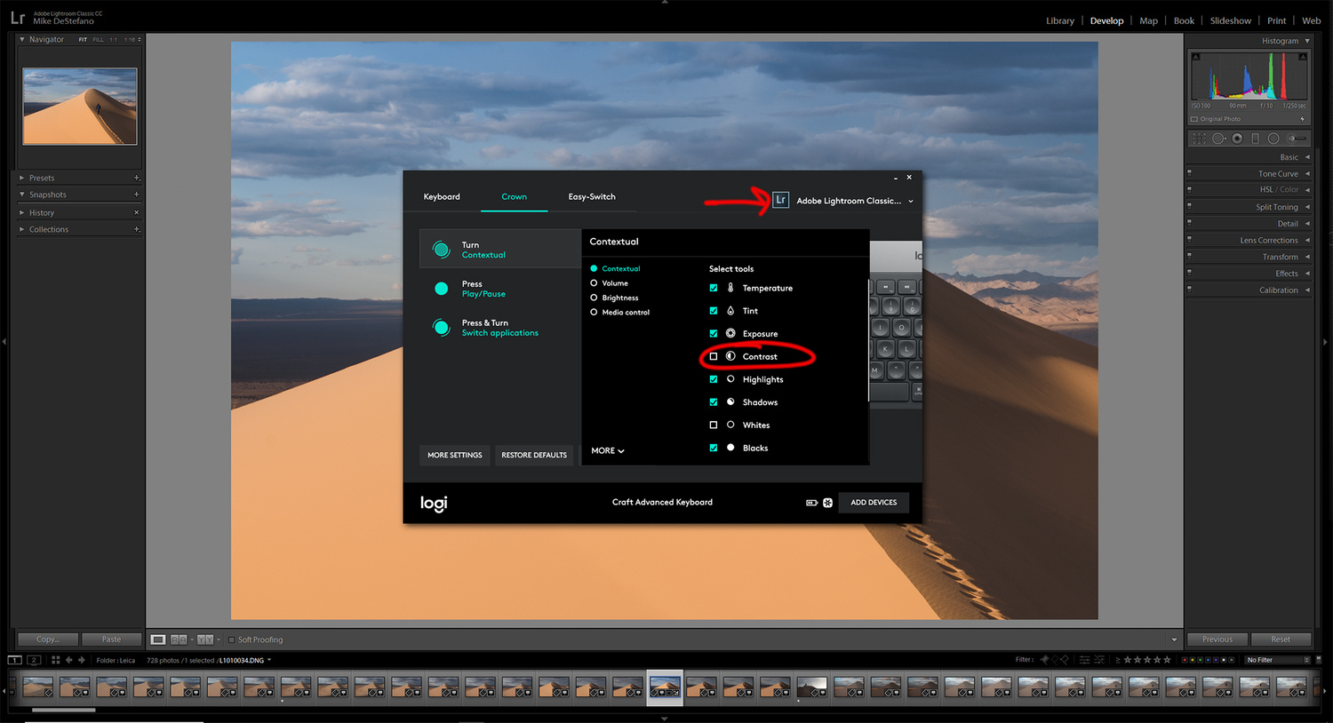
The dial really lends itself well to the slider controls of Lightroom. By default, you can set the dials tap menu to all or just a selection of the Basic adjustment controls from Temperature through Saturation. They really nailed it with giving you the ability to choose which functions are available in the menu. With 11 possible choices navigating back and forth through them can become tedious. So I selected the five most common adjustments I make. I really hope they continue to update the software and add additional functions. It would be great if using the press and turn feature brought up a second menu for the different adjustment section like Color, Split Toning, and Detail, allowing you to navigate through most of the editing controls.
Within the Library module, the only option currently is to control Zoom. I find this kind of useless and a missed opportunity to allow for dialing through images quickly. Zooming from grid view into single image and 1:1 is easily done with the Enter key. Being able to quickly move through images with the dial while leaving your right hand free to use the number pad for rating just seems like the perfect solution.
Photoshop
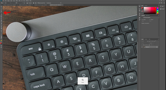
Within Photoshop, the two most useful features were the Brush functions and Zoom ability. If the tool has the ability to alter its size, hardness, opacity, and flow, then you are able to do it via the dial. If not, then it usually defaults to the zoom in and zoom out function. Both of these I usually accomplish with the built-in dial on my Wacom tablet while using the stylus in my right hand, so I am already used to this type of workflow. However, using the dial was considerably better as it is much more sensitive and easier to make small, quick adjustments. Once you get used to the sensitivity and switching between touch and turn motions, you can very quickly make adjustments to all your brush settings.
Occasionally selecting certain tools, like any of the selection tools, defaults to a Brightness, Contrast, Saturation adjustment layer which seems out of place in my opinion. Creating a Levels adjustment or any others doesn't allow for any dial functions, so like in Lightroom I hope they add future additional features.
Premiere
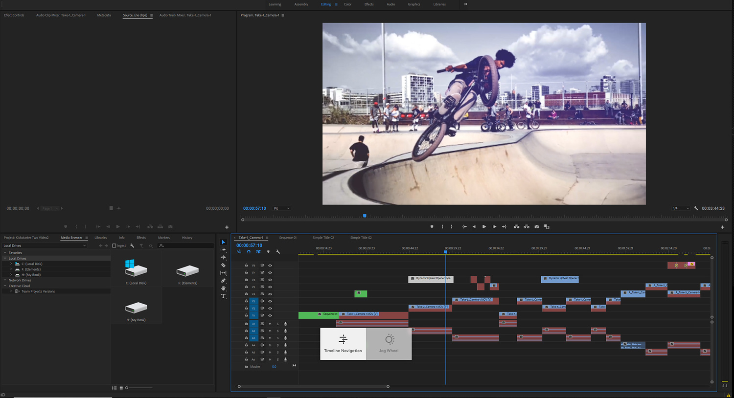
Premiere Pro seems to be where Logitech has the most room for improvement. There seemingly is only two functions available for the dial. You can navigate through your timeline or you can jog through scenes. The ability to navigate through your timeline with the dial seems like a given feature you would expect so I’m glad to see it. But I was unable to find or create any other useful way to use the dial. I imagine, like the two applications above, there is room for improvement but I’m not an expert video editor and just don't know what would be useful.
What I Liked
- Clean modern minimalist design
- Responsive and snappy keystrokes
- Switches between three devices
- Some customizable keys
- Crown dial software profiles
What I Didn't Like
- Price
- Limited function customization
- Not enough non-creative application support
- Non-mechanical keys
Conclusion
When you spend a significant amount of time sitting at a computer, having a quality keyboard and mouse is extremely important. Spending a little more for a product that looks good, feels good in your hand, and has features that make your job easier is worth it in my book. I would have liked to see it come closer to the $150 price point but that's what sales are for. Without the dial, the Craft is a well designed and capable keyboard. If you think a keyboard should look good on a desk then you’ll be pretty happy with it. If you're looking for more functionality and some minor customization without all the flare and LEDs of a gaming keyboard than this might be the keyboard for you.
When I need a new computer peripheral, one of the first places I check is Logitech. There are lots of great companies making accessories these days but the customer support and product updates have always kept me around. As I look around my desk of the seven daily-use items, four are made by Logitech. If they continue to update and add software features, which they have been doing since launching the product, then there is a wealth of potential in the software possibilities. Logitech has a history of listening to their customers and I’m hopeful they will continue to add new features.
Let me know in the comments if you think the Logitech Flow software sounds interesting and you want to see a review of it.









I’m all in for tools that will help with productivity and while I initially loved this keyboard concept I ended up liking my Apple Magic Mouse + BetterTouchTool app. Yes it is Apple only but the amount that you can do to map out your mouse to specific keystrokes has been great for me when using Adobe’s Suite. It is apple’s and oranges but it’s in the same family of productivity. Bonus is that you can bring your mouse everywhere :)
Any plans for supporting Capture One as well or is this exclusive to CS? I know Capture One has their own keyboard, but I'd like to buy one keyboard that I can use for both.
I would hope to see a lot of app support added and they have been adding since it was launched.
I'd rather buy a decent mechanical (like a Ducky) and spend the cash on a Surface Dial.
I too prefer a mechanical keyboard, however, I have the surface dial and this is far superior. I avoided making a comparison as they are not the same thing. Logitech has a much longer history of software integration when it comes to peripherals and it shows on the dial. The surface while much better designed physically can't do very much and is stuck needing software companies to develop integration for them. The Craft does not and already has more useful functions than the Surface does.
I have been toying with the idea of getting the Surface dial to use specifically with Adobe Premiere. Do you use Surface dial with video editing and do you find it useful addition?
Just the addition of a dial doesn't seem to me to give you very much added functionality. And those keys don't look like a joy to type on. I'd definitely prefer a mechanical keyboard. For the last few years I've been using a Razer Tartarus gamepad. This gives me tons of keys that sit under my hand which is supported by a rest. It's completely customisable with handy thumb switches and dials. Pluis once you build the muscle memory you'lll never have to look at the keyboard again. My fingers know where every function is by touch which you can never do with a conventional mouse keyboard setup.
There is no replacement for a mechanical keyboard however as I stated in the article lots of people have never heard of a mechanical keyboard and don't want nor like the typical looks of a gaming keyboard. This fills that gap. For a Z switch, chicklet keyboard the feel and stroke are fantastic. As for the dial I'd say plenty of people will find it useful, just by the pure fact that every stylus tablet comes with a dial, most mice come with a dial and the popularity of the Surface Dial. Plenty of functions lend themselves to being done with a dial than a keystroke or mouse click.
I was SUPER EXCITED when they released this keyboard! Then I saw the price tag. So I asked Logitech if they would support more Lightroom (and Apple Logic) features in the near future but, sadly, their response was that they really weren't focused on it and would not be for the foreseeable future. This was a year ago. WTF?!?!