

As with any creative medium, there are blips of unfortunate comedy. Photography has had more than its fair share, and let's be honest, many of us have tried them. So what are the worst fads of all time?
As is the case with literal taste, your eye for photography and what constitutes good and artistic, and moreover, what doesn't, alters over time. When I look back at my earliest photographs, I often wonder what I saw. It seems almost unthinkable that what I see today and what I saw all those years ago could possibly be the same. I have noticed a real trend in my older photography: the more I leaned into a fad or a style that was in vogue, the worse the image aged. This is true of many other creative mediums too. Think Britney and Justin in double denim or how "busy" the decorating was in your grandparents' house.
When I think of photography fads, a few instantly jump to mind, and many of them I have tried. Let's kick this off with my own mistakes from the very early days with a camera.
The Famous Three
HDR
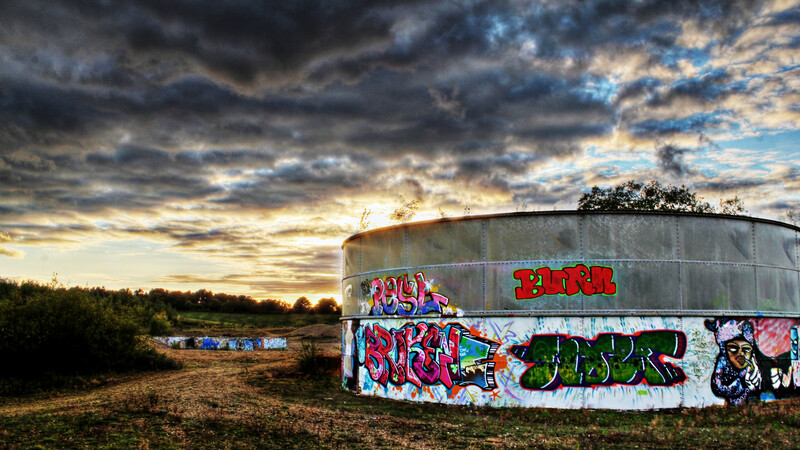
This has to be the most common answer to that question: HDR (High Dynamic Range). Admittedly, the above image is on the extreme side of things and HDR — when used subtly — can be effective. But 10-15 years ago, there was a craze for this brand of over-saturated, over-sharpened, contrasty abominations, filled with halos. What's worse is this above image was a highly calculated outcome. After photographing a dull piece of industrial architecture, I opened the file in Photoshop and with a magazine open next to me, I followed their guide for achieving the punchiest HDR.
Spot Color
This trend has been around for far longer than HDR and has admittedly dissipated from prominence in recent years. This style seemed to be exclusively saved for red things. Armistice Day would forever yield poems over the top of spot-colored images of poppies, but that much I could stomach. Where my tolerance was exceeded was London. Living in and around London means you have to see spot color images of busses and telephone boxes on every corner and by every hobbyist photographer on holiday.
Soft Focus / White Vignette / Vaseline Lens
Like many things, the 80s ruined this effect. I've combined a number of techniques that essentially walk the same "creative" line. The white vignette is still occasionally observable by outdated wedding photographers. The soft focus/Vaseline lens is much rarer to spot in the wild however. You might find it on occasion in high street photography studios that have been lurking around for 40+ years. Outside of that, if any woman in her 50s or 60s has portraits done in a cheap studio some time in the 80s or early 90s, you're likely to get a simulation of looking at someone while having cataracts.
Current Fads for Future Cringes
This is the most interesting part of this discussion for me. As is often the case with fads, at the time they're popular and in circulation, they aren't seen (by many) as dreadful. If history has taught us anything, it's that it repeats itself where possible, and so you can safely assume that current trends will one day be openly mocked. So what present day editing and photography styles will not age well?
Personally, I think there are two prime contenders. What makes me reticent to name them is that I quite enjoy both techniques, but I obviously liked HDR at one point many years ago, so I can't be trusted.
Orange and Teal
This color-grading technique is more common in and made famous by cinema. One benefit it has over a great many trends is that there is at least some color theory behind it, and complementary colors can make an image. That said, it's being used a lot. Whenever you think of eras of cinema in particular, there's usually a "look" associated. For a few decades after a trend, it will become desperately uncool before sometimes returning to the limelight in the cyclical nature of fashions. I wouldn't be surprised if in a decade from now, the teal shadows and orange highlights aren't seen as dated and undesirable.
Crushing the Blacks
It was difficult for me to find a good example of this from my own work. Not because I never crush the blacks, but rather because I do it often and subtly. There are a lot of explanations on how to do this effect and what exactly it does, but for me, I just enjoy the uniform and distraction-free shadows. That said, the above image was for a band and pushed much further than my normal tastes. The term again originates from cinematography, and the technique is commonplace there, but it has crept into photography far more over the last decade or so. It's typically a staple of many filters and presets that can be downloaded, and VSCO practically built a business off the back of that.
It seems that weddings are often the harbingers of trend death. Several on this list have been a staple in wedding photography at some point or another, whether it's white vignette or crushing the blacks and making an image look matte, or sometimes just flat. An interesting area of debate is if you ought to follow trends, avoid them entirely, or create your own look and run with it. There's no simple answer from an artistic standpoint, and I believe the water gets muddier from a business perspective. Catering to what is in vogue at any point in time can be lucrative, though how you make transitions from style to style organic and keep a cohesive portfolio is a key problem with that approach.
What Say You?
So what are the worst photography fads in your opinion? Which current trends will be the source of shame and mockery in the years to come? Share your thoughts in the comments below.
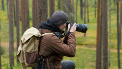
Lead image (which is beautiful and not at all part of a fad) courtesy of Moose on Pexels.

Join the Fstoppers community for free
-
Post comments and join in the discussions
-
Browse the site ad-free
-
Share your work and get featured in the community
-
Compete in the photo contests for fun and prizes
127 Comments
Bokeh for the sake of bokeh like super shallow depth of field just because.
I agree with that one. I think it will always be with us, though. Sometimes, in moderation, it's okay. But not an excuse to be lazy and just obliterate the background instead of incorporating it.
.
Yep, that's the problem in our city. It's clean with abundant green space but also very cluttered. Very few architectural icons and our version of urban forestry is to plant as much stuff as possible and see what survives the winter. Great place to live, not so great to take photos in. I'd put money on every pro in the city having an 85 1.2 and 135 2.0 in their bag for the sole purpose of erasing distracting backgrounds.
.
This is a super unpopular opinion, especially with the help from companies like Google and Apple who artificially create it with their phones. So this trend is only get worse as their software gets better.
This is, however, an opinion that I completely agree with. People will pay so much money for lenses that produce photos with hardly any detail. This is becoming so popular with the younger crowd. They learn that the way to make a good photo is to make the background blurry instead of learning compositional and lighting skills.
I wish this trend would go away soon, but I fear that it's going to stick around for a while.
I think the mark of a "professional" photo is going to soon become having very little blur and still having an attractive composition. When everyone is making bokah on their iPhone, shooting at F 1.2 is going to look even more cheesy than it already does (to me at least).
I really appreciated Tony Northrup's video showing that a lot of regular people don't care about bokeh.
I think of bokeh as a tool, lousy background, blur it out. Other than that I'm at f8 for most of my work.
Apple has a commercila where a mom is mad at her friend who bokehed her kid.
https://www.youtube.com/watch?v=IKok5dykRBM&cid=wwa-us-kwgo-iphone-slid…
Best Apple commercial ever!
😂
Do you know how many people I spoke to never even heard the word bokeh? Or what it means? Apple wants to look cool and mainstream words but the fact is, no one cares or even knows what it means.
I am with Tony Northrup on that.
I have been shooting since the 80s. I first heard "Bokeh" on the internet, maybe DPReview. Is it a technical, camera club, or art gallery term? I never heard used on any commercial/advert/editorial gig.
I started hearing "bokeh" in 1999. Yeah, it was in DPReview.
At least then, there was still an effort to distinguish what "bokeh" actually means--quality of blur--rather than simply artsy jargon for "blur."
That was pretty damn funny!
Hahaha that was very funny
Oh, this is a good one!
Meh, I just see it as subject separation and that it's no different than using a cloth background when your background sucks. I would also say that shallow DOF is probably the biggest distinction between a pro camera and a cell phone pic when viewing them online these days (with some exceptions) even though the "portrait mode" on some phones fake the Bokeh.
Considering AI and "Faukeh" from many new phones I'd say the biggest distinction between phones and "proper" cameras is noise.
Although, I guess both are difficult to distinguish when viewed on phones and tablet devices without zooming in.
True Sean- When an experienced photographer is hired to photograph older successful folks she knows the 'Hubble Telescope' rendering of every lousy Monday morning meeting blemish and line on the subjects face doesn't result in calls for additional work.
There are no fads or rules for successful photographers.
Hard work, study and accepting the occasional mundane assignment puts gas in the car and new sails on the sloop.
That's how one gets the real long-hood Porsche 911 in one's garage.
Imagon- Strap one on and go car shopping...
I've divorced two wives just for saying the word 'bokeh'.
At the same time? lol
I think a lot of the Bokeh fad is due to poor understanding of exposure triangle. Or worse, that they do understand the triangle but the poor quality of their APSC camera and it's kit lens mean that the available light in the room have them opening the iris as far as it goes just to get a non blurry shot.
I've been doing this seriously for about 6 years now. I've dabbled in just about every sort of 'trend', past and present. I still do HDR in both natural and gawdy. I just did a presentation for our photo club on HDR and how it's been pigeon holed by so many. I did a gawdy shot, a natural shot, and showed how to take one image and make a faux HDR shot using LR and creating virtual copies but changing the exposure values of two of them.
As the article states, when used properly, HDR is a very good tool.
If you can tell the it got the HDR treatment it's tacky. The point should be to make sure people won't know right away.
I guess it depends on who's looking at it. This is one of my best selling prints and received third place in my very first exhibition. I know it's not for everyone and I get a lot of negative comments on this sort of shot, but the fact is, there's people out there that not only like it, they hang it in the homes and/or offices.
Except for the Valvoline bottle in the background the HDR pretty much works for me in this shot as it becomes more of an illustrative image. As a straight photo, it might not be as interesting.
The tone mapped stuff works pretty well with mechanical subjects. You ought to see it printed on metallic based paper! :-)
That's not HDR as much as excessive tone mapping. The blurriness is a bit distracting.
No disrespect intended here but HDR to this level distracts to the same level that a signer who obviously autotunes their vocal tracks. If content needs extra heavy treatment to become consumable then was it worth it?
You bet it was worth it since part of the reason I bought a printer and make my own frames is to sell prints. This 'distracting' photo sold enough copies to buy more ink, paper, and wood. Like I said, I get a lot of negative reactions to this sort of image and expect it, so it doesn't bother me.
But with that, I have the satisfaction of knowing that there are people that enjoy this enough to buy my prints. And...it was intriguing enough that the judge at the first exhibition I entered gave it third place.
One of the comments I get quite frequently is that I've turned a chaotic scene into art. Subjective, for sure!
Not knocking you for doing what's bringing in money. Sometimes we need to pander to what puts bread on the table.
I make the comparison to other popular things like movies. The Transformer movies are just a pile of effects with very little in terms of consumable story, context, and meaning. They sell tons of tickets because some people are looking for (or can only comprehend) a shallow cognitive investment.
The point of the article was to invite photographers (people on the inside looking out) to comment on what they feel is tired. Not what audiences/markets (external) like most.
Hey David, first of all I want to make clear that I am not criticizing your photograph, it is a matter of taste and that’s it.
What I do think is interesting is that you say that besides a lot of negative comments (which I think are redundant) people do want it in their homes and offices. My point is that having an audience doesn’t make it right. And I am not talking about your picture specifically.
I understand if you sell it like crazy and you just think about the money, but either you think something’s good, or you don’t, and ‘people’s’ opinions should not matter here is my humble point of view.
I agree with you. Right or wrong is subjective just like what you or I believe is art.
"... you just think about the money..." Yep! It pays for the ink, paper, and wood that I use to produce my prints. I'll never make a lot of money from the sales, but making enough to support what I enjoy is pretty cool.
David Pavlich--At a certain point and for a certain market, work like that becomes art.
Absolutely. HDR is quite a broad term and the subtle blending of bracketed exposures — particularly in landscape — is often necessary for true-to-life images.
Neon white sclera and teeth, frequency separation (gone too far), importing raw files into Lightroom and then exporting them (essentially unprocessed) as jpgs.
Heavy frequency separation is a great example.
Definitely number one on my list: overusing frequency separation
.
I think I understand. Someone people are using Lightroom to convert raw files to jpgs without any real post processing which essentially means they should have just shot in jpg and saved the time wasted importing and exporting files. It would be an unnecessary step. Just my guess though.
I try not to judge people’s creative choices, but as someone with visual perception nothing offends me more than a nature landscape with a teal and orange tone. Reddit is full of people suggesting it to “improve” a photo.
Dark and Moody edits... Like, the ones that just look extremely underexposed.
I totally agree with this one. Especially since groups like "Looks Like Film" tend to salivate over it. I would bet more than 1/2 of them would not have a business or style if it were not for presets... SMH...
I think newbies to the "film look" find the muddy shadows appealing but a lot of photographers who actually shoot film regularly would be frustrated with the loss of detail (most of the time). I also think it's the influential hipsters who've recently started shooting film (keep in mind they like being edgy) and don't fully understand how to properly, in a traditional sense, expose on film posting their work all over tumblr and instagram. After a while of shooting many of them actually start producing good work. It's one of those growing pains I've personally gone through so I try not to harp on them too much.
Joe Baker--Well, those "looks like film" newbies don't realize we were shooting with relatively low ASA film, often unavoidably underexposed and overdeveloped (i.e., "pushed").
We didn't actually aim for no shadow detail...particularly if you were shooting for a newspaper, because black shadows were the bane of newsprint.
I actually like your crushed-black photo; it's a moody image that works - assuming that's the effect you wanted.
Overblown HDR...yick.
Orange & Teal? Looks good when well done (eg your sample) but like anything don't overdo it. Spot colour, ditto.
What about 'toy town' focussing, or whatever it's called. Fun occasionally, but a gimmick.
More frequent is overdone lighting where the photog's prowess with a flash etc dominates the image. Like good sound in a movie, it should not draw attention to itself.
"What about 'toy town' focussing, or whatever it's called." You are speaking of tilt shift. Recently I have even had a couple of my real estate agents specifically ask for this. McKinnon also just did a video on this look.
Tilt shift lenses are used in real estate and architectural photography quite a bit, but not for the "miniature effect". I'm very surprised any real estate involved person would ask for that. Crazy.