
Most of us tend not to think too much about relative screen brightness and the appearance of our photos across the myriad of devices they may be viewed on. But should we?
Before I became hooked on photography, I spent a lot of time doing web design and development. Something was glaringly obvious early on: everyone doesn't have the same computer screen. I would put designs together on the wide gamut and very bright for its time PowerBook G4, only to find out things looked completely different on the CRT monitors used by most PCs.
Luckily today, the variance in brightness from screen to screen is not nearly as drastic. But that doesn't mean the same problem can't happen. Our eyes adjust to screen brightness just like they do to the light in a room. I know it's a battery waster and I really shouldn't do it, but I use my screen at full brightness. Sometimes I may not realize my four million lumen MacBook Pro is at 100% brightness until all the plants start leaning towards me and my dog puts her shades on. If I'm editing and ignoring the histogram there is a good chance the person viewing your the photo won't see what you intended unless you slip them a note telling them to also push the brightness to the max.
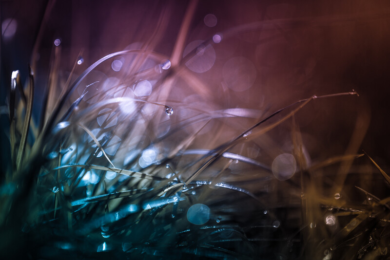
The below photo is an example of an edit that will simply be lost on a darker screen. Yes, it's dramatically edited but the point I'm making is that the viewer might miss your intended vision altogether.
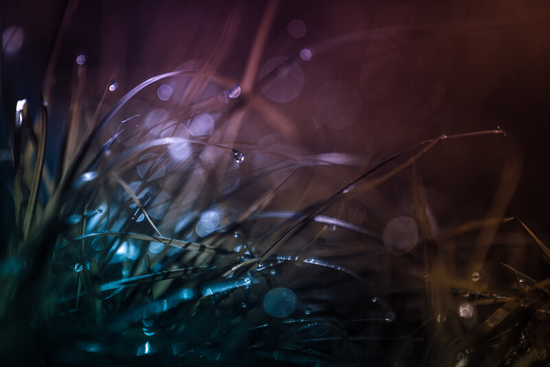
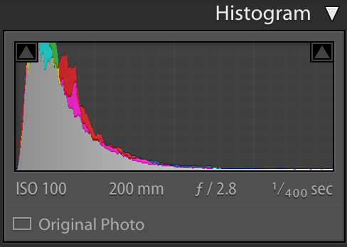
Notice how the histogram looks like a steep ramp all bunched up on the left? That means dark, very dark. This isn't always bad. If your photo contains a lot of shadows or blacks then you will expect to see a lot of data to the left. The real problem is the absence of anything to the right meaning no real highlights to catch the viewer's eye.
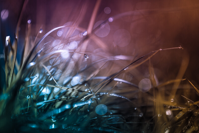
To improve this I bumped the exposure up by one. I wanted to make sure that the water drop was still the focal point with the edges being brighter so I added some custom vignetting. I think the photo looks much better now and has a better chance of appearing how I want it on all screens.
So essentially I'm telling you to lighten up! That is unless you are into preserving your battery and set your screen at the lowest brightness. In that case, your photos may appear too bright to everyone else. This whole relative screen brightness warning may sound like nothing to worry about, but it is just a good idea to test your photos at some different brightness settings to make sure you're happy with the results at all the levels.
Lead image courtesy of Wesson Wang on Unsplash.


Join the Fstoppers community for free
-
Post comments and join in the discussions
-
Browse the site ad-free
-
Share your work and get featured in the community
-
Compete in the photo contests for fun and prizes
19 Comments
Always best to test your output on several different devices (non-Apple if possible). I span it across a tablet, smartphone and laptop screen...even then it's really just a best guess since every viewer will have different adjustments to account for their own vision/tastes.
Great call. Also sounds like a great excuse to buy more non-apple devices to me! :)
I have to boost the brightness of my screens because of my failing eyesight. Excuse me for not being a "discerning viewer".
Had the problem since I do a lot of low key stuff on low luminosity LCDs. Now I Triple check with a monitor on 90, 120, and smartphone.
Low key work is very touchy when it comes to this. Very smart to check the way you do.
Good read. I would love to see more articles like this. With so much focus on how camera settings translate, people can overlook how the general audience views their work.
Thanks so much, Ian!
Good stuff, thanks.
Just calibrated my monitor. Very instructive.
4,000,000 lumens, exaggeration, right?
Slightly :)
I have been a bit tormented over this subject since I got a new laptop. Now I go between it, the old laptop with external monitor, iPad and smartphone. The older monitor, calibrated correctly, seems better than the new laptop.
In the end, I just want a perfect print.
Things can certainly vary from screen to screen, can't they? Taking it to print sure fixes the whole problem of relative brightness! Thanks for reading. :)
Most beginners gets dark prints because there screen is to bright. Also looking at the prints in a to dark room makes it worse. You need a dimmed room with low light on the computer screen and a good daylight lamp where you look at the prints. Images should be bright on a normal adjusted screen to print well.
If for web screen should be brighter.
Younger people have dim screen older people much brighter.
Web is crap as there is no way to make it look good for all:)
But I think the writer wanted to say something about looking at edit in different levels of brightness, to make a good edit?
I was debating setting lightroom up to bump my brightness up when I exported something. It always seemed brighter while editing.