On a day-to-day basis, we go through hundreds or even thousands of photographs mainly through social media. Especially for people with many photographer friends, every scroll is a stroll through a usually poorly curated gallery. If you stop and take a close look at most of the photographs, chances are that you will see certain instances where the photographer has "stopped seeing" somewhere in their creative process.
Photography as an art form requires certain steps to achieve the envisioned output. Much like playing a musical instrument, it requires as much perception as it does execution. To be able to assure a masterfully made piece of work, one must never stop looking and seeing all the aspects that contribute to the general composition of the photograph. The most common reason why we photographers often overlook significant aspects of our photographs is simply because we get overwhelmed. It may be because the certain subject is breathtaking, the location or the environmental condition was harsh, or maybe there's some extraneous factor that was distracting the photographer in the process of creating the image. From visualization, the actual shooting, to post-processing, these distractions may hit at any moment and cause the photograph not to achieve the maximal state of perfection that it could have achieved. These mistakes may or may not be corrected in post-processing, and that is why it's better that we aim to minimize these occurrences.
Framing and Composition

A 10-degree skewed empty horizon.
One of the most noticeable yet very common mistakes is a mistake in composition and framing. When you read certain photographs, often, the more obvious mistakes are those where the photographer clearly had a good vision for the photograph but only came short of executing it perfectly. A classic example for this is slightly skewed horizons. I specifically say "slightly skewed," because these are the ones that are most obviously missed details. There are certain photos where the photographer specifically chose to skew the horizon, and that is totally acceptable, but I always tell people that if you're going to purposefully skew the horizon, make sure that it is obviously your choice. A shot that is only skewed by a few degrees almost screams of a careless mistake in framing. The same principle also applies for using symmetry as the central theme of your visual design.
Clutter

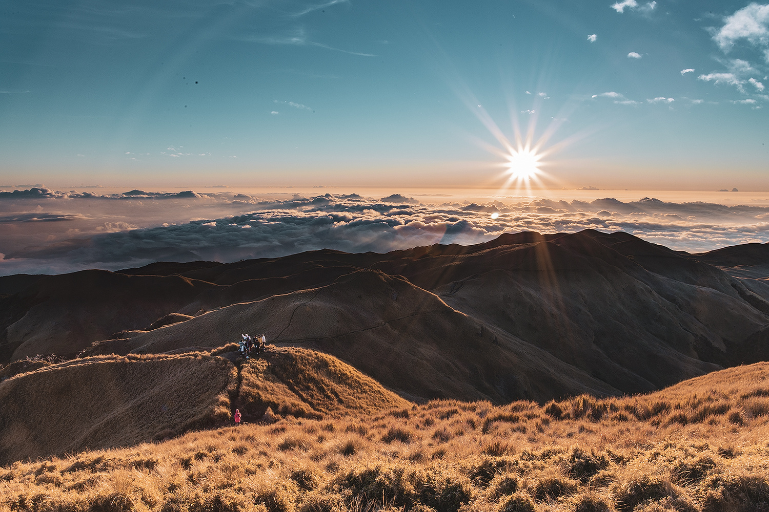
A sunrise photo from Mount Pulag botched by lens flare and sensor dust.
The best pieces of art, not just in photography but even in music, painting, literature, etc., are those that appear coherent or in simplest terms, clean. What many don't realize is that composition, which is the main creative aspect of photography, is not only about what's in the frame and where they are placed, but also (and this is equally important) about the absence of distracting elements in said frame. These distractions may come in the form of unwanted objects in the actual scene placed in a very significant spot or photographic clutter such as sensor dust, filter smudges, lens flares, or digital noise that take away the attention from the main visual design. Thankfully, most of the time, the latter are small enough to be cloned out digitally through post-processing, but the former are most often either very tedious or sometimes even entirely impossible to remove. That is another reason why composition and paying close attention to details in the creative process is crucial so as to not overlook any unwanted clutter.
Colors

Conflicting colors primarily due to sensor misinterpretations.
Colors in any given photograph react to one another. It is important to make sure that the colors you put together in a frame are in harmony. Otherwise, the interaction of these colors may become the distraction that ultimately ruins what could have been a very beautiful photograph. Depending on the kind of shoot you are doing, this can be controlled either in the actual scene or in post-processing. For studio-based photographers who are photographing certain objects or people, the actual colors of the objects or the models' clothes are of course selected strategically either by the photographer or an art director. For outdoor photographers, however, it is of course impossible to control all the hues present in the environment, and that is where post-processing, specifically color blending or grading come in handy. It is also important to note that cameras across all brands have imperfect color interpretation and rendition. Cameras often mistake certain hues for chromatically neighboring shades. As a landscape photographer, personally my biggest frustration is when the sensor perceives the blue sky as purple due to the bright warm cast of the sun during the golden hour. This is a very easy problem to fix, but a very irritating little detail when overlooked.
The best photographs in the world are not necessarily those with spectacular or extravagant subjects or locations. Sometimes, the simplest photographs with very compelling visual design and coherence can outshine a flawed shot of an overwhelming scene. It is with experience and composure in shooting and editing that we come close to perfection in this aspect as visual artists.


I checked too and found about eight and a quarter degrees.