
Why would you want to simplify your landscape compositions? And once you're convinced, how do you start?
Nailing a composition is one of the most important aspects of creating a strong image with a powerful story. A good composition is like a good foundation to a house: you wouldn't want to build your home on quicksand or mud, just like you wouldn't want to post-process an ill-composed photograph.
Simplifying an image is equally important in two ways: ridding of unnecessary elements and improving the mood or story in the photograph. What emotions are you feeling when in a landscape? What state of mind are you in? And how can you compose your image to best share that feeling or story with viewers? A messy composition with little-to-no focus can easily get lost in the endless sea of photographs. But how do you make someone stop in their tracks in awe of a landscape image you created? Try focusing on these simple tips:
Isolation
Isolation parallels emphasis in that you're putting emphasis, or a lack thereof, onto a subject by isolating it from the rest of a scene. This can be done by utilizing cloudy weather conditions, an extreme wide angle or close-up, or even a telephoto lens.

Isolating the tree with minimal foreground and middle ground elements against a vast, empty background, along with dreamy colors, creates a soft and content, but almost lonely mood. Photograph by Timothy Behuniak.
Color
Understanding color theory and the color wheel are major aspects to any creative endeavor. But using color to your advantage to simplify your landscape compositions should not be understated. By observing natural color contrasts and harmonies, you can simplify your compositions by focusing on the color relationship. This strategy for simplification, and having an eye for color in general, can take some time and trial and error, sort of like seeing in black and white. But when it clicks, you'll feel like you're seeing the world for the first time, and your images will reflect this.

Two birds with one stone: the natural outline of the sandstone walls carries a viewer's eye throughout the image, while the red and blue colors provide emphasis and simplification in the landscape. Photograph by Timothy Behuniak.
Lines and Shapes
Leading lines and shapes are two powerful ways to help simplify your compositions. By focusing on geometry in nature, as well as the way shapes and lines interact with each other, your viewers' eyes will have certain paths to follow within your image. This can act as a narrative tool by providing a way for your viewer to enter and exit a photograph.

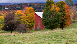
The lines formed by the bases of the trees brings viewers up to the shapes on the hillside and treetops. Photograph by Timothy Behuniak.
Conclusion
Simplifying your landscape images is a good idea, because it rids of distracting elements in your photographs and can more easily convey a story or mood to your audience. A messy composition is a bad foundation to start with, and the three above tips may help immensely in simplifying the world while looking through your viewfinder.
What are your thoughts on simplifying landscape compositions? Do you have different tips for doing so? Do you like different styles? Why or why not?


I'm having trouble understanding the Color example you use "Two birds with one stone", it looks dark and lifeless. I looked at your portfolio and you have many outstanding images - this one seems an exception to me.
I'm sorry you feel that way! I felt that the last light cast on the sandstone wall created a nice red contrast to the blue-hour sky. But I guess that is the beauty of art - it's subjective.
That's what they make vanilla and chocolate. :) I would say from my personal subjective point of view, I love your work.
Thanks for sharing. The image in "color" section looks totally lifeless. The vertical images in other sections have one thing in common which will make many people skip them. Human eyes are more comfortable to look at horizontal orientation rather than vertical; when we use vertical orientation in composition, we make human eyes jump from top to bottom and back, which is not comfortable for majority of people (try to look at similar images taken with horizontal and vertical orientation, to feel the effect). For this reason, images with vertical orientation (especially if they have a lot of negative space) capture less attention and people (on average) spend less time looking at them. Something you may want to consider.
Interesting idea. Thanks for your input.
You are welcome. It is not an idea really:) It is based on psychology fact, and is one of the composition techniques which helps to capture attention of a viewer.
I think the easiest way to simplify a scene is to grab a longer lens. It’s not a groundbreaking revelation, but I find it’s something a lot of newer photographers overlook.
I agree!
.