
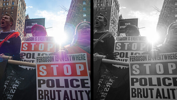
Photojournalism is ostensibly about capturing the world as we see it, as close to reality as we saw it. That reality often includes color, and the question is: does black and white photography have a place in modern photojournalism?
I happened across an amazing project on New York’s service workers and their pandemic experiences by the amazing Todd Heisler, and I was struck by how well done the photos were and the stories to go with them. I was also struck by how they were all in black and white. It’s not a new approach for Heisler, who won an Emmy for his work on the all black-and-white series “One in 8 Million” for the New York Times in 2009.
That original series has spurred debate between many photo professors, photojournalism students, and journalists about the place of black and white photography in journalism. I’ve often had the conversation with esteemed Syracuse University professor David Sutherland (who recently retired after 40 years of teaching photojournalism) about black and white photography, and the answer hasn’t changed in the last decade or so, which is, essentially, that when he sees student work in black and white, it means that the person probably didn’t know how to white balance and messed up their colors. We see the world in color, so photos should be in color. I tend to agree.
But obviously, there are editors and publications that don’t. Sometimes, like in the case of the two New York Times pieces I referenced above, it works better for the uniformity of presentation. A collage of colors could be distracting. However, losing the color loses the colors present in the environment. It robs a sense of the place, and in some ways, robs a sense of the people, who are themselves predominantly people of color. Should they not be shown in color?
There are lots of places where black and white photography makes sense such as fine art photography, landscapes, and other applications where reality and capturing it aren’t the paramount concern. There are even dedicated cameras that have black and white sensors with no ability to capture color at all, such as the Leica M10 Monochrom Digital Rangefinder. While I can wrap my head around capturing color and converting to black and white using high-quality software such as Nik Silver Efex Pro, I can’t understand in 2021 why one would not bother capturing color at all.
In the past, when newspapers were printed in black and white when black and white film was what could be easily developed in the darkroom of a newspaper, there was an argument there to think without color. But most publications are capable of printing in full color, and I can't remember the last time I saw a computer monitor that didn't display color. Shooting color is, at times, even critical to understanding meaning at a news event. Take this "Thin Blue Line" protest photo:
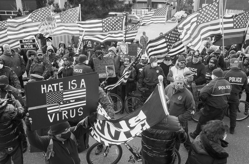

Without color, you'd never know that the "Back the Blue" side of this protest was flying the "Thin Blue Line" flags that many believe are symbols of racism. Likewise, the Nazi flag hidden in the American flag on the lower left isn't readily apparent in black and white either. The entire point of the photo is lost in black and white. The color is critical to covering this event, but one can argue that it's critical for all events.
What Do You Think?
For comparison, Heisler has a colleague at the New York Times, Damon Winter, who captured similar subject matter, but in color. Quinnipiac University journalism student Dan Passapera also produced a similar project on Connecticut's essential workers, also in glorious color.
Did you find the color or black and white approach to color a better fit for the story? What do you think of black and white photography in photojournalism in general? Leave your thoughts in the comments below.


Join the Fstoppers community for free
-
Post comments and join in the discussions
-
Browse the site ad-free
-
Share your work and get featured in the community
-
Compete in the photo contests for fun and prizes
12 Comments
Maybe have a look at the photo agency VII's website and member photos. Plenty of their members are shooting black and white by choice, not because of a color balance problem. In a nutshell, B&W is more transcendent, which is the ultimate goal of many journalists who aren't out to just blindly capturing facts, but are interpreting them, too. And for some, B&W is part of that interpretation. And for others, not. And for still others, like the late Tim Heatherington, both work.
The NY Times had no problem running their news section in B&W until 1997, correct? Not as if color photography has only been introduced in 1995, so there was clearly a place prior to that moment. I can't imagine what has happened in the intervening 24 years to have changed the equation.
I have long argued that the reasons for shooting B&W are largely obsolete. Yes, it is a different esthetic with its own standards for evaluation that are distinct from color. A good B&W image was then and still is a good image. However, when I started way back when that had nothing to do with why I worked in B&W and has nothing to do with why I now shot exclusively in color.
1. Color film and print processing were a lot more expensive than B&W. It still is. With digital imaging and printing, that is no longer the case
2. Until the '70s when Beseler (I used to work for them,) Unicolor, and Tetanol introduced consumer-oriented products, developing color film and making color prints was beyond the technical capabilities of amateur darkroom hobbyists and artists. Even with these, getting the color right was difficult. Photoshop is easier than processing C-41 or E-6.
3. The market for B&W images was much larger than for color as all newspapers and most magazines were exclusively (or at least mostly) B&W. Even Life magazine. National Geographic started out as a B&W title. What was the point of shooting in color if it was going to be printed in B&W? Again, that is no longer true.
4. Yes, color film existed a long time ago, and there were color movies being made, but I refer back to reason #1. Until the invention of videotape and digital imaging, Hollywood's business realities made the decision easy. Today, the director and cinematographer can make their decisions with very few financial considerations. B&W is now considered a special effect.
5. The world is in color. Modern digital equipment (with a few vanity exceptions) is too. Changing a color image to B&W is simple and free to do. So why not shoot in color and preserve the option?
In short, the reasons we shot B&W were financial and technical rather than any artistic value judgment. Frankly, for most of us, we shoot digital color for the same reasons.
For a guy whose profile and banner are in black and white, it's hard to rake you seriously. Your statement, "it is a different esthetic with its own standards for evaluation that are distinct from color..." is the very reason your thesis that "the reasons for shooting B&W are largely obsolete" falls apart. You argue against yourself.
I shoot film, as well as digital, and black and white ENTIRLY for the esthetics. It's the same reason I play a Les Paul through a tube amp, when I could just play through some digital soundboard. It's the esthetics.
I can't believe I'm hearing an artist telling other artists how to approach and present their work.
Maybe someone should have informed Picasso that color paints were available when he created "GUERNICA."
The article is about photojournalism, not art. Although you are right with Guernica, Picasse had had many periods and most of his artwork is in colour, before Guernica almost all: https://www.pablo-ruiz-picasso.net/periods.php
"We see the world in color, so photos should be in color. I tend to agree." Do I? After thinking about it for a while, I tend to disagree. I have been reading newspapers all my life and have never cared whether the photos are in colour or not. For me there are three categories: 1. Colours are important: they add essential information to the photos. Like you wrote above about the flags. Or they are part of the aesthetics and please the viewer. 2. colours don't matter whether you print in colour or not. 3. colours are distracting and in bad cases spoil the impression. Beautiful colours in a war scene, for example. (But that can also be intentional).
I just looked at one of my favourite newspapers. It started 40 years ago with black and white. It still has many pictures in black and white in it. These are pictures in articles about political situations in countries around the world or in documentaries or portraits.
Black and white pictures can often convey bleak or sad situations better than coloured ones.
An actual example (no not converted to b/w).
Yes of course there is just as in all photographic genres, but it’s use should be determined by the subject and the final desired aesthetic.
The example image you chose in my opinion was a poor choice. Imagine faces at the scene of a disaster or other traumatic event, or even portraits. BW images stripped of their colour can tap more directly into the emotion than a colour image can. Sweeping statement, I know, but sometimes BW mages just do it, particularly of people. Remember Jane Bown and her classic images for the Observer.
Color is a language that speak to the viewer with the same strength as the lighting, the composition and the motiv.
To me, all four entities is what forms the pillars of a good journalistic photo.
If it supplements either of the other entities in a picture it enhances the property of that entity and can add to the visual clue the photographer is trying to relay to the viewer.
Sometimes the color itself is the strongest part of the picture, but it cannot carry the picture without the help of one of the others. If it cannot be combined with one of the three other entities, it can become a distraction and should be toned down. The easiest way is to go black and white.
Either way, it is up to the photographer to learn the language of color, and to understand when it speaks to the viewer and when it doesn't.
There sure are a lot of "let's debate subjects that have been debated to death generations ago" articles on this site. Let's have a debate if film is dead. Again.
I would agree with the view that in photojournalism, that there is almost no excuse not to present in colour. For a genre that is so obsessed with not making any substantive changes to an image outside of the processes available in the traditional wet darkroom; exposure, cropping, burning & dodging to maintain the integrity of the image. I fail to see why removing image colour should not be "banned" as well.
The only exceptions would be those rare photojounalists who chose to shoot B&W film or happen to use a Leica Monochrom camera. In those cases, the article should clearly state that the images were captured with native B&W tools.
Color is more expensive for most publications than B&W.
Even more registration problems for small papers.
So much more to go wrong with Color than with B&W in publication.
So, start your own publication and print the way you want.