
In efforts to make Flickr "awesome again," Yahoo unveiled today their new and re-imagined Flickr with a new design and new features. Some of the major design changes include a new homepage featuring large images posted by your friends, new beautiful profile photosteam and new photo pages. Flickr also announced each user will get 1 Terabyte of storage for free, with the ability to upload hi-res photos, and many of them.
Since Yahoo! acquired Flickr back in 2005, almost no changes were made to the service or the design of the website. This decision to keep Flickr as was for so many years caused the service to fall behind and thereby losing its popularity and its users. Yahoo's new CEO, Marissa Mayer, promised to do everything to make Flickr awesome again, and today she proved she wasn’t just talking big - she really meant it.
So, let’s see what are some of the new things on Flickr:
HOME

The Home screen got a major face lift and looks nothing like what it had for the past 6 years. The "recent activity" space was removed and replaced with an endless feed of big, uncropped images posted by your friends. Also Flickr added a few neat new features including the ability to share or comment right from the home page without having to click on the image and go to a different page.
Also on the page: random groups you are part of, people you may know and the most recent blog post by Flickr.
Pros: It's great to see large images and gain the ability to comment, favorite or share without having to go to additional pages.
Cons: One of the things I liked the most about the old Flickr was the fact I was able to see all the recent activity (comments, favorites) right on the main page. I used to go to Flickr.com a few times a day just to see what’s new and who left a comment on my images. Another useful tool I liked on the old Flickr was the Stats, which was located right on the top of the page. Now to access both features, I need to find them in the dropdown under the "you" menu. I have no idea why Flickr decided to bury these two great and, to me, useful features.
PHOTOSTREAM
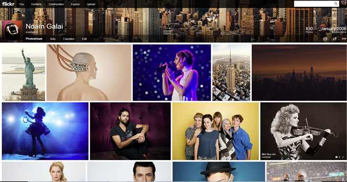
No more web 1.0 look and feel here. The new Photostream is now ‘Justified’ - all the images in the photostream are aligned to form a wall of (uncropped) photos, similar to what you see at the 500px homepage. In addition, Flickr added a cover photo to the photostream, similar to Facebook and Google+. You can choose cover photos from your stream or upload a new one. Another minor change is having a bigger profile image. If you uploaded your profile photo long time ago, this is the time to change it.
Pros: The new photostream page looks beautiful and easy on the eyes. It will make people scroll through different photostreams more often and will finally make people feel like they’re surfing a website that was built in 2013 and not something trapped in the early 2000s.
Cons: For some reason, unlike the homepage, when clicking on the commenting icon it takes you to the photo page. Also unlike the great features on the homepage people can’t favorite images directly from the photostream.
PHOTO PAGES

The new photo page features large, hi-res images on a black background. All the other features and details are hidden down below and users will have to scroll down to see the description, tags or comments.
Pros: Flickr wanted people to be able to enjoy hi-res images and enjoy being able to focus just on that. Seeing large images like this is great- Total success on this matter.
Cons: I don’t like the fact people have to scroll down to see there is more on that page other than the image - it seems like it will make interaction with the images decrease, and I expect to get less comments from now on.
Also, I personally don't like the fact half of the page is black and half white. It looks messy. Flickr should decide what is their background color, and make sure it stays the same all through the website. The way it is right now makes me feel like I clicked something wrong by mistake.
Another issue is the fact all the useful tools we used to have on the top are now under one dropdown (more like dropup) button located somewhere on the bottom of the black screen.
The last con is the fact I couldn't find an easy or intuitive way to go back to the photostream.
SEARCH

The search page got the same face-lifting the photostream got. All the results are now justified, and organized like a wall of images. Also, there are no more pages. The result feed is endless and will continue to show results as long as you keep scrolling.
Pros: Looks great and makes users want to scroll through more images.
Cons: Not being able to comment right from the result page like it’s possible on the homepage.
LOGO
Many of you probably won’t notice, or care. But Flickr’s logo is now black and white. No more blue and pink.
STORAGE
Flickr now offers a whopping 1TB of storage, for free. Users are now able to upload images as big as 200MB each (the limit used to be 50MB per image) and Flickr promises to keep the images in their best quality. This is a major change, and I think it's a great one. Users who want to have more storage can pay $499.99 per year to get a 'Doublr' account with 2 Terabytes of photo and video space.
NO MORE FLICKR PRO
Flickr Pro ($25 per year) used to have many features free users didn't have: stats, no ads, unlimited photo and video uploads and the ability to replace photos. As of today, FREE and PRO users will have the same exact features with one difference: Pro users won't see ads. Starting on 5/20/13, Flickr will no longer be offering new Flickr Pro subscriptions. Pro members have the option to switch to a Free account until 8/20/13. Existing Pro users who want to have no ads on their Flickr will be able to renew their subscription and it will cost $49.99 per year.
Do you like Flickr's new changes? Will you use Flickr more or less now? Let us know in the comments below.


Join the Fstoppers community for free
-
Post comments and join in the discussions
-
Browse the site ad-free
-
Share your work and get featured in the community
-
Compete in the photo contests for fun and prizes
51 Comments
yeah