It’s no secret that the orange and teal look is popular in movies and photos but getting that look without using LUTs, can seem like a mystery. Unless of course, you know exactly what steps to take in post-production. In this article, you’ll discover the secrets to getting the orange and teal look.
Before we go any further, let’s discuss what makes this look so appealing to so many people. One theory is that it replicates golden hour when skin tones take on an orange hue and the shadows tend to have a slight blue tint to them.
Another reason is that orange and teal are opposite each other on the color spectrum making them complementary colors. Which also creates color contrast in your scene.
As you probably already know, some people's skin tones fall in the orange range, and adding teal to the sky, water, or shadows creates a pleasing color palette and adds a feeling of warmth to the image.
As I mentioned, one of the most common uses is to emphasize orange in skin tones and then to add teal to the shadows but you can also add teal to water or the sky as well. Or you can reverse the look and add teal to skin tones and orange into the sky or the shadows. There are no clear rules as to how you can use these two complimentary colors together.
In the video above you will discover several different ways that you can manipulate color in DaVinci Resolve 17 to create the orange and teal look. DaVinci Resolve 17 is available as a free download so feel free to follow along with the tutorial.
If you enjoy using the software, you can upgrade to the studio version to unlock even more features. At the time of this article, you can get access to the Blackmagic Design DaVinci Resolve Speed Editor and get a license to DaVinci Resolve 17 studio for the same price.

You can learn more about the Blackmagic Design DaVinci Resolve Speed Editor and DaVinci Resolve 17 here.
If you are not currently using Blackmagic Design DaVinci Resolve 17, let me know what video editing software you prefer to use for your color grading in the comment section below.


Join the Fstoppers community for free
-
Post comments and join in the discussions
-
Browse the site ad-free
-
Share your work and get featured in the community
-
Compete in the photo contests for fun and prizes
3 Comments
Noticed it was done in heavy effect in the recent Godzilla vs Kong. Like annoyingly heavy.
First clue, just check out the poster for it, not exactly subtle... lol
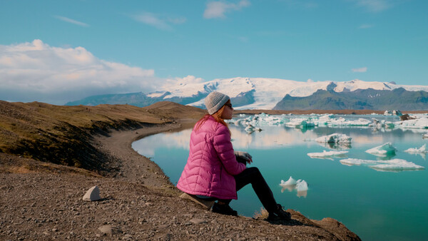
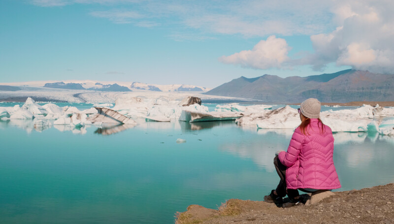
Craig I enjoy your fashion tjps but can't understand why anyone would want to tone the spectacular colours of Jökulsárlón. Nature doesn't need any "help" to look better IMHO.