Metallic paper can turn a flat-looking deep-sky file into something with depth and bite. If you care about how your astronomical images look on paper instead of just on a screen, the choices you make before hitting print decide whether the stars glow or fall dull.
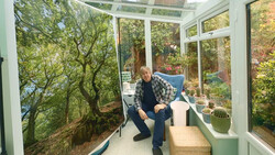
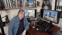
Coming to you from Keith Cooper, this practical video walks through printing astrophotography on the Epson EcoTank Photo ET-8550 using Red River Polar Gloss Metallic 255. Cooper builds a custom paper profile and then goes a step further with an optimized profile after noticing the dark tones were slightly off. That extra profiling work targets neutrality in the shadows, which is where most deep-sky images live. You see how small shifts in black levels can change the feel of a galaxy or nebula. Metallic surfaces are hard to judge on video, but you get a clear sense that the paper adds a subtle sheen that suits stars and emission regions.
The video focuses on preparation, not just paper choice. Cooper raises the black point using a simple levels adjustment so the darkest tones actually print as black instead of muddy gray. He tweaks the midpoint to hold balance after that shift. You also see sharpening applied specifically for print. He uses Nik Sharpener to apply both general sharpening and structure sharpening, adding local contrast that helps faint details separate without looking harsh. The resolution lands at 264 pixels per inch for a large print, and he makes it clear that strict 300 pixels per inch rules are not sacred. You are reminded that the print is the final reference, not the monitor.
A black border becomes part of the strategy. Cooper expands the canvas in Photoshop to add a clean black frame before printing on A3+ paper. When you compare prints side by side, that border changes how you perceive contrast. The stars appear brighter simply because the surrounding edge is darker. He treats the metallic stock as a glossy paper in the driver, using the Ultra Premium Glossy setting and high quality rather than maximum quality to avoid slower print times with no visible gain. Soft proofing with relative colorimetric intent and black point compensation helps preview how the custom profile will behave, though he keeps it clear that the screen remains an approximation.
You also get a quiet but firm reminder that astronomical images are constructed representations. There is no direct real-world reference to match. That gives you freedom, but also responsibility. Adjustments that feel bold on screen can translate beautifully in print, especially on a metallic surface that enhances specular highlights. The paper choice, profiling, black point control, and print sharpening work together, and you see how each step nudges the image closer to something that feels finished in the hand rather than just impressive on a display. Check out the video above for the full rundown from Cooper.


Join the Fstoppers community for free
-
Post comments and join in the discussions
-
Browse the site ad-free
-
Share your work and get featured in the community
-
Compete in the photo contests for fun and prizes
No comments yet