Over the last few years, I have regularly recommended the ColorChecker Passport. Colors are extremely important and the passport helps prevent issues that can come up with many digital camera sensors. Recently, I have been testing the Datacolor Spyderchekr and I wanted to see which of the two was the better option.
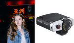
In our latest video, we compare the Calibrite (previously known as X-Rite) ColorChecker Passport against the Datacolor Spyderchekr. Both of these color cards operate in a very similar fashion. Essentially you take pictures of them in the environment that you're shooting. As long as it's a raw file, you can use it to create a custom color profile that is specific to the scene you were shooting.
Using this method allows you to counter many of the issues that digital camera sensors can have. Most digital cameras use a sophisticated form of interpolation in order to produce color. Although it's a brilliant system it's not perfect by any means, and this is where something like the SpyderCheckr or ColorChecker would come in handy.
In the video linked above, we compare both devices to see how well they perform. We use both Lightroom and Capture One to see the kind of results they can produce. However, the biggest difference between the two seems to come down to usability. The size difference between the two could end up being the biggest deciding factor for many photographers.
Check out the full video linked above to how they both perform.


I appreciate the video and all of the instructions and procedural stuff is incredibly important and helpful so thanks but he's using an image that has no color in it. Most of the differences will be seen in the blues, indigos and violets and obviously other colors shift as well to varying amounts. I've photographed a lot of paintings and drawings and of course getting absolutely accurate color is impossible. I'm happy with the Color Checker Passport but using it can be very confusing with Capture One. You can tell that the people who make Capture One aren't really interested in making it easy to use the Color Checker. Thanks for the video though. The more info the better.
I have a Macbeth color checker..yeah it's old. But I use it rarely and that is usually when there is a client on set to add some pizazz. I might even use a lightmeter on those shots and have the assistant yell or radio back to me the exposure LOL
Were there shots in the video that showed the color before the calibration or just the difference between the two products. I doubt the majority of photogs need that or will use a lot after they buy it because we all shift around colors anyway to get the look we like and that is rarely the correctly "calibrated" color balance.
To me it was sort of like the eye doctor test....A or B? well they were both fine but one looks marginally better but nothing you couldn't do by eye. For the record I do shoot color critical projects.
Vibrance has not much to do with colour accuracy. I would expect at least some of the delta E values and an indication of how reflective the surfaces are from such a comparison.
I do agree, Lee. It is all about the the closest LUT compared to the real scene. In the end it is always and only all about the individual perception and the transformation of widespread, real colours and dynamic range of the real world to the relative narrow dynamic range and colours of a screen or paper.
The guy in the video "forgot" to talk about the important things.
"I have different meter calibrations for every lens"
Wow...why? How much real difference does it make? And I mean that seriously. Back when I started assisting we had to use CC filters on different large format lenses (40 year old Ektars and Artar had different color than newer Fuji and Schneiders) but were shooting 8x10 E6 so color had to be right SOOC
Brightness has nothing to to with colours as long as the channels are not clipped. You shouldn't get different profiles with different T- or F-stops because before doing the profiling one has to make sure that the brightest part is close to #FFF (and no channel is clipped). The neutral grey spot should be exposed properly to about L=92 to 96 (from Lab, depending on the chart). I never heard of a shift in colours when the F-stop is changed. That said, one should use the middle of the frame and use about f/8 to avoid vignetting when doing the profiling.
Sorry, yes.
I have the colorchecker passport and need it as the main subjects I'm photographing are a Florist show flower namely Auriculas. With over 5,500 named varieties getting the colour as exact as possible helps avoid some of the arguments as to whether or not I've even photographed the right plant.
I leave the argument as to whether it was the right plant in the first place to the show judges.
The passport takes up less space on the show benches, where space can be at a premium, so it does the job for me.
The software matters more than the chart. I've messed with TONS of software over the years, and basiCColor input is the best for both accuracy and ease of use. Beyond that, the more swatches your chart has for the software to sample, the less interpolation the software needs to do, which results in even more accuracy.
No.
This was like listening to the competitors at car stereo events where I judged sound quality. It's not what the car owner or myself like better, it's about what is correct. I'm from the Bryson Electronics design philosophy. "The perfect amplifier is a straight wire with gain."
Usman quickly went to opining what he liked better when showing the model's facial skin and the bias was evident. Also as a presenter, pick two opposing names that are distinct. He kept messing up which product he meant to be referring to, by using the similar sounding portions of the names.
Please describe the bias, I'm genuinely interested in knowing this.