When it comes to architectural photography, there is one that stands above all: Julius Shulman. Not only was he responsible for creating the world's most iconic images of architecture, but he was on the forefront of pushing the boundaries of the art form into what it is today.
For more on this, and on Fstoppers' next big tutorial/DVD release on the subject of architectural photography, read on.
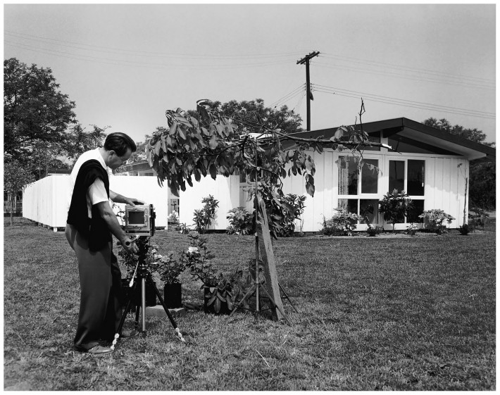
As an architectural photographer myself, I've been compelled to jump in and figure out just how he shot the incredible images that he did before the days of portable lights and post-processing techniques that we are accustomed to today. I wanted to take this time to look back at some historical architectural photography in an effort to best understand how we ended up where we are today. Grab a cup of coffee and get comfortable - this is a long one.
My family and friends will all agree: I'm obsessive. No matter what I'm into at that moment, I'm going to investigate it down to its darkest depths, to find out everything I possibly can, to learn about and dissect every aspect of that subject until I've mastered it. Since beginning to work as an architectural photographer, that pattern has continued, going so far as to move to Los Angeles to pursue it, and not a day goes by where I'm not thinking about how I can master and learn about what I'm putting in front of the camera. I was never formally trained in architecture or photography, but rather, environmental science, so everything I've learned has come from independent research and the devouring of materials in libraries and online. I learn more and more on every shoot I've undertaken, and I've traveled to some of recent architecture's most amazing landmarks, including projects by Frank Lloyd Wright, Pierre Koenig, Frank Gehry, Mies van der Rohe and Richard Neutra, and created personal projects around the world in order to gain a better understanding of my subject and how to best capture it.

In my never-ending quest to find out more about my subjects and genre of choice, I've delved deep into the work of some of architectural photography's pioneers to find out their methods, how they saw architecture, and how they captured it. As I mentioned above, the one name that pops up more than any other and who is more responsible for the recognition of architectural photography as its own art form is Julius Shulman. Shulman is responsible for capturing many of architectural photography's most iconic images - and I really sought to find out what made the images so iconic and how he captured them, in order to incorporate the techniques and thought processes into my own work. Even though the techniques of the day may be dated and easily reproducible in Photoshop, it would be great to understand why he used the techniques he did at the time he did so I can adapt similar techniques myself.
So for this article, I'm going to look at three of the most famous images from architectural photography's most famous shooter - and look into the history and creation (as well as try to reverse engineer each of them) to shed some light on the processes and techniques that were used to create such stunning images.
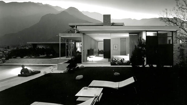
Image #1: The Kaufmann House, Palm Springs, CA

The Kaufmann house is a legendary Southern California architectural gem, and part of the reason for this is Shulman's photography of the place evoked incredible emotion with viewers of the day. Shulman's love of modernism is well documented, and this home in particular was a fabulous match for Shulman's eye. Commissioned by Edgar J. Kaufmann Sr., a Pittsburgh department store developer and investor (and the same person who commissioned Frank Lloyd Wright's Fallingwater), the home was meant as a retreat from harsh northeast winters. Palm Springs provided the perfect getaway, and the gorgeous backdrop of mountains and desert scenery placed the home in a surreal setting.
Of all of these photos, this was closest to being the image that never was. Shulman shot this at the last minute, only as he luckily caught the light fading into twilight while shooting interiors. He was there with the architect, Richard Neutra, photographing the inside, when Shulman noticed that it was getting dark and twilight was fast approaching. Seeing the incredible light outside, Shulman begged Neutra to shoot an exterior. Neutra claimed that the exterior angle was of little importance, especially at this time of day, and asked Shulman to continue shooting interiors. Luckily, Shulman insisted on creating this image - and ran outside, abandoning the interior shoot to instead capture this.
There are three main features of this photo that I want to discuss, and I've labeled them for identification below. Many so-called 'architectural photography purists' insist on shooting images with no compositing, solely as they are, in order to best represent the 'intent of the architect.' But what many fail to realize is that Shulman was one of the pioneers of compositing and lighting.

This image is, in fact, a predecessor to the modern composite. One little-known fact is that it is made of three separate exposures (labeled 1, 2, and 3, appropriately). While the dynamic range of film is greater than that of digital, it still isn't great enough to capture a direct-sun twilight background (this image is shot into the setting sun, facing west), the dim interior lights of the home which were far dimmer than modern lights today, and the light of the pool on the left hand side, all at the same time. Even with some serious zone system calculations, it wouldn't be possible. So what Shulman did was expose the film for each part of the image, covering what was not being exposed, over the course of 45 minutes.
One piece of film was exposed three times, one for each element that I've labeled: a fast shutter speed for the sky (3), a slow shutter speed for the interior lights (2), and a slower shutter speed for the pool light (1). But look again at that pool light. Note the placement of the model: it isn't just arbitrary. She's there for good reason! Not only does she add a bit of life to the photo and make it look more realistic, but she is placed there in such a way to prevent the bright pool light from blowing out and overexposing the film in that area (1). Even though it still blew out a little, seeing this on location was pretty genius, knowing that he couldn't just 'fix it in post' like we can do today with bracketing and Photoshop.

Despite the architect not really insisting upon this photograph being taken in the original briefing, this is the single photograph that propelled this house to such fame. So this photograph raises another important question: since Neutra didn't think that this photograph captured the 'design intent' of the architect, and even told Shulman he didn't think it was important to capture, what is more important? Fulfilling the needs and wishes of the client, or shooting the home in such a way to create the most striking images possible, to raise and generate the most pubic interest and publicity for the home, and as a result the most exposure for the project and architect? Who knows better, the photographer or architect? Do we make a home look as good as we can, or do we default to the client for creative direction? Of course, there is a lot of grey area here, and there is a happy medium somewhere in between.
I don't claim to know the answer, but it is certainly an interesting question raised by this image and the history behind it.
Image #2: The Stahl House/Case Study House #22

Probably the most famous architectural image of all time, Shulman's iconic image of the Stahl House has been seen in countless films and advertisements, and the photo is often recreated by everyone who comes to visit the home, which is open for public tours. Built in 1960 as part of the Case Study Houses program, the the home is considered to be the embodiment of modern architecture in Southern California, and is one of the most famous homes in the world. Shulman's photograph, which depicts two women casually conversing in front of floor-to-ceiling windows looking over the vast and infinite expanse of Los Angeles, has been widely cited as one of the reasons for this home's far-reaching publicity and fame. But, like the photograph of the Kaufmann house above, there is more than meets the eye when viewing this image.

Like the above image of the Kaufmann house, I've circled and labeled what I'm going to discuss. While this may appear at first glance to be a relatively simple image, closer inspection, as usual, reveals more. Circled in red is a reflection from one of Shulman's flash bulbs. Nope, this wasn't a feature of the home or a reflection of a light. It was good 'ol flash - fired via sync cable, reflecting in the glass box clinging to life on the edge of the Hollywood Hills. Again, there are many architectural photographers who claim 'natural light is the only way to shoot!' but here, in the most iconic architectural image of all time, the photographer is using additional light. Check out the sync cable in the below photograph, too:
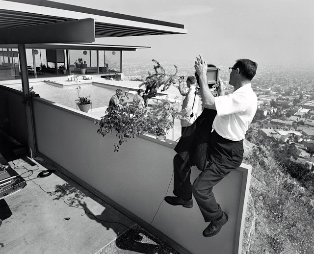
But notice that we don't immediately jump to the conclusion that artificial lighting was used here, because - once again - Shulman's clever staging and keen eye prevents that from happening. He strategically placed the flash in such a way that the reflection is blocked by a supporting beam in the glass. I guarantee, even as a photographer looking for flaws in the image, that the flash reflection wouldn't be the first thing you point out. This is one trick that I use on a regular basis to hide my lights. Instead of messing with staging and lighting and finding the perfect angles for lights, mirrors, and glass - hell, just throw something in the way! A vase, a person, some books, a plant, you name it.
The second part of the image worth discussing is the beautifully exposed light trails and street lights of Los Angeles. In order to capture the interior and the lights of West Hollywood below, Shulman had to pop the flash, and then leave the shutter open for a reported five minutes in order for those lights to 'burn in' on the slow film and small aperture he was using. Today? Psh. We're lazy. f8, ISO 400, a few seconds, and that's the end of it. To pull this shot off without the excessive chimping so common in shooting today (granted, he did have polaroids) is very, very impressive. From the staging, to the composition, to the technical aspects, it's all there.
Shulman also shot the Stahl House in color. Which photo do you think has more impact? I'm preferential to the black and white, which has broken the architecture down into its most pure elements and shapes. The surreal mood added by the perfect processing of the black and white helps, too.

Image #3: Cliff May Home, Southern California, Multiple Images
I didn't choose these images for their historical significance, or sheer visual impact. Rather, I want to take a look at how Shulman used staging and perspective to alter and enhance his mood - choosing not to capture just 'what was there' but rather choosing to create a scene that best fit what he had in his head in order to represent his subject in the best way possible. Cliff May was an architect who was best known for pioneering the California Bungalow, an affordable home for many in the post-war years. Dubbed the 'dream home,' of Southern California, these were all over the place - and it was, yet again, Shulman's images that were in a way responsible for the publicity and fame that these homes garnered.

When photographing architecture and interiors, there's often a lot that goes on outside of the photograph that the viewer will never notice. The countless hours of staging, the twisting, the turning, the fixing, the fluffing and folding, the pinning and tying - to get the scene set just right. I want to present to you one of the best examples of an architectural photographer doing what he does best in order to show the subject in the best way that he can.
This home in particular was a model home which was pretty typical of Cliff May's 'dream homes'. At the time of photographing, none of the landscaping was done, and in order to make a presentable photograph, Shulman had to go out of his way to stage and set up the shot. In a 1990 interview with the Archives of American Art, Shulman tells the story, which is rather entertaining:
"JULIUS SHULMAN: We did an assignment in later years for Good Housekeeping magazine, one of Cliff May's low-cost $12,000 tract houses, out in El Monte, Covina, somewheres. Good Housekeeping had arranged with Cliff May for us to take pictures of this particular house. It was supposed to have been ready. We got out there that morning. There wasn't a stick of landscaping. Not a shrub.
TAINA RIKALA DE NOREIGA: Hmm.
JULIUS SHULMAN: And it was the deadline, in this case. Somebody in the house told us, "There's a nursery down the road here." So I went to the nursery and rented some canned plants--five gallon cans of roses and geraniums, whatever they had in bloom--and set them up in front of the house and framed the picture with these plants, and we broke off a branch from a walnut tree that was growing nearby and fastened the branches to a lightstand so we could frame the picture with an arching branch to look like there was a tree there. And in the finished pictures, the house is perfectly landscaped.
TAINA RIKALA DE NOREIGA: [laughs] That's a good story.
JULIUS SHULMAN: Then in the patio we'd move the same "trees" and branches and plants and cans in front of the camera. We cut more branches, and made it look like the house was landscaped.
TAINA RIKALA DE NOREIGA: With the consistency of landscaping, the same...
JULIUS SHULMAN: The same material--right!--the same plant. Now when I produced the pictures... I was going to New York about that time. I remember bringing them to Mary Kraft. Mary was the architectural interior editor of Good Housekeeping, and she thought the pictures were lovely, as she said, and after the story came out--at least I was wise enough to restrain myself--after the story came out, she sent me a copy of the magazine, and she said, "We're very proud of what you did for us." I wrote back--I shouldn't have--I wrote back to Mary Kraft, I said, "Dear Mary. Thank you very much for the nice presentation you made of the Cliff May house. I thought I'd let you know for future reference, for photographers and architects, that if they come to a house and there's a deadline, there's no landscaping, this is what we did." And I sent her a picture. My assistant took a photograph of me with my camera. It's in my book. Yeah, it's in the book. A picture of me with the landscaping, with the cans, the plants, showing how we framed the picture. She wrote back, angry, in her letter, "Julius, how could you! If I had known that you falsified the landscaping, we would never have published the house."
TAINA RIKALA DE NOREIGA: Huh! What a surprise.
JULIUS SHULMAN: She was so pleased with the pictures, but she felt annoyed. And many of the editors then (maybe now are that way, too), but in New York, architectural editors were real square about accuracy. They wanted to identify the landscaping. For example, they wanted to identify the name of every shrub, the species of azaleas. They wanted to know everything...."
(full interview can be read here)
Here is the photo in question, taken by his assistant, showing the extent of the staging.
Which again - raises the question: as photographers, is it our job to photograph the home exactly as it is, or do we do our best to make it look its absolute best, given what we've got? What if Shulman had never 'lanscaped' that shot? Perhaps the history of the California Dream Home could have been altered for better or worse. Either way, it is some great food for thought for those who shoot architecture and interiors.
I personally believe that a happy medium can be found between client and photographer - that there is a spot for creative input from both, where both are satisfied. As narrator Dustin Hoffman notes in Eric Bricker's Visual Acoustics: The Modernism of Julius Shulman, "Architects live and die by the images of their work, as these images alone are what most people see." Shulman embodies this mantra through and through, even though some of his clients may have to begrudgingly admit that his artistic modifications and interpretations of their work are in many ways responsible for their success.
In Conclusion...Oh yeah, and that DVD/Tutorial...
I hope that this article jogged your mind a bit about the relationship between photographer, architect, designer, stager, and post-processing. The real conclusion that I hope you draw from this is that there is no single best way to photograph architecture, or, for that matter, any subject. As Ansel Adams famously said: "There are no rules for good photographs, there are only good photographs." So go. Go, with whatever tools you have, and make the best damn photographs you can. Work with your clients, and find that happy medium between pure documentation, a-la Xerox, and artistic representation. Talk with your clients, and figure out the best approach. Don't be afraid to try things. Hell, if Shulman never broke any rules, who knows where his photos would have ended up, and who knows about the resulting success of his clients.
While all this rambling is well and good, I want to announce one more brief point of news. I was approached by the owners of Fstoppers, Patrick and Lee, to create a documentary and tutorial featuring my work and processes. This feature will comprise behind the scenes information, walking you through, step by step, how I created well over ten images. We'll discuss everything from composition, to lighting, to staging, to Photoshop work and the photographer/client relationship. It's shaping up to be incredible and we took some great images for the DVD, all of which will be broken down for you. We're even going to include the project files so you can follow along and create exactly the same image as I do. I'm really, really excited and I've got to tell you to stay tuned here or on Facebook for promo materials and more information.
Sources:
Lastly, I didn't want to ramble on about all of this without citing some sources.
-Archives of American Art, Oral history interview with Julius Shulman, 1990 Jan. 12-Feb. 3
-Journal of Architectural Education, Vol. 47, #2, Nov. 1993, pp 101-112 (Thanks to David Eichler for this great lead)
-Visual Acoustics: The Modernism of Julius Shulman
-Julius Shulman's Los Angeles, by Christopher James Alexander
And to wrap it all up, here's a heartwarming interview with the man himself at the age of 98. You can tell the enthusiasm he has for his craft is just incredible, and the way he talks about doing what he does makes me want to get off my butt and shoot!


Join the Fstoppers community for free
-
Post comments and join in the discussions
-
Browse the site ad-free
-
Share your work and get featured in the community
-
Compete in the photo contests for fun and prizes
19 Comments
Possibly the best article I've ever read on Fstoppers. Great work, Mike, keep 'em coming!
Thanks, Scott! I don't publish every day, so when I do, I try to make them count. That's high praise, there.
Great Article.....I am in love with Architecture photography, and like you, spend most of my time working on my craft. Julius' techniques have inspired me as well, and I have been peeling apart and dissecting his work as well looking for methods utilized. He most definitely was not a purist....and I wonder what he would be doing with digital if he were still alive.
I am excited for the DVD. Your residential exteriors are fantastic btw.
Thanks, Josh. It is also reassuring to know that whenever I'm wondering if I should experiment or play it safe, I'll tell myself, Shulma wasn't a purist, either - go for it. And it's resulted in some of my best images. Thanks for the kind words!
Excellent article and for everyone with a Netflix membership, the Visual Acoustics film is (or at least was a couple of months back) available there. Amazing photos, amazing man.
Mike, it's great to see you keeping his memory alive and inspiring all of us.
Very interesting and great technical info Michael!
Quick question about Image#1 "Kaufmann House" please? When you mentioned: "One piece of film was exposed three times", how did he exposed for 3 different areas on a single film in camera? Did he do the sky first in area 1, then cover the sky area up with black fabric while exposing for area 2 and 3?
I would be lying if I said I knew the exact method. The source wasn't overly specific. There are a number of ways he could have done it though. For example, he could have exposed for the sky, let the sun set, then made two more exposures for the house and pool. Or, as you said, he could have flagged the parts of the scene he did not want to expose.
Awesome job, Mike. On Stahl House #22, a telltale sign it's a single image are the valley lights "shining through" the lady on the right...
Nice catch! I would love to see a full-size print of this to look for all the little details like that.
:-)
http://www.juliusshulmanfilm.com/wp-content/uploads/2009/01/5-csh22-two…
... and upon further review... that could also be reflections from the right side. :-(
Fantastic article Mike! Looking forward to the DVD as well :)
Great article! I really enjoyed discovering the author's website too. His Iceland images are gorgeous!
Mike,
This is a significant article and points out several conversations I have had with clients regarding the use of lighting and keeping things "real" etc., and as you and Shulman point out, it is really all about putting architecture in its best light for the most impact.
Thanks for bringing this to light...(no pun intended)!
Ethan
Awesome post Mike! Well done!
holy sh*t what an awesome article an insight into what it takes to make a great architectural shot. Shulman was obviously a special kind of person that could see with a naturally strong eye - by understanding the lilt of a woman's hand with a cocktail glass, or how a guy at a certain placement and orientation (with binoculars to be observed looking out of frame) would impact his architectural shots is genius.
There is also a ton to take from this article for those of us who don't focus on architecture - it reminds me in some ways of Peter's head shot DVD - lots to take away and apply, even if you don't shoot head shots.
Great job Mike, more please!
It kills me that on the "Front Page" of Fstoppers as I write this, are two very old recycled articles, a picture of a pretty girl in a field (now THAT'S cutting-edge), and two equipment reviews (becuse it's ALL about the gear you use)....but a thoughtful, original, good educational article like this doesn't make the cut.
Maybe you should have spent more time talking about what kind of triggers Julius used. Or worked in some soft porn...that always seems to get rewarded.
I don't know if one can say this or that image is "the greatest". No doubt these images are iconic and Schulman played a tremendous roll in the documentation of modern architecture in California. Hedrich Blessing were no less prolific and influential in the Midwest, creating no less iconic images. Ezra Stoller on the east coast came a bit later.
Anyway, an interesting article.
It was great reading this article. I'm currently in process of photographing a Neutra home on the East Coast, that was photographed by Shulman some time ago. Seeing Shulman's images of the home courtesy of the homeowner before starting my shoot, was nothing less than honorable and full of inspiration!