Comet NEOWISE has been hanging around in night skies around the world for a little while now, and most photographers who have been blessed with clear skies have captured at least one shot of the comet. Beyond getting a good exposure, how do you process your astro shots for the best effect? In this tutorial, I'll show you how I edit mine.
Astrophotographs are hard to edit because they're dark and noisy. Low light means long shutter speeds and high ISOs are needed to get a balanced exposure of the stars, and that goes for photos of Comet NEOWISE, too. We all know what a field looks like at midday, and that sunrises and sunsets are golden and rich with warm tones. However, it's difficult to get a handle on the right color balance for night shots. That's mainly because of how our eyes work.
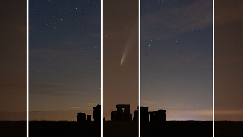
The camera can pick up colors in the night sky that we struggle to see with the naked eye due to the way our light cell receptors work, here the orange strips represent what I saw with my eyes, compared to what the camera is capable of producing in the other strips
In our eyes we have two types of light cells: rods and cones. The cones aren't very sensitive to light, so require a lot of it to work. But they are capable of recognizing color. Whereas, the rods — more sensitive to light — aren't very good at color.
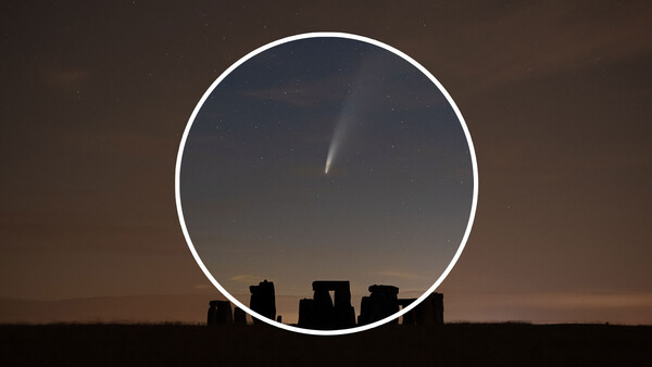
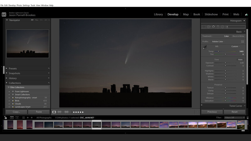
In fact, head outside tonight and you'll see that things are quite monochromatic. That's why it's hard to judge how to process night shots — because we're not used to seeing the light and landscape in great detail. But there are a few things that can help, so let's take a look at how I edited my photograph of Comet NEOWISE appearing above Stonehenge, in England.
1. Shoot in Raw
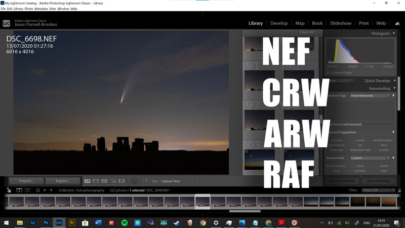
Most major camera manufacturers have cameras capable of shooting in raw format. Nikon uses NEF, Canon CRW, Sony ARW, and Fujifilm RAF
Raw files capture much more data than JPEG or TIFF files, so I recommend shooting all astrophotos, and that includes comet shots, in raw format. It gives access to better white balance manipulation, exposure toning, and noise handling and these three things are crucial when it comes to processing astro shots that are next level.
2. Reduce the ISO Noise
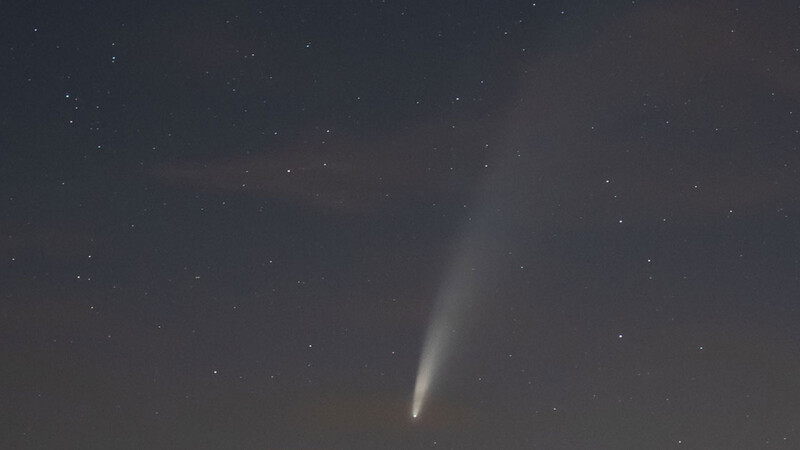
Comet NEOWISE has great definition in its tail, and when it's dark you can see the huge length of it, and the split in the middle from where it got boiled going round the sun. So it's best to capture it with a relatively fast exposure of just a few seconds. That means ISO has to be boosted up high, but with high ISO comes noise. This is the same when shooting during a new moon (i.e. when the moon isn't shining in the sky) the scene is noticeably much darker than when the moon is out. That's when I find myself boosting the ISO up high. But with that comes dreaded ISO noise, which can spoil an otherwise excellent photo, with its gritty bad looks.
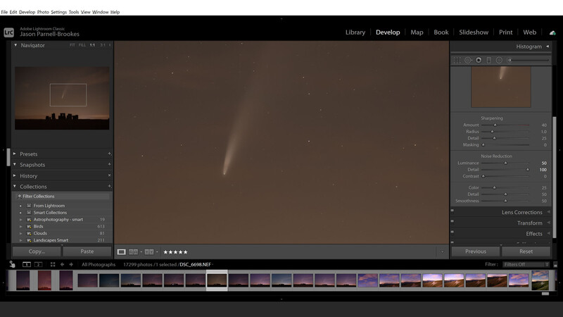
High ISO noise can be reduced through the use of noise reduction settings in image editing software, such as Lightroom
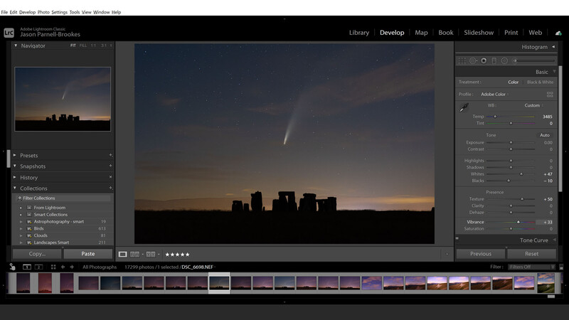
Use noise reduction to take out the excessive grain and you'll be shooting happily all the way to ISO 10,000. In Lightroom Classic, under the Develop module, I head to the Detail panel and boost the Luminance slider high. If you zoom in 1:1 (100%) you'll see that some fainter stars disappear. But that's okay, boost the Details slider and they come back. Now the stars are visibly sharp, but the surrounding noise has disappeared. This technique can also be applied to any other situation where you have excessive noise (such as gig/music photography).
3. Remove Light Pollution With White balance
The orange glow of light pollution can be reduced by changing white balance
Street lights produce an orange glow that radiate up into the atmosphere. If there's even the smallest amount of cloud the color is soaked up into the sky and your astrophotographs come out looking sepia-toned. But there's a way around that. On the camera change the white balance to Tungsten or Fluorescent and the orange hue will suddenly vanish.
That's because this white balance is designed for the warmer interior lights you'd find in your home, so it drops the white balance low to around 3,000 K to compensate and keep colors looking natural (when compared to daytime shots). That's exactly what it does here, enhancing blue and purple, and reducing orange and yellow. I recommend shooting in raw format so that you can tweak this after in editing software, and that's because I sometimes prefer to adjust the Tint slider to remove the excess magenta that's associated with both white balance presets.
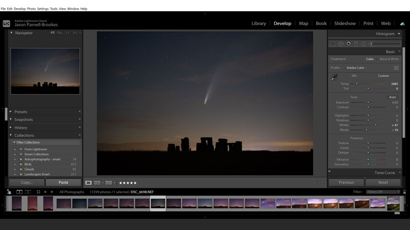
4. Produce Better Contrast
Enhance contrast in your NEOWISE shots by altering the Whites and Blacks sliders instead of the standard Contrast slider, for better control
I normally enhance contrast in my astrophotographs, but never with the contrast slider. I prefer the greater control I have by using the Whites, Blacks, Shadows, and Highlights sliders. I edit in Lightroom Classic and normally boost the Whites slider up, and slide the Blacks slider down. By processing this way I find the stars tend to get brighter without affecting the surrounding night sky too much, and the shadows of the landscape deepen, almost to a silhouette at points, for enhanced depth.
5. Enhance Star Detail
I'm sure I can hear some astrophotographers cringing here, but I like to use the Texture slider to embellish the presence of the stars in my image. Turned up too high and it'll look weirdly grainy again, undoing all the good work of the Luminance slider from the previous step. But add just a touch and it can make your comet photograph pop.
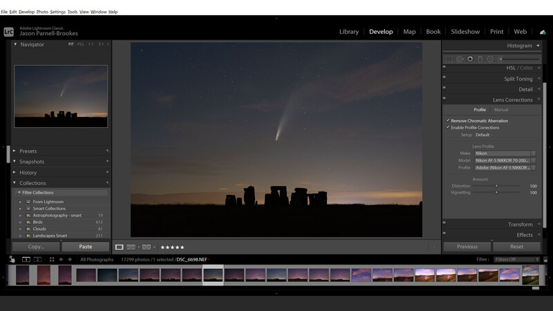
6. Enable Lens Corrections
Enable Lens Profile Corrections to counteract optical characteristics of lenses, that way distortion and vignetting will be at a minimum
Sometimes I find the stars have little fringes of cyan or purple around them, and this is known as chromatic aberration. So I usually go to the Lens Corrections panel in Lightroom Classic and tick the Chromatic Aberration box to remove this automatically.
I'll also tick Enable Profile Corrections to counteract the lens distortion and vignetting characteristics because I want an accurate, undistorted astrophoto. Then, if I want some of that vignetting back I'll either add some Post-Crop Vignetting in the Effects panel, or just use the Radial Filter with the Exposure slider turned down to -10.
7. Boost the Colors
Boost colors with the Vibrance slider to avoid color clipping, and to boost the weaker colors in the scene
I like using the Vibrance slider to give some extra pop to my astrophotos. That's because vibrance, unlike saturation, doesn't clip colors and instead boosts the weaker colors to give the shot some extra punch. Whereas the Saturation slider in Lightroom Classic uniformly boosts saturation of all colors that exist in the image, regardless of their intensity, and if pushed too far, they can clip.
8. Make Several Versions for Comparison
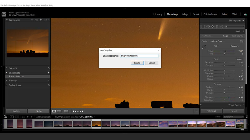
Create Snapshots in Lightroom Classic to compare different edit versions and see which you prefer without having to undo paintstaking work
I've found that from photographing Comet NEOWISE over the past week that there's quite a variety in processing techniques I've employed depending on the foreground subject, and whether there's cloud cover or not. Most noticeably I alter the color balance from shot to shot, so it's a good idea to make multiple copies and compare them before publishing.
I use the Snapshot feature in the Develop module of Lightroom Classic to do just this. Click the + button in the Snapshots panel, name it and click Create. Then make your adjustments and do the same again to save another snapshot. Now you can flick between the two to compare the edits.
9. Compare Multiple Similar Shots
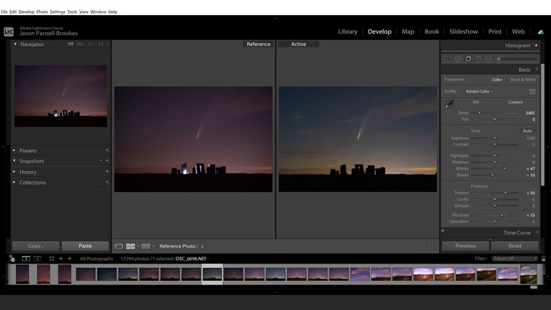
Compare two shots by using the reference view in Lightroom Classic to choose between two similar-looking photos of the same scene
Find your favorite shot of Comet NEOWISE by getting them up side-by-side. In Lightroom Classic click the R/A (Reference View) button above the film strip and drag one photo to the left Reference split view. Then simply click on another photo in the film strip to have it appear on the right Active split view to compare them both.
There's no right or wrong way to process astrophotography shots, unless you're doing it for scientific purposes, but even then NASA false-color images. Experiment with the above until you find what suits you. Sometimes a little more yellow suits the scene, and other times it looks best cool and blue.


No comments yet