
With modern cameras having incredible resolution and dynamic range, we all obsess over sharpness and the tonality of our images and how flexible the raw files are. But when broken down, what really makes a good portrait? Is it the perfect focus on the eye or a subtle transition of highlight to shadow from a massive softbox? As with all things, what defines a good portrait can go out of style. This was an interesting wake up call when a friend asked me to create an early 20th century style portrait of him.
The Setup
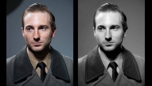
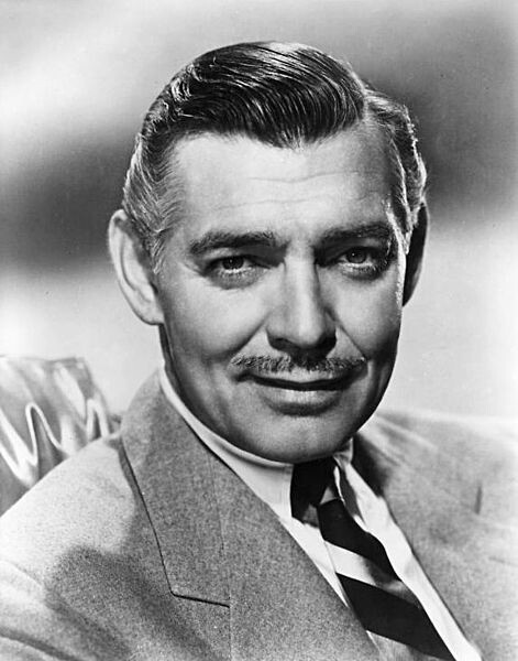
The first thing I had to do was break down the lighting. In reality, it’s quite simple but it’s quite a departure from what you see gracing most magazine covers of the past twenty years. We used an image of Clark Gable as our inspiration. In just about every headshot you’ll find of him, it’s consistent lighting for that era of photography: it’s all hot lights. Judging by the shadows around his nose, hair, and ears, my guess is that the lighting is fairly close to a bare bulb light. They may have had some sort of reflector to direct the light, so I chose that route when creating my lighting setup.
I used two Profoto B2 heads, each with a magnum reflector to create this look. I would have used actual hotlights or can lights but couldn't find any at the time. If you’ve ever used a Profoto magnum reflector, you know just how incredibly hard the light from them is. They were the perfect choice to create this look. Our final image was a little low key in comparison to our inspiration as the side of our model's head is quite a bit darker than that of the original. This came down to the amount of lights we had available, but the direction and power is about the same.
The Clothing
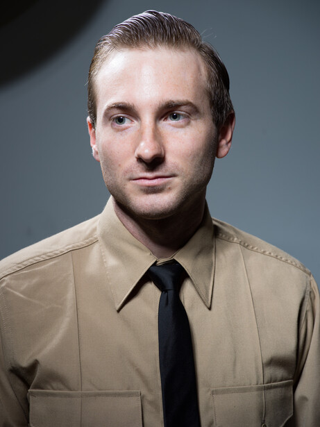
Originally we were going to have the model sporting a pencil mustache and suit, but he had shaved just before we shot, so that idea was scratched. In order to date his appearance in accordance with the lighting, he slicked his hair back and threw on a well pressed beige button down and black tie. The style and cut of the shirt are reminiscent enough of older military photos that it ties the image together quite nicely.
The Post Processing
This is where the image really came to life. Because the image was shot on the Hasselblad X1D, we had far more detail and tonal information than we needed. I brought that camera to shoot some more images with him outside of the studio later that evening, so I thought I might as well use it here since I had it. I used the following adjustments to make the image look old and lo-fi.
- Black and White conversion
- De-sharpening
- Detail slider to 0
- Grain (subjective)
- Curves for contrast
- Reduced contrast with contrast slider (this coupled with the curves adjustments really crushes the dynamic range of the image without fading the highlights or shadows too much)
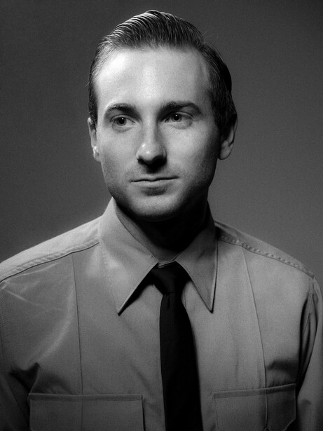
After making these adjustments in Lightroom, I sent the image into Photoshop to remove the shadow of the back light and clean up some stray hairs and dirt. That was my final step before calling it a finished image. It was a great experiment and a way for me to step away from my usual light modifiers. While I can’t imagine I’ll be creating images like this for clients (who’s to say, styles come and go), trying concepts like this can be useful to learn techniques that can be applied to your paid gigs.


Join the Fstoppers community for free
-
Post comments and join in the discussions
-
Browse the site ad-free
-
Share your work and get featured in the community
-
Compete in the photo contests for fun and prizes
2 Comments
Enjoyed this little game..I can't help but prefer the Gable and old school shots...and I don't know why. Is it that we are trained to judges certain look as better, is it our minds being drawn more to something lacking a bit of information that we fill in with imagination or expectations and spend less time glancing through more images that do all the work for us?
Interesting article, especially on toning down the importance of "technical perfection" vs. achieving a certain look or mood. I too, find that we are getting more and more obsessed with resolution and fringing rather than, pardon the pun, focusing on the end result and the relation with the viewer it should create