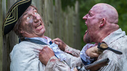
I love zombies and wanted to commemorate them in a holiday e-card I created to send to my client mailing list. I did this a couple of years back, but never really promoted on other sites until now. I called on some friends for props, extras, zombie makeup, and styling. My total expense was probably around $150-200 to pay for zombie clothing and rent a big industrial fog machine. I used 4 lights, including one behind the fog machine to create that great glow.
I like how the light behind the fog machine also cast a great shadow from the stairs on the wall behind the male human subject on the far right (It was an accident at first until I saw it in my first test shots). Lighting was essentially simple, it was just a matter of using barn doors and grids to control where the light fell so that it made my subjects pop out and the environment remain reasonably dark and spooky.
Zombie Makeup: Kwame Head
Clothing Stylist: Tara Papanicolas
Have questions or want to suggest posts you’d like me to do in the future? Hit me up on TWITTER, FACEBOOK
You can see more of my work here: www.SondersPhotography.com

Remember kids, always shoot fun projects for yourself. It’s one of the best thing you can do for your portfolio and your career. You are showcasing your true passion for creating images. Art directors love seeing that stuff!

8 Comments
Very nice :)
I too did some zombie stuff a little while ago now and it was fun, My shot isn't quite up to the same standard as Douglas Saunders image I thought I would share. I didn't have a budget but I'm lucky my sister is doing a make-up course just now and a few friends were wanting to help and I even got a loan of a smoke machine.
We got the use of an old farm workshop, my daughter and a friend kindly modelled for me, we had a tone of fun.
There is a lighting diagram and also images of the lighting being built up (so you can clearly see the effect of each one) if anyone is interested over in http://www.lencarta.com/studio-lighting-blog/09/a-zombie-and-her-pet/
thats pretty nice Paul!
Thank you :D.
Very nice as always Doug! Great shot Paul!!
Super cool Douglas! The toning on that image just nails the vibe as well. Great work.
I agree :)
Paul - too damned hard to post a kind comment on your blog. Here it is: "Awesome image, Paul. Can you describe what sort of post-processing you did? Thanks! Kevin"
ahh sorry Kevin, my website isn't so good.. It's something I'll have to work its www.ohhtography.com, the lighting blog I linked to in my former post isn't my site but rather the maker's of the lights I use.. they linked my image and asked me to write more about it.
As for the post work,
Lightroom:
Color balance to 4.8k
+1.3 ev (it doesn't recognise iso 80 images and makes them darker)
+88 contrast
+33 shadows
+100 clarity (the smoke killed micro contrast)
-23 blue saturation
Some dodge/burn
Photoshop:
Clone some dirt from the floor onto cloths to make them look dirty
Clean up of some some background things
overlay sharpening
Then back into light room to do some split toning (11 saturation orange hue in the shadows)
Boost the shadows a little more and a little more clarity
When I edit my images, I don't really have a set way.. I play around with them till it feels right which can change over time.. as I want to burn her forehead down a little now as its a little to bright :)
It was quite a quick edit, I could see me tweaking the edit a bit more later and possibly adding a faint texture overlay.