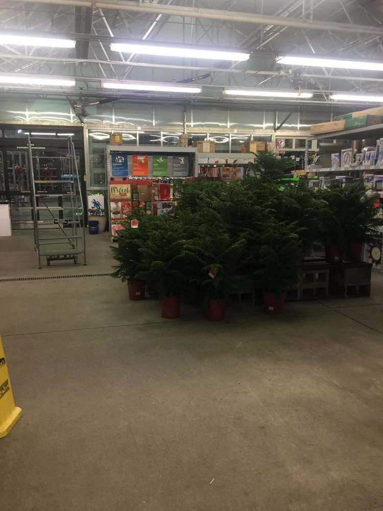
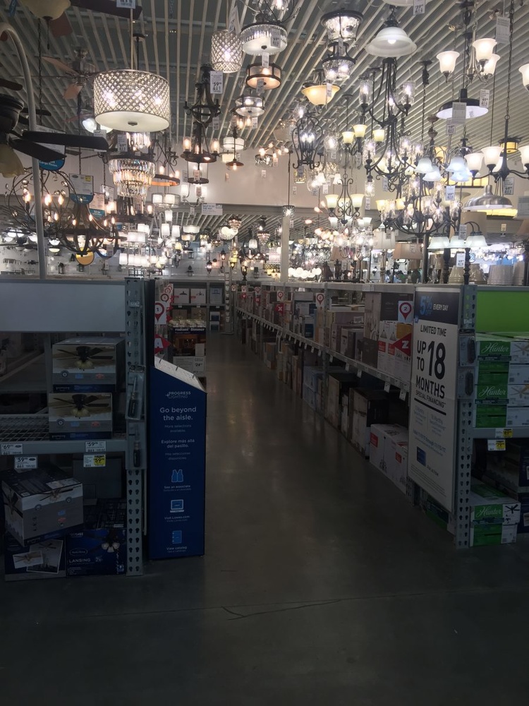
One photographer has set out to prove you don’t need a beautiful location to take amazing snaps by holding a photoshoot inside a Lowe's store.
Jenna Martin is a photographer based in Billings, Montana who normally specializes in fine art and underwater photography. But for a recent experimental shoot, Martin decided to pick the least photogenic place she could think of to use as her setting.


Writing on her blog about the decision to shoot at her local Lowe’s store, she details how she aimed for “horrible lighting and limited backdrops.” Ultimately, the brief was "somewhere that made absolutely no sense for a photo shoot."


Enlisting the help of her model Rachelle Kathleen, the pair decided that the latter should bring just a couple of outfit changes, and that they wouldn’t take any professional lighting equipment with them. The two of them worked their away around the store, using paint color samples, shrubs, trolleys, and the light aisle as their various backgrounds and props.


Speaking of the biggest challenge, Martin said the aisles were the hardest to work with:
Horrible lighting, lots of plastic surfaces, really nothing that would be considered aesthetically pleasing, but that was the point. This was the essence of Lowe’s, and we wouldn’t have been doing the challenge just to steer away from it.


What do you think to the final results? You can find more of Jenna Martin's work at her Facebook and Instagram.
All images used with permission.
[via Daily Mail]


Of course it always helps to use a pro model that's easy on the eyes. 😎
I once photographed flowers and other plants in a Lowe's garden center, I got some funny looks from people, but it was a lot of fun.
Lol goddamn, bringing a pro model to a junkyard will make any photo from someone who knows how to photograph her will make any shots good.
Still, good job on showing us how it can be done.
With the exception of the trees, it just looks like a hardware store themed photo shoot. Maybe that’s the point “make the most out of what you’ve got” or “own the ugly,” but that’s a little harder when things don’t match (like an almost beautiful garden with transformers and pipes randomly placed in the not quite full enough flowers), and as people have pointed out, that’s a lot easier to do with a professional model haha
All in all I guess it’s a good way to get people who don’t know how to work around such issues to think differently about “bad locations,” but the idea seems to be to work WITH the “problems” rather than around them (otherwise we can just say “shoot tight and bokeh the background to oblivion”), but I dunno.
TLDR; cool, but I don’t think the point is proven
Done the same haha :D
But in a different store.
Although the other shoot isn't bad, I think I like yours better.
Wow thanks a lot! That's nice to hear :)
I agree!
thanks, Andy!
Did Lowe's sign a location release?
This is just the classic "hide the ugly stuff in white/black by over/under exposing". Nothing new, but it works.
Very nice images, but it also helps when you have, from what it looks like, the whole store to yourself. And like Lenn says above, how did you get permission from Lowe’s? Most stores have an issue with this.
Not sure this place was any harder to shoot in than the ruin porn model shoots. Actually it would have been a lot easier.