
These days, there are endless ways to get your images in front of clients, and it is more important than ever to put your best foot forward at all times. A tight and well curated portfolio is absolutely essential; trimming the fat and staying true to your brand. But keeping a consistent brand and level of presentation isn’t the same as duplicating your presentation, and to best reach your intended audience requires consideration of the end-user experience.
Step one is the hardest: making sure you have a tight edit. As I’ve mentioned in a previous article, curating your portfolio is more than just compiling your best images and tossing them into a gallery. It’s about defining your brand not only by what you include but also by what you leave out. It shows images that connect to one another and clearly define your product for any potential buyer.
But almost as important as what images are in your portfolio is the sequence in which those images are placed. Think of it like a movie. A movie may have a great climax, but it’s only significant because of the scenes that came before. Out of context, the scene may just be average, but with proper story structure the whole can add up to more than the sum of the parts. But even once you’ve nailed down the images and the perfect sequence, your job is not yet complete.
With so many different avenues for reaching potential clients these days, marketing your photography can be sort of like a chess master playing on multiple boards at once. Marketing is a 360-degree effort sometimes taking you into a face-to-face meeting with a printed book or tablet, an avatar-to-avatar meeting on social media, an all-digital soiree via your website, or even by way of the postal service via a physical promo piece. All of these platforms are different. And, yes, that last sentence definitely falls into the category of obvious, but it is very easy to allow our human nature to trick us into overlooking... human nature.
Here’s a case in point. Like all photographers, I love photography. I love looking at photographs. I love looking at the work of photographers I admire. I’m willing to spend a great deal of time doing this. So, when I visit a photographer’s site, I tend to pick a series that I’m interested in, start with the first image, click to see it big on the screen, then continue to hit the right button going through image after image in awe at that person’s level of skill. The better the images, the longer I’m willing to spend on the site. I can do this because my objective in that situation is simply to enjoy the photography.
But I’m a photographer.
Now, let’s look at the same scenario from the standpoint of a potential client such as an art buyer, photo editor, or an art director. These people also love photography. They look at it everyday. To be more precise they look at a lot of it everyday, all day, and their days never seem to be quite long enough. So, while they may very well wish to spend the entire day going through each of your galleries from beginning to end, it is far more likely that they will only be on your site for 60 seconds or less. Not because they don’t like the work, they just don’t have the time.
So how do you get around this issue? There are several ways to go about it. Personally, I address the issue by opting for a mosaic layout rather than a slideshow presentation on my site. The logic being that as soon as a potential client lands on my homepage, they can see the breadth of my work by simply scrolling down. This has the advantage of not requiring any extra clicks on their part, as well as allowing them to get a sense of my product in a very short period of time.
If they want to see additional work there are more detailed galleries they can opt to view. And they can click on any image in the mosaic to enlarge it then scroll through one after another in slideshow format if they prefer, but they don’t have to. This both presents them with the images I think they need to see while respecting their extremely limited amount of time. So, if they are in a hurry, which is 99 percent of the time, they can know all they need to know just from looking at that one page.
Let’s say that you prefer the slideshow over a mosaic layout. That’s a perfectly solid option as well. But let’s again look at it from the client’s point of view. Your choice of slideshow, mosaic, or otherwise isn’t going to add any more time to your client’s day. They still will have only a limited amount of time to spend with you. So what things do you have to consider?
First would be length. While we may have 100 amazing images to string together in a slideshow, it’s unlikely they have the time to click 100 times to reach the end. So, option one would be to try and keep the gallery short. Maybe in the 30–40 images range.
Second would be sequence. If you do opt for a slideshow, remember it is far more likely they will see the early images than the later ones. If you’ve done the work to keep your edit tight in the first place, all 30–40 images should be the highest quality. But if there are one or two images the client simply has to see, you’d be best served putting them early in the rotation.
You can also address this with design. Many photographer will opt for a horizontal scroll presentation. Not quite a mosaic, not quite a slideshow, it allows the viewer to move the slider side to side and move along through your portfolio without any added clicks. This has the benefit of locking your viewer into a very specific viewing sequence while taking out any effort with the mouse. It is super crucial in this setup, however, to keep the number of images in your gallery very small. There’s only so far people are going to keep sliding along.
These are just a few of the potential configurations for a website. But, a website is only one avenue for your portfolio to reach the world.
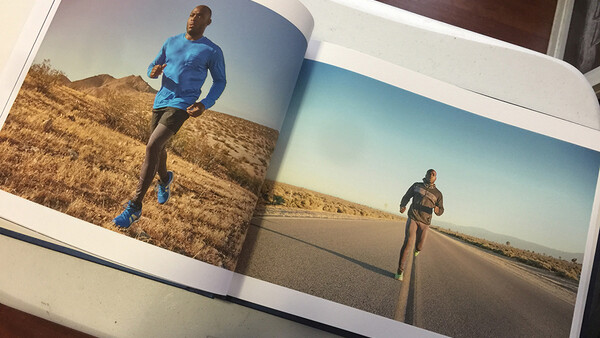
For years before the advent of the tablet, and, in my humble opinion, still the best way to present work, is the printed portfolio. Nothing quite conveys quality or branding like walking in with a preset carefully selected and sequenced book of large printed images for a client to review. In this method of presentation, selection and sequencing is more important than ever. It needs to be relatively short to give your reviewer adequate time to salivate over each of these carefully chosen images. It needs to be coherent. Nothing brings down a portfolio like one random out of place image. And while the tablet allows you to make specific changes right up until literally the last minute before walking into the room, the sheer finality of a printed book can convey extreme confidence in your brand. You know exactly who you are as a photographer and what product you are offering. Having that confidence in yourself can help convince the client to have confidence in you as well.
Obviously, there are benefits to both a printed book and a tablet portfolio. Again, either one will work if used correctly. Personally, I tend to use both. I lead with the printed book, then only drag out the tablet if a client wants to delve deeper into a particular series or see motion work. But, again, each comes with its considerations.
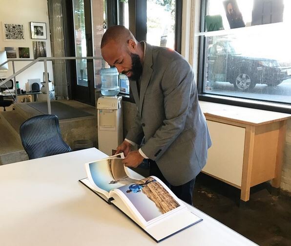
Let’s again put on our client personas to see it from their point of view. The printed portfolio is large and tactile. Going through it’s pages are much like going through a coffee table book. From my experience, viewers tend to linger longer with each image as opposed to the easy swipe left associated with tablet viewing. The prints themselves can be a significant part of the viewer's experience. I’ve had more than one client comment positively on the quality of the actual prints in my book. Yes, the prints cost money, but the attention to detail in printing the book suggests the attention to detail I would bring to their project. Also, in a printed book, pairing and layout of images can be paramount. Image A may be amazing. But placed next to image B it may look decidedly less stunning. Likewise, some images may look great printed big at full bleed, while other’s charms may be best displayed in a smaller form.
The book's format itself may change my image selection as well. My book is printed landscape so each page is wider rather than taller. So, if I am choosing say four images from a series of twenty that will fit into my portfolio, I may choose to include the landscape images rather than the portrait orientated ones. They may just look better printed in this particular book, even if the portrait ones looked better included on my website.
This is probably a good point to add the side note, that the images in your printed portfolio don’t have to be the exact same images that are on your site. As a photo editor once hinted to me, it’s not necessarily a bad thing for an art buyer to be able to see additional work in your book that isn’t available on your site. For one, it gives them the impression that you are constantly producing work (which is hopefully true). It also allows them to feel special because only they get to view this work as opposed to the images on your website that the whole world gets to see. Yes, you’ve shown this book to multiple people, but still, it can make them feel like part of a secret club. Also, if they’ve already seen your website (which is likely if they’ve invited you in for a meeting), then the new work can be extra special, a pleasant surprise and another opportunity to impress them.
It also needs to be pointed out that, even though they can be alternate ways to show a portfolio in person, an iPad presentation and a printed presentation are also different experiences.
The main advantage of showing work on an iPad is flexibility. Not only can you tailor your portfolio to your brand, but you can tailor your portfolio to that individual client. Whereas a printed portfolio requires the time and, more importantly, money to produce physical prints, changing out images in an iPad portfolio can be done with the tap of a finger.
But, it’s important to remember that all that added fuel creates a slippery slope. Trying to build a portfolio based on what you’re guessing an individual client wants to see, rather than knowing your brand and stating what you have to offer, more often than not leads to a disjointed narrative. You may quickly find yourself with a portfolio running along strong and cohesive suddenly broken up by a random string of images that you think the client wants to see, but in actual effect just end up confusing the client as to the type of material you’re best suited to shoot.
Also, because there is no financial consequence to adding images to a digital portfolio, the temptation is to just include everything and allow your portfolio to bloat with each successive shoot. But as mentioned before, whether digital or physical, less is generally more. A carefully curated portfolio will win the day, everyday. If the client wants to see more, you can prepare secondary galleries to show on request, but you should treat the editing of your iPad portfolio with the same care as if each image were costing you additional money to print.
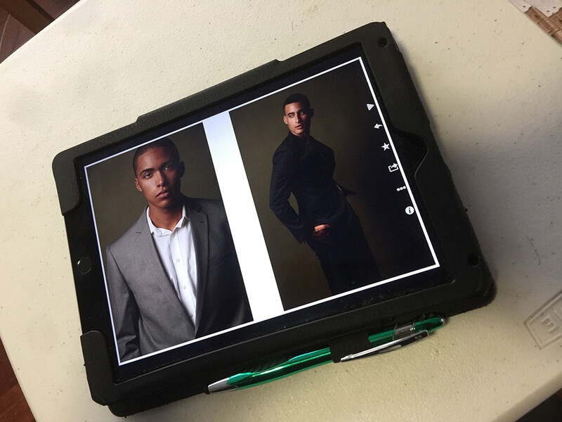
Also, as a quick side note, the iPad also brings with it the power to show every image full screen simply by rotating the device to accommodate a landscape or portrait orientation. But the person reviewing it may not be crazy about constantly flipping your device back and forth after every image to accommodate your framing. It’s a small thing. But in the interest of making their viewing experience as positive as possible, try keeping a string of verticals together or a string of horizontals together to minimize the physical effort the viewer has to exert. Or, as in the case of my own portfolio, I keep all images in horizontal orientation, then when I need to include a vertical, I create either a single vertical image on a horizontal frame or a diptych on a horizontal frame so that the viewer can go through the entire portfolio without having to flip at all. Yes, that means that the handful of vertical images in the portfolio are shown in a letterbox fashion rather than full frame. But for me, since I have far more horizontal images than vertical ones, it's worth the tradeoff to improve the client's experience. For you, it may be the opposite.
At the end of the day, like building a photography career, there are a million and one different ways you can go about presenting your work to a potential client. My experience is based on pitching to commercial and editorial clients and thus dealing with art producers and photo editors. You may be instead focused on pitching to brides, seniors, or fine art galleries. Each of those clients will have unique needs and provide a unique set of variables that will influence how they experience your work.
But regardless of the type of work you produce, it is important to keep in mind the end-user experience when you go to present it. If you spend as much time considering how they will consume your great images as you do in producing them, you may very well just find a match made in heaven.


Join the Fstoppers community for free
-
Post comments and join in the discussions
-
Browse the site ad-free
-
Share your work and get featured in the community
-
Compete in the photo contests for fun and prizes
9 Comments
Thanks for writing this article Christopher. Great advice!
Thanks Grason
This is fantastic! Thanks Christopher
Thank you, Casey
Nice article with much good advice. Thank you.
Thank you Heratch.
Thank You very much!
Thanks, Lorenzo. Much appreciated.
Just revisited this article as I'm procrastinating on trying to launch a career into being a fiction writer (building the courage for the query phase). The wisdom here filters in for me in useful ways, too. Thank you. :)