We all know the concept of a skinny mirror or fat mirror but lighting is really what can change your appearance in photos, especially when defining muscles.
My name is Monte Isom and I specialize in photographing athletes for advertising. One consistent theme in my work is creating a lighting scheme that makes the subjects body look strong and powerful. Every year, I get the opportunity to photograph boxing posters for HBO and it's one of my most favorite projects to shoot. Boxers are ideal subjects to illustrate this technique of shaping muscles with light and shadow.
Now don’t be fooled, not all boxers show up in the best shape. You can’t make a beer belly turn into a six pack. You can, however, accentuate any existing muscle tone with the use of dynamic lighting. This will emphasize as many muscles as possible and convey the power and intensity that you're looking for. In this video we needed to shoot plates of the WBC championship belt.
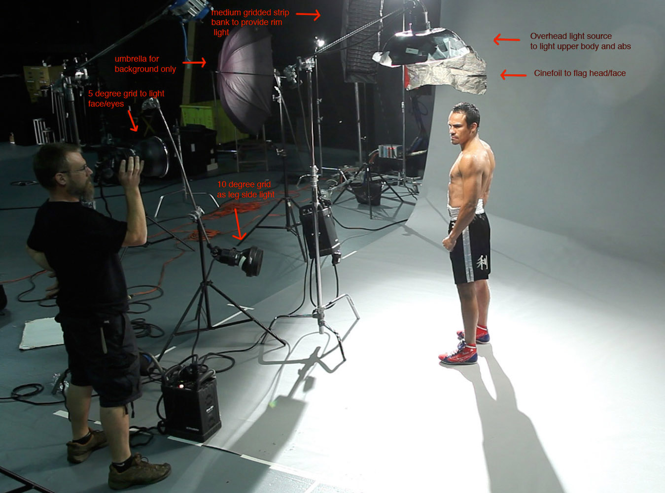
On camera flash is the worst possible light to define muscle tone. First, break the body down into regions. You want to start with a light from above to define abs and upper body. The proximity of the light source to the subject dramatically changes the contrast of these shadows. The closer you bring the light the deeper the shadow/quicker the fall off. Try flagging the subjects head with Cinefoil attached to the source as to avoid deep shadows on their face and eyes. A 5 degree grid spot to fill and evenly light the eyes and face works nicely. For legs placing 10-20 degree gridded lights from the side works best. It avoids light from spilling onto the abs and upper body and filling in the shadows produced from overhead light source. Two medium strip gridded rim lights behind the subject helps create separation from the background. This keeps the shadows we’ve created with our upper body lights from blending into the background.
Here are two images of Miguel Cotto from the same shoot as in the video. You can compare when only the rim lights are firing vs the overhead, face and leg strobes too.

Rim lights only and all lights firing
Check the diagram from a Juan Manuel Marquez and Manny Pacquiao shoot to see placement of lights.

Lighting diagram
The results from the Marquez shoot are unretouched. No burning in abs, no defining muscles in Photoshop.

Unretouched photo of Juan Manuel Marquez photo by Monte Isom

Unretouched photo of Juan Manuel Marquez photo by Monte Isom
It does not take a ripped athlete for this lighting to work. Even my assistant Jon can look cut in this lighting scheme. Here is Jon with a filled in front light and in the lighting configuration outlined above.

Front filled vs muscle defining lighting scheme
Three things to remember:
- Light the body in zones (head, upper body/abs, legs)
- Light directionally from above and sides
- Close proximity of lights to subject for increased contrast
If you want to learn more, I will be teaching two classes at the Fstoppers workshop in the Bahamas this coming May. The classes will help you learn how to take your work to the next level with ad agencies and include a shoot in a boxing gym with real boxers. We will go much more in depth and show you first hand how to tweak this setup and have participants photograph these athletes adopting these and other studio lighting techniques. To register, visit Fstoppersworkshops.com. Deposits to reserve your seat can be placed until March 1. Please contact lauren@fstoppers.com for more information.
Monte Isom is a highly sought after commercial photographer specializing in photographing athletes and movie posters. Based out of NYC, Isom has been capturing images for mega brands like HBO, Sony, Gatorade, Nike, Adidas, New Balance, and Visa for over 15 years. Monte’s schedule keeps him shooting full time, but he makes time for his joy of teaching. He’s led seminars at Photo Expo East, The Hallmark Institute of Photography, Miami Ad School, San Francisco Art Institute and Apple stores. Isom is thrilled to be participating in Fstoppers Workshop this year.


Very interesting. I can see this useful for defining softness as well, as with a woman's sensual shape.
Thanks for this article. Question on the diagram - it says you are using the cinefoil to flag the head/face, but it looks like the beauty dish is actually flagged to keep it from falling on the background. Can you clarify? It is hard to tell from the photograph.
Hey Matt, Great question. The cinefoil actually flags both the face/head and background. I've uploaded a photo of Sergio Martinez where you can see his relation to the light and cinefoil. When you have the light so close to subject you NEED to flag the head to keep it from blowing out. I'll be teaching more lighting techniques at the Fstoppers workshop in the Bahamas. Come on down and join us.