Fstoppers' photography contests/critiques are back, and now the prizes are bigger than ever.
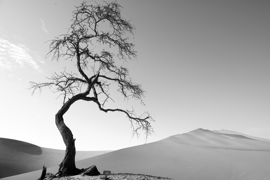
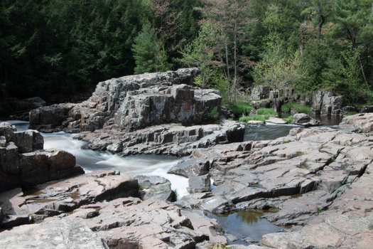
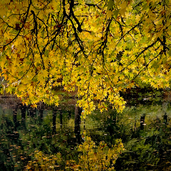
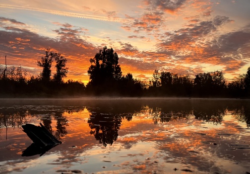
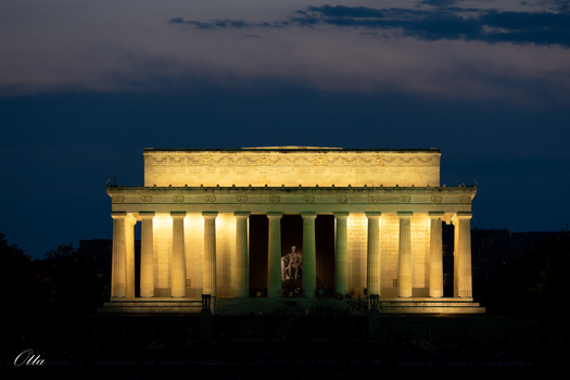
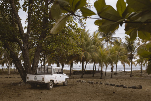
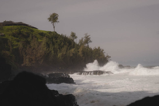
For this first contest in October, the theme is landscape/cityscape photography, and to launch this new format with a bang, all 20 of the photographs we pick to be featured in the critique will receive a free tutorial of their choosing from the Fstoppers Store. To make it even more exciting, one of those 20 photographers will also win $1000 cash.
Learn more about our new photography contests in the video below:
Contest Rules:
1. Each contestant may submit up to three images
2. Images this month must be related to landscape or cityscape photography
3. Each image submitted must include a description of the photograph. We want to know what it is, how it was taken, the gear used, and any post-processing you did to it. Images without a description will be disqualified.
4. Each photographer is only allowed to win one grand prize/year and one tutorial/year but they may still submit images to, and be featured in all 12 contests.
5. Everyone is encouraged to rate and comment on everyone's submitted photos but the highest-rated image will not necessarily win the grand prize.
The deadline for this contest is October 30th. Around November 1st we will review our favorite 20 images and announce the winner of the grand prize on the Fstoppers Youtube Channel.
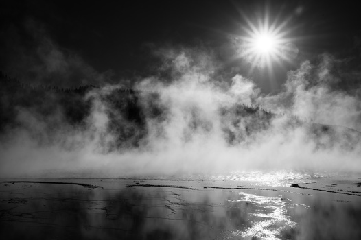
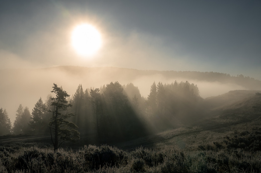
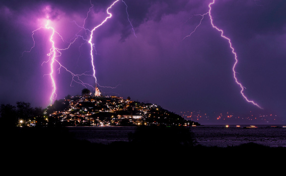
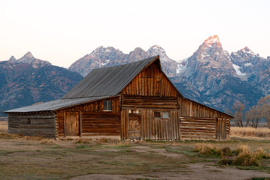
Featured Image by Elia Locardi via Photographing the World Japan
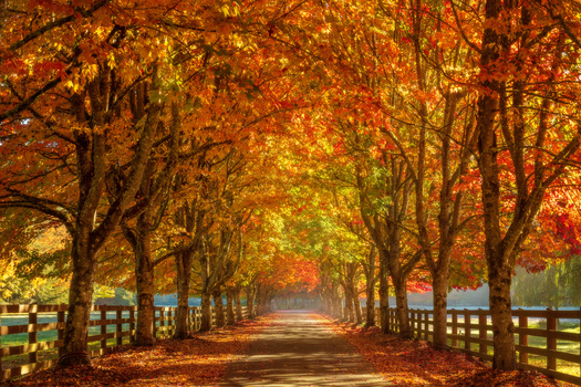
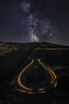
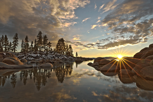

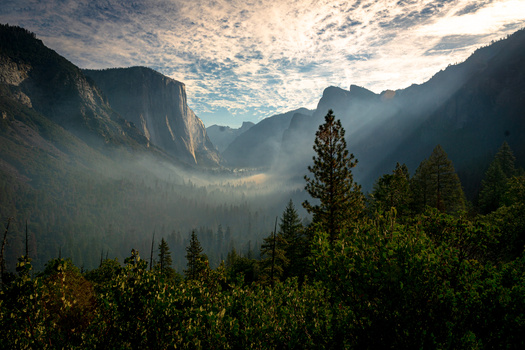


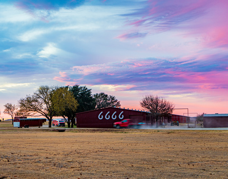
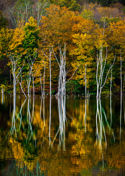
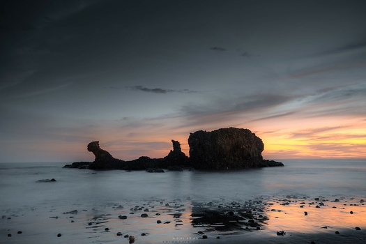

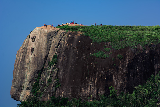
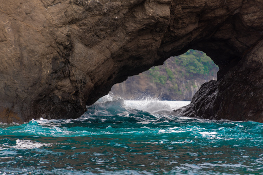
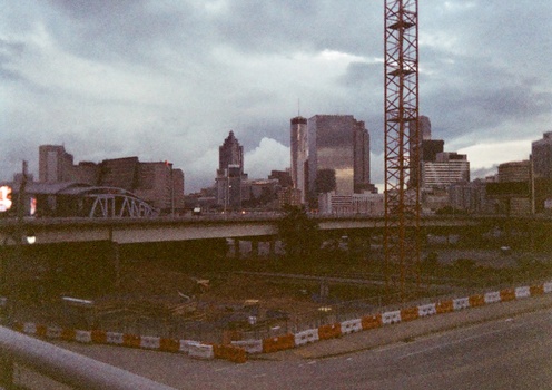
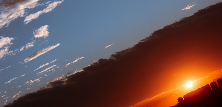
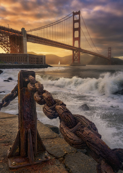
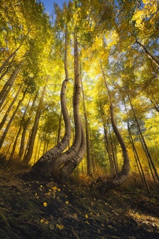
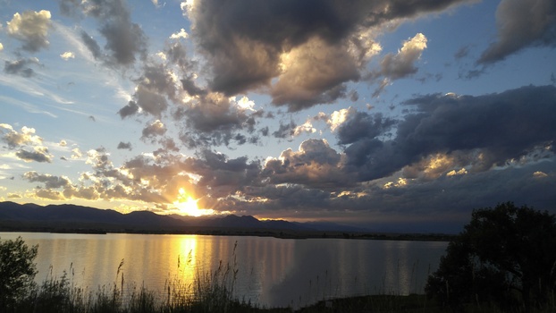
There will be thousands of photos ....
Hope so!
I think thats the point
Hope so. Lately it feels like fstoppers is just dying. No new users. 3 votes per photo. Zero comments with constructive critique.
Ya we have to build it back up. hopefully $1k will inspire some new users.
Yes please rebuild Fstoppers!! I loved the site and I loved writing for you years ago.
I've been a lurker for awhile. A couple years ago I binged through most of the CTC videos and found them to be interesting, but this is the first one I've caught while it was still 'live'. Landscapes are my thing (like a lot of people), so I had to participate.
I'm inspired
I’m glad you’re bringing back Critique the Community. I’ve missed your critiques. Those were always my favorite videos.
I'm sure it has nothing to do with the highly toxic environment of the site.
There's also the much more simple reason - this site and the videos these guys do, focus on a style of extreme post-processing photography that is rapidly dying out in the enthusiast community. No one cares about digital art creation skills anymore. People are fatigued on photos that aren't photos. Plus, when it comes to this style of non-photography digital post-process artwork... AI does it better. It's simply a dead niche.
The site really isn't toxic. These CTCs might be a little toxic with people down voting on purpose. But the site is actually pretty helpful if you can find an active group.
I know people are fairly polarized on rating people's work 1-2 stars but we've tried to be as objective in defining what a real 1 or 2 star image looks like.
Of course some people can try to game the system or vote in a toxic manner to lower a score but 1) we don't always pick the highest rated images anyways so lowering a score doesn't necessarily mean an image won't be featured and yours suddenly will be and 2) I'd say 99% of the time Lee and I give our ratings and compare them to the community, the community rated score is almost exactly in line with what we think.
I would agree in the toxicity of the community if people were leaving really harsh and mean spirited comments, but rating an image 1, 2, or even 3 in some cases isn't what I would consider a toxic behavior on it's own.
although i agree that low ratings from the community do not necessarily mean bad intention, i think that they're not really usefull either, because they're not accompanied by a reason, and even suggestions where the image could get better. so to me it feels more like a "i like/i don't like" system, which i think doesn't offer much real benefits FROM the community and FOR the community.
what i would suggest is that you could improve the rating system by forcing the voter to comment why they gave that rating and where could the image be improved. only then, the vote could be submited.
in fact, that's exactly what you and Lee do on the youtube videos. which i think is truly helpfull. so i'm only suggesting extending this format to the community rating as well.
I definitely do not agree with this idea entirely. AI is great and in most cases it is producing better looking images that what humans are producing. I've run my own work through AI and have to admit, the tweaks it makes produces a better result 9 times out of 10. However with landscapes I have not found this to be true. Most AI landscapes often have much less resolution (rocks, leaves, splashes, etc are simply not well definted) and very often have a ethereal or fantasy element to them that make them not look real at all.
Compare that to landscape photos that have time blending or very simple clone cleanup, or wild natural lightening events mixed with city lights and the difference is still staggering. I'm actually producing a video series right now where I place AI generated art side by side with "real" traditional photography and see how the normal public reacts. Shockingly, it was near impossible to find compelling landscape images for this test as the most popular ones posted online are WAY more extreme than anything posted here on Fstoppers.
I do tend to agree that the over the top post processing that has been so favorable might be falling out of fashion to some degree but that's not to say we wouldn't feature or critique an image that is more muted and still has interesting subject matter and composition. Infact, we tend to like those images more but less of them are submitted.
As for the toxic environment, I've addressed my thoughts on that in the comment below.
I was right 2k+ already :D
Will the photos be used beyond the list of contest submissions and the YouTube channel to announce winners? There is no mention of how the submissions will be used beyond as a submission. I assume that's the only case, or you would have mentioned it, but just in case.
The Fstoppers privacy policy is very standard but also gives us the right to use images posted to the website. This is only to protect us from frivolous lawsuits (we are in one right now). We always try to give attribution any time we use an image as, for example, the featured image of a future contest.
Sorry to hear you have to waste resources defending your company against a frivolous lawsuit. That sucks! Why do A-holes have to make up things to sue about? They make the world a worse place for all of us.
This lawsuit is particularly insane. I hope to be able to speak about it but our lawyer is suggesting we stay quiet at the moment.
I understand following your lawyer's advice and not disclosing any of the details. Hopefully when it is over, there won't be a nondisclosure agreement, and then you will be able to share what it is about. I think it could make for a very interesting article that I will want to read and comment on.
Yeah I'm pushing for no nondisclosure agreement because I want to talk about it very openly. It's pretty much a blatant money grab under the guise of copyright protection. I hope we can wrap it up soon so we can talk about it in detail.
Sorry to hear that Lee.
I posted 3 photos the other day, but they are no longer showing up with everyone else's, I just see them under "Yours" tab now.. Any reason for this?
I guess they show with everybody else for everybody else then you.
The reason is you CAN'T vote for your own work.
Seems like my picture has been deleted alongside some of other pictures from other photographers. Any clue why?
I have not deleted any photos. What exactly happened?
Well there are certain pictures not visible anymore, which have been visible before. I cannot see them, when I am logged off. However, when I log in with my user, I can see at least mine under "Yours". But when logged off, it should show it. Anyways, not a biggie as I can see that other users still give votes, so must be visible for others.
copy the URL of your submissions to this thread and I'll tell if you if I can see them.
thanks Lee, but I can see it alongside the other submissions again. I can confirm it is there. Thanks.
I'm creating this post to comment on what I'm seeing from the 695 submissions thus far.
There are many images where the color editing is really bad or the framing/crop is not optimal. Oddly, I see many potential 3 to 4 star images where I ended up giving a 2 or maybe 3 stars because of the two issues I stated above.
I know we all start somewhere, I'm just surprised by the lack of 4-star images posted so far. Out of 695 images, I'd assume I'd rate at least 20+ of them 4-stars, but I think I gave maybe 3-4 images 4-stars. I'm guessing the top notch landscape photogs have stopped visiting this site or moved on to other things in their life.
Apologies for being transparent. I'm sure I'll get raged for posting this too.
Lots of people need their Lightroom slider license revoked. We've all been there though. Lay off the saturation and clarity sliders, folks!
Also agree on the weird cropping. If I see a non-standard crop, I assume it was a cheap editing hack to get rid of something you didn't intend to be in the composition.
When I was a child my mother told me a story about when she was on her honeymoon trip... She watched a painter who painted a picture of a landscape while she gave him advice on how to do things and what color to use according to her opinion. . Then the painter offered the brush to my mother and said: Why don't you paint the picture?... I think this story responds very well to you (@Lewis Green too), because art is free of expression . If you don't like it, do it yourself.
We are literally being asked "judge" and "rate" the images posted. I'd say opinions are allowed in this case.
Judges should never follow options but facts
Sorry...but I don't understand what you're trying to convey. "options"?
A bit sad really...I thought I gave some general feedback without being rude, and people take it as a personal attack. Again, there are buttons on this website, for this contest, labeled, "judge" and "rate".
Sorry was autocorrected. Should read “opinions”. As far as I am concerned I am done with the discussion. As mentioned I have removed as many of my photos from my profile as I could. Time to move on. Please don’t take this personal. Of course you have the right to critique as you like.
Welcome to CRITIQUE the community. As Ryan said, a lot of the photos submitted could be a star higher if not for the heavy-handed process, so I think the feedback is constructive.
And who is Ryan that his words are above everything? It is his opinion, nothing more... Everyone has the freedom to express their photos as they want and no one is allowed to superimpose their tastes above others. If you like realistic photography, then take realistic photography, but that does not mean that you are better than anyone, nor that everyone should do the same as you. Photography is an art of free expression, there are many aspects and forms, everyone is free to do as they want and no one is the one to say how things should be done in this case...
Thanks for the transparent feedback. Withdrew all pictures from competition and deleted almost all from my profile (only the POTD I couldn't delete). Deletion of fstopper-profile is under consideration.
Why is that? You had images submitted for the contest and you deleted them?
Correct, a bit too toxic for my taste. Thanks for following up
Same
What exactly was the toxic element? Were people leaving negative comments on your work or you did not like the lower ratings people gave? We've addressed this ad nauseum but even with all the anonymous 1-2 or even 3 star votes, 99% of the time we review an image, our rating fits perfectly with the average of what the community gave. The cream always rises to the top. Even when I post my own images and get lower ratings than I want, I've learned to take the community's critique to heart and try to look past my own biases.
Now if people are leaving rude comments and not just low ratings, I am not okay with that and would love your help to moderate that sort of non constructive criticism.
what is the minimum pixel size for the pictures?
Enough to be viewed and give that "wow" factor. 1mp might not be enough.
There are a handful of gems in the group that only have 2-3 stars, which surprises me. I realize that photography is highly subjective, but something is wrong when a few excellent photos cannot garner a 4-star rating.
Clearly there are people here downvoting their competition. Just look at my recent submission. I am not saying it's the winner or even a finalist, but it is certainly not a 1 star photo. This is my first time giving Fstoppers a shot at getting my photos out there, but if this kind of petty stuff is going on, well, why should I waste my time? I make enough money from the photography I don't post and so totally content keeping it and my process to myself. Thanks Fstopper community!
I gave your Blackstar Canyon waterfall a 3-star, but since I've been there a few times, I have an emotional attachment to it. For anyone to give it a 1-star is silly. There's obviously thought that went into it rather than it being a "snapshot". Hell...the fact that you have visible long exposure applied to it means it cannot be a 1-star image.
I appreciate the feedback. I too have emotional attachment to it. There are certainly better waterfalls out there with better framing and more space to play with composition. It's far from my best photo, but it is one of my favorites because when I usually see it, it's a trickle...
I just wanted to leave a bit of feedback as well on the photo, I just popped over to your profile and scoped it out. Didn't want to make my comments something permanently attached to the photo so I thought I'd just do it (semi) privately here.
You're right, its not a 1 star image, but its definitely between a 2-3 imo. I wont bother dropping credentials, you probably have more experience and make far more money than I do off photography, but I do have some experience professionally judging photos, so I hope you don't take offense to a little detail on why it might be showing up a bit lower than expected.
One, there is a dichotomy between the two main elements of the image; the walls of the canyon are this gritty, bold, muted blacks and greens with lots of texture, set against the milkiest, smoothest, nearly blown-out waterfall. The slight blue tinging around the lower section of the waterfall, and the top edge on the left looks almost photoshopped (I cant zoom in to see, so I'll assume it wasn't).
The foreground is almost an afterthought here as well. It offers little contribution to the image; no dynamics, no real leading lines. Its visible, it doesn't take away from the image, but it doesn't ADD to the image a whole lot. The rocks on the left look like great options for creating some leading lines, something to create visual interest in the foreground, but its nearly lost in the foreground rocks as it becomes one unicolor mat.
Those are my critiques. On the other side, I love the colors. I love the twisting nature of the rocks on the right, nearly matching the waterfall itself and creating powerful vertical lines in the composition. The location looks awesome, and I can totally understand the emotional connection to a spot like this. There are many spots I visit that are only epic a few days a year; being able to catch those are an exciting moment and I love that you were able to be there to see this! Its a totally sellable, totally awesome shot. But from a pure review viewpoint, its interesting how personal preference can take a back seat to technicals. It says nothing about you as a photographer if you don't succeed in a competition, especially a publicly voted on one, and it doesn't mean you aren't awesome or cant sell work. Its a totally different game, entering judged competitions in my experience, and not reflective of the value of someones art.
So please, don't take it to heart! :)