
I know, it’s a loaded question. Heck, it’s a loaded word, that one — good. According to whom? By what measure? Who do you think you are to criticize my work? I know. And, I agree. But I suspect there are still a few checks we can make to see if an image is headed in the right direction. Let’s look at five of them!
Five Perspectives to Consider
A lot of ink — and I’ve a sneaking suspicion, a lot of wine — has been spilt over the years hashing out theories about what art is and what makes a piece of it good. It’s easy to imagine the well-lubricated midnight arguments at my friend’s dining room table stretching back in an unbroken chain of pointed, passionate discussions for hundreds of years: “No. Art is this” — whatever "this" is.
While questions about the meaning of art and the quality of artworks are terribly intriguing to ponder, they’re also easy to get hung up on: “I don’t know what the answer to life, the universe, and everything is. How dare I be so bold as to go to the store for milk?”
But what the heck, let’s be bold! Let’s take a stab at identifying a few of the potential ingredients that might contribute to great photos that might at least provide some guidance as to how we could approach that centuries-old question: Is the artwork I just poured my heart into complete crap, or might there be something there?
Five factors that contribute to many great photographs come to my mind: technique, composition, subject, story, and integration. We’ll leave the motivation for why these five things for another article. They certainly aren’t the only perspectives from which one could think about an image, but they do at least provide something of an explicit structure for examining our work, a place to start from. That can be valuable even if it only prompts us to ask what some other better questions might be. Let’s take a quick look at what each of these ingredients encompasses in a little more detail. Then we’ll try ripping a couple of images apart to see how such an evaluation might work in practice.
Technique
We use a camera to selectively collect information about a scene, a raw converter to tweak colors and luminosities across an image, and a photo editor to make local refinements. Virtually every genre of photography requires other strong skills as well. Adept technical ability allows a photographer to effectively translate their vision and emotional intent into reality.
Composition
Images are constructed from a combination of simple building blocks: lines, edges, forms, colors, and tones. Our visual systems have a low-level, subconscious response to the arrangement of these elements within an image. Lines subliminally lead the eye from one part of an image to another, areas of contrast draw our interest, repeated forms create soothing patterns, colors evoke a warm summer afternoon or a lonely winter evening. Our emotional response to combinations of these simple elements is why we find some abstract images "work" and others, well, don't.
Subject
The subject of an image can elicit a subconscious, emotional response. Evoking just about any emotion but apathy can be effective. But that can be surprisingly hard to achieve. Our brains are bombarded with visual information every waking moment of every day. They are very good at filtering out 99.999% of what we see. Anything that’s not crazily interesting, stunningly beautiful, highly unusual, or about to kill us gets tossed out before it has the chance to become a conscious distraction. As creators of images, that leaves us with a high hurdle. And it doesn't help that something like 100 million new images are shared on Instagram everyday. Posting one more wildflower by the trail in midday sun photo isn't the way to stand out. I’ll often do a quick test. If a keyword search on Google Images yields a few hundred — or, as is often the case, a few hundred thousand — other images similar in subject matter, perspective, and lighting to my image, I usually figure it probably isn’t portfolio material. Even if it might otherwise have been interesting, people will probably have seen something similar so many times at this point that they've become anesthetized to it.
Story

A great story gets viewers’ minds consciously engaged with an image; it can ask them to ponder challenging questions and keep them thinking long after they’ve moved on to other things. The story an image tells may be the single most powerful tool that we, as artists and communicators, wield. Bring a strong story to the table and you have an image that your audience may remember years down the road for what it told them about the world or themselves. Images that tell strong stories have changed the world.
Integration

For an image to be its most effective, the four previous ingredients (or at least those that are present) should strengthen one another. Technical choices should strengthen the composition. A composition should guide the eye to the subject(s). Subject(s) should work together to tell a cohesive story, not distract from one another.
Caveats
By no means are all of these things necessary to create a great image. Street photos can be a bit coarser when it comes to their technical merits. They can be gritty, contrasty, a bit out of focus, and yet, still be incredibly effective. Robert Mapplethorpe’s flowers don’t tell much of a story, yet they’re notable (to say the least) because of their stunning compositions. Chris Hondros’ images don’t... actually, they’re pretty much just stellar all around.
The point isn’t to have a one size fits all checklist that will confirm exactly what we’ve done right or tell us where we’ve gone astray. The point is to give ourselves a few reminders that might prod us into a little structured, critical thinking about our work or the work of others.
Kicking the Tires
Often, the best way to get a handle on an idea, to see whether or where it might have any value to us, is to try applying it to a couple of cases. Let’s take a look at the five ingredients mentioned above in the context of a couple of images: one that’s maybe a little stronger, and one that’s a little weaker.
A Little Stronger Image
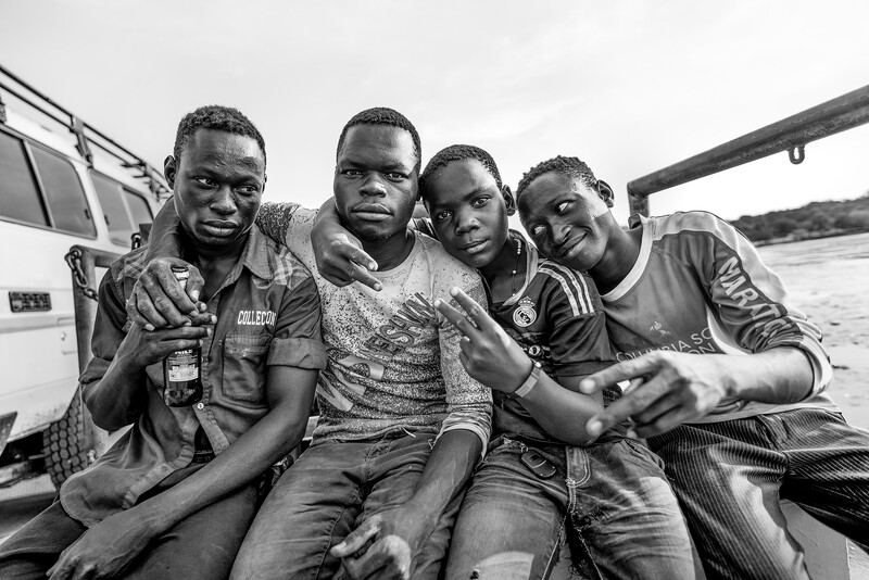
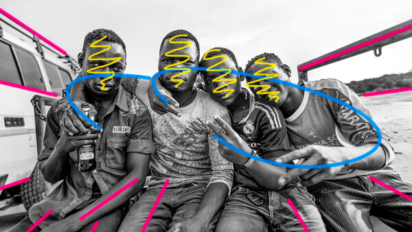
Technical Choices: Sharply focused on the eyes. If the lens had gone to f/1.4 or f/1.2, a little shallower depth of field could have been desirable, but it was shot wide open for that lens at f/2.8. Conversion to black and white in Lightroom with a bit of highlight recovery and increased contrast. Lightened the vignette in Photoshop along with making some local contrast adjustments, including increasing texture in the faces. I don’t see a whole lot I would change technically.
Abstract Composition: Relatively simple, but fairly strong composition. Shot from a low perspective so that the ferry’s railing, lines of the 4x4 at left, and subjects’ legs all work as leading lines to guide the eye toward the central focus of the image, the faces. The tilt of the heads, the direction of the arms and fingers, and the sweep of the shoulders also work to dynamically draw the eye through the faces. The directions of the boys’ gazes helps to add additional movement and framing, with the two kids in the center looking straight at the camera while the two on the outside look across the frame. There aren’t too many adjustments I would have made here, either, but that’s not remotely to say that there isn’t something I should’ve done and just don’t realize it.
Subject: The school boys are obviously the subject, with the row of four faces the center of attention. In addition to strengthening the composition, shooting from down low also made the interaction with the subjects more intimate, more powerful. The boys in their dirty shirts, their corduroys and pin-striped dress pants, the bottle of Nile Special, make fairly interesting subjects. They’re a brief glimpse into another part of the world, a different experience of life. A quick search on Google doesn’t yield many other images of this subject shot in this same style or intimacy. There might be something interesting and unique enough here to be worthwhile.
Story: Had the image only contained the three boys on the right, it might still have been interesting, but lacked much of a story. The mixture of friendly smiles on some of the boys with the harder character of the boy on the left, a mid-afternoon beer held loosely in his hand, hints at something deeper, rougher in their existence. It hints at a story, but doesn’t complete it. I think the story is the weakest aspect of this image. A few weeks spent in this community — rather than a few days spent circling its periphery — would yield a fascinating wealth of stories and insights, I’m certain.
Integration: Many of the technical choices strengthen the composition of this image, the composition strengthens the subjects, the subjects all work together to tell something of a story. The various aspects of this image are fairly well integrated.
A Weaker Image
Selecting a passably decent image is relatively easy. Selecting a weaker example is a good bit more challenging. I’ve only got a few decent images to choose from. Crappy ones? I’ve got tens of thousands of those. The image above falls somewhere in the middle, which will hopefully be instructive.
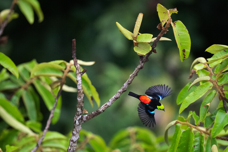
Technical Choices: This is a far more challenging image to pull off from a technical perspective. A rainy day in the Amazon means low light levels; a long lens implies a relatively slow aperture, even wide open; and birds on the wing necessitate fast shutter speeds and ridiculously good autofocus. The bird is actually in the focal plane, but even at 1/1,600th of a second shutter speed, there’s a significant amount of motion blur. The shutter speed should’ve been faster. Lightroom and Photoshop were used to reduce the contrast and luminosity of some of the leaves without going so far as to actually call attention to them.
Abstract Composition: Still. It’s not a pleasing composition. There are far too many distracting elements in the scene and no central compositional theme. Nothing to guide the eye to the primary subject. And the subject, itself, is flying out of the frame to the lower right rather than into it. Its direction of travel and gaze tend to draw your eye out of the image. Not a good composition on a bunch of counts.
Subject: The subject is likely the one redeemable thing about this image. The paradise tanager is a stunning bird. Seeing one in flight, with its wings fully spread, is pretty amazing — more so when you're looking out on it from more than a hundred feet up in the canopy of the Amazon rainforest. It's a unique experience and perspective.
Story: There isn’t much of a story here, however. No interactions or conflicts, no unusual behaviors. If the background of the image were a stretch of deforested, smoldering land, for example, that would be both a tragedy and a strong story, but fortunately for this region of the Amazon, that’s not (yet) the case.
Integration: Even a little bit of Photoshop work wasn’t able to render a strong composition. The composition detracts from, rather than strengthens, the subject. The subject doesn’t really work to tell a story. Not a well-integrated image.
Give It a Whirl
Try thinking through some of your own images in this way, both those you’re pleased with and those you have a feeling might be lacking a little something. Helpful? Do other questions or key ingredients come to mind that might help to better differentiate critical features of images that work and those that don’t? I’d love to know what they are!
Join the Fstoppers community for free
-
Post comments and join in the discussions
-
Browse the site ad-free
-
Share your work and get featured in the community
-
Compete in the photo contests for fun and prizes
5 Comments
Nicely done! The examples are great. I think the composition of the bird photo could have been improved through cropping to create an image of the lower right part of the frame. The point being that one need not accept the compositional limits imposed by conditions at the time of shooting. (I know you know that; might just have further strengthened the already-strong instructional value of the piece.)
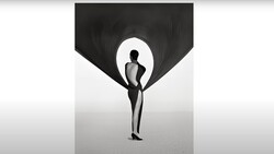
Not great, but passable, illustration:
Thanks
Hey Saul. Nice! That is *definitely* a better composition.
Oh, now *this* is definitely one of the finer example of why one should be subscribed to FStoppers. Brent? -- Following!
Thanks Joseph. Glad you found it informative!
Thanks for this insightful article, Brent! Well worth the read. One of my interests is in the use of computing tools to help education in photography. I wonder whether we'll ever be at a place where AI can help us create better photos by, for instance, suggesting changes in technique or composition or helping us understand the novelty and affect of a subject. For instance, I've often automated Google searches in my work in tech for various reasons, can you imagine a system that gives you a hint about novelty without you having to do the search yourself? Story and integration seem more human and intangible to me.