For years, I enjoyed cinematography and photography as almost non-overlapping magisteria. I was fully aware that they played by many of the same rules, but I didn't entertain the idea of extracting elements of cinematography and inserting them into my images until much later.
Perhaps this is primarily pertinent to editorial work and portraiture, but its applications are not limited to those. For simplicity's sake, I will concentrate on the cinematography of one film in particular to display how effective the constituent parts of high-end cinematography can be; that film is "Drive." For those of you who haven't seen it, I implore you to give it a go even if the content isn't really for you. It is widely accepted as a visual masterpiece as well as having an incredible and fitting soundtrack. For a detailed breakdown of the film, I recommend watching Cinematography Database's video below, created by Matt Workman:
Color Grading
This is the least alien concept to photography but also the one I find has the most impact. Complementary colors are often employed in shoots both in wardrobe or location and in post-production, but a color palette present throughout a shoot — or even if only in post — can tie together images otherwise disparate. In the video above, Matt displays the two colors that are prominent throughout the film:

Matt Workman on Drive's color scheme.
This serves a number of purposes. Firstly, the green and the orange are close to complementary colors and are a rather common choice in editorial photography as much as cinema. Secondly, as discussed, every frame of "Drive" has an identity, a sense of "Drive-ness." This congruence throughout is the best way to tie all the images of a shoot together even if they are lit differently, have different subjects or locations, and so on. This isn't just useful for fashion editorials and look-books, it's fantastically effective in other areas, with wedding photography being just one. A popular processing method in wedding photography is crushing the blacks (something seen in almost all cinema) and soft cream tones. The third benefit of having consistent toning throughout a shoot is perhaps a little more niche: storytelling.
Storytelling
This is more relevant to cinematography than photography without a doubt, but it does have worth in series of images. In Matt's video, he identifies the color blue as denoting the artificial and the generally negative, whereas the color orange tends to highlight hope, happiness, and the good. Whether you agree with this hypothesis or not, assigning colors and different lighting to present a theme is useful in many areas of photography.
Composition
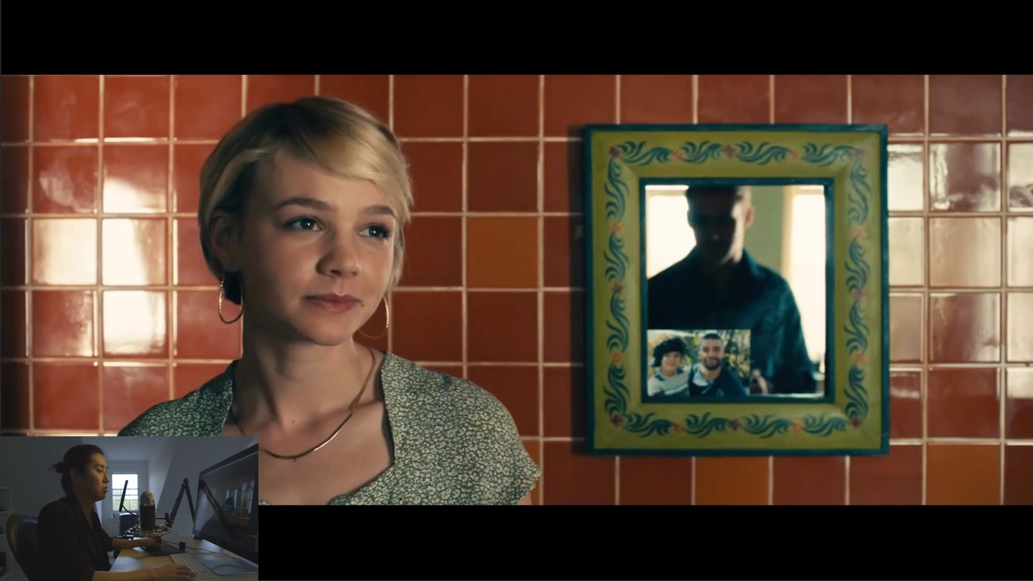
This is perhaps one of the more surprising inclusions, but I feel as if photography and cinematography approach the same rules of composition rather differently. A lot of films abide by rules of thirds and leading lines, etc. in the same way us photographers do, but sometimes, it appears that us photographers use these rules "because that's how you do it" rather than cinema's approach, which is both aesthetically satisfying but also to further a theme or plot. The image below is a perfect example:

Matt Workman on "Drive."
Firstly, the composition is abiding by the rule of thirds, and it's a very well-composed scene. However, it's interestingly set out and deeper than the mere mechanical structure of a frame according to the "rules." Ryan Gosling is noticeably blurred and dark, also in the green color scheme. He is isolated from the rest of the warm, orange scene, and it adds so much more to it over a floating bokeh head. When composing a photograph, ask yourself whether you can achieve the desired effect using a more interesting method.
Summary
Honestly, the list does not stop there, but a lot of overlap halted my tangent. I love cinematic photography, and I'm not alone in my appreciation of its allure. Some of the most memorable images I've seen have been ones in which you get a sense there is a story behind it. I have mentioned the Photographer Lee Jeffries on more than one occasion and his (now rather famous) portraits of the homeless have that magical quality of leaving the viewer wanting to know more about the subject or moment. Another common aspect of memorable photography is unique twists on traditional composition, and although that's perhaps the most difficult concept to employ, there can be no harm done from experimenting with different versions of classic composition. Finally, color grading is just about the most important part of my retouching in any type of photography. Sometimes, the difference between a good image and a great image is just a couple of subtle curve layers. I implore you to check out the work of Julia Kuzmenko McKim to get a sense of its power.


Ryan Reynolds is not the one framed, it is Ryan Gosling who is Driver. Its not orange and green, it is orange and teal, the widely used hollywood summer movie color grading trope.
Ryan Gosling > Ryan Reynolds
This topic has already been well hammered out by David Geffin in much greater detail and more accurate information.
Many, if not all, of Nicolas Winding Refn's films are visually stimulating, including Drive as you mentioned. His most recent work on The Neon Demon is simply stunning and his use of color in the film is nothing short of masterful.