Released in 1990, "Pretty Woman" became a massive box office success, but it wasn’t just the storyline that made it memorable. The film’s visual style, particularly its use of lighting and color, gave it a dreamlike quality that still feels fresh decades later. Understanding how these elements work can teach you a lot about creating a specific mood or aesthetic in your own projects.
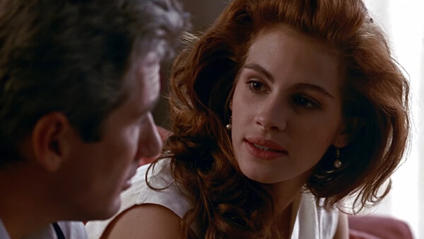
Coming to you from Sareesh Sudhakaran of wolfcrow, this thoughtful video breaks down the elements that made "Pretty Woman" stand out visually. One of the main highlights is the lighting style. Cinematographer Charles Minsky used soft, shadowless lighting to create a warm, glamorous glow. This kind of lighting is ideal when you want to minimize imperfections and give everything a polished, almost ethereal quality. By using soft light straight from the top, Minsky was able to highlight faces without harsh shadows, a technique often referred to as classic Hollywood lighting. Another method he employed was moving the light slightly to the side to create the well-known Rembrandt lighting, adding a subtle three-dimensionality to the characters’ faces.
Another key element discussed is backlighting. Even when it might not seem logically consistent, backlighting was used to ensure that subjects stood out from their surroundings, adding depth and making the characters look more striking. This was controlled carefully throughout the film, keeping the look polished without making sets appear too artificial. If you’re aiming to create a glamorous, high-end look in your own work, experimenting with these lighting techniques could help you achieve it.
Color played an equally significant role in defining the visual tone of the film. "Pretty Woman" is often associated with the color red, a bold and passionate hue that embodies the film’s spirit. But as Sudhakaran points out, it’s not just about red. The movie uses two distinct color palettes. The world of Edward, the male lead, is bathed in muted shades—browns, blacks, and grays—reflecting a controlled, business-like atmosphere. In contrast, the world beyond Edward’s offices bursts with vivid colors, particularly red, which is tied to Vivian’s character. Julia Roberts' iconic red dress is a clear visual representation of her transformation, and it stands out all the more against the muted background, emphasizing her as the focal point of the film.
The video also explores how production design and location choices helped convey the film’s story. Beverly Hills and Rodeo Drive are portrayed as almost otherworldly—clean, shiny, and prosperous. These locations, coupled with smooth camera movements, help make the shopping sequences feel like stepping into a fairytale, full of endless possibilities. Even if you're not into fashion, it’s hard not to get swept up in the visuals, which effectively tell a story of aspiration and transformation. In this way, "Pretty Woman" uses visual cues not just to set a tone, but to drive the narrative forward.
The fairy tale aspect of the film is another interesting point that Sudhakaran touches on. "Pretty Woman" modernizes the classic Cinderella story, replacing carriages with luxury cars and glass slippers with high-end accessories. The film doesn’t try to hide its fairytale underpinnings; it leans into them with visual elements that feel polished and refined without crossing into overt cheesiness. The balance of grounded realism with fairy tale elements is one of the reasons why the film’s visuals have aged so well. Check out the video above for the full rundown from Sudhakaran.


Join the Fstoppers community for free
-
Post comments and join in the discussions
-
Browse the site ad-free
-
Share your work and get featured in the community
-
Compete in the photo contests for fun and prizes
2 Comments
Being shot on film added a lot to the look.
I agree the film selection, at the time, and the sound capture is another as well as all the other things. Todays digital films and sound equipment are like being in a room with bare floors noisy and lighting that is too harsh. Also the study of colors comparing has been missed in study by either directors or since selectors. TV and films have gotten so bland and noisy maybe because of digital and a bad selection of capture picture styles (there are so many vs film selections). Even in just stills photography you will find many Picture profiles designed for movies but one for stills and Creative Looks used in jpegs only but after you will find in Lrc (etc. other programs) under camera matching profiles( best guess by program) but may be too many profiles to choose from in a post world of editing for camera profiles and made to choose from. But film comes in less choices and an easy study and remember.
What does a fabric isle do to you?